

William Overington
-
Posts
3,062 -
Joined
-
Last visited
Posts posted by William Overington
-
-
24 minutes ago, Rickertmork said:
I’d like to see to see someone replicate one of my paintings through this this program.
That someone could be you.
Then you could be skilled both with paint and brush and with Affinity software.
William
-
-
2 minutes ago, Rickertmork said:
Hello, thanks for not deleting it! Looks like a have landed in the wrong thing , , fascinating indeed, I will have to dig and find out exactly what affinity is. I’d like to see to see someone replicate one of my paintings through this this program.
Hi, thank you for posting.
Basically, Affinity is a set of three software programs for producing electronic output.
They can be used alone or together, as desired.
Affinity Publisher is basically for text publications, maybe, indeed often. for more than one page.
Affinity Designer is for producing artwork from a zero start, either vector art or bitmap art, or a mixture of both.
Affinity Photo is for editing photographs and the like.
These forums are for discussing the software and its applications.
This particular section is for posting what one has produced, or edited, using these products.
The moderators are very strict about not posting anything that has been generated using AI (Artificial Intelligence) software.
The participants include professional artists and hobbyist artists.
It is a polite, good-natured forum.
The really good thing about Affinity software is it is NOT a pay a subscription product. If you buy a licence, that is it. If they produce a later version, well, that is another payment if you choose to buy it, but you don't have to buy it.
For example, Affinity Designer is on version 2. I am still using version 1.
William
-
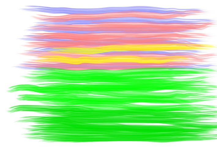
Some readers may have noticed the thin line around the pictures. I did not want it there but I could not work out how else to get a section of the image of a known size as a png file. I looked up crop but I did not find it quickly obvious how to do what I wanted, so I made a copy of the .afdesign file, added a rectangle with no fill and a 1 point Stroke and then exported the png of the selected area.
Checking now it appears that the colour of the line is not the default black. The colour seems to have been carried over from the oil paint, and Is different in the large version and the small version.
William
-
-
Oh, that is rather too big for the forum screen. I'll try it at 501 by 501.
William
-
-
I have had a go, it took from 2:02 pm until 2:20 pm.
I used an A3 landscape canvas and a separate layer for each colour.
I used Affinity Designer version 1 and I used the last of the brushes under Oils that is listed as 200.
I am thinking that I can try to select an area from the middle and it might look better.

William
-
1 hour ago, Alfred said:
Maybe the results of any such efforts would be better posted to a new thread.
Yet whichever way, or even both, this thread has encouraged me to try using the oil brushes in Affinity Designer.
Maybe other people too.
William
-
For the benefit of readers who do not as yet realize why Alfred laughed at that reply, here is a link to a chapter of my second novel.
http://www.users.globalnet.co.uk/~ngo/localizable_sentences_the_second_novel_chapter_048.pdf
William
-
-
@Alfred Well, you could have noted that you altered what I wrote by changing some of it to be in bold.
William
-
In the first picture, I like that sky with the orange and the blue.
Can one produce that effect using Affinity Designer?
William
-
1 minute ago, PaulEC said:
There are plenty of places on the web where people can display their art work, and where other people can look for inspiration.
As this is an Affinity forum, I think it should be limited to work produced using Affinity software. I would not like it to become a general forum for anything created using any medium, purely on the basis that it might inspire people to do something themselves using Affinity!
Yes.
I am just saying that I consider that it will serve no useful purpose to remove the first post of a new participant in these forums.
The strongest trees sway in the breeze.
William
-
Yes @GarryP you are correct. Alas, if you had used an Oils brush that would have looked good.
I know, I know, but the thing is if this thread is removed then a new poster will have had a first post rejected.
When my post with the picture incorporating an enlargement of a picture generated using an Artificial Intelligence program was removed, well, I started a discussion thread about it and I now realize why the post was removed. But I was an established poster, it was not my first post in the forums.
I don't go in for the culture of self-putting-down-of-own-efforts but I realize that I am not that good at art, but I enjoy having a go, and this thread has had the effect of trying some of the Affinity Designer oils brushes.
So the original post, the starting of this thread, has had the effect of encouraging at least one end user of Affinity software to use it.
So I hope that the moderators will either "let it go" and leave this thread in Share your work, or move it to another section of the forums if they prefer.
Maybe some of us can produce something using the Affinity oils brushes and post it in this thread.
William
-
50 minutes ago, GarryP said:
I can’t see where those applications have been used, at all or at least in part, to create the things you have shown us.
Nevertheless, the thread has had the effect that I have opened Affinity Designer and had a go at trying the Oils brushes that are supplied. I started with the default black, then tried red, with several of the brushes.
So, rather than this thread being declared "non-Affinity" and hidden, I hope that the moderators will let it stay and it become a thread to encourage people, not only the professional artists but also those people (including me) who enjoy having a go at producing art. using the oils brushes of Affinity Designer.
William
-
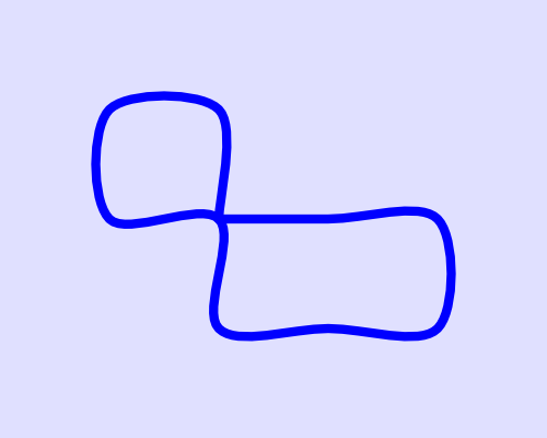
Experimenting with a pelagic random walk that will return to its start point within a given number of steps.
I put twelve pieces of paper in an opaque bag, three labelled Red, three labelled Green, three labelled Yellow, three labelled blue.
Repeat
Get a piece of paper from the bag.
If the opposite movement of the previous piece, put it back and try again until such an opposite movement piece is not found.
If Green, move 100 pixels to the right.
If Red, move 100 pixles to the left.
If Yellow, move 100 pixels up.
If Blue, move 100 pixels down.----
I then carried out a run of the process.
The result is as follows.
Green, Green, Blue, Red, Red, Yellow, Red, Yellow, Green, Blue, (Yellow, Blue as only one left.)
Here is the result of the first ten points expressed graphically using Affinity Designer. using the Pen Tool.
I started with an A3 size canvas, landscape orientation, with the measurement unit as pixels.
If then used the Pen Tool to draw an essentially arbitrary closed shape with twelve nodes, the first node in the middle of the canvas and the other eleven spaced out from left to right a little below the upper edge of the canvas,
I then used the Transform panel to set the point that was in the middle of the canvas to X=2000 and Y=2000.
Then, one by one, I used the Transform Panel to position the remaining points, though as the run ended, I deleted one of the points. In retrospect, maybe I should have started with thirteen points, maybe not starting with a closed loop. But such is what my happen when trying something new. Well, at least new to me, I have not yet found this idea elsewhere, so maybe it is totally original, maybe not.
Here is the image with (most of) the corners converted to smooth. The "origin and end point" are not converted to smooth.
Another run of the process would usually produce a different result.
This is an initial experiment with an idea.
This experiment has 12 steps, 3 each of 4 colours.
In another experiment the number of steps could be increased.
In yet another experiment, there could be 6n steps with movement in three dimensions, which could be expressed using an isometric diagram. If an interesting shape were to be produced then it could be made as a wire sculpture.
William
-
How did you do that please?
William
-
6 minutes ago, AlanPickup said:
No mainly Times Roman and Gill Sans, ...
Was that because that was what Adana had on offer?
Those and Spartan if I remember correctly.
Ah, and Engraver's Titling.
William
-
13 minutes ago, AlanPickup said:
One of the main things on colour is to ensure there is contrast as this causes problems for many eyesight problems if type is overlaid on a background of similar colour, so contrasting colours rather than complimentary.
I have found that black ink on yellow paper is good as some elderly people had said that the white paper was glaring for their eyes.
William
-
4 minutes ago, AlanPickup said:
(I shudder sometimes to think I set 6pt by hand in the 1960's, these days I would struggle to see it)
Was the fount Spartan?
William
-
3 hours ago, Alfred said:
The point is that you chose the order in which to present the wording! Putting ‘No on-site parking’ and ‘Take your litter home with you’ immediately after the details of the live entertainment and information about the date, time and cost of attendance is like a business telling potential customers about terms and conditions before telling them what goods or services they’re offering for sale.
The other approach is that when I bought something from a well-known retailer some time ago, shortly afterwards I received an email asking me to write a review of the product to help other customers. So I thought I would. So I went through to the page and there was a link to Terms and Conditions, so I had a look. Down the page is a section about Indemnification such that if I posted a review and anyone made a complaint about it then et cetera et cetera for legal fees of various companies, their associates and so on.
So I did not write a review.
I wrote about such terms and conditions in a chapter of my second novel.
localizable_sentences_the_second_novel_chapter_029_version_2 (globalnet.co.uk)
William
-
43 minutes ago, wonderings said:
Exactly. His line of thinking would be to have the small print large and in your face because they should know about all those details!
Well, my thinking is to have what is often known as the "small print" of an adequate size and be sufficiently prominent as to be a reasonable way to serve those terms and conditions.
52 minutes ago, wonderings said:So instead of listening to people who do this professionally, and try and learn and understand why this is never arranged the way you have, you are stuck in your thinking that would have any add agency/designer/advertiser rolling their eyes. You are trying to get people to come to an event, you highlight the things that will entice them to come, then the details like time, date and if you need to bring something like lawn chairs. The lowest priority is all the things you can't do, and rules and regulations.
Nobody has stated why the so-called "small print" is so often at the end of a document in a tiny size of type. So how can I learn and understand why this is, as you put it, "never arranged the way you have"?
I would have worded the so-called "small print" differently if I had authored the brief. This was discussed earlier in the thread.
For example, rather than
Dogs to be kept on a leash at all times.
I would have put
If you bring a dog, please keep the dog on a leash at all times.
The other "small print" items could also be reworded to be more of polite requests for sensible villagers cooperating for the common good than authoritarian orders, but that is not how the brief was worded.
So I had to decide whether to participate or not. I decided to participate.
Thus far only two people other than @GarryP have posted images.
Will anyone else?
Rules and regulations are not the lowest priority. The people organizing the Summer Fair decided to include them. If they are not important, then why include them?
William
-
9 minutes ago, Alfred said:
The point is that you chose the order in which to present the wording!
Yes, I did, deliberately.
10 minutes ago, Alfred said:Putting ‘No on-site parking’ and ‘Take your litter home with you’ immediately after the details of the live entertainment and information about the date, time and cost of attendance is like a business telling potential customers about terms and conditions before telling them what goods or services they’re offering for sale.
In my way of thinking, it is no good putting terms and conditions in tiny type at the bottom edge of a document as what I regard as swizzlines.
If dogs are required to be kept on a leash, then people needing to know that.
I did not word the text of the poster.
William


Oils
in Share your work
Posted
Well, I had tried that and it did not work for me, no fill, no stroke, it disappeared!
William