Dybkjær
-
Posts
85 -
Joined
-
Last visited
-
 Dybkjær reacted to a post in a topic:
IPad Affinity Publisher fails to show Export dialog
Dybkjær reacted to a post in a topic:
IPad Affinity Publisher fails to show Export dialog
-
IPad Affinity Publisher fails to show Export dialog
Dybkjær replied to Dybkjær's topic in iPad Questions
Hi Stokerg, you are right. With Never the Export dialog comes up, with Preflight set to Export or Live, the Export quits during the preflight check. This is another workaround, thanks. As for the file, it is uploaded as julekalender 2025.zip. At first I had some problems, so I first uploaded a file with a link to another copy, but moving to a place with a better network connecting did the trick, so now the real file should be in you DropBox as well. Hope it turns out useful, I'm sorry I couldn't pinpoint the problem in a small file. You are welcome to fold origami from the book 🙂 Just don't distribute the book. Best regards, Hans -
IPad Affinity Publisher fails to show Export dialog
Dybkjær replied to Dybkjær's topic in iPad Questions
I have found a workaround. And a partial reproduction. I found an older backup that worked and then copied the contents of the 33 spreads one by one from the new, offending document to (a copy of) the backup. The result is a document that works and has all the newest contents. This version, like the old one, has a preflight warning due to a page number from a master page being wrapped outside its box by an overlapping image. I tried to fix this by making a new master with that page number removed, and then apply that master to the spread. This works fine, the preflight warning disappears in Publisher. However, the Export error reappears. Reproduced. This, however, is not the full reproduction. If I delete like 12 spreads from the book, but retain the page with the new master, the Export works again. So it is not this master alone. It must be a combination of at least two factors. To the Serif supporters: If you would like the offending document for debugging, you can have it. I will not include it here, both because of its size (192 MB, the reproduced one even 292 MB, or 221 MB when saved without history), and because it is a draft of a book to be published which I don't want to make available here. -
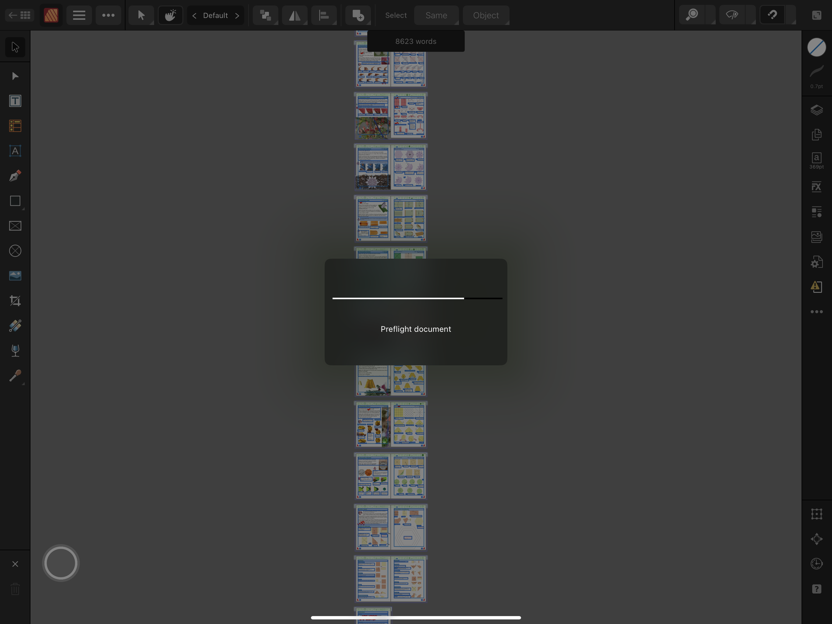
I have a 192 MB 64 pages book I want to export to pdf for printing. When I press "Export" it briefly displays the "Preflight document", see picture below, then closes with no further notice without showing the expected Export dialog. If I delete like 10 spreads (20 pages), I get the export dialog as expected. I can do this in two different ways with no overlap between the two sets of pages, so it seems not to be related to any specific page. I have produced a PDF for that book a few days ago, before making a number of proof reading changes, adding missing pictures, redrawing a number of illustrations etc. I do not think it is the size. The iPad Pro 12.9" (6th Generation) runs iPadOS 18.5 and has 1 TB disk, 16 GB RAM. Publisher Help says version 2.6, df738.

-
I would like to bump the priority of this up. The workaround is fragile and the problems will increase as the distance between the current version on the iPad (currently 2.5.5) and the PDF-stable version 2.4.2 on Mac increases. Already now I experience that documents look different when opening them in version 2.4.2 on the Mac. I'm producing more books, and any difference in rendering between the two versions nullifies the "workaround", and makes it really difficult to use Publisher to actually publish anything.
-
Crashes when moving nodes with node tool (AP)
Dybkjær replied to Dybkjær's topic in V2 Bugs found on iPad
Hi Callum, MEB posted this text (I got mail about it), but the post and the download do not seem to be available? Concerning the second part, crashtest1.afpub, I have enclosed a screen recording showing the problem. MEB is right, you can do it without the error which you can see in the first part. Then I undo and try again slightly differently, and you can see it crashes. The difference I can see is that in the first attempt I approach from the right, maybe a bit slowly. In the second attempt, the approach is slightly different, and it crashes. I have been able to reproduce the non-crash once, as seen in the second recording. All other attempts, about a dozen times, ended like the third recording, with a crash. Thanks for looking into this, Hans RPReplay_Final1725779147.mp4 RPReplay_Final1725779677.mp4 RPReplay_Final1725780553.mp4 -
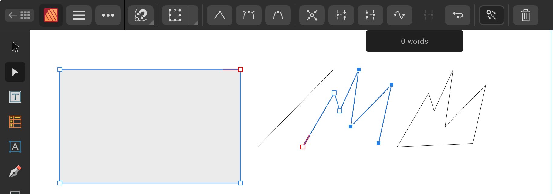
Description: Select two vector shapes, one open and one closed. Use the node tool. Select all nodes of the open shape. Grab one of the selected nodes and move it to a node of the closed shape. Affinity Publisher crashes when the nodes are near each other. Experiments show that it is not necessary to select all nodes of the open shape, but the one moved must have an unbroken chain of selected nodes to an endpoint node of the shape; see "Reproduction from scratch" below. Platform: iPad Pro 12.9" 6th generation, iPadOs 17.6.1. Affinity Publisher 2.5.4.2572. Offending example document enclosed. The error can be reproduced in different documents, even one created from scratch (enclosed). It also crashes on a Mac Mini M1 2020, MacOS 14.5, using AP version 2.4.2 (I only use that as a workaround for a PDF production error). I enclosed the crash details from that (crash-details.pdf). I'm not sure, but it may require a couple of attempts to reproduce on a Mac. Severity: AP crashes. I cannot do what I wanted in the way I thought was obvious and which seems easier and more precise. I do have at least one workaround: Move each node of the shape individually; it is difficult not to distort the shape this way, though. The use case is to align nodes of two different objects, without distorting the objects. Reproduction from document reduced to two objects (movecrash.afpub): In the picture below, the blue rectangle and the dashed line are both selected with the node tool. The node endpoints of the dashed line are selected. Enlarge the picture to focus on the upper, right corner of the rectangle, and the two nodes there. Now try to move the upper endpoint node of the line to align with the upper, right corner node of the rectangle. When the line endpoint node comes close to the rectangle corner node, Affinity Publisher crashes. The two nodes never comes on top of each other, it crashes before that. Reproduction from scratch (crashtest1.afpub): This time I created a new document from scratch and added a rectangle, converted it to curves, and created another shape using the pen tool, and made sure the shapes have another height. Select the rectangle and one shape. Node tool. Select the nodes of a shape and move one node (I used the topmost) of the shape near the top, right corner of the rectangle. AP crashes. EXCEPT when I do this with the closed shape: Then AP does not crash. It must be the open shape that is selected and moved. The situation in the picture will crash if you move one of the selected nodes near the rectangle corner node. If you deselect of the two mid-nodes and move the top selected node, it does not crash (but the shape of course severely distorts, breaking the use case). Note: the two open shapes were made by breaking a copy of the closed shape. I did test this on a Mac, and got the crash below, details in crash-details.pdf. For some reason it seems I have to do a couple of attempts to trigger the error on the Mac. On the Mac I used version 2.4.2 as I because of this other error cannot upgrade. movecrash.afpub crashtest1.afpub crash-details.pdf
-
Set selection box
Dybkjær replied to Ash's topic in [ARCHIVE] 2.5, 2.4, 2.3, 2.2 & 2.1 Features and Improvements
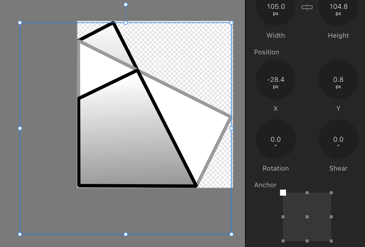
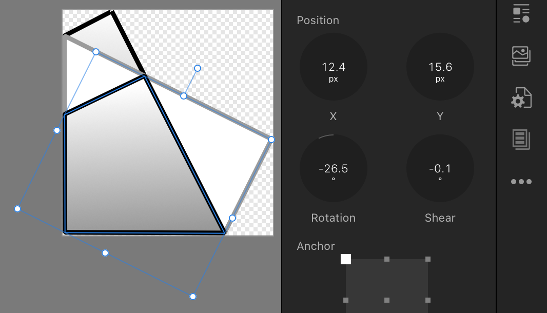
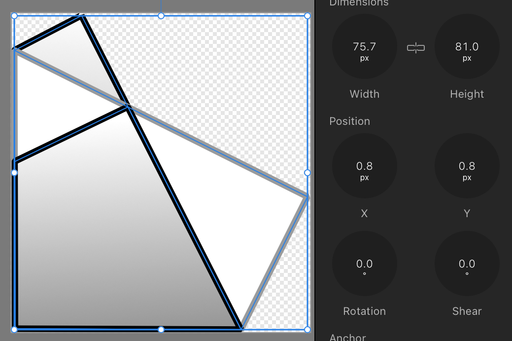
I'm not sure if I use "Set Selection Box" correctly, but when I group, the selection box seems ignored. I use iPad Pro, iPadOS 17.6, and the Affinity Publisher 2.5 1c794. I have this image (picture 1), see the enclosed example file (it's a stylised origami Santa). All three objects are rotated, not with the same amount. I cycle and Set Selection Box on each of the three objects. Looks fine (picture 2), also when I select all of them (picture 3). Then, when I Group the three objects, the resulting box boundary does not bound the Set selection boxes, but the original boundaries (picture 4). Which surely was not what I wanted: I want a group which can be layouted, rotated, etc. based on the normalised boundary box, like the one in the third picture. Regards, Hans selection box example.afpub
-
 Dybkjær reacted to a post in a topic:
How To Reset The Bounding Box In Designer...
Dybkjær reacted to a post in a topic:
How To Reset The Bounding Box In Designer...
-
lmashton reacted to a post in a topic:
Light Mode for IPad apps planned yet?
-
Dybkjær reacted to a post in a topic:
Stroke width scales with object despite "Scale with Object" being off
-
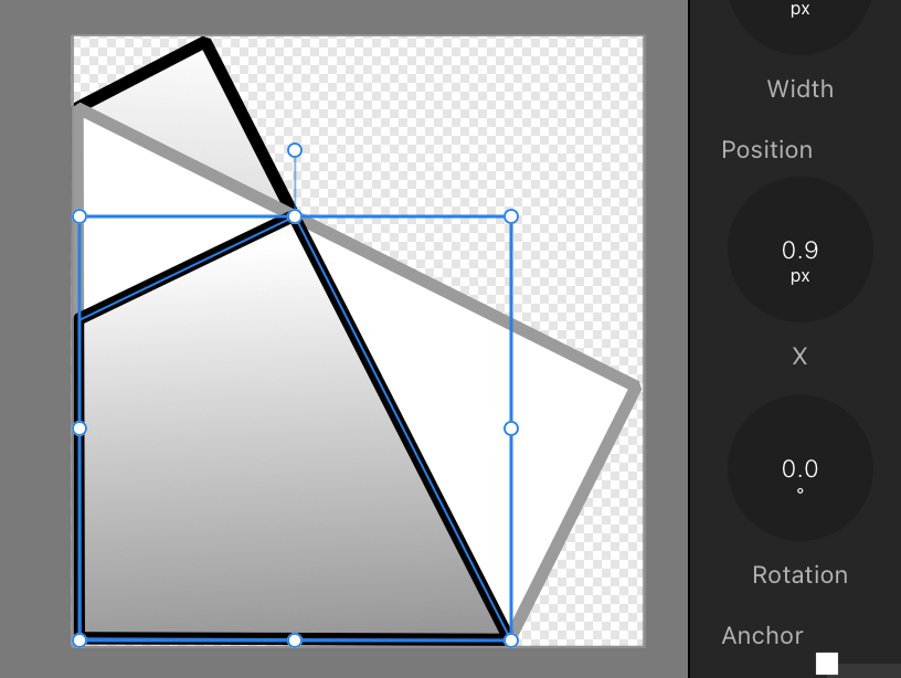
Thank you so much, Lepr. I see it. I must incidentally have turned it on without noticing (see picture). When I turn if off, the scaling works as expected. I still have to fix the consequences of having it on for a while. At least I learned a new thing. The bug report may be closed. Affinity, you might consiger marking the "Scale with object" as overridden when activating the override options. Thanks, Hans
-
Platform: Affinity Publisher 2.5.3, iPadOS 17.5.1, iPad Pro 12.9" 6th generation, using pen and Magic Keyboard. Description: if I scale an object, the stroke width scales with the object despite the "Scale with Object" being off. The bug only happens with some documents. Reproduction The enclosed document is one page of a 63 page book draft. In the picture below I selected the small square, arrow, and dashed line. Then made a copy and moved that copy. Then in the Transform tool linked the dimensions and with the copy selected, multiplied the object width with 2. As clearly can be seen, the stroke width of all three scaled with the object. Workaround This cannot be reproduced with a new document, not even if I copy the objects from the bug document to the new document. Somehow the bug is associated with this specific document, and copies thereof "Saved as" with "Save with history" off. Hence I am able to work around it by creating a new document in the correct print size and settings, copy all the drawings (63 pages) to the new document, and then fix the stroke with of every object (way more than 1000 objects) (as I only realised the bug after a good while). Doable, just really annoying and time consuming, even using Select Same. Best regards, Hans bug-demob.afpub
-
Also, this "feature" does not seem to work in the iPad version. I could really use a proper "reverse layers" feature. I'm diagramming instructions, and sometimes I ask the reader to "turn over". That would be easier to draw if I could just reverse the selected objects' layer order.
-
wlorentz reacted to a post in a topic:
Plus and underscore work like shortcut keys (Magic Keyboard, Danish)
-
wlorentz reacted to a post in a topic:
Plus and underscore work like shortcut keys (Magic Keyboard, Danish)
-
Dybkjær reacted to a post in a topic:
Grid settings doesn’t display
-
I can confirm that the problem still is there with AP version beta 2.5.3.2516.
-
Thank you! Both for confirming quickly, and for the workaround. I can confirm that by using AP v2.4.2 on the MacMini, the test document as well as the full document export to pdf without the errors. Though I look forward to a bug fix of 2.5, it is not as critical as long as the documents I produce on my computer (the iPad) can be exported by using remote desktop to the Mini and then use version 2.4.2 to export them there.
-
Dybkjær reacted to a post in a topic:
Affinity Publisher: Critical v 2.5 error: Export to PDF wrecks havoc with some of the lines
-
Extra info: The export as pdf fails in the exact same way on a Mac Mini M1 running Sonoma 14.2. It can be updated to Sonoma 14.5, though I doubt that will make a difference. The AP is version 2.5 1c794 here as well. I know it may take time to pinpoint the bug and subsequently fix it. As I planned to publish the book now, if your initial analysis indicates it will take more than a few weeks to fix, I would appreciate ideas for workarounds. Is it somehow possible for me to run AP version 2.4, maybe on the Mac Mini (which I only use occasionally)? Also, here are some pictures from the main export bug pages from the documents in the previous message. The original at the bottom and the exported pdf at the top. The difference is pretty clear, and there is no way I could let the top row go into print 😃
-
Just tested this in AP version 2.5, and now the example document exports fine to pdf. Thank you for fixing this issue.
-
Dybkjær reacted to a post in a topic:
Plus and underscore work like shortcut keys (Magic Keyboard, Danish)
-
This is critical as this is supposed to be the final export before sending the 148-page book to the printer. It worked fine in version 2.4. Now, in version 2.5 it is totally unusable. I assume the error lies with AP version 2.5 as that came a week ago, and the export and print on May 12th worked fine. But I have no access to verify with version 2.4.2. I export a book from Affinity Publisher. Some of the pages go wrong. One detail is shown here, the Publisher vector drawing on the left, the exported result on the right: I have included the failing pages in the attachment, and the exported PDF in the other attachment. Pages 1, 10, 11, and 15 are ok, all the other 17 pages fail. The non-failing pages are included 1) for reference, 2) because then the spreads are as they are in the original. The remaning 127 pages of the book look fine, so I have omitted those. To reproduce: Open the document in AP 2.5 (1c794). Export. Select PDF (Press ready). Select Color Space: As document (because the printer, BOD.de, wants RGB, and because that worked fine previously). The generation takes a minute or so. Ok, and save. IPad Pro 12.9" (6th generation), iPadOS 17.4.1. I hope you can fix this serious bug asap, as it worked before, and I want to submit the book now. I have the pdf generated on May 12th, 2024, which looks fine and which printed well with the printer. The new one from today fails. I am not sure of the precise version of the ok one, but since AppStore says v2.4.2 came a month ago, it is likely that one. AP-v25-fail.pdf.pdf AP-v25-fail.afpub