ecce
-
Posts
15 -
Joined
-
Last visited
-
I've created a bunch of custom shapes in Affinity Designer to use as symbols. Normally these are a single color and very simple, image street signs for example, that kind of symbols. One look sort of like the figure 8 (an easy example). The two "holes" are transparent (as they are not part of the object). But in some situations I want to fill the two holes with a color. What's the best way to do that? Can I easily create a new shape within another shape and fill that? Or is there a better way?
-
 ecce reacted to a post in a topic:
Making "flat" 3D objects
ecce reacted to a post in a topic:
Making "flat" 3D objects
-
ecce reacted to a post in a topic:
Making "flat" 3D objects
-
ecce reacted to a post in a topic:
Making "flat" 3D objects
-
Making "flat" 3D objects
ecce replied to ecce's topic in Pre-V2 Archive of Desktop Questions (macOS and Windows)
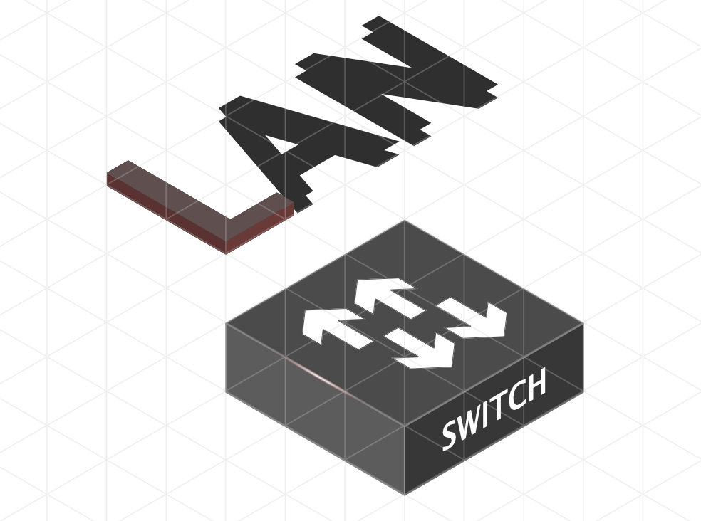
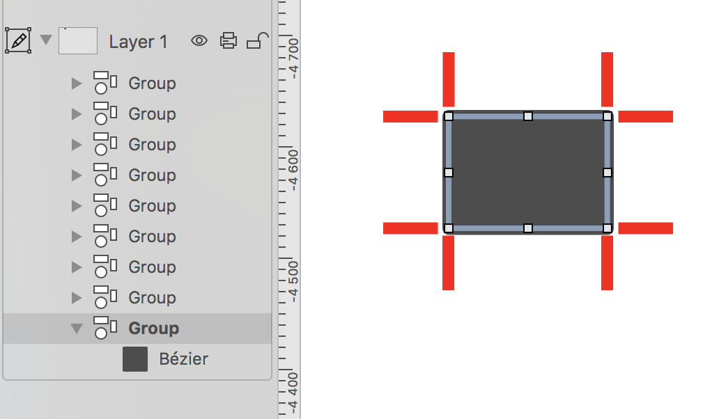
That's what I have done, but of you want to make e.g. a cog icon 3D the grid is not much help? There is an example below with a symbol I have created, and a sample text. The arrows on the box for example, could those be given a 3D-look by giving them a height in some easy way? Drawing shapes and joining curves works but it's to much work to be worth it.
-
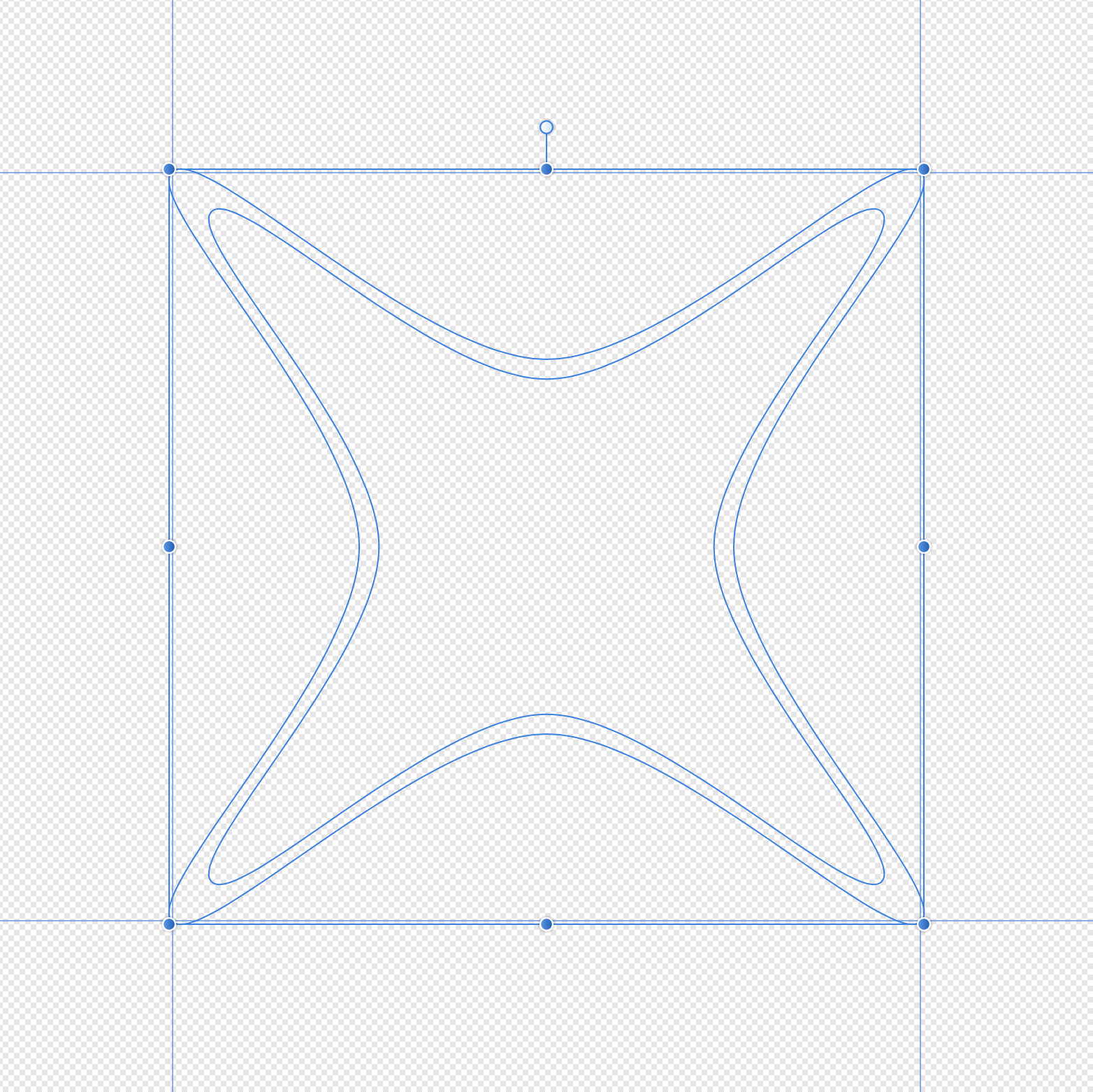
Is there a way to easily make 3D shapes in affinity designer? It does not have to be a true 3D object that exists in a 3D space, the illusion of 3D will do fine. I want to draw a shape, use rotation and perspective to "lay it down" on a surface and then apply height to get a 3D effect. The built in fx functions like 3D and bevel & emboss are not what I'm looking for, mainly because they rasterize when exported. I want to stay vector based. They are also limited in for example visual height setting. Simple shapes like a cube can easily be done manually, but complex shapes I have not found a solution for yet. So far I've done a bit of manual job, duplicating an object and then manually draw lines with the pen tool between the two shapes to create areas that look like a 3D object, but it's very time consuming.
-
ecce reacted to a post in a topic:
Creating a shape showing just the outline without using stroke
-
Perfect! Thanks!
-
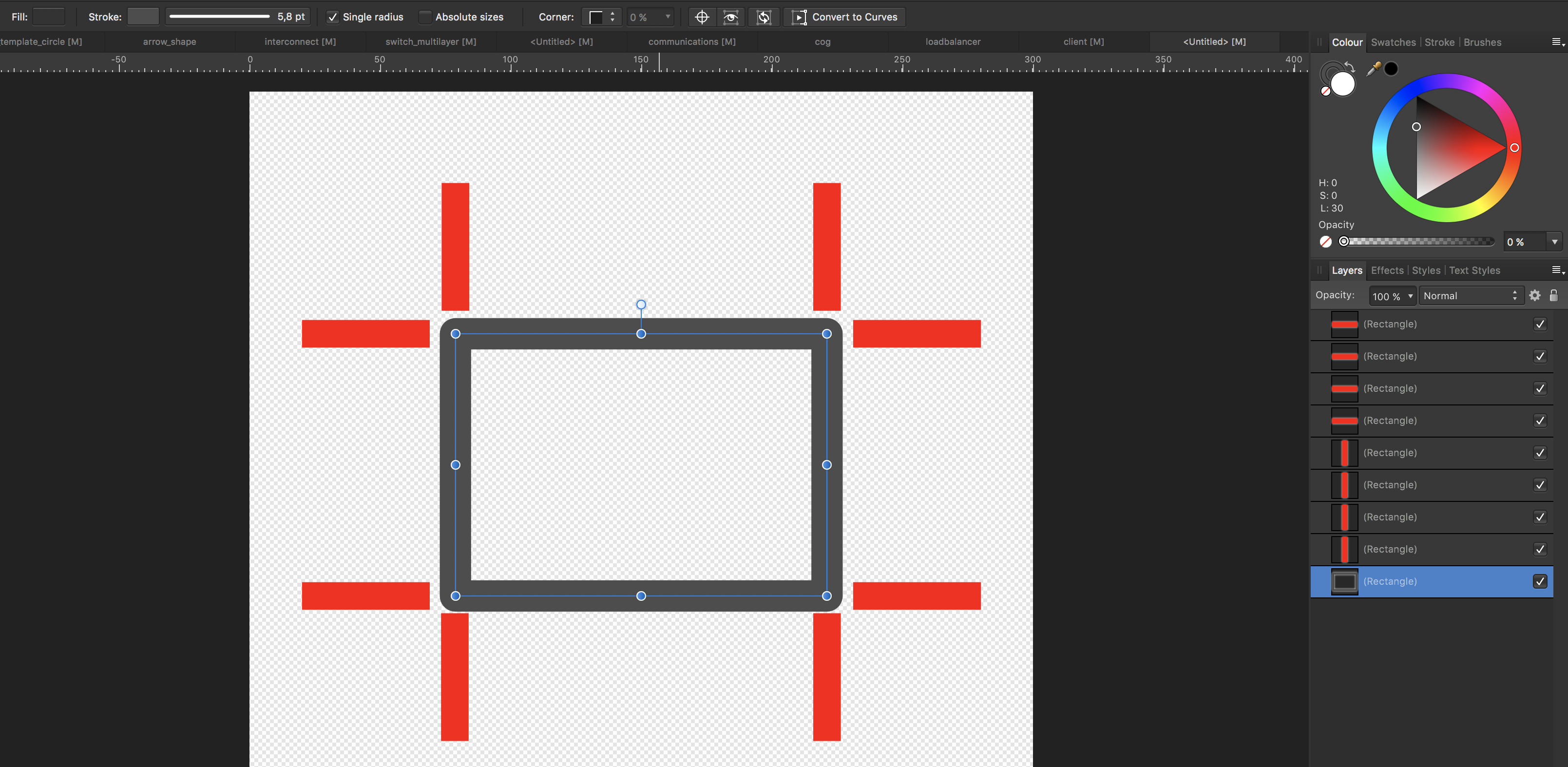
I tried it now, not sure what to do with it. Does it not just show the outline of the shapes? I find this a bit hard to explain. Also I'm new to this kind of applications. I want to create a shape like the one above, where the line has the same thickness everywhere. The filling color should be in the line itself, not the area within the shape. If I duplicate the object and shrink it, the thinkness won't be the same (see below, the corners are way thicker). Otherwise subtracting the smaller from the bigger would solve my problem.
-
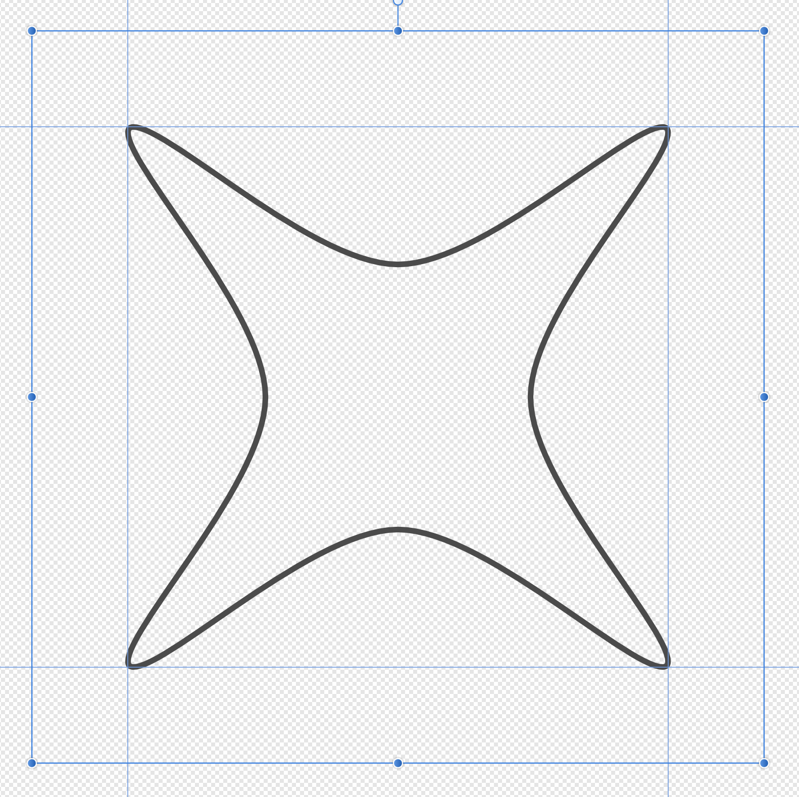
Sometimes when I do complex shapes I just want to keep the outline of the shape and make the center transparent. This is easy to do with the pen tool and then set a stroke, but when combining that shape with others, the stroke setting messes up the combined result. Is there a way to convert a shape using stroke to a line or something like that? Converting to curves does not seem to solve the problem. Another option would be to draw two shapes, one smaller than the other one and subtract the smaller from the bigger. But I have not found an easy way to get a smaller shape with the proper curve radius and other various settings to make this look good. Just shrinking the bigger one won't do it, it will make the diff between the two shapes vary in thickness. The shape below is an example. How could you draw this without using stroke?
-
SVG export becomes weird
ecce replied to ecce's topic in Pre-V2 Archive of Desktop Questions (macOS and Windows)
I get the same result with a rectangle when I use stroke and no fill. Alfred: I'm not ignoring your suggestion, I'll try what you said later.
-
SVG export becomes weird
ecce replied to ecce's topic in Pre-V2 Archive of Desktop Questions (macOS and Windows)
Yes. -
SVG export becomes weird
ecce replied to ecce's topic in Pre-V2 Archive of Desktop Questions (macOS and Windows)
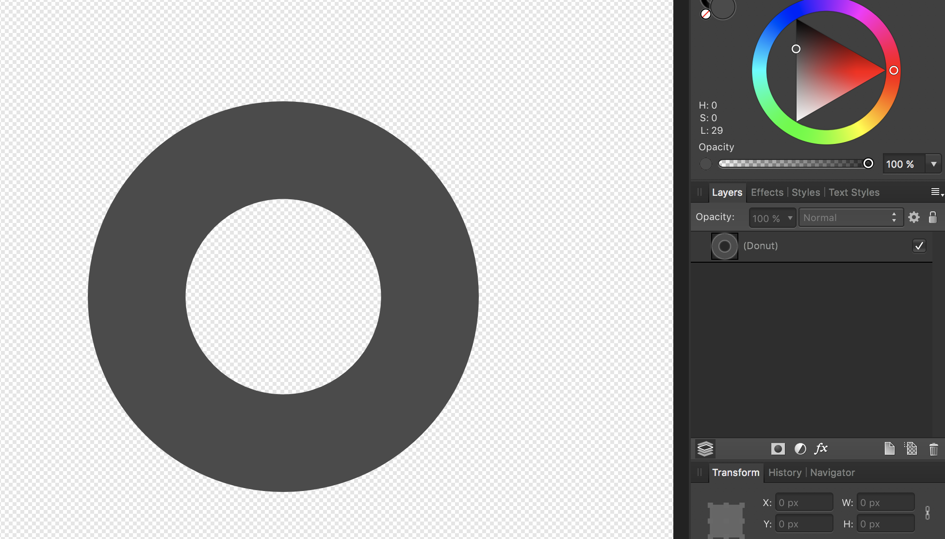
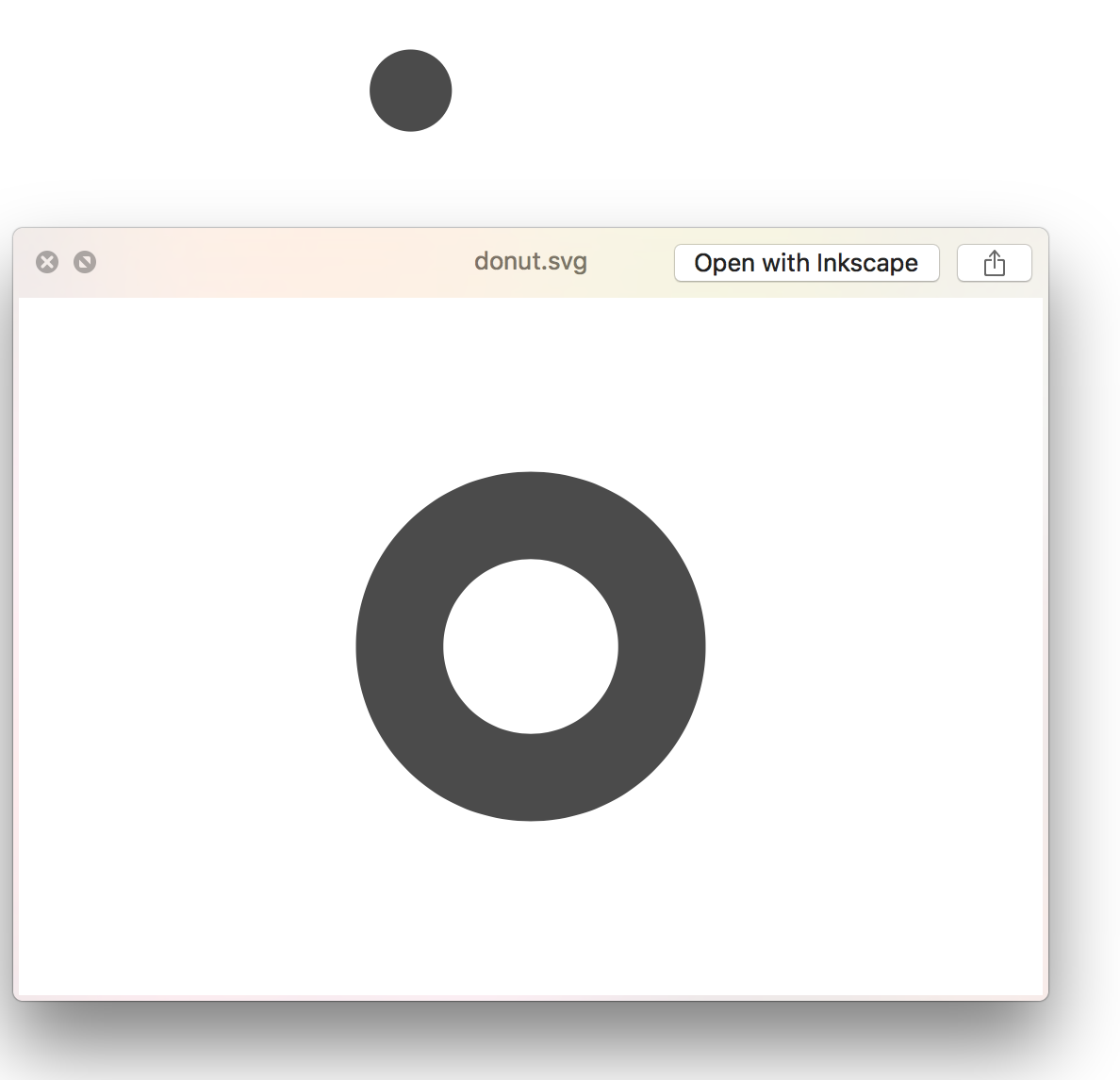
If I use the donut tool I get another SVG export problem. There is no hole in it once it's imported to omnigraffle for example. Screenshots shows affinity designer, the preview in finder and the filled dot is the SVG imported in omnigraffle.
-
Alfred reacted to a post in a topic:
SVG export becomes weird
-
firstdefence reacted to a post in a topic:
SVG export becomes weird
-
SVG export becomes weird
ecce replied to ecce's topic in Pre-V2 Archive of Desktop Questions (macOS and Windows)
Too late. -
firstdefence reacted to a post in a topic:
SVG export becomes weird
-
Alfred reacted to a post in a topic:
SVG export becomes weird
-
ecce reacted to a post in a topic:
SVG export becomes weird
-
ecce reacted to a post in a topic:
SVG export becomes weird
-
ecce reacted to a post in a topic:
SVG export becomes weird
-
ecce reacted to a post in a topic:
SVG export becomes weird
-
ecce reacted to a post in a topic:
SVG export becomes weird
-
SVG export becomes weird
ecce replied to ecce's topic in Pre-V2 Archive of Desktop Questions (macOS and Windows)
The support you get here is worth the license cost alone. I didn't know about the donut tool. I'm not a designer or used to work with these kind of applications, I learn as I go. I got tired of really ugly symbols used in other applications so I started making my own. -
ecce reacted to a post in a topic:
SVG export becomes weird
-
SVG export becomes weird
ecce replied to ecce's topic in Pre-V2 Archive of Desktop Questions (macOS and Windows)
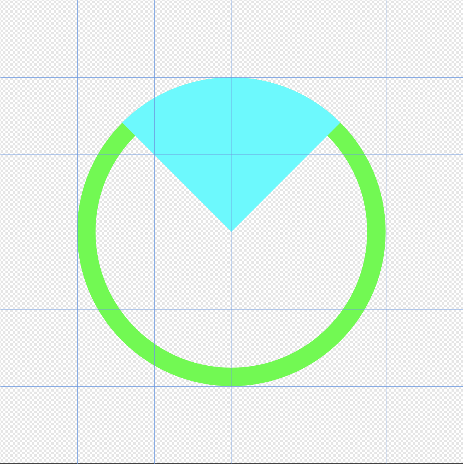
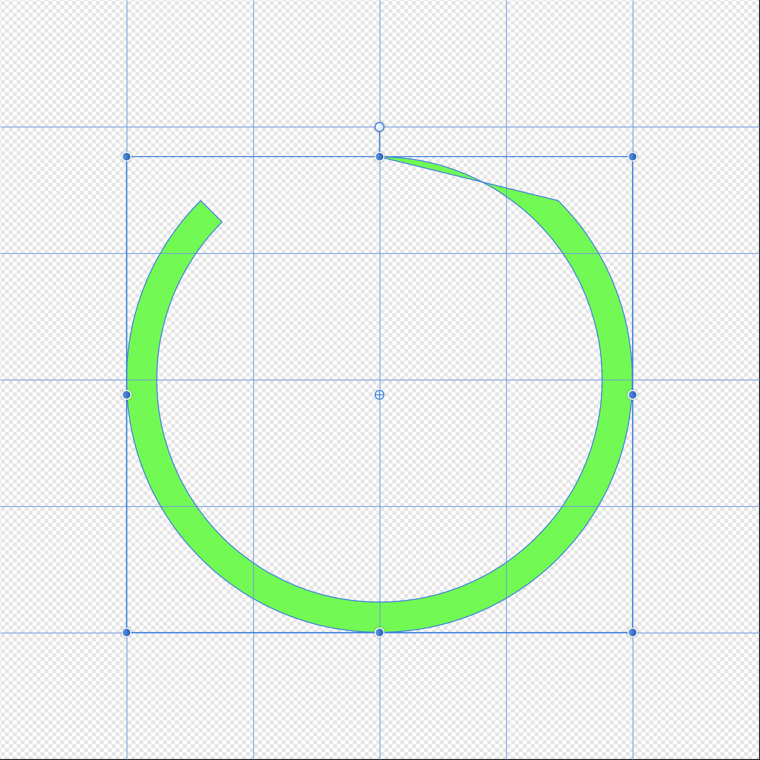
I think I got the hang of it now. I can see a few bugs here and there, it's easier to restart that fixing the ones I've already messed around with. I have re-done about 30 symbols so far and every one has exported like expected. I do get stuck on what I suspect is bugs. Look at the pictures below. The green circle is a curve, created bu two circles where one is stbstracted from the other. The Circle sector is on top. Subtract those two and unexpected results happen.
-
SVG export becomes weird
ecce replied to ecce's topic in Pre-V2 Archive of Desktop Questions (macOS and Windows)
Awesome help guys, much appreciated! I have tried making a single entity but I seem to do something wrong. When I union the two curves I don't get the result I want. The bar usually gets white or the circle gets filled and un-croped and I cant change that. This is how I do it: Create two circles, one smaller than the other. Subtract the smaller one from the bigger one Crop the circle Draw a bar and position it Union the two objects. I tried to walk through the steps firstdefence did but I cannot follow it completly (I lack experience). I have attached the apdesign file. EDIT: Re-did the whole thing and it worked like I expected. So that's nice but I noticed that all the layers are preserved in the SVG file, making it difficult to move around in for example omnigraffle. If i flattern the image it will be rasterised. Is there a way around this? Combining the objects does not seem to work, I get the same kind of results as earlier, with objects being wrong color/disappearing. camera_dome.afdesign -
SVG export becomes weird
ecce replied to ecce's topic in Pre-V2 Archive of Desktop Questions (macOS and Windows)
Omnigraffle is one app I tested, that's were the screenshots are from. The other is GNS3, a virtualization app for network engineers. The symbols I've created was intended to use with that application. I have not tested any other so far. I have a license for Illustrator CS5.5 (yeah, old), I tried importing the EPS there and make a SVG file that way, but the result was either the same or a terrible looking image. The SVG file is rather large, almost 100 KB, I attach it instead of pasting text. camera_dome.svg -
I've just started using Affinity Designer and so far I love it. When I export to SVG I get weird results. Circles get look like they are partially inside a black box, croped objects does not look croped. If I export to EPS everything looks fine. It also depends a bit on the app I use to view the SVG file. Finder in MacOS shows the SVG file as I expect when I preview them. But a bunch of other application does not. Please see the attached image. The symbol to the right is EPS and looks like it should. The symbol to the left is SVG and that's how it looks i most applications when I import it. I'm nor very familiar with SVG, I know there are different versions. Are there settings somewhere I could try or is this a bug?