Alewan
-
Posts
7 -
Joined
-
Last visited
-
Hello everyone, I've noticed in the latest releases that palm rejection is more buggy than ever (50/50 between the times it work and the times it doesn't). I'm using an Apple Stylus 2 with my iPad Pro. I'm left handed but my UI is displayed normally (I don't want to invert the icon bars). Is there anything I can do to improve it?
-
 Alewan reacted to a post in a topic:
Compound shapes
Alewan reacted to a post in a topic:
Compound shapes
-
To create a "vignette" with the gradients tools
Alewan replied to Nadar's topic in Pre-V2 Archive of iPad Questions
You can apply a gradient from the FX studio. Would that work for your workflow? -
Problem with Affinity Photo on iPad...
Alewan replied to PooPsTech's topic in Pre-V2 Archive of iPad Questions
To be complete, I do not regret my purchase despite these crashes, I still recommend their apps, and will probably buy their new apps in the future. The only complaint I have is that the apps are not updated as often as I'd like, though I believe this would require them to switch to a “subscription” model and I can see many will be angry if they did. -
Problem with Affinity Photo on iPad...
Alewan replied to PooPsTech's topic in Pre-V2 Archive of iPad Questions
All Affinity apps crash once in a while. It helps to enable auto-save, and also I try to think about closing/reopening the document I'm working with after I make major changes that I wouldn't want to lose (this is how you force a Save). Not sure all crashes are their fault, maybe this is iPadOS killing random apps to regain memory. It's still a major annoyance, though. -
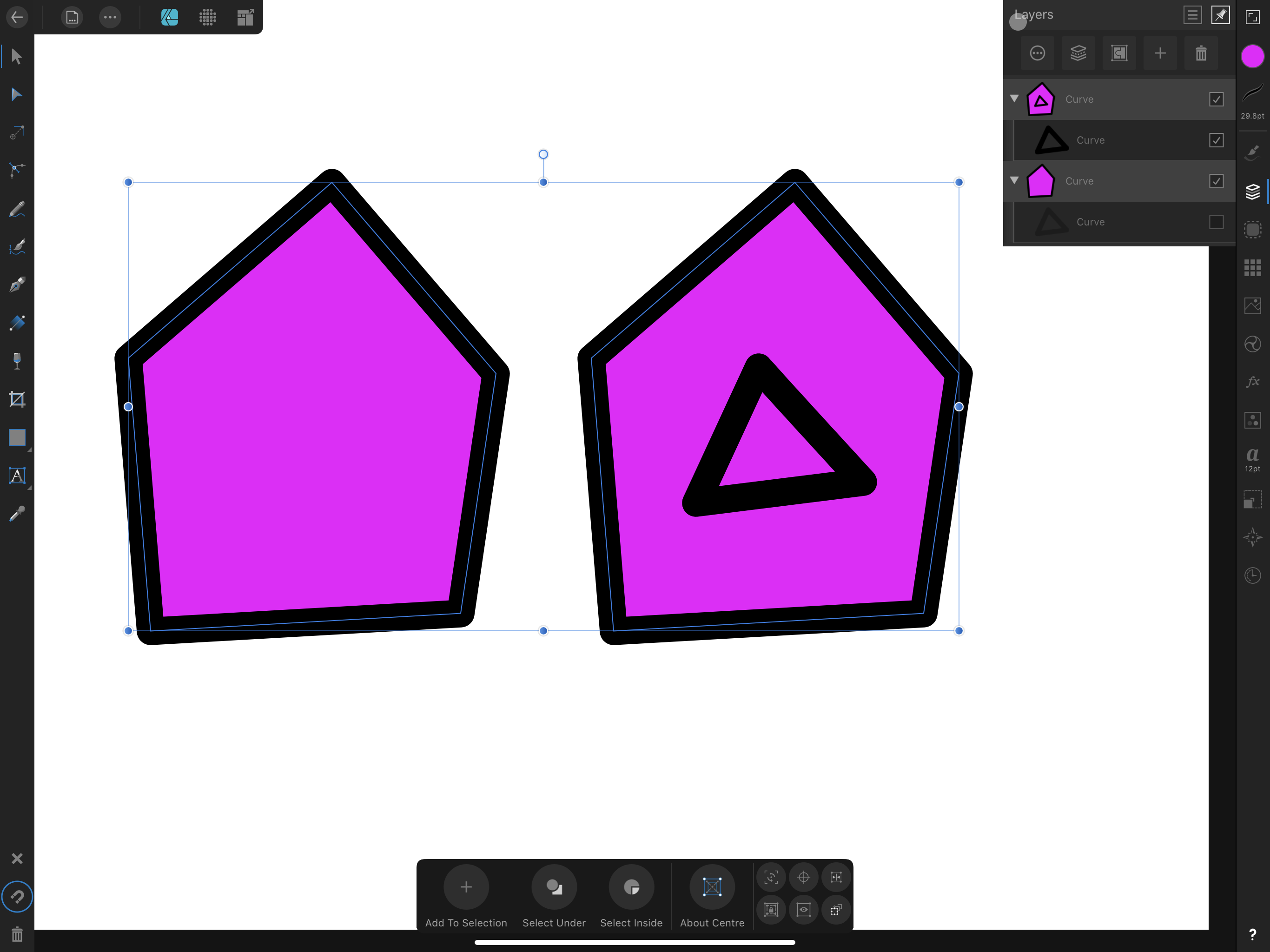
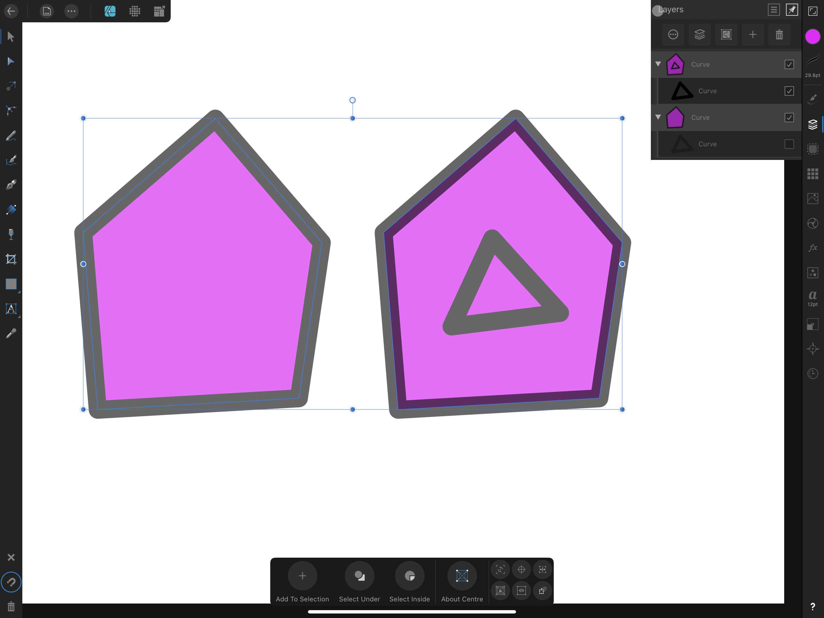
Hello everyone, I have just noticed something that I find puzzling. I have a curve with different background and stroke colors, containing another curve. I have duplicated this shape so that I have it twice. On the left, I have unchecked the inner curve so that only the outer curve is shown: Now, if I change the opacity of both curves, here is what happens: As you can see, on the right, the area of the stroke that is outside the node path has the correct opacity, where the area “inside” the node path somehow “blends” the color of the stroke and the color of the background. This does not apply on the curve that do not have a child. Is this expected? I would have thought the shape on the right would look like that on the left, with the addition of the inner shape. If it can helps, I have attached the afdesign document to this thread. Thanks! 👍 Stroke and Opacity.afdesign

-
Thanks for sharing that video! It sounds so much promising!
-
DM1 reacted to a post in a topic:
Howto: Visualize selection and feathering, edit it and turn it back as a selection
-
Hello, For the last few days, I've been trying to find out how to visualize selections as blck&white on the iPad version of Affinity Photo, and how to make sense with feathered selections. I've been finally able to understand how this can be done with the app, and I thought it would be useful if I share the details, in case someone else is wondering the same thing! First, let's start with a pixel layer with a white to red gradient. Then, go to the Selection persona, and in the menu, select the Tonal range Midtones. You can not actually “see” it, due to how Affinity Photos display the marching ants, but that selection has a feather. Some pixels outside the marching ants are in the selection, and some pixels inside are excluded. I learnt on this forum that Photos shows the marching ants for the area with 50% opacity. This can be “proven” by creating a mask layer: as you can see, there is some feathering around the diagonal line: Let's undo the alpha mask (we don't need it for now), and go to the Channels Studio. As we can see, there is a “Pixel Selection Alpha” channel. Let's click on the three dots on its right and create a Spare Channel: Spare channels are really useful because they can be later loaded on the individual channels of the image. Let's create an empty Pixel Layer (by going back to the Layers Studio), show only this one, and let's go back to Channels Studio. Now, we will do two things: first, we need to make the new layer opaque, which we can do by clicking on three dots next to the Pixel Alpha Layer, and choose Fill. Next, we click on the three dots beside the Spare Channel that we just created, and select Load to Pixel Green (or whatever channel, I just chose green because it is different than the red color I used for the gradient). What appears on my layer is a full representation of my selection: greener color are more opaque, while darker colors are transparent (they are dark because my document has a black background). I can use brushes to change my selection (and we will see later how to turn this back into a real selection): Now, what if I wanted to “unfeather” my selection? That's pretty easy, because I only have to deal with pixels. Let's deselect, then go to the Adjustement Studio, and pick Levels. Now, go to the Green channel, and enter 50% Black and 50% white: Next, apply the Levels adjustment (click on the down-facing arrow in the bottom toolbar) and select Tonal Range Midtones (this will select the green and not the black areas): This time, the selection looks the same, only it has no feather. We can hide (or delete) the green layer and go back to our original layer (with the gradien), and create a mask to see that, this time, there are no feather: Et voilà! We've been able to “convert” a selection to a pixel layer, actually “see” the feathering that Affinity Photos does not show around the marching ants, tweak the selection as a pixel layer and then back to a selection, where we could do further work. Hope this will help anyone with the same questions!