Richard Liu
-
Posts
222 -
Joined
-
Last visited
Everything posted by Richard Liu
-
Thanks. I'm trying real hard to give public access to the .afphoto's of original and cropped versions of both these images in order to allow people to "play around" with them, but I'm running into the problem of limited space. They are 420.5, 417.8, 315.3 and 314.9 MB. I can upload them to Dropbox, but I seem unable to share just a plain link to them. Dropbox insists on sending an email invitation. When I send one to myself, then click the "View file" button, Dropbox tries to display the file. This is getting to be a real pain. It seems that I can only share links in Dropbox Professional, and I am disinclined to upgrade. Where can I upload these files? >>> Here's a link to a .zip file on Google Drive: https://drive.google.com/file/d/1bOasvxCDbrza4_hNk6XffJb7-RJXqhXd/view?usp=sharing The files in it are name as follows: _DSCnnnn_AFP32.afphoto and _DSCnnn_AFP32_cropped.afphoto, where nnnn = 2082 or 2093. Before cropping _DSCnnnn_AFP32.afphoto, I made a snapshot and saved the file. Then I cropped (fixed ratio 1:1 from upper left corner) and saved it as _DSCnnn_AFP32_cropped.afphoto. When I open the cropped file and immediately restore the snapshot, the image is much, much darker. So I undo the restore and attempt to restore the uncrossed image with Document | Unclip canvas. For nnnn = 2082 this results in the original image displayed with what seems to be a border, 168 px wide. For nnnn = 2093, the border is only 1 px wide. The original image is 5600 px x 3728 px. I have no idea why the two crops unclip canvas so differently. I am using Affinity Photo 1.7.1 on a 2018 MacBook Pro 15" running macOS 10.13.6 with all the latest Apple updates.
-
I even tried saving a snapshot before cropping -- I usually do that last in my workflow -- and saving the cropped image as an .afphoto, but restoring the snapshot immediately after opening that .afphoto does not restore the document as it was before cropping. For one thing, it's much too dark. I think I'll report this as a bug, seeing as how doing the same thing with a variant of the RAW image processed in the workflow described above, i. e., snapshot - crop - unclip canvas, seemed at first glance to reproduced the original uncropped image. Actually, each dimension had 2 px too many, i. e., 1 px on each of four sides, as opposed to this RAW file, which, when I unclip canvas, has 168 px too many on each side.
-
Made a screen movie of what I did. I find no way of getting rid of the borders, I don't understand what the "marching ants" are supposed to signify. I attempt to crop off the borders by specifying the original dimensions as absolute size, but I still have to adjust the cropping frame to the smaller unclipped image, and for that I don't receive any support from snapping. So, inevitably, I don't get the cropping frame to align exactly with the image, and the one pixel too much on one side displays as "marching ants." I somehow don't thinks this is the way uncropping was meant to work. Logically, to uncrop I should not have to recrop, should I? >>> I must apologize. I cannot upload the screen recording. It's too large. After trying several times to make it smaller, I've given up. This has been an exercise in frustration. I wish I knew why unclipping puts a border around the restored image to begin with.
-
I'm sure somebody has posed this exact question, but searching in the Affinity forums is a real trial. There doesn't seem to be a way to search for the phrase "undo crop." So, having cropped an image in Affinity Photo and saved without saving history, how can I get back to the original image the next time I open the file? Yes, "Unclip canvas," but that puts some annoying transparent "stuff" around the original image.
-
@BofG is on Windows. What about @CC GREEN? I'm on Mac. Theoretically, the OS manages the color of the display by using the profile that the user chooses. I would see no reason for Affinity Photo to try to circumvent that. The existence of the Soft Proof adjustment layer, for which one supplies the profile that the printer will actually use when printing, seems to be a clear warning the what one sees in Affinity Photo while working on a photo is not necessarily what will appear on the printer. How closely Affinity Photo's soft proof resembles the print will also depend on the display's profile. But in general, I would expect it to leave color management of both displays and printers to the OS, at least in the Mac world. Assuming that is the case, and after reading the article HARDWARE CALIBRATION TARGETS on Image Science's site, https://imagescience.com.au/knowledge/hardware-calibration-targets , it became evident to me that even with my hardware calibrated monitor set for RGB and gamma 2.2, I was going to have to choose the white point and the brightness of the display properly if I was going to even have a chance of achieving close agreement between the soft proof and the print. Never having worked with Photoshop or Lightroom I cannot say what they do in the realm of color management, and whether they do it the same for Mac and Windows. It would be good to hear from some of the Serif developers, what active color management their products perform, whether the same for Windows, macOS and iOS, why there might be unexpectedly large discrepancies between soft proofs and prints, and what might be responsible for the inferiority of Affinity Photo's prints compared to Photoshop's or Lightroom's.
-
@carl123, Yes, that's what I understood, but how do I do that in Affinity Photo 1.7? Suppose I have a pixel layer containing an image, e. g. the Background layer produced by the Develop persona. Now I add a High Pass live filter to it, typically as a child layer, set its radius and set its blend mode to Overlay. So that's the high pass filter as it usually works. Now to invert I go to Layer | Invert, but what layer do I want to invert. Not the High Pass live filter layer. That only leaves the Background layer, which I cannot select without selecting the High Pass one, too. Presuming I duplicated the Background before beginning, do I then put the inverted Background cum High Pass live filter on top of the original Background and the blend mode of the inverted Background to Overlay?
-
Thanks, @IanSG. Yes, I had noticed that I could stack multiple layers of negative clarity to overcome the -100% limit. You might be interested in this thread that I just started: Wondering how negative clarity is achieved, hoping to find a scientific article, I ran across a blog posting that simulates negative clarity in Photoshop -- where, presumably, no simulation is necessary, since it is already present and, by some reports, can achieve stronger results than Affinity Photo -- by somehow "inverting" a high pass mask and overlaying it on the original. I tried that in Affinity Photo and have come to the conclusion this does not mean to simply invert, say, a high pass live filter layer, and I don't know how to invert just what one sees in AFP when one twiddles the Radius control of the high pass live filter and sees more and more details of the image appear, seemingly embossed, on the grey back ground that only disappears when the blend mode is changed from Normal to Overlay.
-
I recently ran across this proposal for using a high pass filter in Photoshop to achieve the same results as negative clarity: http://thegreyblog.blogspot.com/2011/11/clarity-adjustment-local-contrast-in.html . In effect, the proposal is to "simply" invert the layer created by the high pass filter and overlay that on the original, this as opposed to not inverting the layer before overlaying it, thereby simulating the clarify filter. I'm having some difficulty doing this in Affinity Photo. I create a high pass live filter underneath the Background layer, set a radius that makes it evident where the local contrast is, and set the blend mode to Overlay. Some details are sharpened, some are not. Now if I invert the filter, nothing is affected unless I paint some areas with white, and then they will be sharpened, which is not negative clarity. I'm sure I'm missing something very elementary here. Can anybody tell me what?
-
After seeing to what use fellow members of my photo club put negative clarity in Photoshop, I must say that the softness that Affinity Photo produces with clarity set to -100% is so subtle as to make me wonder whether this is Serif's final word on the matter. In general, unsubtle effects should be possible with all filters and adjustments, subtlety being the user's choice, not a limitation of the software.
-
Very glad to see that the new tutorials have subtitles for the languages which the Affinity site supports. This will save me time when I explain to my colleagues in photo club of the Volkshochschule Rheinfelden how I develop and edit my photos in Affinity Photo. With regard to the tutorial HDR from one exposure (https://affinity.serif.com/de/tutorials/photo/desktop/video/341759551) I have found some mistake that will wreak much confusion: 00:44 Wir belassen das dabei 00:47 denn wir wir die Ausgangs-Farbkurve anwenden -> denn wenn wir die Ausgangs-Farbkurve anwenden 00:51 werden unsere Werte außerhalb der Grenzen liegen. -> werden die außerhalb der Grenzen liegenden Werte abgeschnitten. One could consider using the subjunctive here, i. e., denn wendeten wir die Ausgangs-Farbkurve an, würden die außerhalb der Grenzen liegenden Werte abgeschnitten. At any rate, as it stands, the text makes no mention of the fate of out-of-bounds values, namely, that they will be clipped. Regarding the translation of to clip as clippen, I have the feeling that one says in German, that highlight details clippen, but not that they geclippt werden (are clipped), i. e., that clippen is intransitive and has no passive voice, even though the past participle, geclippt, can be used adjectivally, e. g. when speaking of geclippte Highlight-Details. That is why I used abgeschnitten, not geclippt. 02:12 und wir können sie kolorieren. I am puzzled about the use of kolorieren. I have not encountered kolorieren as a translation of to tone map. Linguee.de seems to imply that tone mapping is usually translated with das Tone Mapping, and gives many examples where the verb to tone map is rendered as to do or to perform a tone mapping. Actually, though, developing to a 32-bit space means, more generally, that out-of-bounds values are retained and remain available for all the things that one can do to the output of the Develop persona, including but not limited to tone mapping. I suggest, und bleiben für die Verarbeitung nach der Entwicklung der Roh-Datei erhalten -> and remain available for processing after developing the RAW file. This, of course, means that tone mapping, or whatever it is being called in German in Affinity Photo, is one such "thing."
-
I'm not quite sure where to put this question, so, since it arose while I was trying to follow the tutorial on isolating layers, I'll post it here. On my Mac I most often have to option-double click where @James Ritson says to option-click when I use the Apple Bluetooth keyboard and mouse, but the same thing happens when I use only the MacBook Pro's keyboard and trackpad. In fact, very often I have to double click where a single click should suffice. I don't notice this behavior in another application. I'm running AFP 1.7.1.
-
@Murfee, For the better part of a week now I've been reconsidering my Develop-Photo workflow on the basis of yours. I've set RAW output format in Develop Assistant to RGB (32 bit HDR) and leave Blackpoint alone in the Develop persona¹. I content myself simply with addressing clipped hightlights and shadows and adding some details to the image, then develop it. In the Photo Persona, I apply Haze Removal to a duplicate of Background. Then, depending on the particular photo, I will usually work on a duplicate of either Background or the dehazed duplicate² in the Tone Mapping persona, limiting myself to either a reasonable adjusting compression and local contrast, or setting compression to 0% and local contrast to 100%³. Back in the Photo persona I then combine all the layers, choosing their opacities and blend modes to produce a pleasing, realistic result while avoiding the "burn your eyeballs out" effects typical of bad HDR. From there on, my work in the Photo persona is not much different than when I work in 16-bit RGB. I do notice that results have more "pop" than before, and the agreement between what is displayed on the BenQ SW271 calibrated to RGB, 100 cd/m², 5800K and gamma 2.2 and what is printed on the Canon Pro-1000 with the paper-specific profile provided by Canon is reasonably good. The Soft Proof adjustment layer still has its limitations, of course, and I do not find a clear statement from Serif about how it is handling out-of-gamut colors. If Check gamut is activated, pixels of out-of-gamut color are displayed in black. But if that option is not selected, are those same pixels displayed in the color calculated by Affinity Photo from the specified rendering intent, or does Affinity Photo simply pass the rendering intent to the operating system, in effect leaving the handling of out-of-gamut colors to it and the display? So thanks for your help. __________ ¹ That was a misunderstanding on my part. In a tutorial for AFP 1.6 entitled Salvaging Underexposed Images (http://player.vimeo.com/video/202715178/) James does adjust among other things the blackpoint of the RAW file and summarizes these endeavors collectively at 1:16 as "creating a very flat image" in an attempt to capture "as much highlight and shadow detail as possible." ² If haze removal has dramatically improved sky detail, I usually pass the Tone Mapping persona a duplicate of the original Background layer. If the effects of dehazing are more subtle, I apply Tone Mapping to a duplicate of the dehazed layer. I don't want overly dramatic skies in the tone mapped layer to dictate its opacity in such a way that the extra detail that I intended it to provide must be barely visible, lest the sky be too dramatic. ³ James' new tutorial, and his older one on bringing out water detail (http://player.vimeo.com/video/202899215/) are reliable guides to which tactic to use, depending on which of these two purposes the tone mapped layer should fulfill.
-
Lighting filter not printing???
Richard Liu replied to Richard Liu's topic in V1 Bugs found on macOS
@BofG AD = Affinity Designer? This discussion is being posted in Bug Reporting > Report a Bug in Affinity Photo > Photo Bugs found on MacOS I find no such setting in Affinity Photo or the the macOS dialog that printing from the application initiates. If your replies pertain to Affinity Designer, I wonder whether they shouldn't be posted in a more appropriate forum? What do the moderators recommend? At any rate, and pertaining to the problem at hand, i. e., that live filters aren't being processed (properly) by Affinity Photo during printing, given the many blend modes with which they can be applied that greatly affect chromatic aspects of the final result, it is unsurprising that, absent such effects in the print, colors will be "waaay off." Regarding the tangent in which I vented my frustrations over what appears to be a reduced concern on Serif's part for ensuring that printing works properly, if indeed that is the case, I have no doubt that other Serif products will also be afflicted by it. -
Lighting filter not printing???
Richard Liu replied to Richard Liu's topic in V1 Bugs found on macOS
@walt.farrell No, you haven't misunderstood. I haven't made myself very clear. I rely on the soft proof to tell me what is out-of-gamut. Sometimes I will then add layers below it (not nested in it!) to bring those areas into the gamut of the printer profile that I have specified. When I do, I turn off the soft proof layer, leaving the correction layers on, then decide how close the result is to what I had when I wasn't worrying about printing at all. In order to make this iterative process more manageable, I group the soft proof and correction layers together, especially as, typically, I might have two Curves layers, one for RGB and one for LAB/lightness, and an HSL layer for lowering saturation and raising luminosity, and I am trying to decide which one(s) do the job best. In the end, though, I might decide not to correct at all. So, if that's what I decide, then of course I uncheck the whole group before printing. Otherwise, I leave the soft proof layer and any superfluous correction layers unchecked, but the whole group checked. I apologize for the confusion.- 15 replies
-
- 1
-

-
- lighting
- lighting filter
- (and 2 more)
-
Lighting filter not printing???
Richard Liu replied to Richard Liu's topic in V1 Bugs found on macOS
@Murfee, What bothers me is the extra manual intervention required before printing. It just creates other sources of operator error. As it is, occasionally before printing I forget to uncheck the group of soft proof and out-of-gamut correction layers, or, assuming I do not wish to apply the corrections, mistakenly uncheck only the soft proof layer instead. Using merge visible I have to determine whether an existing pixel layer so created is current -- yes, I know, the History tab! -- and remember to turn off all the layers below it -- not just in the interest of saving computing time, since we know that live filters in those layers aren't being rendered when printing or exporting to PDF, so who knows how they plus now the pixel layer created by merge visible will be. "Venting" a bit here, I wonder how regression tests missed something so serious as live filters not being printed or exported to PDF? In other threads that I read relating to discrepancies between what Affinity Photo displays and what it print, some contributors express views similar to this one by @BofG in this discussion: He/she replies Of course, nobody printing at home is expecting "pro-level print output," only accuracy within limitations imposed the available equipment. As @DianeF intimates, there's no reason to believe that Serif, with all the talent that it evidently possesses, cannot meet the high standards for print quality established by Photoshop. Perhaps it's time for Serif to taking printing more seriously. -
Lighting filter not printing???
Richard Liu replied to Richard Liu's topic in V1 Bugs found on macOS
Oh, wow! That's everything, then. I'm no expert user, but where else can a live filter be placed where they are neither nested nor sitting at the top level? So, in my example, even removing the grouping so that the highlighted live filters and three pixel layers below them pop up to top level, doesn't circumvent the problem. It seems that the safest course of action for printing with the least impact on a future when this bug has been squashed is, export to anything but PDF and print with another program, e. g., Preview on Mac's. -
What I value about @James Ritson's tutorials: They're short, focused, and get right to the point. No introductory music, no self promotions, no solicitation for clicks. Even the 1.6 tutorials' introductory "Welcome to Affinity Photo" has been dispensed with in those for 1.7. And, as @LILOUBAE's post makes clear, the photos on which the techniques are illustrated are well chosen, seem to be unique for each tutorial, and remain in the mind's eye long after the recipe has vanished from short-term memory. Thumbnails of the photos used in a tutorial would therefore be a brilliant addition to the index in the first post in this thread. https://affinity.serif.com/en-us/tutorials/photo/desktop/ goes in that direction.
-
@LILOUBAE, I believe you mean this one: https://player.vimeo.com/video/155542288/ You can find the old tutorials here: http://www.miguelboto.com/affinity/photo/video-tutorials/
-
Lighting filter not printing???
Richard Liu replied to Richard Liu's topic in V1 Bugs found on macOS
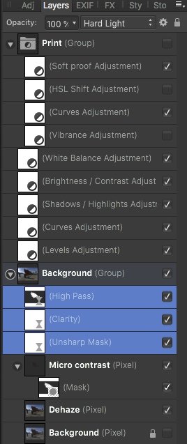
OK. I don't mean to be "dense," but I assume that live filters in the Background group in this example are not affected by the problem and will print, right?
-
Lighting filter not printing???
Richard Liu replied to Richard Liu's topic in V1 Bugs found on macOS
@Chris B, All Live Filter layers that are nested in other layers? That would explain why some prints don't look quite right, given that I usually nest the sharpening live filters in the Background pixel layer. -
Lighting filter not printing???
Richard Liu replied to Richard Liu's topic in V1 Bugs found on macOS
Still more on this while waiting for some response from a moderator or developer. I tried turning off Metal, but that does not seem to solve this problem. -
@Chris26, OK, thanks for your help. I think, like you, most of us live by the maxim, if it ain't broke, don't fix it, a corollary of which is, if it works, don't worry how it works. It's when things don't work, at least, not the way we expect them to, that our strategies diverge. Mine is to try to understand what components are involved, what each is supposed to do, and where the cause(s) of the problem might lie. I do not know Photoshop, have never worked with it.
-
@Murfee, I really appreciate your time. After reading your account, I redeveloped the .NEF file. I've made a screen movie of my developing steps. It's also on Google Drive: https://drive.google.com/open?id=1zkX5qqe1shqc2igAalTTEVzNNefsDwZc. 00:00 Load the .NEF into AFP 1.7.1 00:07 The Develop Assistant confirms that it has applied the +2/3 stops exposure correction that I dialed in on the camera. Clipped highlights, shadows and tones are displayed. 00:16 I begin to play with the Blackpoint. Usually, I push it to about -5% in order to create what @James Ritson in one of his 1.6 tutorials calls RAW latitude. You can see the veil appear as the slider moves below zero. 00:31 Pull the highlights down until they aren't clipped anymore. 00:41 Increase brightness. 01:00 Add a bit of sharpening. 01:17 The sharpening has evidently clipped some shadows and tones. 01:35 Just demonstrating which profile we're working in. 01:38 Opening the shadows up a bit to remove the clipping caused by sharpening. 01:51 Oops! Forgot to activate sharpening. Do it, then try to get a good setting for Shadows. 02:30 Check increasing exposure. Nope, that just blows out some highlights. 03:16 One last check before hitting Develop. Some tones are still being clipped, but I think that's OK. 03:26 I just noticed that I deactivated Details before hitting Develop! Dumb! But you get the idea, I think. So the veil is being caused by reducing the blackpoint. Now I've done everything all over again, beginning with a more careful development as per the above, except for the oversight at 3:26 (_DSC1411_AFP36_2.afphoto and _DSC1411_AFP36_2.jpg) In Photo I first dehazed a copy of Background, then ran that through Tone Mapping, adjusting basically tone compression and micro-contrast, then I recombined the original and the tone mapped, dehazed Backgrounds. I didn't see much point in adding more sharpening, but I did use the High Pass live filter to sharpen small details, e. g. the pebbles in the swing area and the leaves. Defringe was supplied selectively to the folded umbrellas and the pole to the left of the bear, lest even the little red bulbs be defringed and lose their color. After that things are pretty straight forward: Levels, Brightness/Contrast and Curves deepen the shadows and colors, then Vibrance and White Balance to adjust the colors, Soft Proof and Curves to address out-of-gamut colors. Basically, if the gamut check is deactivated, the soft proof is just somewhat lighter than the original. In fact, if I turn off soft proof and uncheck the curves adjustment required to address the out-of-gammut tones, and print, the printout is much lighter. One possible bug: The fringing that is selectively corrected with Defringe is very visible in the print and in the exported JPEG, but not when viewed in AFP at 100%. If you have time, can you confirm that this happens on your setup, too? Thanks.
-
@Chris26, Thanks, I didn't see the Header record. Yes, actually one can use the ColorSync utility to examine any of the profiles, so not only the ones for the displays, but also those for the printers, scanners, etc. Seems that they all say "Perceptual" in the Header, but I'm wondering what those entries with descriptions "Intent-i, 16-bit, device to PCS converter," and "Intent-i, 16-bit, PCS to device converter" do? I would imagine it's the printer driver that takes the colors that an application sends it and maps it to the color specified by the printer profile, and it would have to handle any rendering intent specified as well. The printer dialog is what pops up when you tell Affinity Photo to print. There, you specify the printer and the profile. It needn't be the same printer and profile that you specified for soft proofing, of course, since nothing even forces you to soft proof. So, taking the profile for my Canon Pro-1000 and the Canon Plus Glossy II paper as an example, I see that the header in the profile specifies rendering intent Perceptual. So if I give that profile to the Soft Proof adjustment layer and specify Absolute Colorimetric, how can it possibly honor that profile unless there's something in it that either supports that intent directly, or tells the application or print driver how to convert from Perceptual to it? In other words, why doesn't AFP give me an error message saying this printer and profile only support Perceptual? Now things get more interesting when I print, because, on a Mac there's nowhere in the print dialog, including all its submenus, where one can specify rendering intent. I understand that specifying rendering intent for printing is supported on Windows.
-
Your thruppence is much appreciated. I have opened some profiles and see variables with descriptions like "Intent-i, 16-bit, device to PCS converter," and "Intent-i, 16-bit, PCS to device converter," where i is an integer from 0 to 2. I was expecting something like "Relative colorimetric," "Absolute colorimetric," "Perceptual," etc. The problem is specifying the intent for printing, since the print dialog evidently does not support it. I assume that the printer driver then uses a default one, but which one is that?