Stokestack
-
Posts
433 -
Joined
-
Last visited
Everything posted by Stokestack
-
Thanks for your reply. It does indeed appear that the middle of the page was the culprit. I thought the guideline was already centered there, but it must have been inadvertently shifted at some point. Looks like you can close the associated bug report.
-
You don't see a problem with it snapping to a phantom location that is not the guideline? That's a major problem. What you're drawing is the wireframe geometry of the shape. You can change stroke width and end caps at any time. It is the nodes that are supposed to be snapping to things, and the nodes are in the center of the stroke. But... just to test your idea, I did exactly what you suggested. And guess what happened? Video attached. buttCapBogusSnap.mov
-
Hi all. I was perplexed when I drew half a logo, snapping all of its right-side line ends to a vertical guideline; then mirrored it horizontally and expected the new half to line up correctly. It didn't. The centerline nodes of the two halves were offset horizontally by a tiny amount, so after I'd combined the shapes and tried to delete the redundant (overlapping) nodes down the center (along the guideline), the geometry was messed up (no longer symmetrical). I attached a screen grab of the apparent bug in action. Anyone else notice this? Thanks. Edit: I guess this belongs in the bug forum, but I can find no way to delete posts. Re-posting there... bogusSnapping.mov
-
Cool story, bro. What does that have to do with this thread?
-
Thanks, Callum. I made this suggestion about how to fix the Fill panel a while ago: https://forum.affinity.serif.com/index.php?/topic/12471-designer-consolidate-fill-controls Gavin
-
Eye dropper tool
Stokestack replied to AshTeriyaki's topic in [ARCHIVE] Designer beta on macOS threads
Thanks for the info. I don't recall any precedent for having to drag from a color picker icon to sample a color. Or drag from any other tool's icon to use it, for that matter. There may be one, but this seems like a non-intuitive action. Typically you click on the eyedropper, and then you're in color-picking mode. Just like any other tool: Once you click it, it becomes the active tool that you're using. Currently, if you do somehow stumble upon the action of dragging the eyedropper icon or the little circular well, you find that they do exactly the same thing, as does clicking on either one of them. Curious. Another odd thing about the picker: It doesn't set the current color or the color of the selected object; it merely puts the color into this ancillary color well that then must be clicked again to apply it. Normally, a color picker presents several means of choosing a color and making it the currently active color. If I select an object, click on its Fill color in the toolbar and sample a color, I expect the object's fill to change to that color (and for that color to be the active one in the Fill color well). I was going to call out Designer's use of this ancillary well as a bad design; but thinking it through, I can see how it's convenient to retain the last-picked color in that well, so when you select the next object and its Fill color is made the "current" color, you still have the previously sampled color available in the 'last-sampled" well. Uh... except you don't. The last-sampled color always goes to black when you change objects. Is that a bug? Screen grab attached. sampleDiscarded.mov -
Eye dropper tool
Stokestack replied to AshTeriyaki's topic in [ARCHIVE] Designer beta on macOS threads
I'm modifying an object's fill, but the same applies to any color selection. Here's how it's backward: colorPickers.mov Side note: Why can't we upload files with "mp4" extensions? -
Nice to see active development guys. That's why I always recommend Designer over Illustrator. On the other hand, I'm disappointed to see a couple of fundamental problems lingering, and bummed that they'll now be propagated to the Windows version. The Fill panel hasn't been improved at all. It still has a baffling "None" tab that shows color swatches; and the Gradient panel is riddled with unlabeled (or perplexingly labeled) controls and no apparent way to control gradient angle. Then there's the nonsensical application of properties to objects after you've changed tools in the palette. Try drawing a white rectangle. Then select the text tool so you can create some text. Let's say you want it to be red, so click on the text tool's color well in the toolbar and pick red. HEY! The rectangle turned red. That doesn't make sense. After all, if you return to the same toolbar and click on the "italic" button, it doesn't make the rectangle slanted, does it? The text tool should not be modifying arbitrary, existing objects. Nor should any other. In thinking through why we don't see this problem in other similar software, I concluded that it's because object-creation tools do not act on existing objects (with the exception of text tools, which allow you to select and then modify existing text). That's what the selection tool (arrow) is for: selecting an object to move it or tweak its properties. And this is a more efficient way of working, because it allows you to rapidly create multiple objects of a certain type and with similar properties. To work around Designer's design, you have to make sure you deselect the previous object before you do anything. This seems very cumbersome.
-
Eye dropper tool
Stokestack replied to AshTeriyaki's topic in [ARCHIVE] Designer beta on macOS threads
I guess I'm missing something, because the eyedropper seems to work the same way as it did: backward. In any other color picker, you pick the eyedropper tool, then use it to click on a color somewhere, and the chosen color is moved into a color well. Then you can select objects and click on the color well to change their color. Affinity does exactly the opposite. Why? -
Hi all. When I try to launch the beta, it says I need the retail version. But I have it (and it runs). Is this a known problem? Thanks!
-
The question is: Why is it a "tool" in the first place? A tool is something you're working away with, making objects of a certain type or adjusting them. An artboard is part of the document's structure. Are you really sitting there churning out one artboard after another, with no intervening activity? One of the fundamental problems in Designer is misuse of the toolbar and tool palette. For example, if you draw a rectangle and then select the Text tool, you might want to set the color of the text you're about to create. So you go to the toolbar (where the text properties now appear) and pick the text color. NOPE: The color of the rectangle just changed! I reported this bug, and it was shrugged off as, "That's because the rectangle was still selected." But that doesn't make sense: The toolbar belonged to the text tool, not rectangles or anything else. It was full of things that can't apply to a rectangle. What if I pressed the Italic button? Would the rectangle become slanted? In another example, we have gradient fills. I notice that the Fill dialog remains unfixed as well. People were asking how in the world do we control the angle of a gradient fill. The Fill panel shows a bunch of other properties, but the gradient angle is perplexingly absent. Turns out you have to find and select a secondary "fill" tool in the tool palette, into which some missing controls have been dumped. Why? We just set up the fill using an entire fill-properties panel; why would we then guess that there's another "fill tool" lurking somewhere in the application? Fill is a property of an object, not something you're going to churn out over and over. It would be easier to take this apparent disorganization if there were a stated and valid rationale for these decisions. But I haven't seen any.
-
Hi all. Can someone enlighten us as to why artboards are hidden under the so-called Move tool? There is absolutely no way I would guess that I needed to dig through a secondary menu on a selection tool to alter my document's structure. I would expect to find this function under the Layer or Edit menu. Not only is this implementation obscure, but it defies the expected sequence of events: Opt to make a new artboard, specify its properties in a dialog, and then confirm. Instead, we have an entire "artboard" tool that hangs around and presents a toolbar with those properties instead. Maybe I'm not familiar with how people typically use artboards: Are they really pressing "Insert artboard" over and over in a rapid-fire fashion, to create lots of identical artboards? Because that's the only use case where this toolbar seems to make sense. And once you're done making an artboard, you're left without a selection tool... until you go back to the palette and switch out of "artboard tool mode" and go back to the selection (misnamed "Move") tool. Every time. Which of the following is more common: 1. Creating an artboard and then going back to work with another tool? 2. Creating lots of artboards in a row (which don't depend on selected objects)? If the answer is 1, the current design makes no sense. On a tangential point: The "hand" tool is called "Move" in every other application in which I've seen it, on any platform. The "arrow" tool is Select (because that is its primary function), in every other application. And they work the same as they do here. Is this a language issue? Thanks for any insight!
-
Fast Text Edits in Layers panel
Stokestack replied to evtonic3's topic in Older Feedback & Suggestion Posts
This is a good idea. -
Unfortunately you're probably right, Lille. But if people file this request with Apple, at least Apple can't honestly say they're not aware of the problem.
-
With all respect to those asking for this option, for many (most?) of us, reading black text off the surface of a glaring light bulb all day is about the worst scenario. This inverse color scheme (black text on a white background) is a vestige of the "desktop publishing" craze of the late '80s/early '90s, which made a failed analogy between a piece of paper and the computer screen. That analogy is a failure because a piece of paper doesn't emit light (which is why a Kindle is a much better reading device than an iPad). So users have sat in front of their CRTs with three electron guns going full blast in their faces all day, essentially reading off a light bulb. And now with LCDs. I'm very surprised to hear that this wouldn't trigger a headache for you guys, but rather the opposite setup does. The default color scheme for computers before this detour was white text on a dark-blue background, because it was found to be the most legible and comfortable. In fact, this scheme still exists as a checkbox option in Word ("Blue background, white text"). Affinity's color scheme resembles that of other professional art- and image-centric applications, where the color of elements around the image is important because it affects the user's perception of color in the image. But for you guys, this isn't the greatest. So your request would best be directed at Apple, which has forced a hard-coded color scheme on its users for 30 years. Windows (and other GUIs) has let users define their own color schemes for 20 years, where you could configure a light-grey background and dark text that should be honored by all applications. Application developers on those platforms don't need to do extra work to respect your color choices, except to avoid hard-coding colors in their applications. They let the OS draw the screen elements using the system-wide colors dictated by the user's color scheme. Apple has forced Affinity and everyone else to hard-code their UI colors, making it impossible to cater to everyone without building a proprietary color-scheme-configuration tool into each application. That's a shame, especially considering that 95% of the world's computer users enjoy this capability, but not those of the vaunted Apple UI. By ignoring this situation, Apple ignores the needs of people like yourselves and others with visual conditions that simply can't be served by hard-coded colors. The GUI is the fundamental component these systems, so when it's hobbled for millions of users by the glaring lack of this function (available for a generation on competing platforms), any marketing about "accessibility" or addressing the needs of disabled users rings hollow. Ask Apple for user-definable system-wide color schemes here, and note that you have a condition that requires this flexibility in order to make productive use of your computer. Mention that Windows and other systems have it. Unless users make this an issue for Apple, we have no chance of getting Apple to address it.
-
Hi all. I included this in a thread in the bug-report area, but it really belongs here. I think consolidating the fill controls into a single panel would clarify their use for users. Currently, an object's fill control presents a series of tabs that offer conflicting functions. The tabs represent different types of fills and are exclusive of each other; therefore I submit that these fill types should be offered in a drop-down list and not as tabs. When the user selects a fill type, the panel can display the appropriate set of controls in the panel and the appropriate on-canvas controls (like gradient angle), which currently do not appear at all when using the Fill control panel for an object. Also, the current panel for gradients can be improved by indicating to the user that he needs to click on those circles to set colors and properties, and indicating which of the controls pertain to the selected control point and which pertain to the entire gradient. A colored highlight makes the current selection more clear than simply having a bigger circle and smaller circle (and that size difference isn't even shown on first use of the panel; I assume this is a bug). Users should be able to right-click in that gradient display to insert, delete, copy, or paste control points. Currently it doesn't seem that there's any way to determine where a new one will be inserted. All of the current buttons, except Delete, suffer from major ambiguity: If I press Insert, where will the new point go? If I copy one, how do I paste it? Or does Copy here actually mean Duplicate? Without some hint, however, I don't think users would ever guess that they could add more control points. And then a bunch of Affinity's work would go to waste. I vote for putting a label below the gradient display instead of the buttons, instructing users to right-click to add or manipulate control points. It's more clear, and space-efficient to boot. And finally, I had no idea what "stop" meant. I guessed it was some kind of option for determining what should happen beyond the end of the gradient, but of course the functions offered by those buttons didn't seem to make sense in that context. In any similar type of editor, I see "control point" used more than any other term. I think the flexibility of Designer's fill function is remarkable! Some revision of the UI will help users find it and take advantage of something that Affinity clearly put quite a bit of effort into.
-
This is the second time I've run into an issue in Designer that results from partially redundant UI. It would be better to consolidate the controls for each function into one place, rather than duplicating some of them in unexpected areas with no evident benefit. When different control panels are presented for the same functions, and some of the controls are missing from one of those panels, the user is led to believe that the function lacks capabilities (because he might not have found the other panel). For example, there's another thread where some of us didn't know there was an angle control for the gradient fill, because the gradient panel doesn't contain it or activate it.
-
Ah yes, I didn't notice that way over to the right. Thanks! That works fine.
-
Thanks for the reply, but no, they're not grouped. You can try this by simply drawing two rectangles and selecting them both. The properties disappear from the toolbar.
-
Thanks. But... the chance of hitting that tiny, invisible area is pretty small. Why doesn't it at least use the entire height of that line highlight? In fact, if you drag to any other position in the list, it does use the entire height of the highlight. This problem seems to occur only when you're dragging something to the bottom of the list; it's not reacting to the cursor's horizontal position if it's in the lower half of the line highlight. Seems like a bug.
-
Hi all. I selected two triangles and wanted to change their fill color. I can find no way to do this, because the properties disappear from the toolbar when more than one object is selected. Am I missing something? Thanks!
-
Thanks for the responses, guys. I can see the argument for your first point, but that one level is pretty minimal and a widely accepted standard in art software. It seems more superfluous in Designer because of Designer's "every object is a layer" concept. This concept does provide a convenient way to implement clipping (by making one object a child of another), so I'm open-minded about it. My main issue is that the dragging of objects in the layer list did not allow me to place an object at the same level as other objects on a layer (thus changing its priority and overlap of other objects on the canvas). This is the problem depicted in the video above. I wanted to keep the rectangle object at the same level on the layer, but simply move it down in the list; the UI wouldn't allow that. The only choices I had were to either drag the object outside the layer entirely, or drag it below (and make it a child of) an object on the layer. Here's another screen grab, where I explore the range of cursor movement available even more clearly, and you can see that it never allows the dragged object to be placed at the same level as its peers on the layer: http://ambitiousproductions.com/probs/noPeer.mov
-
Hi all. I noticed that in one of my Designer documents, one of the objects ( a simple filled rectangle) didn't reside on any layer. There's one layer (which contains three imported images), and then at the same level there's the rectangle. This brings up a question: Why are objects allowed to exist on no layer? What is the point? And why did a layer get created in the first place then? Another question: I moved the rectangle onto the sole layer. That worked, but now it was on top of all the other objects and blotting them out. So I dragged the rectangle down in the layer's hierarchy of objects, but it refused to remain a peer of the other objects. It instead could only be placed within (indented under) one of the other objects. Any attempt to drag the item to the bottom resulted in this incorrect result, or the rectangle once again falling out of the layer entirely and existing in a void. I attached a screen grab of this perplexing interaction. Anyone have any insights on it? Thanks! layerProblem.mov
-
I posted the lack of an angle control as a bug originally, but I'm cross-posting here after getting more information: When I set the fill for an object, I use the Fill control provided in the toolbar and its dedicated tab for gradients. I would not expect to go hunting around for a separate tool for this and drag an additional effect onto an object, when fill is an intrinsic property of an object and controls are already provided for it. If the controls for a property are deemed too complicated or difficult to implement in the control panel, I would expect on-screen controls to appear when I select that property (in this case, the Fill color well) from the object's property panel or toolbar. The current design, aside from looking like it suffers from a major omission, leaves the user wondering if he's applying a separate effect to the object. I suspect this will be even more problematic if Designer offers multiple fills on the same object (which I saw in the feature roadmap). I urge Affinity to eliminate the fill control from the Tools palette and integrate its function into the Fill control on the properties toolbar that appears for an object. Not only is this much more intuitive for the user, but it allows you to enable or disable the control as appropriate for the type of object selected, and to cause it to disappear when no object is selected. As it stands, it makes no sense for the Gradient and Transparency tools to be enabled when nothing is selected. Gavin
-
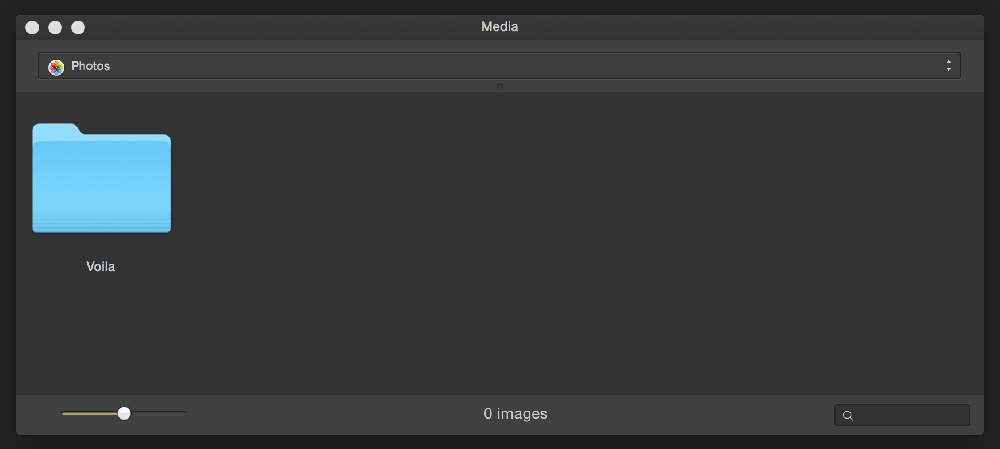
Hi all. Just fired up the beta and looked for a way to browse media. Opening the Media Browser, I notice that: 1. It's showing me a "Pictures" folder at the top of the dialog and then a "Voila" folder (of unknown origin) as its contents. But there's no path to show me where these reside. 2. Double-clicking on the Voila folder does nothing. Right-clicking on it and saying Open makes it disappear, but the top of the dialog still says I'm looking at Pictures. 3. There are no navigation controls. There's no way to go up to the parent directory, or browse volumes on the system. If there's anything we all should appreciate after dealing with Finder's continuing design flaws, it's the importance of location, location, location... and proper sorting. In a browser, I'd expect to be able to navigate the file system, see the path of whatever container I'm looking at, and to have items sorted correctly (folders first, then individual items) so we can drill down through them. A nice-to-have would be the option of switching between a list (treeview) and icons/thumbnails. Anyway, great work Affinity guys! Really excited to have alternatives to Adobe. Gavin