GraviolaB17
-
Posts
42 -
Joined
-
Last visited
Everything posted by GraviolaB17
-

Free Content included with 1.6 ('Till 16th November)
GraviolaB17 replied to MEB's topic in News and Information
Hi! Mac: - AD user, but both the AD and AP free packs seems really cool and I would really need the skies and all the stuff the AP freebies comes with. - Fixed and added AD to the Firewall exception - No CLAIM link whatsoever when I start AD. - Have bought the workbook from the website and I have the account and I see my WB order - Still no extra freebies for download. ... //D -
Hi man! Thanks a lot, ok then I know! ps. found a tutorial and explanation of the "metallic" thing I was looking for it was called Stroke, adding this to a text! problem solved! but ok ...I thought there were smoe way to "crop out" some things from an image and remove the background.
-
Hi! Maybe there's a tutorial but haven't found it. This guy copied a picture of an old PLAY text from a picture like an old VCR but you get the whole screen/picture and in Photoshop he kind of crops the PLAY text and get rid of the background. I am working with stars/optical flares and want to "crop out" images from other images but when they are copied into my designs there's this background left still when I change the blend mode you can see that it's a small optical flare inside a pic and yeah, you get me. Is there a way to just "select" let's say the play button here like he's showing in Affinity Designer? So I only "save" the text/flare/symbol? And 2, is there a way I can "lighten up" things with colors in Affinity Designer like in the 2nd video? Kindest regards, https://youtu.be/LL_sIIO8Kj0?t=9m27s https://youtu.be/xEQxEmpfFL0?t=2m6s I really want this text to stand out more in the picture and make it like a shiny theme, and I don't know how to make it look like a "glassy" text, I need it to look more "metallic" like a plate or so! Attach a pic of my design!

-
Hi there! Thanks for a great review hehe! I am planning buying a pen tablet/graphic tablet to my drawings. I was thinking of DRAW or ART. 1) It says that the DRAW does not include any "smart gestures" like zoom in+out etc. How do you manage this when you are working in Designer? Are the buttons on top cool? I think they are pretty ok! 2) How is the ArtRage app? It looks cool! 3) How is the size of it - reasonable? Seems that the Draw only comes in small or does it come in Medium too?? Do you still recommend DRAW without the smart functions or should I go for Art or another one instead? How do you like it so far - and @seanwholland how do You like it? All the best!
-
Lens Flare
GraviolaB17 replied to aloach's topic in Pre-V2 Archive of Affinity on Desktop Questions (macOS and Windows)
Something like this in Designer would have been great! -
ps. Another user did another tutorial, but in Affinity Photo! A great one too I must say! What heroes there are out there! Cannot wait til Affinity Designer will get the perspective tool ... maybe there's a way to do a grid yourself and just "stretch it out" somehow. Anyhow Isabel's trick is awesome, worth gold!!! Here is one from Carl Surry https://www.youtube.com/watch?v=XuPP6L9hNyw&feature=youtu.be
-
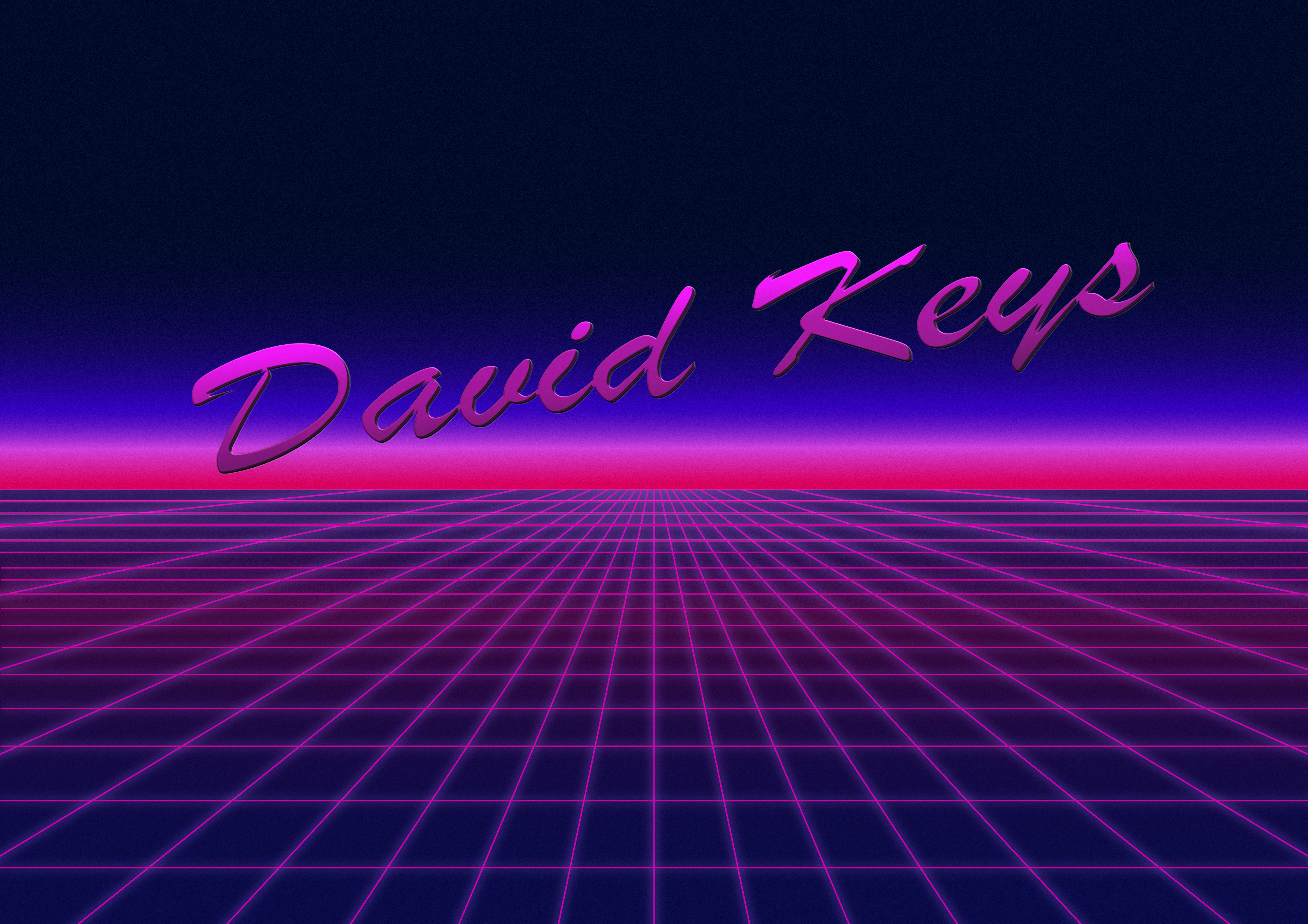
Just wanted to say Thank you everyone for your tips and recommendations, extremely helpful! I haven't got any mountains yet or a sun but will definitely add it. Don't know if I should go with something like that in my "artist logo" or just keep it clean, maybe add something to the background... I was thinking of vector palms or just black sihlouettes of palm trees like in this video hehe, that's another mission for me Anyhow, just to share what I've done so far this is my design, the artistname David Keys is not 100%, you guys will be the first one actually to see my design+artist name I play a lot of piano and was also thinking of Miami Key West and the palms .. why some palms would spice it up a bit. I am thinking of maybe add a sun or have a sun and mountains on all the singles of my first EP or have it as an album cover of my first EP that will be released sooner this year or next year! So the sun+mountains and stars and everything was SO helpful Isabel! Cannot thank you enough and also all the other guys here! The picture is absolutely not finished yet, the text seems a little bit... I dunno, too fat and not as noisy and retro as I want, but I will experiment til I get it. It seems a little bit too "plastic" or ..not that Sharp as I want. Ah, I'll see! Palms, sun and mountains and a triangle like dutschader showed will be the next ! If anyone know if there's a good tutorial in the AD vimeo or in the workbook (not home atm but will look later) how to work with vectors like in the video that'll be cool, want to copy some palms in there perhaps...but will try to figure it out myself first! Hope u like my design and thanks for everything guys! All the best, "David Keys"
-
Oh I see! Reading the roadmap post and others, hopefully we'll see something like that And again, thanks for your help it has been great! Can't thank you enough!
-
AD - Perspective grid tool
GraviolaB17 replied to John Mevis's topic in Older Feedback & Suggestion Posts
Bumping this! I'd also love a perspective tool like B13eL is asking for! I started a thread some weeks ago for doing a neon grid 80s design and yes, it would be much better to have a PT in Affinity Designer when doing this to save time instead of going around this in other ways which are not that efficient compared to a PT. Like Ps and Ai it would be a core function and standard I'd say... Thanks in advance! -
My friend! Thank you So much!! This is so nice of you! I realized now that the function I am after doesn't exist in Affinity Designer?! Perspective / live tool like in this video which I think is a little weird? Think it should be a standard thing even for AD and AP. Anyone know if the function is coming or will? I'll text the mods or the team to see what the idea is! Anyhow thank you very much I will look into it! https://vimeo.com/channels/875980/147726737
-
Guys! A late little self bump, Bought Affinity Designer and also the workbook I'm waiting for. Been experimenting a little bit But: The grid is something I still struggling with, @dutchshader would you mind chip in how or where you managed to drag it down to the middle/centre and then having the design it has. Would be super happy if just the commando or where in AD I'll find these parameters for the incline of the grid/gradient. Hope you understood my question, and again thanks for everything so far!
-
Guys guys guys you're totally awesome!! Oh that's super nice! I will def take my time and order the book and learn from that. Looking forward to all the fun! First I need to finish all my retro tracks ;)
-
Maestro! Thank you SO much, I am preetty blown away!!! I will update this thread with some examples - or post it in the My Designs forum. Will def buy the book to have a better grasp at all the functions. The design you made is totally awesome - thanks a LOT! Love the shadings in RETRO as well as the background, colours and the square base. LOVE IT! :D
-
Last questions, about this design is there any tutorial on this or will this be done easy when I'm in the program? :) Or is it explained in the Work book? Was thinking of buying it to get a good introduction. Then about filters for photos, are there some filters included like this picture for the city sepia and the vintage filter of the beach? And lastly, are there included "pictures" or frames like cars or palm trees (they can be black shapes also) ? The Tiger Club is such a cool design btw: https://cdn.affinity.serif.com/img/designer/1-4/collage-251120151114--desk.jpg Thanks!!
-
Hey man! Thank you so much for the fast and very good response ! I will absolutely look into that and see how far Affinity can take me with my basic skills, hope I can improve it and start off soon! About the Fonts - ok cool! Thx for the sites. Can the texts also be divided in multi layers/colors in the background ? Or maybe you already answered that! :) Lens flare was something new I will look into. Again thank you very much for quick and very good response and explanation. All the best! Hi mate! Thank you so much for the friendly approach, much appreciated! Cool designs you've made also.
-
Hi guys! New member here. I produce film music and also been doing some 80's retrowave/synthwave music. Didn't wanna go the Photoshop/Illustrator route with the subscription so found Affinity Designer (also iDraw/Graphic) but seems Affinity is the better one here? Anyhow, I don't know all the effects and names for everything more than layers etc. But wondered if it is possible doing somewhat like all the stuff here in Affinity: The 80's retro designs with cool backgrounds, layers and reverse pyramid designs with some cool retro fonts with layers (behind) and sometimes adding effects like shimmer/lights and splitted colours in the text string. Is this possible in Affinity and do you guys know what the effects are called? I could also just find a background and make a nice font to it. Oh yeah, how many/good are the fonts if I want to make the typical Retro designs inside Affinity?? Much much appreciated and all feedback is welcomed. I will absolutely watch the stickies with the tutorials and perhaps I'll learn more from there, but wanted to give you some examples. //D