Nuth1n
-
Posts
59 -
Joined
-
Last visited
Everything posted by Nuth1n
-
Export to Adobe XD?
Nuth1n replied to chris.bannu's topic in Feedback for the V1 Affinity Suite of Products
Another time Export editable text to PSD would be such a valuable function. -
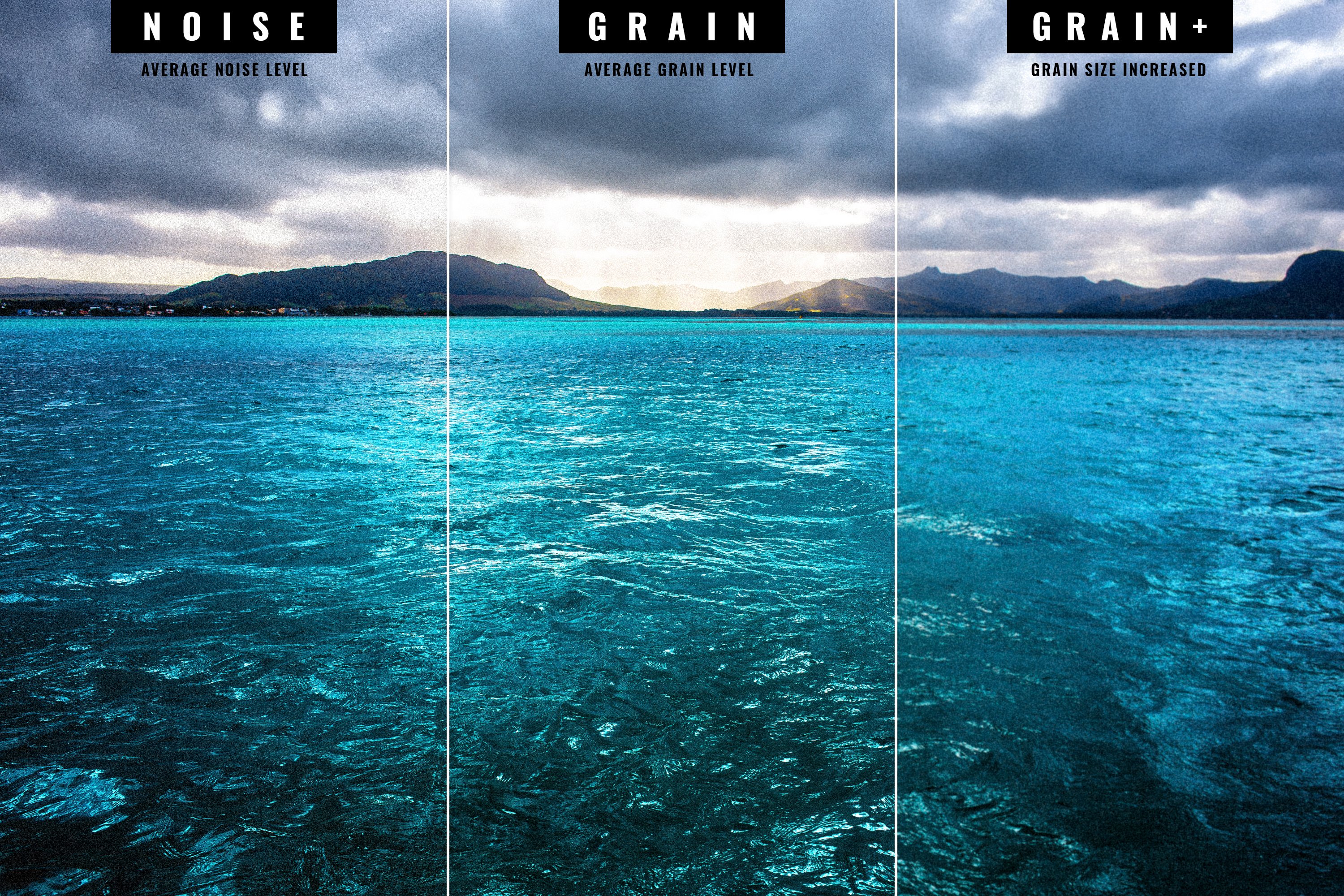
So this one is a bit of a niche filter, but it is one of my favourites (it does an excellent job at breaking up hard edges, and helps bind layers together beautifully if you're going for the grainy look but don't want to introduce standard grain/noise) Especially when photobashing for concept art, "I use it on the daily".
-
@MEB This also just solved the main issue I was having, as I like to setup templates for proofing. I agree with @HenrikMay I also suggest the tool in the toolbar use this feature natively instead, and have a button in the dialogue box to commit it if they want to use the tool destructively. So by default I think it will save most people from having a headache. If we could get this feature to work with liquify as well it will open the windows for people to start using mock-up packs. which could save many designers a lot of time on presentation documents for things like curved surfaces etc.
-
Possibly, I don't know why that didn't occur to me. Been ages since I struggled with that in photoshop so it feels like a distant memory
-
I just experienced this problem for the first time. I tested it out in Affinity Designer and Publisher and both could not export it. I incrementally deleted each object until it would export, the suspect object was a standard square shape with a color fill. The strange thing is that Affinity Designer thought the box was a text layer. Would you like me to upload the file somewhere or have enough files been submitted to review this big/issue?
-
Thanks for the effort guys. I managed to recreate the file, so luckily I can submit it (luckily I exported a PDF, which I used to copy the text) It was stored on an external drive. Hopefully that won't happen to me again. I now incrementally save more copies as back-ups anyway. If I experience the issue again I'll be sure to update it in this thread. Otherwise I've had flawless performance and I'm glad I have this application.
-
Hey Jon, thank yo for the speedy response. I uploaded the document for you to look at. I've already begun recreating the document from scratch, just in case It's really strange, The app hasn't crashed once .
-
Using affinity publisher official release 1.7.1 Made some minor changes to a document (mostly spelling corrections) and tried to open the document again a few days later. POP-UP: Failed to open document <file path> The file appears to be corrupted. I've tried opening the document with Affinity Designer & Affinity Photo and had the same message. Is there a work-around I can use to recover my document? It's 36 page document I have to submit today.
-
Bump, editable text on export should be a priority to help studios migrate. I'm still forced to use Photoshop in many situations because I have to pass open files to team members who prefer Photoshop because the text is rasterised and they would no longer be able to contribute to the project otherwise. This is an issue with the desktop versions as well.
-
Export embedded document
Nuth1n replied to Nuth1n's topic in Feedback for the V1 Affinity Suite of Products
I did this with logos before, it works as a temporary fix. But this feature does not work at all with embedded jpg, png or other 'export' files.- 8 replies
-
- 1
-

-
- smart objects
- embedded documents
- (and 1 more)
-
A quick search and I couldn't find anything. There should be a way to easily export a selected embedded document. This is especially important when you have to share open files with colleagues who need to use assets in other software or suites. Many web developers I work with require the original images I use in my layouts - so the can set up their websites to automatically crop and treat images in the same manner.
-
No need to go to extremes. I'm not suggesting taking away all customizability, the motivation is to keep the UX less distracting. This is just from a professional use-case standpoint where we want to spend less time on tweaking interface elements. Maybe making it a default is a good compromise, and allowing people to change this in the application menu for thier particular setup. So it doesn't interfere with other users setups when sharing documents. Example: "Set color 1" can be a pastel on my interface "Set color 1" can be neon on someone else's
-
I just think they should be more subtle like the Adobe palette. I also think it shouldn't sit over the ✓ box only. It should span the entire name. If this is an issue then perhaps do what Pixelmator Pro did? (attached) I'll disagree on this point. because consistency in user experience is vital for any application - especially one targeted at designers and illustrators. A carefully well-designed palette would be the best thing. Maybe just double the amount of available colors instead.

-
The current colors are really ugly, and intrusive. The Bright colors are distracting from the main artwork... I recommend soft pastels instead of the current options (something that doesn't contrast too heavily from the UI interface too)
-
Astute Graphics Technology
Nuth1n replied to kaseopea's topic in Feedback for Affinity Designer V1 on Desktop
It would give AD the upper hand because the technology would be built into the software, where right now Adobe only supports it as a plugin. It would bring features to the table like better boolean operations, cleaner curves, collision detection, curve fitting, scattering operations, Curve extension based on trajectory, etc. If it is part of the core software, it makes it a better core package. I actually agree with your completely, if I could just use the same plugins that would also be great! Serif could also develop the tools as part of AD expansion, and just create a subscription for those of us that need it. I doubt astute will want to support plugins for multiple suites. And the developers at Serif will know who best to fit it in without compromising their suite. I've also wondered why Adobe hasn't gone this route. I feel like Adobe doesn't really focus on their products with special care and attention they used to. The latest copies of Photoshop and Illustrator are very slow and unstable, and instead of fixing these issues they just keep on adding more features that contribute to compromised performance and unreliability. I've been wondering if Photoshop for iPad is going to also accompany an unveiling of a rewritten Photoshop for desktop... in which case maybe they're just being secretive until their project is further along. -
Astute Graphics Technology
Nuth1n replied to kaseopea's topic in Feedback for Affinity Designer V1 on Desktop
+1 more vote on integrating the Astute Graphics Technology in Affinity designer. I own the entire AG suite, and it’s the only reason I still open illustrator. This would give AD the upper hand over illustrator in every way. -
Astute Graphics Technology
Nuth1n replied to kaseopea's topic in Feedback for Affinity Designer V1 on Desktop
+1 on this! I own the full astute suite, and it's honestly the ONLY reason I still have illustrator set up on my machine. -
I would like to draw some attentions to the camera raw abilities PS has. Which I have grown accustomed to using, where you can develop with added grain which is very different from noise. Instead of simply adjusting luminosity of single pixels spaces underneath, it seems to find averages based on the values. So larger grain creates this beautiful effect that destroys details, but without making the image look ugly. creating soft edges without seemingly "losing focus". It's one of my favourite features to use when creating artwork and binding together different layers with different pixel densities. It's also an important feature when emulating a lot of vintage photo effects. giving you that VSCO look.
-
Unify resize behaviour with and w/out shift key
Nuth1n replied to lexislav's topic in Older Feedback & Suggestion Posts
@MEB Thanks for the response. I may have brushed over this too quickly. I tried what you are referring to you before adding my post, and it didn't originally apply to everything. For example fonts would continue to maintain aspect ratio, and shapes like a simple rectangle didn't when grabbing the corner - and resizing it. despite having selected 'preserve aspect ratio" as the default. Just to make sure I wasn't being silly, I tried again, and it seems to work =D Didn't think to restart the app, which may have made a difference. -
Make a character panel that can be snapped to the side-bars (much like layers, effects, styles etc) This makes global & multiple character & paragraph style changes easier to implement.
-
Unify resize behaviour with and w/out shift key
Nuth1n replied to lexislav's topic in Older Feedback & Suggestion Posts
Glad I found this, its also been bothering me a lot. The shift key modifier should either preserve aspect ratio by default with all elements, whether they're pixels layers, vector shapes, text, or placed graphics - or vice versa. -
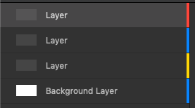
This should work in both Designer and Photo. When you click on a layer to have the layers panel scroll to, and highlight, the selected layer. It's very inconvenient to scroll up and down looking for the object you've selected especially with more complex documents.
-
I don't have a single document that doesn't use smart objects. It's the best way to manage multiple deliverables that all use the same resources... and when a client makes a change to one element it propagates to all documents. Also ensures the layouts are much smaller, especially when you keep all your revisions for archiving.
-
This is a feature I've grown to love in illustrator. If you have multiple shapes that have been 'combined' to make one object you can double click on it. From there you can click on a part of the combined shape and delete it without having to remove it by deleting one node at a time.