JGD
-
Posts
549 -
Joined
Everything posted by JGD
-
 This is way too complicated to describe in detail, and you know I have a penchant to write 300-page essays on simple stuff, so… please just watch the video and tell me what you think. index bugs.mov Basically the Index panel is all over the place, and when it reaches the final state, when the “Options” section disappears altogether, it becomes unusable. And this is completely reproducible, by the way. The only way to restore it is by force-quitting Publisher Beta, and I haven't even tried quitting and restarting it properly out of fear that the Index panel might become corrupted for good and force me to trash Publisher's preferences. I will try making a backup of those and see if a soft relaunch does the trick, though. Edit: I just did, and it seems a soft relaunch does indeed do the trick. Still, while it's good that the release version doesn't suffer from this bug and this is a beta, it's very broken and may preclude those users who might want to use it to avoid those print and export bugs from doing so if they need this feature.
 -
Thank you. For your remarks and especially your demo, which I should've done earlier but now you saved me the trouble. I never did a full degree in UX/UI, but I did study ergonomics at my Uni and, you know, being a communication designer and all, I'm extra sensitive to this kind of stuff. I've been reading on it a lot since I got an internet connection, and probably knew about UX principles like Fitts's Law back when I was 17 (shortly before switching to the Mac, which makes extensive use of it; I eventually learnt about it by starting here: https://guidebookgallery.org ). And I do remember recognising Windows 95 as a Mac OS clone from having used System 7 on a friend's Mac Color Classic a handful of times (and, conversely, remembering just how similar the latter was to Digital Research's GEM, way before I learnt about Apple's lawsuit against that company), and noticing even the minute differences between Windows 3.0 and 3.1, so I definitely had an eye for it even earlier still (yeah, as far back as when I was six/seven years old!). It doesn't take a degree, or working professionally in the field, to know that needlessly obscuring UI chrome is a big no-no, but it's refreshing to finally see someone who is incidentally very much in Serif's target demographic chime in. As for users shrugging and moving on, I agree, but I'll add that a crucial detail, “to where”, depends on a few factors. If they can afford a CC subscription, they may shrug their shoulders and… move back whence they came. Considering its promise, it would be a very sad state of affairs if a sizeable portion of Affinity users were just silently tolerating it because it's cheap and they have already invested on a license.
-
Well, duh. Also this. It's either a case of lack of testing, lack of use, or both. Devs are, first and foremost, devs, not designers, and even if they dabble with their own apps every now and then, they only do that, dabble. These apps aren't something like Brent Simmon's awesome new NetNewsWire, i.e. a simple but generic app that anyone may use daily, including the head developer himself. Also, sure, we know for a fact that Serif does have an in-house design team, but if not a single one of its members uses separated mode, boom, it ceases to be a priority. And if none of the 90%ile target demographic for their apps, i.e. digital illustrators/photographers on a budget on small 13'' or 15'' MacBooks and PC laptops, use it either, boom, it will stay that way. Serif desperately needs professional testers on their QA team, even if it means hiking prices a bit. I've said it before, and I'll say it again.
-
Again, devs beware. When users do this, in the middle of August, it means that it's serious. “Lousy” and “irritating”, is even stronger language than my own at my worst, wow. But I concur; it is, indeed, “lousy UX”. Sure, it may affect 0,0001% of your user base, or some person who opened the trial just to check the app out, but… what if it's another influencer? Separated Mode is a complete, useless shambles, and it does Serif no favours having it in its current state on a shipping product. It feels more of a bug than a conscious decision.
-
A million times this. There are a lot of shortcomings in Affinity apps that I let slide; it's only when I get into “it doesn't feel good” territory that I actually take the time to come here and create entire threads on those. Just a heads up, in case you find any other shortcomings yourself and feel the need to point them out: you should either get a thousand reactions and replies to your thread, or produce a >100 word request in the first place; otherwise, the Serif team will outright ignore you, no matter how sound your argument is. [Funnily enough, that reply was exactly 100 words long, ha. Guess my training here on the forums has paid off, after all. ]
-
All fixes to font rendering and embedding, especially when it comes to OpenType features, deserve my sincere commendation. It's good to know that Publisher will play well with those in all scenarios and that advanced typography is a true priority at Serif. A good “set-it-and-forget-it” default preset that preserves type designers' hard word and prevents end-user confusion – which might otherwise turn them away from those features – is always a win in my book.
-
Both fair and related points. If Serif ever becomes big enough to manage such a diverse forum – and keep it civil; otherwise, what's the point? –, it will be a welcome addition, but I think we will all have to agree that making do for now is an acceptable compromise. I, for one, don't mind discussing those issues and be educated on the matter if need be via PM. Anyhoo, and back to the topic at hand, I'll translate my latest observations into animated demos soon. You know, to make it easier for the team at Serif. Stay tuned! As for modifiers and the way they are totally scrambled, eh. This isn't the right place to discuss that, either, and the subject probably warrants its own thread. Once this low-hanging fruit (because that's what “ghosts” are) is addressed, we should consider creating one. If any of you think it's a priority, sure, go ahead and do it right away, and you'll have my full support; but I, for one, don't, and am picking my “battles”, so to speak.
-
Yeah, you are, for the most part, correct. In any case and by the way, I'm probably the worst offender when it comes to all things off-topic. Still, don't you reckon that if the user count booms it may one day become necessary (even if you personally don't use it, which is just fine anyway)? Just a thought.
-
I was, obviously, being a bit facetious with my remark. I will say, however, that as a native Portuguese speaker, I understand and agree with most (if not all) points you made. If the mods wish to move that discussion to an off-topic thread (and Affinity forums could certainly use an “off-topic” section; call it “Community”, or something), I'd be more than happy to comment on them. I do have some likely interesting thoughts on the matter but, as it stands and for approximately the same reasons you mentioned (I wouldn't go as far as calling the topic “PC ‘garbage’”, but I do agree it sometimes breaks the flow of debate), I won't be adding them here. I'm already verbose enough when it comes to my tools, haha.
-
Even when Apple is explicit, they sometimes leave some stuff omitted (and I can't seem to find anything on Command+dragging), but the best practice is to keep it as consistent with the pre-installed apps (and not necessarily all the first-party ones – do you guys remember the dark days of “brushed metal”? And what about GarageBand and its wooden trim? –, but mostly those, too) as humanly possible. As for the other modifiers and the Pen Tool, I haven't tested them enough for that to be able to express a final opinion on that. But I will stress that Command+dragging should not result in duplication, ever. If it even nullifies it in, of all apps, the Finder, it stands to reason that it should never, ever do the opposite. No matter what ergonomics tell you. In my 16+ years of experience as a Mac user, I can assure you that's just not how 99% of macOS apps are developed, period. @Ben, this shouldn't be a case of accommodating users who “can't cope” with a non-standard behaviour (there's so much troubling stuff to unpack in that statement that I don't know where to begin), but instead fixing something that was patently wrong in the first place. If you wish to make things simpler and have two modes in Affinity apps, “Standard” and “Optimised for Ergonomics”, so be it, but at least respect conventions in some way and give users, pun unintended, some options on the matter. Look, I've studied ergonomics. I know that if I'm not careful enough I may get RSI and CPS (if I don't suffer from them already; I'm 34 and have been working and playing with PCs since I was 7, after all…), so you're preaching to the choir, here. But the default behaviour should always be to have shortcuts (all of them, as in both key combos and mouse+modifier combos) be as consistent with the host OS and apps as possible. And if someone is such a power user that having to move one of their fingers an extra inch might cause them RSI or slow them down considerably, add it as an alternative preference for them, then. Or if you're so afraid that users will injure themselves with (or be pissed about) that new default, keep this current weird behaviour as it is and add the other one for “lite” users (which, as it has been so eloquently stated here more than once, may eventually become your biggest user group) who may enjoy a bigger level of consistency across their OS. Those are the ones who will, after all, be using other first- and third-party apps for longer and who'll have to face the worst muscle memory conflicts when firing up Affinity apps (if you're a power user, you may deal with those conflicts more frequently and, bothersome as they may be, you eventually get used to them, just as I did when I had to deal with that “UX turd” of an app that was QuarkXPress; “lite” users, on the other hand, will just get frustrated all the time).
-
Not explicitly as such, but implicitly, yes. Much like there's the letter of the law, and the spirit of the law, if the only mention (that I could find, at least) [see: Pointers > Drag copy] in Apple's HIG to Option+dragging is to a cursor (which, while I'm at it, you should consider using if this “ghost” functionality is to be implemented, to further visually distinguish such a “dragCopy” operation from a regular operation), well… you're not supposed to use other modifiers for the same function. UX redundancy in such a context is undesirable. It's not different enough to feel like it's an alternative (like, say, an explicit duplicate command, with a menu item and a keyboard shortcut of its own, or regular ol' copy'n'paste) and confuses the user instead. Why you're still arguing with me about this eludes me, and just feels petty at this point. I'll suggest you try doing other Modifier+drag operations in other apps just to see what they do, but I can assure you (and I'll bet both my kidneys on it) that it's never a duplication. Control+dragging is probably not even an option in most cases (see: Keyboard > Keyboard Shortcuts > Defining Keyboard Shortcuts): As for Command+dragging, in the Finder, for instance, it forces it to always move a file even when the default, unmodified action would be to copy (such as when dragging to any kind of external R/W media); perhaps Command+dragging objects across Affinity apps could have the same effect, and I'd expect all other apps to adhere to this convention – written or otherwise…
-
Well… On the other hand, many Corel users are running oooooold versions. They just keep on going. And legally so, because, you know, perpetual licenses. Offering them something new and fresh, that respects some of their favourite app's conventions (at least when it comes to object selection, which is a biggie) and optimizes the UI/UX greatly, might be an interesting value proposition.
-
Fair enough. “Gentleperson” it is, then, since there aren't, AFAIK, gender-neutral honorific titles (though the good people at Serif, being British subjects and all, might be able to enlighten us on those. ).
-
Isn't the last screenshot actually of Mac Paint? I mean, compare it to the screenshot on its Wikipedia entry; it is Mac Paint. So… you're absolutely right, Apple came up with that UI, in 1984. https://en.wikipedia.org/wiki/MacPaint#/media/File:MacpaintWP.png
-
Yet more interesting clarification. You, sir, are on to something. That would make a lot of people very happy. Serif would totally kill Corel if they did that, by the way. The market you're describing seems to be very much dominated by them (here in Portugal, at least). And once they had those niches nailed, they could then go on to fry the bigger fish.
-
Ahhhh, now I get it. Makes sense, and yes, Adobe's management are a bunch of profiteers, I'll give you that. Interesting analysis. To which I'll add: Serif marketed their software as if it might replace Creative Cloud for those who do need it for constant work and who were fed up with Adobe; however, they struck gold and ended up absorbing that huge crowd you've mentioned, which is indeed mostly content with Affinity in its current state. That's why many of “us” (i.e. those who use e-mail, CAD, video editing and whatever else only 10% of the time) feel left out. However, many of those – me included – do want Affinity to succeed not just for financial reasons (or if so, also because of hardware longevity), but out of principle. We want to own our tools and not be forced to upgrade just because. Also, we don't want to lose access to old artwork if we ever need to go into hiatus. It's just good business and digital archivism practice. We may be a minority, but we're a pretty vocal one. This isn't just about money; it's also about politics and ideology. And the reason many of us haven't jumped ship to Inkscape+Gimp+Scribus is because they're a bit too far out, and a tad inelegant…
-
I'm a bit of a weird case, as in, the opposite of that. I'd gladly do the 90-10 split in favor of Affinity, but currently I'm doing the reverse, because these limitations do impede my workflows. I use Adobe CC by default, and will try to do simpler stuff on Affinity on occasion, when I know it's better as a tool but especially to keep tabs on the development progress. However, when it comes to the urgency of the matter, I'm behaving as if I had to depend on Affinity 150%, or 200%, because students. I'm a teacher and an influencer, that's why, and I do feel sad that I can't recommend it unreservedly. Every semester is a wasted opportunity to push this thing to 30-40 more young minds in each round and to fellow teachers (and, if things go according to plan, those number should grow; but I digress and covered that topic to death already, so… moving along). I know that when @Ben and others point out that there are ways of doing task x-y-z, they are mostly thinking of the crowd that went all-in. And if people depend on it, it's understandable they'd be willing to look past those limitations and, if need be, take 5x longer to do some obscure, infrequent task (considering Serif's current user base, that is); however, someone from “the outside” must do the work I'm doing, otherwise you people will just be stuck inside an echo chamber of praise and workarounds.
-
Exactly. Because for quick and dirty edits, or for people who, as you've so eloquently said, only use the app occasionally, or even pros like me who could very well use this stuff all the time but sometimes prefer to think visually and incrementally without too much fuss in setting up stuff, both are valid. Yes, I'm an analytical guy and will do a lot of math to get things just perfect, but I already have too much on my plate when working with InDesign/any other DTP app… Ai, OTOH, is my sandbox/playground and sometimes I have one of those fleeting “shower time epiphanies” (you all had at least one of those in your life, I hope?) and just want get right to work and plop a quick modular alphabet without even bothering with setting up grids. If it's any good, I may redo the whole thing from scratch with a proper setup, but more often than not I'll just do that in Glyphs.app instead… Though having at least a first draft in a vector editing application is good practice, as I can use it later for presentation posters and showing off the grid and modules. Something a bit like this: Just because a feature is absolutely perfect for a user, that doesn't necessarily mean they'll want to use it all the time. Humans are complicated and counterintuitive, like that.

-
(sorry for the angry looks on Steve Carell's face aha… I didn't have enough reacts anymore and this was the GIF that felt more appropriate ) That's precisely what I feel. I know keeping things both simple and discoverable are sometimes competing goals, and it's hard to achieve that fine balance; I do, however, feel that Designer is indeed imbalanced towards simplicity. @robinp I should point out that I “cheated”; I kept alternating between the Selection Tool and the Direct Selection Tool. However, that “cheat” would never work in Designer… Either you switch from the Move Tool (V) to the Node Tool (A), and then proceed to select all nodes from the previously selected objects by pressing Command+A, or your switch from the Mode Tool (V) to the Point Transformation Tool (F) and then proceed to press Control before selecting the desired node. Designer always makes things more complicated than they are in Illustrator, and even if ghosts and self-snapping are added, it will remain so until this modifier+click+drag situation is solved. Serif does have some deep-seated issues when it comes to modifier keys, with a lot of functionality duplication and [conscious?] trampling on Apple's HIG going on. I should also add that the current Control behaviour when using the Move Tool on handles is redundant; it just emulates the Point Transformation Tool, except in crippled – and reversed form (I'll post a demo later in a separate thread). If it duplicated Ai's behaviour, and selected nodes instead, it would actually be consistent with the Point Transformation Tool's behaviour when Control is pressed, which would be a win-win situation in my book. But then the default Control+click functionality to access the contextual menu on macOS would have to be thrown out of the window, so clearly there has to be another way. Then again, Designer's behaviour when pressing Control and clicking is vastly inconsistent, and warrants a demo of its own. It's unpredictable at best, if not outright buggy. Maybe taking Duplication out from Command, where it should've never been put in the first place because it's in complete contravention to the HIG, and leaving it under Option (or, as I've seen @Ben calling it, “Alt”; maybe he was indeed referring to Windows, but I'm always thinking and speaking from a Mac-centric perspective… It was never the official name of that key, and indeed the “Alt” label has recently been removed from the keycaps on recent Mac models), where it should've been since the beginning, and using Command to alternate between the Move and the Node Tools, while allowing to select any node, just like in Ai…? Does Adobe have a patent that prevents Serif from doing that? Is there anything wrong with adhering to a standard that works? I'm guessing no to the first, and a big, fat NO (not quite Steve Carell's “NOOOOO”, but close) to the second, too.
-
@Ben, I just recalled something else extremely important: “Ghosts” in Ai aren't just useful for moving; they also work great when using resizing handles. Most of the time, I cut objects in half (or in quarters) by resizing them towards their centre point. You may say “but there's already an alternative” (like inputting “/2” into the W and/or H fields). Indeed, but it's usually much slower on a 27'' iMac. When I'm creating, I don't want to take my focus away from my artwork, and if I can do simple calculations visually, I'd rather work that way. If I didn't, I'd be an architect and use AutoCAD instead.
-
Spot on. I did expect a holiday, but what I got was a bit of a bastard hybrid. A “holication”, if you will. (That sounded way better in my head before writing it down. Oh well )
-
By the way, and without making any definitive considerations on how I did it (because it's been over four years since I even looked at this thing closely; I'm guessing I used self-snapping a lot, and zero keyboard shortcuts, only modifiers like Option+dragging and Command+dragging to alternate between the two selection tools in Ai), I'll just leave this here. It's my “Maluda-meets-grids” interpretation of a view of Saint George Castle from the Saint Peter of Alcântara belvedere, in Lisbon: And the outlines view, just so you can appreciate the sheer complexity of this thing: And the illustration superimposed over the original photos: Yes, there's an orthogonal grid, to which I snapped larger stuff. But Power Duplication here would be kinda useless in many instances (as there's too much variation), as was the rather coarse grid on a micro scale; there are, however, many different “super-grids” and “sub-grids” arising from the illustration itself, and self-snapping was still useful. Basically I turned off “snap to grid” and did the finer stuff completely by hand, always subdividing objects by half; or maybe I made the grid finer, whatever. Either way, I still found the visual feedback of “ghosts”, which enabled me to compare before/after positions, on the fly and on top of a photograph, to be a vital tool. Not having to constantly undo and redo hundreds or even thousands of operations did greatly speed up the process overall. Because, you see, in these use cases when you're tracing from a photo to a grid, if you want stuff to match up you usually only have three choices: A perfect one (when you're lucky enough that everything falls into place) or (when you're not), An optimal… … and a sub-optimal one. You can, of course, start subdividing the grid right away, but I usually reserve that approach only for when the detail or the subject justifies it (in this case, you can clearly see I only resorted to that when doing the intricate, Mannerist south tower of São Vicente de Fora Monastery – on the left-hand side of the image –, and the nearby façades with a very oblique perspective which turns windows into nearly imperceptible slits); overall, I'd rather reinforce the grid while still being as faithful as possible to the source material. Hence my insistence on having those “ghosts”, even – nay, especially – when snapping to the grid is active and the entire goal of the project. I know that for a fact and have the experience to back it up; I'd probably go insane and, to use @Ben's and my own emphasis, hate to do this in Designer. It's a strong verb that shouldn't be used lightly, but I'm sure I would, because I did get frustrated with much simpler projects in Designer and can easily extrapolate from there. And hey, it's digital illustration, so you can't really say I'm not in AD's current/preferred/most loyal target demographic; it's just that my style doesn't conform to the mainstream (though I'd argue and stress, once again, that geometric stuff is very much in fashion right now, because of the entire “flat design” aesthetic trend that [re-]emerged since the iOS 7 UI redesign, but I digress). As for self-snapping, if “ghosts” are an option in the first place, so should that functionality, as Ai users/switchers like myself will pretty much expect it to be included and it won't hurt anyone for it to be there (even if it's yet another separate toggle in the snapping manager). And yes, I know I blew the magical 100-word limit on this one. But considering how many hours it took me to do this thing, and the complexity involved (I don't even want to go into object grouping and layering details!), that's a very concise description of my workflow and the entire thought process on how this validates my request. You wanted real-world examples? You got 'em.
-
Sorry @Ben, this was another miscommunication. Yes, snapping an object's nodes A, B and C respectively to A, B and C is ridiculous. That's what Undo is there for. “Self-snapping” always refers to the hexagon demo, i.e. moving an object and snapping node A to node B or C's original position. If you add centre points, mid-points, geometry, paths, etc. into the mix, it gets even more useful. Add multiple object selection to the mix (then you can indeed have full A—A, B—B, C—C snaps, except to different instances), and it suddenly gets even more interesting.
-
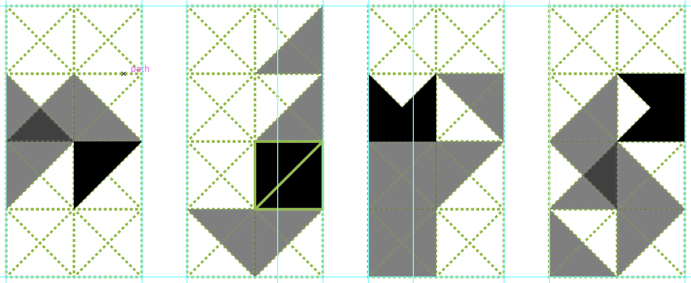
That's the textbook definition of a tesselation right there. It absolutely does relate to this request; I'd say that's the biggest use case for the self-snap feature is precisely that. In fact, I've been saying as much – and talking about tesselations, but also general geometric work – for a while now. And while you're right, it can be extremely useful in the set up stage. But sometimes, even while editing stuff, moving an object away from the “mesh/grid/tesselation/whatchamacallit” and still have it snap to its own nodes can be useful, especially when you're dragging a multiple object selection.
-
Now that sounds very interesting. But please consider the usefulness of being able to do geometric work without too much prior set up (i.e. with this ersatz smart[er] snapping). Sometimes people are just whipping up a poster or a portfolio, and those carefully curated grids/tools won't carry over neatly; if one has to do quick edits, it can become a total chore, whereas if the engine itself was ready to accommodate those workflows by design, that wouldn't be an issue. Those two approaches shouldn't be mutually exclusive, obviously, and I can't wait to see what you come up with. Also: 99 words once again. At this rate, we can shut the thread down and move this to Twitter.