tonyrambler
-
Posts
52 -
Joined
-
Last visited
Everything posted by tonyrambler
-
Hi Lepr, that's a brilliant solution, I never would have thought of that 🙏 . I've saved the file and video and I'll use it for the next project in a day or two. Thanks and very best wishes Tony
-
Hi Lepr, this sounds really helpful. I have the full suite, so anything's possible. I'm deep into this current project, which is throwing up other challenges all the way through (in more than one software type) so my brain is too full to figure out what your approach is just yet, but it will be very good to know. 👍
-
Thanks Lepr, that's kind of what I was getting round to thinking. I guess it takes a bit of thought to make sure that all the likely moves are allowed by what the outer container is like? For instance – if I want to move the <title> up and the <words> down will I need to make each have its own outer container before I start? And does the outer container give me access to more than just repositioning? Another for instance – say I want to space the <words> apart more, will that work once they are in a single outer master container or would they all have to be separately contained so that I can move each of the little master containers apart? Hope that makes sense. Anto – thanks, I think I see what you mean about the styling. The issue I've been coming up against most often is simple positioning changes, which I can't address through styling changes.
-
Thanks Anto, I'll try what you say on the next document, as I think I've completed this one (hopefully). I don't quite follow what you mean about the names and styles but I'll try putting the merge fields in the first page rather then the master page. I still want to be able to change anything about the layout (including the data merged fields position, size etc.) from the master page. I'm not sure how that works if the data merge fields don't exist on the master page(?)
-
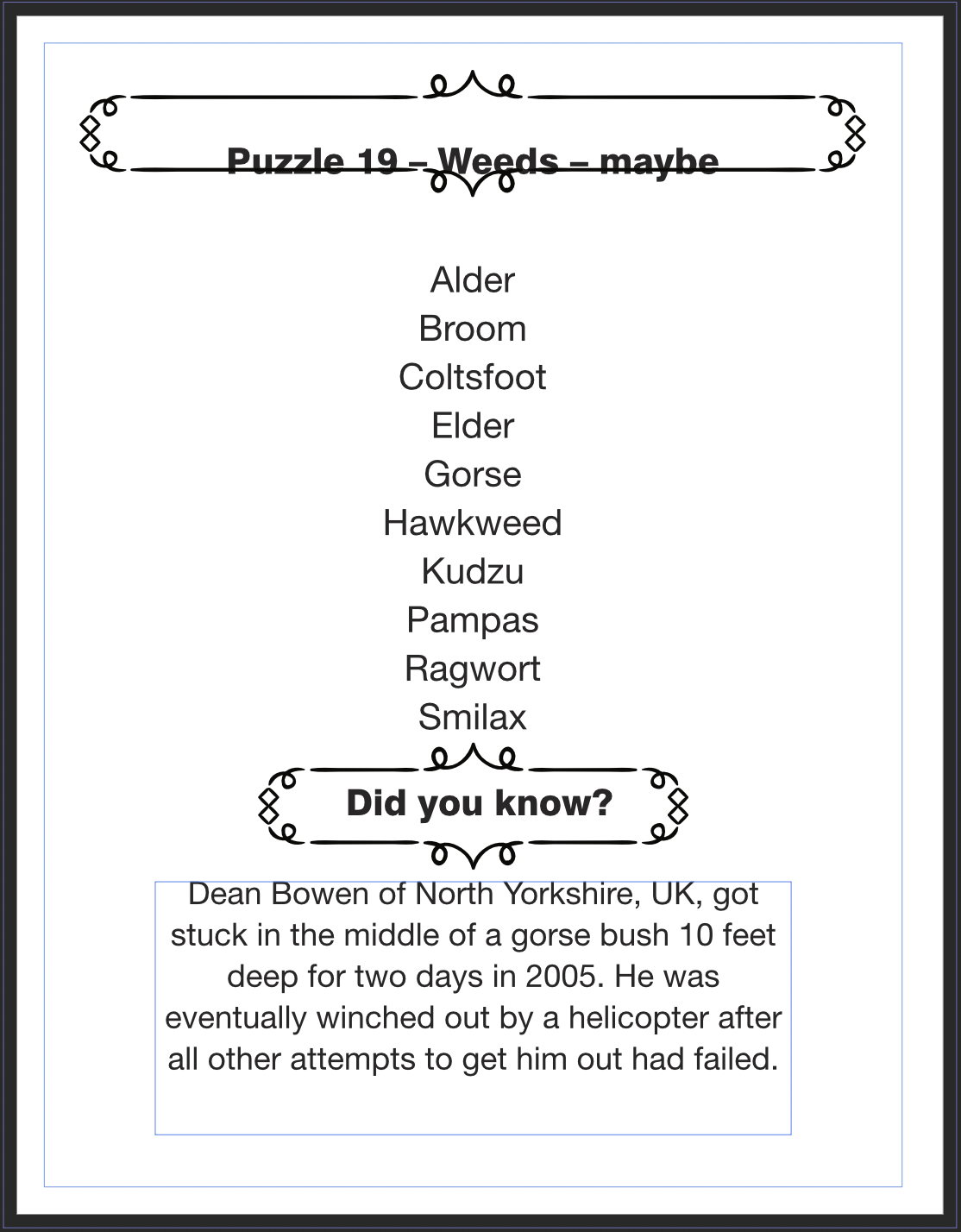
Hi People, I have a 100 page Publisher document which loads a portion of each page's text elements from a CSV. The data merge is working fine. When I generate the data merge, Publisher produces a new untitled document with the required 100 pages and all the generated text in place – so far so good. The problem I'm having is that once I'm editing the new, merged document I can modify any Master Page elements – position, size, add/remove etc. – except for anything within the Data Merge Layout group. If I shuffle a DML group text box up or down the page, for instance, it changes on the Master Page but the other pages don't update. Anything I modify outside the DML group updates fine on the other pages. I've attached 2 screenshots of the Master Page, before and after selecting everything and moving it up a few nudges just to illustrate the issue. Everything has moved up on the MP, as expected. But on the example resulting page of the document you can see that the text boxes for the <word> and <title> data have stayed right where they are, despite moving on the Master Page. The only way I have found to get round this is to do the original data merge again from the original layout file. It doesn't work to try to re-merge the data into the one I've been continuing to work on. This is a huge pain because I have to copy across all the changes I made to each individual page since the original data merge into the new merged copy that Publisher makes. Does this make sense and has anyone also found and solved this? Am I missing something really basic? It seems like it. Thanks, Tony

-
Thanks Wonderings. I had a go at a couple. Still had the same issue that there always is outside of Draw, which is that no other file format can recognise the transparency blend modes of AND or OR, so I can't convert to anything else except raster without losing major parts of the work. If it weren't for that, I could simply make the pieces again in Designer (and I would have by now.)
-
That's a great summary. I used to use Draw full time, on Windows back around 2000. Of course, everything Windows related was clunky then so it was just normal, but it was quite powerful overall. I later managed to get the last Mac edition from 2001 and kept it working until 2013 – all because I like a couple of transparency blend modes that no other suite offers, even now (as far as I know). Powerclip seems so antique now, it's such a lot of fuss for just putting things in other things. I hope that Affinity steers its course carefully. It's not perfect but compared to the Corel Suite it's stable, fast and does some complex things very simply and efficiently. Fingers crossed, I guess.
-
I've ended up installing the two week trial of CDraw Suite for Mac and opened all the files I wanted on that. Neither Inkscape nor Libre&AD could access them properly. It seems to be because almost all of the objects are wrapped in one big page-sized powerclip, and neither program can deal with the powerclip. One file had a group of vector objects outside the powerclip and that shows up but the vector group becomes one raster image layer in AD, for some reason. Also, the three vectors all have Draw-specific transparency blend modes which won't export to SVG or anything else and I can't imitate the effect in Designer, so I'll be doing everything on them in Draw and exporting as maybe a PSD or something when they're complete. On another note, if you want to really appreciate Designer, use Corel Draw for a couple of hours. It feels about a hundred years old and it's really clunky!
-
Hi Whiz, thanks, that's an interesting tip. I've tried a couple of files and they open with only some objects visible (I can't work out what the characteristics are that make them visible or invisible – perhaps being grouped makes them invisible?) Selecting all and pasting as a new document into AD gives me the correct document proportions and whatever details were visible in Libre do appear within it. It all pastes as a raster image. The one image I'd really like to complete from my CDR days is quite complex and it looks like this will be beyond this technique! Is this roughly how you've found it to work? Have you found any more tips or workarounds for it? Cheers, Tony Edit: Actually, it seems that my old CDR files are corrupted or incompatible somehow. I've downloaded Inkscape, which loads them natively, and exactly the same objects appear and the rest don't. I will try a trial of CD Suite and see if I can retrieve them and export them in another format during the trial period!
-
Designer: erratic rotation centre placement
tonyrambler replied to tonyrambler's topic in V2 Bugs found on macOS
Hi Nathan, no just using Designer 2.04. Waiting for the full 2.1. I haven't come across the issue in Photo v2, although I use it a lot, probably because I rarely do that kind of work in it. Same with Publisher v2. -
I've seen this mentioned for Photo and Publisher on other threads. Working in Designer, centre of object rotation is sometimes relocating itself a short or long (or massive) distance from the real centre, even when placed back there with snapping on. Don't know if I can reproduce it (will try) but it is often enough to be very annoying. Only solved by restarting the app. Trying to find the centre—sometimes way off the document area—has made me wish there was a "return to centre of object" button for the toolbar, as on a big screen the small crosshair is hard to find out in the weeds. This is of course a separate issue to the bug.
-
Total number of layers?
tonyrambler replied to tonyrambler's topic in Desktop Questions (macOS and Windows)
Re: the other suggestions: Regarding Select All, Ungroup All etc., I just tried that now and on this image it is a big job. Ungroup All only ungroups the top level groups each time, and this pic has multiple nests up to 6 deep all over it—possibly over a hundred of them—which remain grouped, so I'd have to dig into each nest and Ungroup All over and over again…………………………… nah. Thanks all. -
Total number of layers?
tonyrambler replied to tonyrambler's topic in Desktop Questions (macOS and Windows)
Thanks (old) Bruce. Select Object has just solved it, in fact. I'd overlooked both Select XYZ features completely (haven't kept up with all the features…) so thanks. The answer for this one piece seems to be 3138 objects. For some reason it won't respond to Select Vector Layers or Curves at all but it will happily select all Transparent Objects. Thankfully, every single layer has transparency except the background colour rectangle. Tony -
Is there a way to display or discover the total number of layers in a Designer image? This would include all of those concealed in groups as well as those that are separate. Tony
-
Possible to create custom blend modes?
tonyrambler replied to tonyrambler's topic in Desktop Questions (macOS and Windows)
Thanks everyone for the continued inputs. I will be looking at the earlier replies in more detail when I have some free time. For clarity, all of my work using (Logical) And mode was always in Draw, not PhotoPaint, as my work was all vector based. FirstDefence—yes, those are something like I was producing, but always in Draw. None of the Affinity modes replicate the effect, including Multiply. RichardMH, I think I see what you are getting at. I have actually done a couple of pieces where I mimicked the approximate effect by combining shapes and things like that, but it's a very tiresome workaround and it doesn't provide the organic variations of the blending modes. Thanks. Tony -
Possible to create custom blend modes?
tonyrambler replied to tonyrambler's topic in Desktop Questions (macOS and Windows)
Hi NMF, thanks for those details. I'll look at Apply Image later when I have some clear-headed time. I searched what I could find on CDraw blend modes but can't find a definition of how And or Or work, only found Xor on one forum. I'm not even certain that Draw still includes And. As you can imagine, it's also a very frustrating search term to have to use. It's almost impossible to search for in any specific way, so I've had to look for complete docs on blend modes but can't find the formula listed. Thank you for your suggestions. -
Possible to create custom blend modes?
tonyrambler replied to tonyrambler's topic in Desktop Questions (macOS and Windows)
I was using it in Corel Draw for shapes with gradient fills. Often the shapes were just rectangles over the entire area of the design, as it was the gradients I wanted. Here's a portion of one example. This is two overlaid gradient filled rectangles, one radial and the other (probably) conical, blended using And. Ignore the star effect, it is just the background colouration effect that's important. I haven't found a way to recreate this yet without Draw.
-
This is a very technical question and a very long shot, and I am not necessarily mathematical enough to understand a technical answer! Back when I used Corel Draw there were three blend modes I haven't seen elsewhere: And, Or and Xor. I did many pieces of work using the And mode for a particular effect. My question is, does a tool such as Procedural Texture allow the creation of such a custom blend mode (or to mimic it) and how would something such as the And calculation be formulated? I haven't yet found anything explaining the nuts and bolts of the And mode in Draw. I see things written about And gates, such as the equation is Y=A.B but I don't know how this relates to creating the solution. Anybody clued up on this kind of thing? Thanks!
-
Hi, maybe I'm missing something— is it possible to constrain the direction of movement of warp controls using snapping or shift key or etc.? Also seem unable to use arrow keys with/without shift to move warp control points (only the whole object). It seems that the movement is aways unconstrained regardless of any modifiers or snapping settings, so tricky for getting symmetrical quads/meshes etc. Hope this is clear. Thanks.
-
Bumped anyway. It might be a waste of time but it isn't a waste of very much time, after all. Serif—love your apps, use them most days, please add ColourChecker support as it is absolutely essential for a serious photo app. There, my work here is done and it only took a moment.
-
I'd like to bump this thread up again, as this is still an important missing feature in Photo 2.0.
-
Hi jweitzel, Thanks for your response. I think the Affinity suite is remarkable and I agree that it is unfairly criticised by some on here. It wouldn't surprise me if there was some incentive for certain other corporations to muddy the waters a bit on the forum. It happens everywhere else where market share is involved, after all. Ah well. This macro complaint isn't such a big deal but the code needs fixing and also it's a bit clunky in its design even when it works. Personally, I love the Affinity Suite. I used the StudioLink integration exhaustively on one very large project (a 300 page illustrated book) for several weeks with totally consistent smoothness and speed and almost zero glitches, all in one chameleon-like book/photo/vector window the whole time. It was a total pleasure to use. The Famous Industry Standard apps never gave this kind of ability. I think the whole suite is great. It doesn't have to be perfect, as long as they continue to listen.
-
Similar issue here with macros not playing, also Photo 2.0 DIY Macro for luminosity layers runs sometimes and then other times doesn't at all. No notable differences in images (I'm batch scanning many small colour & bw photos, all the same spec when being edited.) I do agree that the interface isn't very intuitive. When I first clicked on the macro in the Library it did nothing. I turns out this is what you do, but it just didn't work that time. Having to "Edit Macro" and then press play worked that time but doesn't always (again, a bit unintuitive). Any clues?
-
That's very helpful, thanks. I hadn't explored the left hand tool bar of the Develop persona at all. I use Photo as much as possible but occasionally there's still something useful (and maybe basic) that hasn't appeared yet. Best wishes.
-
Hi David, perhaps you know the answer to my next issue with using the above technique in Photo— In Photoshop's Levels dialog there are black, grey and white pickers. I cannot find an equivalent in any of Photo's adjustment dialogs. Am I missing something simple? Tony