

thomasp
-
Posts
135 -
Joined
-
Last visited
Posts posted by thomasp
-
-
just wanted to support the request to add a 'Lazy Mouse' type of functionality to Photo!
-
just wondering if i'm the only one missing a context menu to quickly pick brushes right on the canvas, adjust their parameters and so on instead of having to dig around in the interface for the settings in the context toolbar and the brushes palette.
there's of course hotkeys to change brush parameters but i find quite often that a little more visual guidance is really handy, especially when you're not just changing brush radius all the time.
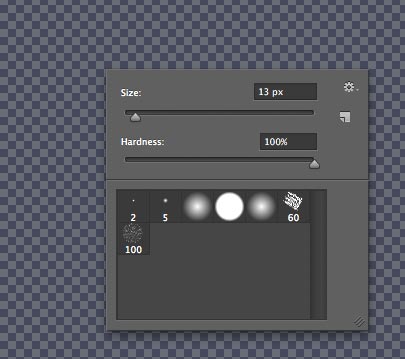
example from photoshop: quick access to brush library and basic brush settings on sliders

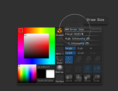
here's a nifty one from zbrush (more of a 3D program) that includes links to a lot more options probably irrelevant to a 2D program but most notably has a mini color selector which i think would be really handy (especially with a little palette of color swatches that mirror the swatches tab).
would be happy to see something like this pop up in photo at some point. :)
-
while i am strongly in the favour of dark UI's myself (and see it as one of OSX's letdowns that it's interface is just so glaringly white and not customizable beyond the menu bar for when you step out of graphics apps running full-screen) i think it totally depends on what kind of work you do and your work environment.
mine requires working with often pretty flat texture files and CG renders with a lot of darks in them and is done in a dimly lit environment. a white interface would completely overpower the image contents. i actually skipped PS CS2-5 because of this and know a few others in my line of work who did similar. all my tools come with dark interfaces or are customized to look like that.
however, when trying to work with generally bright images or working in daylight on the reflective screens so common on macs i can see how this could get very hard to read. just taking a screenshot of the interface with tool icons set to greyscale and inverting it gives a pretty decent result already.
shouldn't be too hard then to implement a slider for setting interface brightness in a decent range. one for background, the other one linked to that to adjust text and icon brightness?
-
indeed - and there it is! i could swear i did not see this in the previous version - when i went through preferences customizing the app. a recent addition?
thanks - and please close/move this topic as you see fit. :)
-
i'm not much of a photo editor but i work in 3D and generally use Photoshop for painting. industry standard and all. my little 2012 mini sidekick with Photo so far destroys my 3D workstation running Adobe for paint work/fluidity in large canvases. not to mention instant filters et al.
....now i find myself looking at mac pro's. ;)
the other advantage that is very obvious is simply that it's not rental.
-
hi,
first of all: terrific program(s) you are developing here! these really expose the competition's lack of performance!
just wondering if you intend to let the user customize tool shortcuts at some point? could not see it mentioned in the roadmap. this is pretty much a standard across most 2D/3D tools i've come across in my day-job and very helpful when working with multiple apps so as to not get shortcuts mixed up all the time.
on the mac i know we can assign our own shortcuts to menu entries via the system keyboard preference pane but from what i can see the tools are not accessible this way.
please consider it!
-
i just signed up to post this as a feature request... :)
i think this should be in both designer and photo and done so that it replaces the toolbar that now sits at the top of the interface. check out the 3D DCC 'maya' from autodesk for inspiration on how this could be done with a tabbed shelf to organize functionality in.

Beta expired
in [ARCHIVE] Designer beta on Windows threads
Posted
my Designer beta came up as expired. before purchase i'd however like to know if the requirement to enable aero on win 7 has now been lifted? will the program start up again in classic mode?
i'd check with a trial, but.... ;)