Petar Petrenko
-
Posts
2,987 -
Joined
-
Last visited
Everything posted by Petar Petrenko
-

Scripting
Petar Petrenko replied to kimtorch's topic in Feedback for the Affinity V2 Suite of Products
The precision of the decimal part of the numbers in Python is same as in other programming languages ~15 digits of precision, as you say. But. non-decimal part of the numbers can hold as many digits as the amount of RAM allows. -
Scripting
Petar Petrenko replied to kimtorch's topic in Feedback for the Affinity V2 Suite of Products
In Python, number precision is "limited" by RAM. I have 16 GB RAM on my laptop and Python can show up to 4300 significant digits. -
Maybe better question is: why do I need master spreads, at all?
-
Instead of Copy/Paste text to quote it, you can select it and click on "Quote selection" button that will appear on the bottom right of the selection.
-
Auto correct settings
Petar Petrenko replied to Petar Petrenko's topic in Feedback for the Affinity V2 Suite of Products
And, to be ahead from QuarkXPress and InDesign, you can add character style to be applied to the replace word. -
Auto correct settings
Petar Petrenko replied to Petar Petrenko's topic in Feedback for the Affinity V2 Suite of Products
Why? I layout books in many languages, like Macedonian, Serbian, Croatian, English... Also, the books do not contain one language only. I have to enter phrases from other languages, so I use shortcuts, not to switch keyboards. So, all these shortcuts must be entered in all the dictionaries which languages I use instead in only one dictionary. With the approach Affinity has, I can't switch to another dictionary if I need its shortcuts. Shortcuts for symbols found in Italian and Spanish dictionary are the same and the are, even, found in almost all others. Because Macedonian dictionary is empty and I need these shortcuts, I have to recreate all of them and it will be the same if any new dictionary is added. Please Affinity, join all of them into one common dictionary. Much easier to maintain. Thank you. -
What is so funny here? Just tell me, maybe I can laugh, too.
-
I mentioned the Wingding font, and you can, also, see from the Publisher example; You can see it from the attached .PNG file.
-
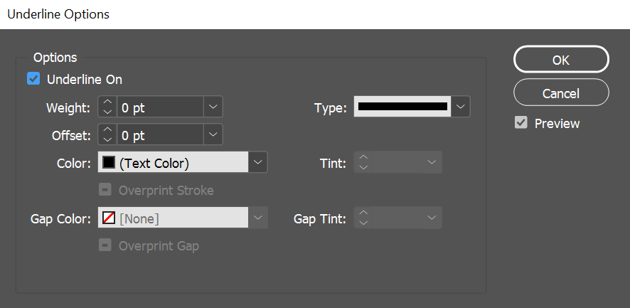
You can't: make round ends; reposition the underline and strikethrough line; change the thickness of the line.
-
Hi, Please, open the attached document and press <ENTER> to create a new line. Decorations settings suddenly dissapear. My first intention was to create character style which will create negative numbers (white text on black background). But, because Publisher doesn't have decorations on character level and also doesn't have some features for underline and strikethrough like InDesign has (see attachment), I created this line using paragraph decorations. This is not a solution because text after the number must stay Regular, not negative. I know I can use Wingdings font for this purpose, but it is limited to numbers up to 10. Please Affinity, add Decorations on character level. decorations.afpub

-
OK, I challenge you to meet each other tomorrow, November 26th, 2024 at OK Corral at High Noon to settle this out.
-
If they don't want it, why the didn't delete it instead of putting it outside the artboard(s)? They could make it an asset and use it anytime they want instead of keeping it outside document area.
-
Something off topic: After INDEX, INTRODUCTION... tabs and page numbers should be (in your case) Italic not Bold or Bold Italic.
-
If you move it on an artboard, you will see it when you select that artboard.
-
On the screen. If you move it on an artboard, you will see it when you select that artboard.
-
That silly file was placed for another reason, not for asking a new "artboard palette" feature. At the end, me and you have totally different way of thinking and if we continue to discuss it further, it will become part of a "Guiness world of records" of thread length.
-
No, it is not. The artboard panel must exist to avoid confusion in the layers panel. Imagine you have 10+ artboards with 10+ objects on everyone of them. You will have to collapse and expand artboards to manipulate the objects. If you have artboard panel, you see only the list of the artboards and you just click to any of them to see the objects and work with them easily.
-
In Artboards panel you see the list of all artboards. If none of them is selected you see nothing in the layers panel. If you select one of them you see only its objects in the layer panel, but on your screen you see all artboards and all objects you placed on them even the objects outside of the artboards (depending on your zoom level).
-
Comparing to Publisher where you have facing pages or multiple pages in a spread: If you select one page, the other page(s) are still visible and you see everything on these pages in the document window but only layer(s) of the selected page in the layers panel.
-
1. Of course, because they will exist in the Artboard panel only. 2. They would be visible as the pages are visible in Publisher.
-
The best way is to "Place" it, not with Copy/Paste.
-
List of Artboards, as the list of the pages in Publisher. And, when you click on certain artboard you can see its content in the Layers panel.
-
Thanks Thomaso, but this is too complicated. Some features in the apps are not so easy to understand how to use them.
-
This is just for testing purposes. I thought it would work as easy as you put an object over 3 page spread in Publisher, but obviously, it didn't. And then, there is another confusion with Artboards. They deserve their own panel. They are not layers, but objects (something like pages in Publisher) that can have their own layers.
-
Thank you for the answer, but can you offer me a solution? I can't make it parent layer.