Bit Disappointed
-
Posts
550 -
Joined
-
Last visited
Everything posted by Bit Disappointed
-
 I don't think there is, no.
 -
Of course - it's an obvious workflow improvement, especially for complicated gradients that need to be fine-tuned. It always annoyed me that I had to go through such heavy adjustment workflows when it could be done much, much faster and easier. Conversely, one should try to argue that it shouldn't be possible (like today), but that you have to adjust each stop manually and time-consumingly, or destroy the vector with a rasterising adjustment layer or other cumbersome workarounds. That's not how professionals work.
-
Which also rasterizes output and is a clumsy time robbing work around. Requesting a simple, efficient and fast method to adjust all individual nodes in the actual gradient inside the object directly after years of only having such work arounds at my disposal. I think Serif understands. 🙂
-
I already use adjustment layers in simple designs that will be delivered in bitmap format. Adjustment layers rasterize the object upon export to vector formats so I can't use them that much. I am requesting an easy way to adjust a gradient in a vector object directly - and fast. 🙂 I will sometimes make up to a hundred gradient adjustments to make an illustration appear natural. Sometimes more, sometimes less.
-
I edit a lot of gradients on a lot of objects, either after copy styling to a new object or I do it on a lot of duplicates, to either vary a tiny bit from each other to give an illustration a more natural look, or simply to adapt a copy of an element to different lighting conditions or give it a colour cue to fit into the part of the illustration it has been moved to. I miss the ability to adjust hue or saturation or lightness for ALL gradient stops by simply dragging the slider for e.g. hue when the object is selected. Could also be great if it worked on a selection of objects with gradients (could even then apply the change to the fill on objects with no gradient). Couldn't this be an option with a modifier, Command + drag slider, whatever? It would really be a life saver for me. This might be of most value in scenarios where some nuance or saturation errors around a design need to be corrected on a number of objects, perhaps even close to deadline and under pressure. Technically, it must be doable within reason, and therefore perhaps a low-hanging fruit. 🙂
-
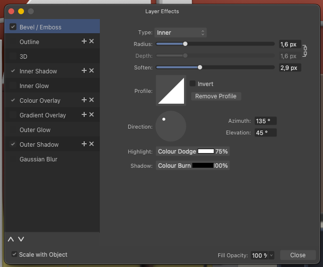
I suggest a Reset/Clear/remove all effects button in this dialog. It's tiresome to start over for example when the object is a copy of an object with several fx you don't need in the copy. As there is no OK Cancel options in this dialog a confirmation dialog is mandatory.

-
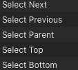
I forgot to mention this use case for "Select all on current level" (fx nested under an object") - I use this very often when I have modified an object inside a group or nested inside an object, and need to quicly select the rest of the objects and paste the style or FX to all objects on that exact level.
-
This suggestion would be even better in full screen mode.
-
I'm a little surprised that all blending modes have shortcuts, when some of the more common operations don't have shortcuts on the iPad, which I use non-stop with a keyboard when I'm not in the office, because it's so time-consuming and interruptive to use the tablet interface, so here's a suggestion - as an example: Select commands! Especially Select parent - a life saver when I have selected a child element by accident - and in many other scenarios. Firstly, it will make it easier and faster to use an iPad Pro with a keyboard - and even better, it will enable you to take your work routines and muscle memory from the desktop with you when travelling, visiting work, on planes and in public transport. And just focus on working - not stumbling around in user interfaces. And, please, as suggested seperately, add a "Select all on current level" (fx nested under an object" - I use this very often when I have modified an object inside a group or nested inside an object, and need to quicly select the rest of the objects and paste the style or FX. Thanks! 🙂
-
Hey @Sean P ESC works with a regular selection of objects, but if I select some text in a text frame, ESC has no effect. In Affinity for desktop, the first time I press ESC, it deselects the text selection and the second time it deselects the text frame. I think that scenario should also be handled by ESC. 🙂
-
Just verified both control + D as well as ESC on a non-Apple keyboard, both now works, thanks! Expect them both to work as well when I will verify on the much lighter and better Apple keyboard later this evening.
-
Oh yes bot here and in the layers panel - in fact in any panel with complex and hierarchical content. It's no wonder the wish pops up here again and again, it's incredibly difficult to work without it.
-
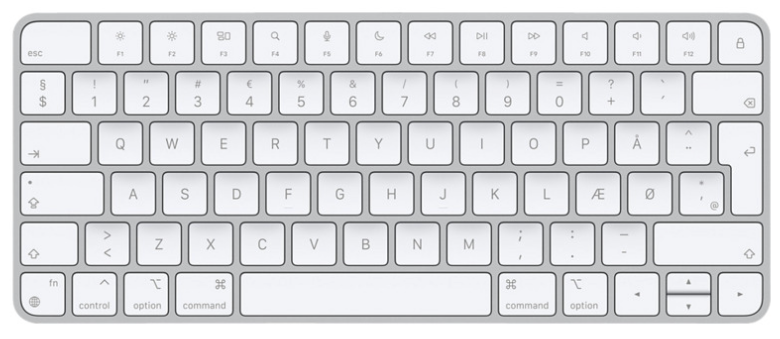
If there hadn't been an ESC key on my Apple keyboard, I wouldn't have had time to report here, but would have been standing from morning to night throwing rotten eggs at Apple's windows in Cupertino. I use this magic keyboard for all Macs and iPads with my iPad Pro 2022 🙂 https://www.apple.com/shop/product/MK2A3LL/A/magic-keyboard-us-english Both most recent models
-
Hi Serif staff Since the beginning of Affinity, the icon for converting to curves in desktop applications has looked like this: In other words, both an icon that tries to illustrate the functionality - and then a very wide text description on top of it. This is a rather extensive and unnecessary waste of screen space for a functionality that is presumably mostly used by experienced customers who can make do with less, and who most importantly understand a simpler and smaller toolbar button. On top of that, the icon as I remember it looks different in the iPad applications, here it is just an icon, but a completely different icon with a triangular symbol. I didn't realise until late that the triangular icon was actually convert to curves, and this confusion is natural when different icons represent the same functionality. I therefore suggest that you reduce the toolbar button to just a square graphical icon with no text and standardise the icon between the desktop and iPadOS versions of Affinity.
-
Look closely and you will see some relations and similar workflows.
-
I did - not the same, at all. Like in not at all. Those are resample algorithms only used for resizing the document during the export. Applied only when you change the output size, that is. Output sharpening is for all types of export and could also be an option in a print dialog for that matter. Output sharpening is applied to an image even if it is not resized during export. The purpose of output sharpening is not just to compensate for the softness that may occur due to resizing (like the algorithms with geeky names you refer to), but also to enhance the perceived sharpness of the image for its intended output medium. For instance, an image being prepared for web display might benefit from different sharpening settings than one being printed on a high-quality photo printer, even if the image dimensions remain unchanged. The sharpening is adjusted based on the characteristics of the output device and the viewing conditions. It’s about optimizing the image for the final presentation, regardless of resizing. Output sharpening is for applying a type of sharpening for the actual output media - can be quite extreme sharpening for some types of print. (Optimally) output sharpening is tailored to the output Medium: It is usually tailored to the type of output you're preparing the image for, such as screen display, glossy or matte paper, etc. Each medium displays sharpness differently, so the sharpening is adjusted accordingly. Users can often adjust the intensity - amount of sharpening applied - from low to high, depending on how much is needed for the particular image and output method. Output sharpening is the final polish on an image before it is shared, ensuring that it looks its best on whatever medium it is presented. In Lightroom it is kept simple: Capture One Professional: Personally I would prefer these options in Affinity - some I could configure myself.
-
Configurable Output sharpening in export dialog and persona, yes please. For print, web and screen. Not as live sharpening layers in the image itself (work arounds) in every single document - no, as options during export than can be saved and selected exactly there.
-
Let me put it this way: the spiral tool came in handy for a rather complicated illustration I was doing, but I would have done the work without it in a reasonably short time. Spiral tool is great for those rare occasions when I personally need it. I'm about to generate several hundred shapes in transitions that can only be meaningfully generated by a competent and configurable blend tool. And tomorrow I have to do the same again in another illustration. And again on Monday in a third illustration. And so on. It's a permanent need for me. So I have to go to another program to do it, but not everything is suitable for this round trip. So for me, +1 is not enough of a statement. I really, really seriously need a blend tool and really, really miss it.
- 219 replies
-
- 2
-

-
- blend tool
- blend
- (and 1 more)
-
I had to convert some shames to curves to scale some objects when pasting an object in another illustration - very silly now that I had ticked scale with object on both stroke and FX and THEY were scaled correctly.
-
I hope this will be fixed in the next release, it is super annoying. 😞 Not working in current beta.
-
@Ash thanks for the clarification, I asked because I was led astray by the behaviour of the pen tool in the app for months: If I draw a curve and move the pen away from it, and the status bar on desktop apps says "Drag to create staring point of new curve", the previous layer is deselected when I create the second node in the new curve. I only noticed this today when reading your answer and investigating a bit. In the iPad version, there is no status bar by default that tells you this, and I thought I continued to draw in the previous curve because it was still selected when I created the first new node, and therefore pressed the X icon constantly during tracing which is super annoying. But apparently not necessary. Is there a reason why the previous curve is only deselected when you put the second node in a new curve?
-
Hi @Sean P Could you add to this bug - or make a separate is that is how you work - that hitting the ESC key should also deselect a selection. This is not a configurable action, this is how it works in Designer for macOS. Thanks!
-
I see this a lot in Affinity Designer with hand traced curves - and I see it less in other programs. Almost got used to it, expect it and I correct it almost subconsciously. But it's an algorithm weakness that should definitely be significantly improved in Affinity.
-
This reminds me that I miss a story editor / text persona in Publisher for working with text and styles exclusively with great performance and total focus on the actual text which is key when working on text heavy documents also in the DTP stages and finalizing stages.