Bryan Rieger
-
Posts
329 -
Joined
Everything posted by Bryan Rieger
-

Variable Font Support - Kerning Issue
Bryan Rieger replied to Bryan Rieger's topic in Other New Bugs and Issues in the Betas
Yeah, it was originally created in 2.4. Using the static font. Disabling the static font and then enabling the variable font seems to have caused this problem. I can see folks who have used static versions of fonts in the past wanting to migrate documents to variable versions if possible. -
Variable Font Support - Kerning Issue
Bryan Rieger replied to Bryan Rieger's topic in Other New Bugs and Issues in the Betas
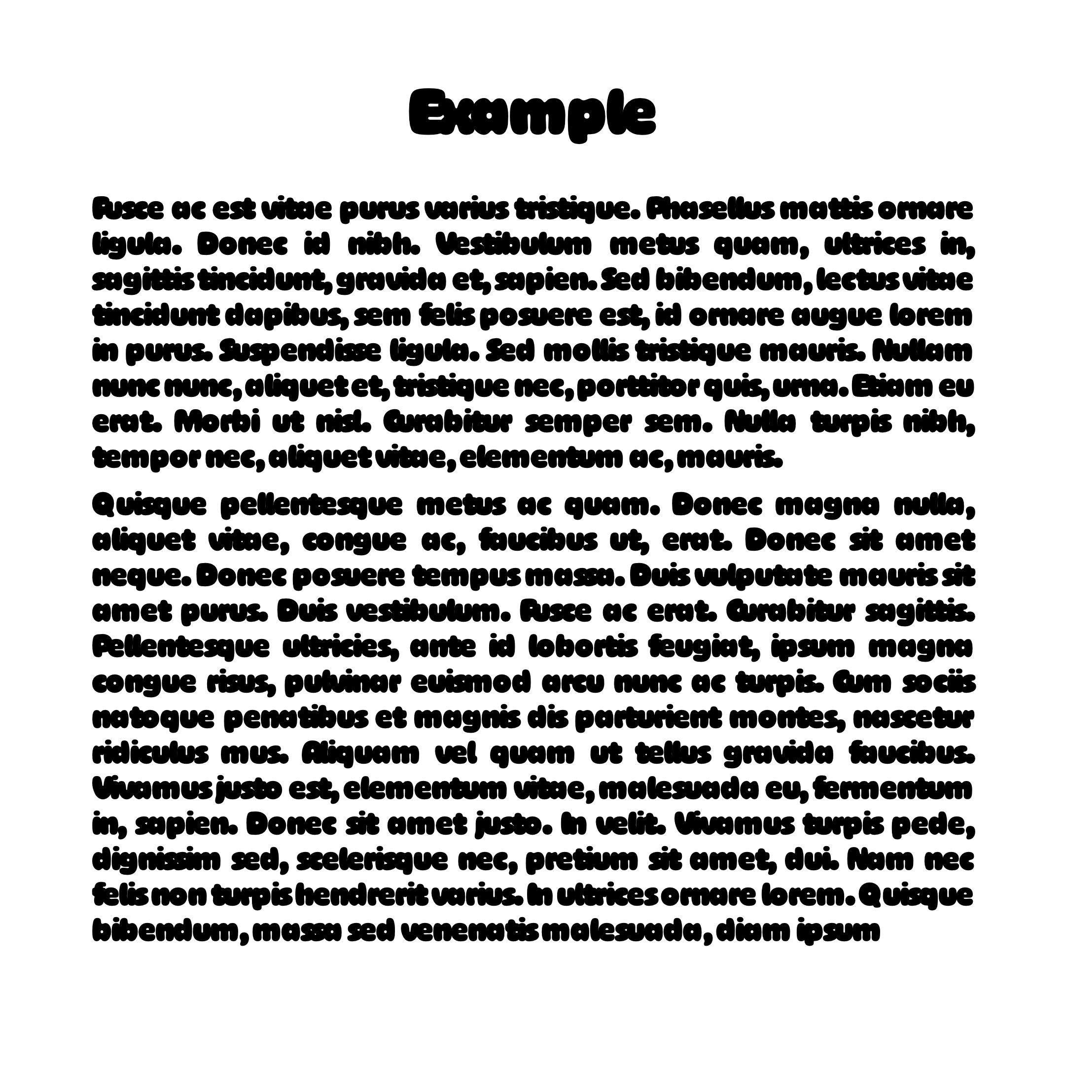
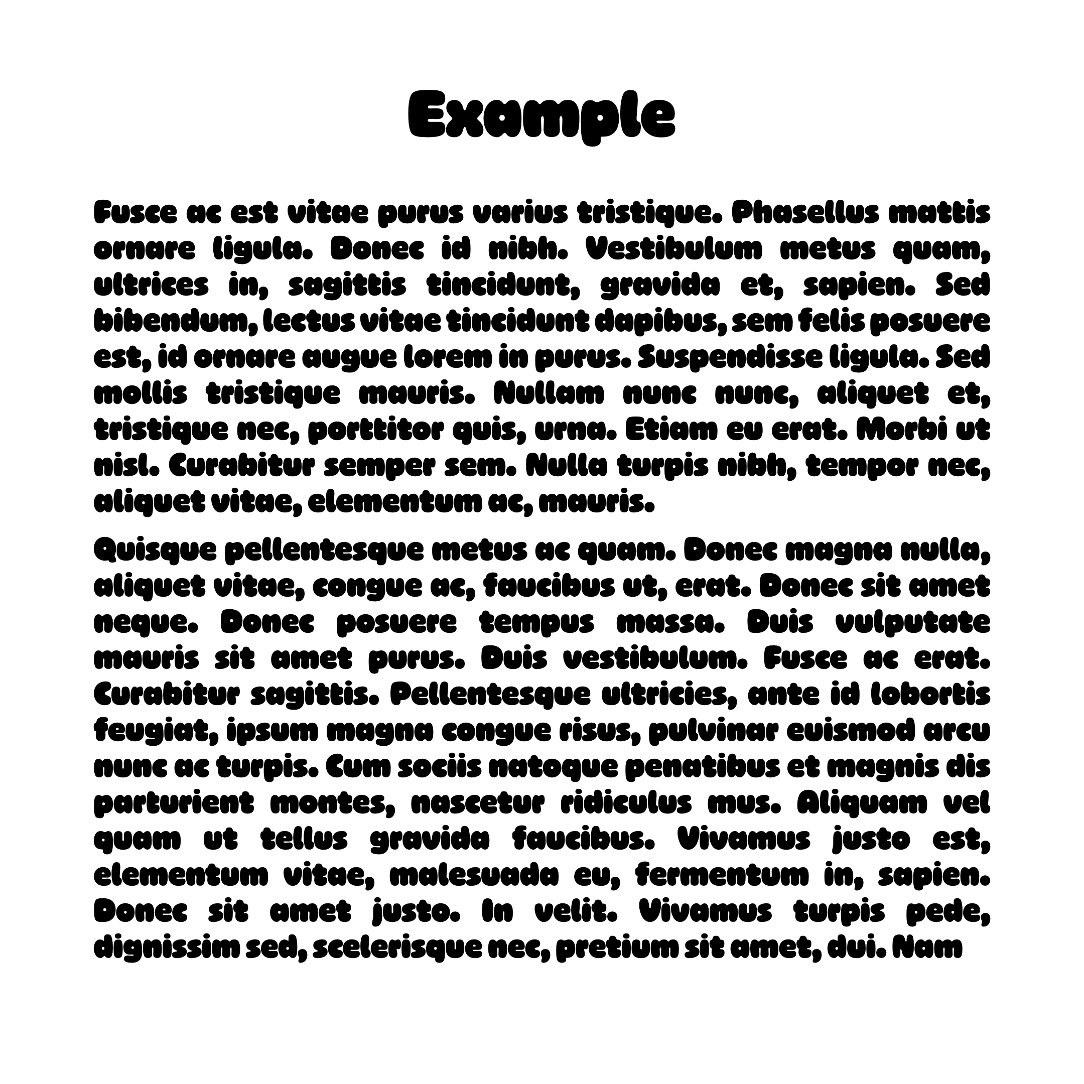
Sure thing @Pauls. I've attached an example file here. FWIW The Example.png file is what I see in Designer using variable fonts (see Example_static.png for static fonts), but I have no idea what is happening with the exported PDF using variable fonts (attached) as the font is the wrong weight—but at least it's legible. The font used is Ohno Softie Variable from Adobe Fonts. Example.afdesign Example.pdf
-
+1 I think this is a great idea.
-
Yes, but it's not flagging it as an incorrect font regardless. Also, as folks move their existing documents from static fonts to variable fonts, no doubt this 'user error in configuration' will come into consideration.
-
FWIW I had some weirdness in Affinity where I had one document I had opened that used a static version of a font, while I then created a new document that used the variable version (but only having the static or variable version of a font active at one time). I ended up Affinity picking up the 'correct' font, but there were visual glitches in terms of tracking, kerning, metrics, etc. Even copying between Affinity documents was creating some confusion. I'm not entirely sure if this problem is down to only some variable fonts, or if it's potentially a larger problem in the way that Affinity handles these fonts in general. I'll do some more testing later, and try to come up with a solid reproducible test case.
-
I've got maybe a dozen fonts installed beyond the standard macOS font set.
-
I've noticed some issues with some variable fonts, such as Ohno Softie (Adobe Fonts) where the kerning and tracking is way off from the actual settings. Apple Pages renders the font as you would expect, while Affinity squishes everything (and often inconsistently) together. Example from Apple Pages (above) and the same text in Affinity Designer (below).
-
There's a noticeable lag with variable fonts (it's there with regular fonts too, it's just not as noticeable) where the text is fuzzy (like a highly compressed JPG) for a moment before it sharpens while being edited/resized/etc. I realize this was probably designed this way for performance reasons, but it's rendered fuzzy for just long enough to be distracting. macOS 14.4, MBP M1-Pro, 32GB.
-
Pencil Tool Improvements
Bryan Rieger replied to Ash's topic in 2.5 Beta New Features and Improvements
I think so, as it was in relation to @Frozen Death Knight's comment (see above) to "press ctrl/cmd to temporarily active the Node Tool when using the Pencil Tool". Yes, I know where everything is in relation to the context bar (both v1 and v2) and the slider in v2. My comment is in relation to the Command Controller (aka the asinine keyboard shortcut joystick thingy) not being a great experience when drawing with the pencil in the iPad, and was directly related to the comment I quoted. -
Adding another one. Crashing on start-up. log.txt
-
Pencil Tool Improvements
Bryan Rieger replied to Ash's topic in 2.5 Beta New Features and Improvements
Yeah, unfortunately that is a really poor user experience (even on the desktop). One of my biggest gripes with v2 on the iPad was the removal of the bottom context bar (it desperately needed a redesign, as well as the option to be hidden/minimized, but it was useable) for the addition of the asinine keyboard shortcut joystick thingy. The iPad is not a desktop computer, and using that silly virtual joystick thing completely takes me out of the drawing experience as I have to look at it each time I use it to remember where each of the virtual keys are, and often where the trigger is in the first place. -
I've had a few crashes lately with 2.4.2 when Designer is just sitting idle for a bit. Here's the log from the latest crash. log.txt
-
Made with Mischief like ability
Bryan Rieger replied to Jt_moreno's topic in Feedback for the Affinity V2 Suite of Products
Mischief was really neat, but unfortunately it was bought and killed by Foundry. FWIW Concepts is very similar, alive and well, and available for many platforms. Edit: actually, I just checked and their ability to zoom stops at 1600%. The Affinity apps can zoom in MUCH more. -
It requires you to enable 'Transform Objects Separately' in the top control bar (see below). If '=' is only ever available/permitted when 'Transform Objects Separately' is enabled, then maybe it would make sense to enable it automatically if somebody types '=' into a field for that transformation only. Adding a little 'toast' animation or some sort of indication that 'Transform Objects Separately' has been applied would be helpful not only to provide feedback, but to aid in further understanding of how the feature is intended to work.
-
Pencil Tool Improvements
Bryan Rieger replied to Ash's topic in 2.5 Beta New Features and Improvements
I noticed some weirdness with the auto-close feature when zoomed in (see video below). It gets harder to not only see the 'close loop', but to also trigger the auto-close feature the more you zoom in. This is especially noticeable on the iPad, to the point where I didn't think auto-close was working at all. I routinely work at zoom levels of 400% or higher, and this appears to be the point where the auto-close feature begins to get wonky. CleanShot 2024-04-19 at 16.17.54.mp4 -
I just wanted to say thank you for adding the ability to move width profile points along the curve. It's the little things that make such a difference. It's especially welcomed while working on an iPad with an Apple Pencil. CleanShot 2024-04-19 at 13.43.24.mp4
-
Pencil Tool Improvements
Bryan Rieger replied to Ash's topic in 2.5 Beta New Features and Improvements
So, the pencil tool improvements are great, and after a few hours of using them I'm finding that they enable me to stay in the flow while longer drawing as I'm not having to constantly shift to the node edit tool to clean up extra nodes and reshape curves. However, the one thing that keeps pulling me out of flow now is sharp corners, as there is no way to specify one while using the pencil tool, so once again, I have to grab the node edit tool in order to make those changes. I was hoping that if while drawing I slowed and stopped for a second at a corner it would take that as an intent to create a sharp corner/change of direction, from which I could then continue drawing. Adobe Illustrator on the iPad uses a similar technique when using the pencil tool where when you slow and stop for a moment it displays a small pulse animation at the location of the corner to provide feedback that it has created a corner node, from which you can then continue drawing. The other thing that Illustrator on iPad does that's insanely helpful is they provide a small contextual toolbar while drawing that enables you to quickly move between the pencil and the node tool and modify nodes and curves as you go (as well as access common features). It's a great feature, but unfortunately the rest of Illustrator on the iPad is a dog's breakfast. -
The width tool isn’t locked to nodes as you can drag anywhere on the curve to change the width profile. So you’d either need to radically change the node edit tool, or require a new width specific tool. Also hiding features behind keyboard shortcuts obscures them, and impedes discoverability—especially on the iPad where keyboard shortcuts (or that weird Affinity shortcut control) are not something most users are familiar with.
-
And let’s not forget that you can also use velocity to set ‘pressure’ (ahem, profile) values. Improving naming/labels here would go along way to creating a consistent mental model of what all these tools are doing. Defining the line/curve width profile.
-
Pencil Tool Improvements
Bryan Rieger replied to Ash's topic in 2.5 Beta New Features and Improvements
Below is a video showing drawing with the pencil with Sculpt and auto-close enabled. As you can see when sculpt mode is active, auto-close doesn't work. Also having the pencil turn into a 'node manipulation' tool is kinda weird. I like the '+' aspect of the cursor, but the pointer doesn't really match the action. Perhaps using the pencil icon with a + symbol when sculpting/adding to/continuing from a path/curve makes more sense? Untitled.mp4 -
Pencil Tool Improvements
Bryan Rieger replied to Ash's topic in 2.5 Beta New Features and Improvements
Yeah, I miss that effect a lot, but I'd prefer it to be more of a non-destructive vector effect (sort of a mix between the contour tool and layer FX) so that you could always go back and edit the effect as and when needed. Also see 'pucker, bloat, splatter, block shadow, offset, etc'. Roughen also isn't an effect that should be limited to the pencil tool, as using it with paths/curves/shapes drawn with the pen tool, shapes and fonts would also be desirable. -
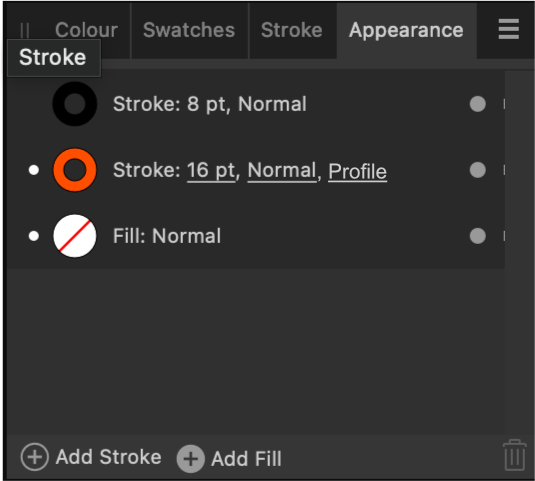
One other thing to consider is renaming the 'Pressure' graph in the Stroke panel to Profile, as it's not always reflective of what controller/data (velocity, pressure, etc) is affecting the width profile of the stroke. Also, the Stroke pressure graph itself has a button labelled 'Save Profile', so simply renaming it to profile would make it much clearer. Then adding a 'Profile' attribute in the Attributes panel (see my previous post) to indicate strokes that have profile data applied would make things much clearer for users. The profile controller (see above) in the pencil tool can be set to velocity, pressure, etc, while the Stroke profile graph (see below) uses inconsistent language with the profile graph always labelled 'Pressure', with the 'Save Profile' button confusing things further. Using consistent language and labels will help user understanding.
-
Oh, that does help, but it's not overly intuitive as there's no indication in the appearance panel that the stroke has a width profile associated with it. Perhaps adding another attribute such as 'Profile' (see mockup below) could help to indicate that the stroke has additional width/profile data associated with it? Addendum: I added a few more thoughts on the overall stroke width 'Profile' UX in another post.
-
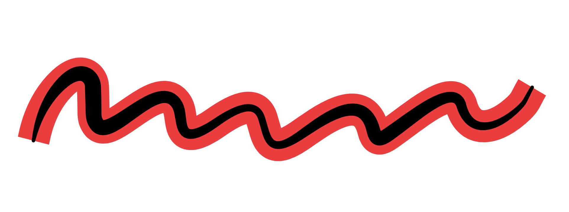
The contour from the line width tool isn't automatically carried over to additional strokes that have been applied to a line/curve, making it difficult to create an outline that matches the existing line contour. It is possible to select the another stroke and set line widths for it (which is very nice), but being able to apply the existing line width settings applied to additional strokes would also be helpful. Above: Current line widths are not applied to additional strokes. Above: An additional stroke with separate width settings applied to the same curve (very nice).
-
Variable Font Support Discussion (split)
Bryan Rieger replied to fde101's topic in Beta Software Program Members Area
For SVG you can use variable fonts if the rendering application supports it. ie: you can use variable fonts in most web-browsers available today. For other contexts such as importing into other applications; CAD, 3D tools, cutting tools, etc I suspect most SVG implementations in these contexts won't support variable fonts and converting text to curves will likely produce much better results.