sansnom
-
Posts
360 -
Joined
-
Last visited
Everything posted by sansnom
-
@KarinC, sorry!… I intentionally blurred my visual. But ask @jmwellborn, @Xanadu and especially @Circulus. For my part, I withdraw, not thinking that my original assembly would provoke so much reluctance. But hey, the time is for reversals of minds and priorities.
- 14 replies
-
- 1
-

-
- affinity designer
- texts
- (and 2 more)
-
I apologize for this post which was simply intended to illustrate the indignation of more than a thousand English musicians in the face of a threat to culture here as everywhere else, with a composition which paid tribute to them through a simple graphic play... That's all. 😶
- 14 replies
-
- 4
-

-
-

-
- affinity designer
- texts
- (and 2 more)
-
@Circulus, you are talking about politics: we are talking here about musical culture and only musical culture. We do not, a priori, have the same values. And when I look at all these English artists, I see all my heroes.
- 14 replies
-
- 2
-
-
-
- affinity designer
- texts
- (and 2 more)
-

- 14 replies
-
- 5
-
-
-

-
- affinity designer
- texts
- (and 2 more)
-
@Patrick Connor, sorry... I'm a bit lost with Serif, but I maintain my attachment to these softwares. Good luck.
-
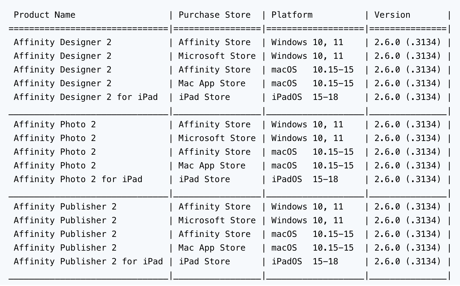
🇬🇧 ...(Google translate, sorry) some very personal remarks that only commit me. I try to be careful, but I still have questions. • The delivery of version 2.6 includes an AI function. Mastering such an innovative and new technology may not be given to just anyone. • The overhaul of the management of pages and boards in Publisher with this version 2.6 took a lot of time and does not seem perfect in use to date: it is perhaps that the programming base had not anticipated such an evolution, an evolution that is nevertheless essential for any page designer of books and other multi-page paper media. • If we look at the number of versions of the software in the suite (see the table below), maintaining these 15 variations is perhaps a very (too) complicated undertaking. • The acquisition of one company by another is often a major destabilizing factor for companies and their employees. The arrival of Canva in the equation, with certainly its own technical and financial requirements, may have insinuated doubts and questions in the minds of both companies. And it is indeed the giant CANVA that bought Serif. • Offering the software of the suite for free (for a period of 6 months) is commercially attractive, but one can wonder about the loss of revenue that this implies. A loss of revenue that can lead to a restriction of human resources for IT development. Similarly, offering for the purchase of a single license the 15 variations a single price, without additional cost for the user. • Reliability problems, from yesterday (still not resolved to this day) as today with this version 2.6, all software have them. But, if we read here on this forum so much negative feedback from users, we can legitimately ask ourselves questions about the reliability of the suite. • Finally, offering an identical software solution to two categories of users (image professionals and individuals at home) may not make sense, since these two categories of users do not have the same requirements and expectations at all. I therefore remain cautious when using this valuable software suite that I love for the individual work of an individual at home, with a long experience as an image professional. 🇫🇷 ...quelques remarques très personnelles et qui n'engagent que moi. J'essaie d'être prudent, mais je me pose quand même des questions. • La livraison de la version 2.6 comprend une fonction IA. La maitrise d'une technologie aussi innovante et nouvelle n'est peut-être pas donnée à n'importe qui. • La refonte de la gestion des pages et des planches dans Publisher avec cette version 2.6 a pris énormément de temps et ne semble pas parfaite à l'usage à ce jour : c'est peut-être que la base de la programmation n'avait pas prévu une telle évolution, évolution pourtant indispensable pour tout metteur en page de livres et autres supports papier multipages. • Si l'on regarde le nombre de versions des logiciels de la suite (voir le tableau plus bas), maintenir ces 15 déclinaisons est peut-être une entreprise très (trop) compliquée. • Le rachat d'une société par une autre est souvent un gros facteur de déstabilisation pour les entreprises et leurs employés. L'arrivée de Canva dans l'équation, avec certainement ses propres exigences techniques et financières, a peut-être insinué des doutes et des interrogations dans les esprits au sein des deux sociétés. Et c'est bien le géant CANVA qui a racheté Serif. • Proposer gratuitement (pour une période de 6 mois) les logiciels de la suite est commercialement attractif, mais on peut s'interroger sur la perte de revenus que cela implique. Un manque à gagner qui peut amener à une restriction des ressources humaines pour le développement informatique. De même que proposer pour l'achat d'une seule licence les 15 déclinaisons un seul et même prix, sans surcoût pour l'utilisateur. • Des problèmes de fiabilité, d'hier (toujours pas réglés à ce jour) comme d'aujourd'hui avec cette version 2.6, tous les logiciels en ont. Mais, si on lit ici sur ce forum autant de retours négatifs des utilisateurs, on peut se poser légitimement des questions sur la fiabilité de la suite. • Enfin, proposer une solution logicielle identique à deux catégories d'utilisateurs (professionnels de l'image et particulier à la maison), n'a peut-être aucun sens, tant ces deux catégories d'utilisateurs n'ont absolument pas les mêmes exigences et attentes. Je reste donc prudent quand j'utilise cette précieuse suite logicielle que j'adore pour les travaux individuels d'un particulier à la maison, avec une longue expérience de professionnel de l'image.
-
 @IItirtartar: “Now everytime I open Designer a window pops asking me to update to 2.6.0. I looked for an option to disable update checks, and I didn't find it. Nice. Did I miss it? Does somebody know if update checking can be disabled somehow, please? ” If you've already launched and used version 2.6.0, reinstalling version 2.5.7 "might" cause problems, I think, but that's just my opinion. So, be vigilant. For my part, I went back to version 2.5.7. But, I had previously saved my configuration on an SSD, just in case. Here are the files and folders on macOS that make up the Affinity apps installation. Again, this is just my experience and I was able to get my 2.5.7 apps working again, just like before trying this 2.6.0 version: In the "Preferences" folder, three files: “com.seriflabs.affinitydesigner2.plist”, “com.seriflabs.affinityphoto2.plist” and “com.seriflabs.affinitypublisher2.plist” In the "Applications Support" folder, three folders: “Affinity Designer 2”, “Affinity Photo 2” et “Affinity Publisher 2” In the "Group Containers" folder, then "6LVTQB9699.com.seriflabs": “v2”
 -
I'm afraid that with this episode number 6 of season 2 of the long-awaited Affinity Suite, we should exercise the utmost caution. The writers seem to have worked insufficiently on this new story and the introduction of a new actor in the person of Canva has, perhaps, shaken up the already established production process... Affinity.Suite.2025.S02.E06.NopFiNAL.DivX Otherwise, adopting the same attitude as with major macOS updates while waiting for versions x.3 or x.4, especially on production machines, seems to me to be responsible, even essential in order not to waste our time and nerves. In the meantime, I'm sticking with the previous version. #StayOn2.5.7 The next version can only be better and more solid.
-
Slow startup time?
sansnom replied to Morten_Hjort's topic in Pre-V2 Archive of Desktop Questions (macOS and Windows)
Parfait @Vladimok, j'espère que la situation va perdurer : je m'en vais de ce pas brûler un cierge... 🙂 -
Very pretty: this simplicity is definitely very elegant.
-
Slow startup time?
sansnom replied to Morten_Hjort's topic in Pre-V2 Archive of Desktop Questions (macOS and Windows)
...on pourra aussi appliquer le principe de précaution appliqué aux produits Apple comme à son système d'exploitation : attendre la version x.1 ou x.2 et laisser aux équipes de développement le soin de réparer les bugs relevés par la communauté devenue béta-testeur !… -
Slow startup time?
sansnom replied to Morten_Hjort's topic in Pre-V2 Archive of Desktop Questions (macOS and Windows)
🇫🇷 Bonjour @Vladimok, pour ma part, j'ai abandonné la recherche de solutions. Il faut dire aussi que je ne dispose pas d'un bagage exceptionnel pour trouver des solutions, mis à part une quarantaine d'années sur macOS qui ne suffisent pas devant ce fournisseur et ces outils graphiques si particuliers. Puisque l'on est entre nous, j'ai même imaginé récupérer les versions non-officielles des programmes pour voir si la situation évoluait dans un meilleur sens : mais, une nouvelle fois, j'ai abandonné l'idée. J'ai installé la version 2.6 hier soir, APRÈS avoir réalisé une solide sauvegarde sur SSD de ma machine. J'ai fait quelques tests qui ne m'ont pas convaincus et j'ai abandonné : j'ai réinstallé la version 2.5.7 et replacés tous les fichiers système par la sauvegarde. D'autant que si l'on suit quelques fils sur les forums, de multiples bugs sont toujours présents et de nouvelles fonctions ou implémentations semblent très “tordues”. Je vais partir du principe que la version 2.5.7 fonctionne bien sur ma machine et que j'ai maintenant confiance en cette version que je “maitrise”. Pour les fonctions avancées que l'on utilise tous de temps en temps, je passerai par d'autres outils ou d'autres bidouilles. Pour l'essentiel, et par rapport à mes besoins, cette version 2.5.7 est “viable”. Et puis, j'en ai marre de devoir me prendre la tête !… 🇬🇧 Hi @Vladimok, for my part, I have given up looking for solutions. It must also be said that I do not have an exceptional background to find solutions, apart from about forty years on macOS which are not enough in front of this supplier and these very particular graphic tools. Since we are among ourselves, I even imagined recovering the unofficial versions of the programs to see if the situation evolved in a better direction: but, once again, I gave up the idea. I installed version 2.6 yesterday evening, AFTER having made a solid backup on SSD of my machine. I did some tests which did not convince me and I gave up: I reinstalled version 2.5.7 and replaced all the system files by the backup. Especially since if we follow some threads on the forums, multiple bugs are still present and new functions or implementations seem very “twisted”. I will assume that version 2.5.7 works well on my machine and that I now have confidence in this version that I “master”. For the advanced functions that we all use from time to time, I will use other tools or other tinkering. For the most part, and in relation to my needs, this version 2.5.7 is “viable”. And then, I am tired of having to rack my brains!… -
Affinity Designer 2.6 update
sansnom replied to JabbaLeChat's topic in Feedback for the Affinity V2 Suite of Products
@thegary, this update was ALSO focused on PUBLISHER!… -
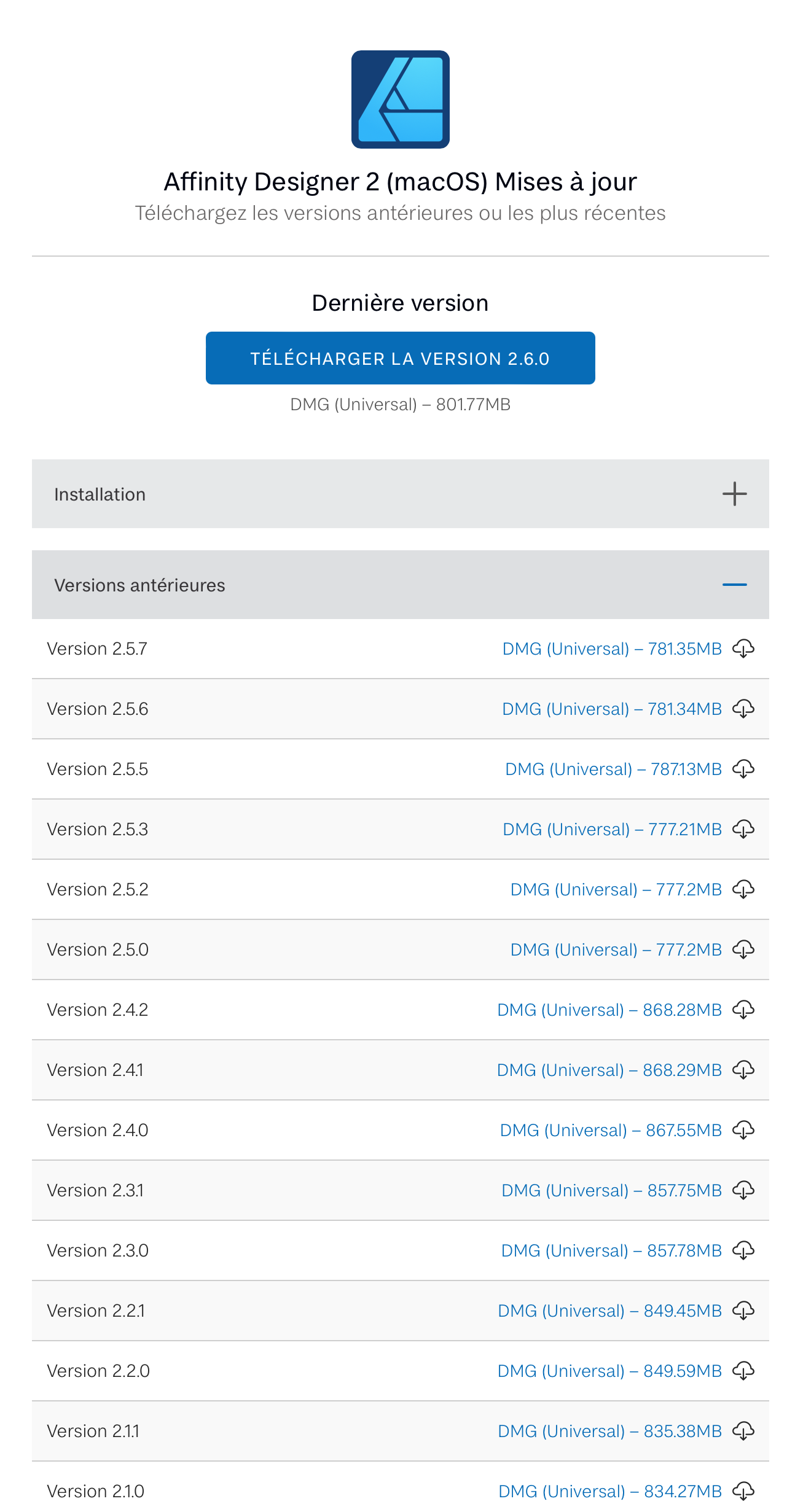
@HarleyN: https://store.serif.com/fr/update/macos/designer/2/ Sorry: in French. If you've already launched and used version 2.6.0, reinstalling version 2.5.7 "might" cause problems, I think, but that's just my opinion. So, be vigilant. For my part, I went back to version 2.5.7. But, I had previously saved my configuration on an SSD, just in case. Here are the files and folders on macOS that make up the Affinity apps installation. Again, this is just my experience and I was able to get my 2.5.7 apps working again, just like before trying this 2.6.0 version: In the "Preferences" folder, three files: “com.seriflabs.affinitydesigner2.plist”, “com.seriflabs.affinityphoto2.plist” and “com.seriflabs.affinitypublisher2.plist” In the "Applications Support" folder, three folders: “Affinity Designer 2”, “Affinity Photo 2” et “Affinity Publisher 2” In the "Group Containers" folder, then "6LVTQB9699.com.seriflabs": “v2”
-
Affinity Designer 2.6 update
sansnom replied to JabbaLeChat's topic in Feedback for the Affinity V2 Suite of Products
-
Affinity Designer 2.6 update
sansnom replied to JabbaLeChat's topic in Feedback for the Affinity V2 Suite of Products
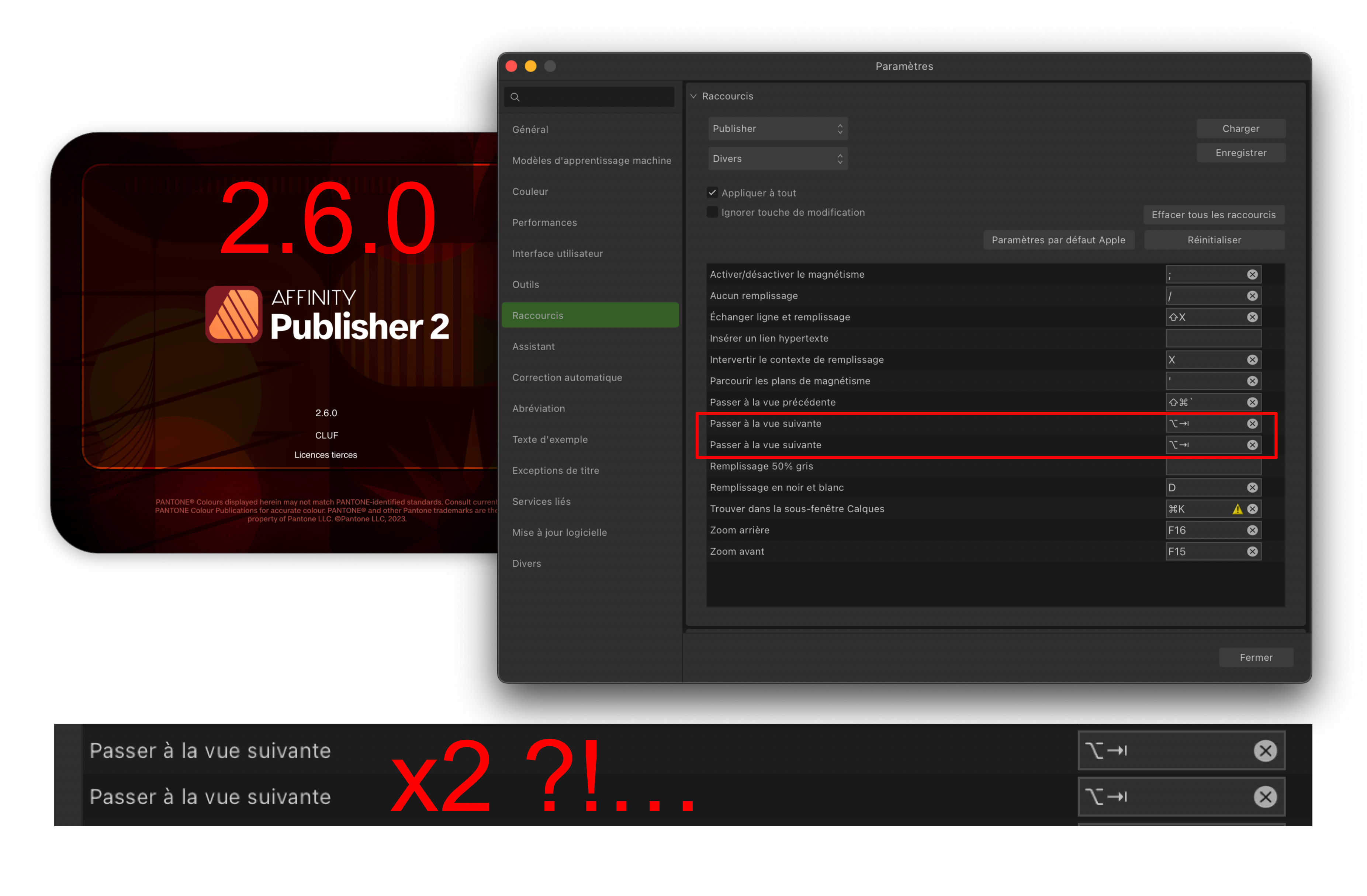
...actually, what puzzles me a little is that a small bug so simple to fix is not taken into account with this new release. But hey, everything seems to be going wrong and worse lately. @Chills, this is Mac: and this is French:
-
Affinity Designer 2.6 update
sansnom replied to JabbaLeChat's topic in Feedback for the Affinity V2 Suite of Products
Re-Oops!… But, there are certainly more important things to manage. We will wait patiently for version 2.6.1.
-
...with all these bugs revealed by users, and many thanks to the administrators of this forum who accurately inform us poor users, version 2.6 of the Affinity suite will not be released before Christmas 2025!... Good luck to the programmers to resolve all these reliability, functionality and ergonomics issues.
-
🇬🇧 I allow myself to react to this post as it reminds me how important our work is to us and how losing it can be dramatic. SERIF seems, a priori, aware of this problem. Well, okay. We take note and smile!… Building computer files, whatever the type or applications used, can require a lot of individual or collective investment, and for service companies that use these apps on a daily basis, they are forced to honor their contracts, under penalty of sanction or loss of trust from their customers. There is therefore an urgent need to consolidate your workflow, or even increase security. I know, I am stating the obvious. And this can also apply to non-professional users, at home. It may not be so ridiculous to implement very small actions in order to reassure everyone, the productive, their managers, the company directors and especially their customers. We can easily imagine some good habits: – Duplicate the file from the previous session by incrementing its name by one number and continue working on the new copy, or even apply this principle several times a day, the ideal being also to be able to document (text file listing the corrections and modifications or brief given by the client) all the actions associated with each file, – Duplicate the backups on different media, physical or virtual of course, or even multiply the sites geographically, – Having a USB key on hand can encourage you to plug it into your machine and drag a few files into it: it only takes a few seconds, – In the case of sending to the clouds, send in parallel a copy of the file compressed in .zip for example, the compression only takes a few seconds, – Since the purpose of prepress files is often export in .pdf format, it is not stupid to carry out this export during the mockup phase to validate the good quality of the file for the printer. Moreover, sending the current file to the client in .pdf is already a check of the integrity of the files, – Do not hesitate to quit the application on which you perform long tasks during the working day rather than carrying out an uninterrupted session for 8 hours without any interruption, – Remain vigilant when the application seems to malfunction with very long reaction times or the obligation to have to apply several times in a row the same command that normally works the first time. In this case, save the file by duplicating it, quit the application and restart the machine, – Give the application the maximum of the machine's resources so that it can "work" in the best conditions (do not launch a C4D rendering or a video conversion in parallel with the layout of a book on Affinity Publisher...). Finally, we cannot compare the "infinitely short time" to apply these few precepts to "that spent building the model of a book", for example. Michael Blechinger speaks above of a 200-hour document that can be lost: through (bad) experience, and certainly like others unfortunately, I had to deal with this situation and the entire production line had been broken. I then had to work several nights in a row to catch up on the situation!… You can't wish that on anyone. 🇫🇷 Je me permets de réagir à ce post tant il me rappelle à quel point nos travaux sont si importants pour nous et leur perte peut s'avérer être dramatique. SERIF semble, a priori, conscient de ce problème. Bon, okay. On prend bien note et on souri !… Construire des fichiers informatiques, quels que soient le type ou les applications employées, peut requérir énormément d'investissement individuel ou collectif, et pour des entreprises de service qui utilisent au quotidien ces apps, elles sont contraintes d'honorer leurs contrats, sous peine de sanction ou de perte de confiance de leurs clients. Il y a donc urgence à consolider son flux de travail, voire à multiplier les sécurités. Je sais, j'enfonce des portes ouvertes. Et cela peut s'appliquer aussi à des utilisateurs non professionnels, chez eux à la maison. Il n'est peut-être pas si ridicule de mettre en place de toutes petites actions afin de rassurer tout le monde, les productifs, leurs responsables, les dirigeants d'entreprises et surtout leurs clients. On pourra facilement imaginer quelques bonnes habitudes : – Dupliquer le fichier de la précédente session en incrémentant d'un numéro son nom et continuer à travailler sur la nouvelle copie, voire appliquer ce principe plusieurs fois par jour, l'idéal étant aussi de pouvoir documenter (fichier texte listant les correctifs et modifications ou brief donné par le client) l'ensemble des actions associées à chaque fichier, – Dupliquer les sauvegardes sur différents supports, physiques ou virtuels bien évidemment, voire multiplier les sites géographiquement, – Avoir sous la main une clef USB peut inciter à la brancher sur sa machine et à glisser quelques fichiers dedans : cela ne prend que quelques secondes, – Dans le cas d'un envoi sur les clouds, envoyer en parallèle une copie du fichier compacté en .zip par exemple, la compression ne prenant que quelques secondes, – Puisque la finalité de fichiers de prépresse est souvent l'exportation au format .pdf, il n'est pas idiot d'effectuer cet export durant la phase de maquette pour validation de la bonne qualité du fichier pour l'imprimeur. D'ailleurs l'envoi en .pdf du dossier en cours au client est déjà une vérification de l'intégrité des fichiers, – Ne pas hésiter à quitter l'application sur laquelle on effectue de longues tâches durant la journée de travail plutôt que réaliser une session ininterrompue durant 8 heures sans aucune coupure, – Rester vigilants quand l'application semble dysfonctionner avec de très longs temps de réaction ou l'obligation de devoir appliquer plusieurs fois de suite la même commande qui normalement agit du premier coup. Dans ce cas, enregistrer le fichier en le dupliquant, quitter l'application et redémarrer la machine, – Donner à l'application le maximum des ressources de la machine afin qu'elle puisse “travailler” dans les meilleures conditions (ne pas lancer un rendu C4D ou une conversion de vidéo en parallèle de la mise en page d'un livre sur Affinity Publisher…). Pour finir, on ne peut pas comparer le “temps infiniment court” pour appliquer ces quelques préceptes à “celui passé à construire la maquette d'un livre”, par exemple. Michael Blechinger parle plus haut d'un document de 200 heures pouvant être perdu : par (mauvaise) expérience, et certainement comme d'autres malheureusement, j'ai eu à gérer cette situation et toute la chaine de fabrication avait été cassée. J'ai dû alors travailler plusieurs nuits d'affilée pour rattraper la situation !… On ne peut souhaiter cela à personne.
-
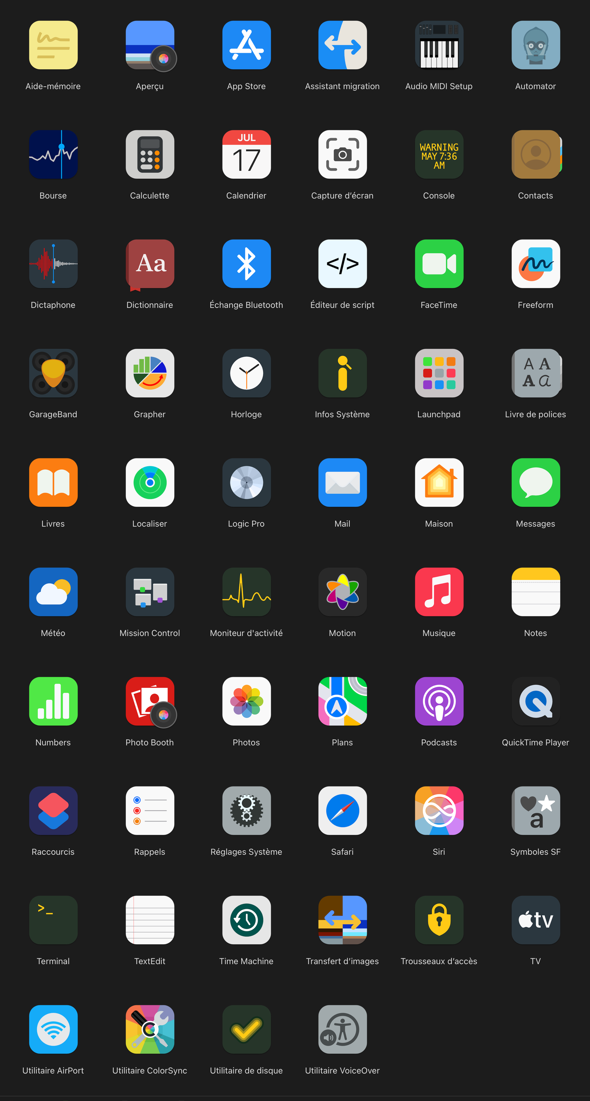
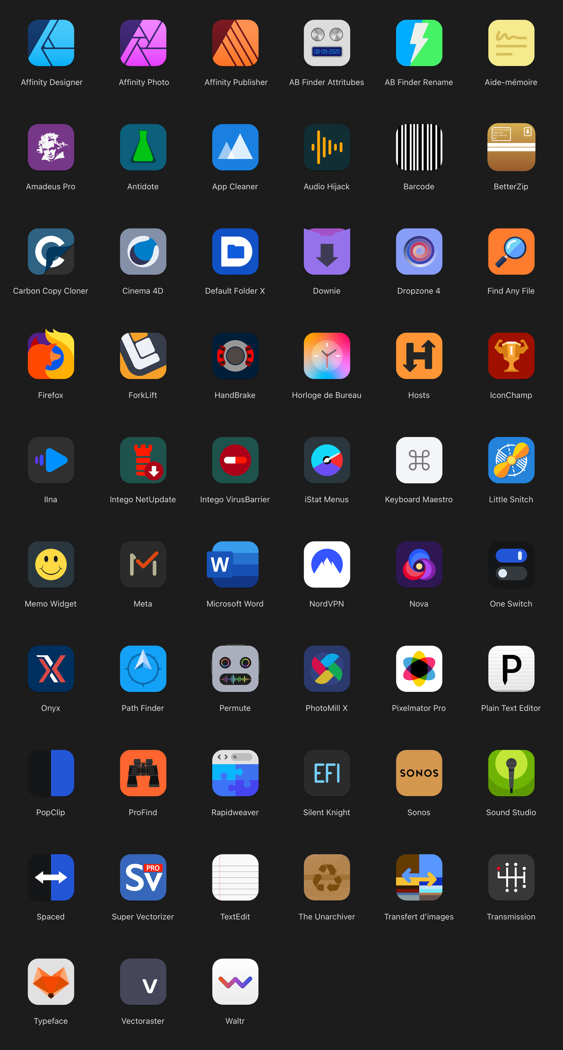
🇬🇧 Hi, Apple has delivered a new application called “Invitations”: we can’t say that aesthetically it is very rich. And yet, I find the graphic principle very effective visually by its simplicity. Here is a new take on Apple macOS icons and third-party applications. The game here was to redraw these icons without color gradients, without lines, effects, transparency, shapes or extra elements and with very little color. Appreciating (for fun) changing my interface from time to time, I took the opportunity to apply the same graphic charter for the folders which very simply take the shape of the applications (square with rounded corners). 🇫🇷 Bonjour, Apple a livré une nouvelle application qui se nomme “Invitations” : on ne peut pas dire qu'esthétiquement cela soit d'une grande richesse. Et pourtant, je trouve le principe graphique très efficace visuellement par sa simplicité. Voici donc une nouvelle reprise des icônes Apple macOS et des applications tierces. Le jeu était ici de redessiner ces icônes sans dégradé de couleur, sans traits, effets, transparence, formes ou éléments surnuméraires et avec très peu de couleur. Appréciant (pour le fun) changer mon interface de temps en temps, j'en ai profité pour appliquer la même charte graphique pour les dossiers qui reprennent très simplement la forme des applications (carrée avec coins arrondis). Set ICONS APPLE.zip Set ICONS APPS.zip Set SONOMA Stroke.zip
-
Long loading times: maybe a solution!…
sansnom replied to sansnom's topic in Feedback for the Affinity V2 Suite of Products
Perfect @carl123 and delighted for you and all PC users. I especially hope that the loading time does not vary between 8 and 10 seconds. Otherwise, Pixelmator Pro on M2 Pro launches in 2 seconds... and at each launch!… -
Slow startup time?
sansnom replied to Morten_Hjort's topic in Pre-V2 Archive of Desktop Questions (macOS and Windows)
Unsolved mystery, enough!… -
Long loading times: maybe a solution!…
sansnom replied to sansnom's topic in Feedback for the Affinity V2 Suite of Products
🇬🇧 Well, this solution is a failure: Serif applications definitely have random behavior at startup for my configuration. Finally, I think Serif has implemented its own programming and that other software vendors have followed the recommendations provided by Apple much better. NB: do PC users also have the same problem of loading times that are way too long? ... 🇫🇷 Bon, cette solution est un échec : les applications Serif ont définitivement pour ce qui me concerne sur ma configuration un comportement aléatoire au démarrage. Pour finir, je pense que Serif a mis en place une programmation qui lui est propre et que d'autres fournisseurs de logiciels ont beaucoup mieux suivi les recommandations fournies par Apple. NB : est-ce que les utilisateurs PC ont aussi le même problème de temps de chargement bien trop longs ?… -
Slow startup time?
sansnom replied to Morten_Hjort's topic in Pre-V2 Archive of Desktop Questions (macOS and Windows)
@yggdr4s17, I recently posted a "solution" that "could" work on your machine... Maybe... But hey... It is not perfect. -
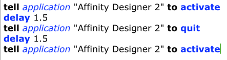
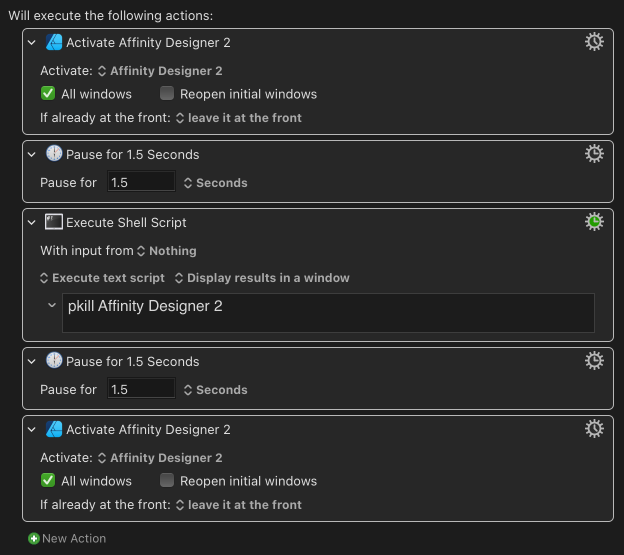
🇬🇧 Hi, like many here, we are very, very annoyed by the loading times of our “favorite apps” on macOS, Affinity Designer, Photo and Publisher!… There may be a solution to reduce these loading times that Serif does not seem to want to resolve by, for example, providing these “precious” customers with installers corresponding to the type of processor on their machine. According to the feedback from Serif technical support, it is the “size that matters” and the three apps have files that are too large and have difficulty passing the macOS Xprotect analysis. But hey… Before posting this post, I read a lot of posts on the same subject and carried out several tests on my configuration (Mac Mini 2023 M2 Pro with 512 GB SSD and 16 GB RAM) with my Mac turned off between each test, over several days. It works very well on my machine, except for Affinity Publisher which does not react like Designer or Photo!… Another mystery. The result is a loading time reduced to a few seconds and for each launch. The idea is therefore to modify the process of the FIRST launch of Serif applications on a new session: like me, many have noticed that in the same session, the SUBSEQUENT LAUNCHES were done in “reasonable” and normal times for apps on macOS (a few seconds). Normally, you open an application by clicking on its icon in the Applications folder, on an Alias or from the Dock. The solution I propose is a little different: 1 - a launch, 2 - quickly followed by a “kill” of the application, 3 - then finally a new launch of the same application. This process can be achieved by using the keyboard command “Force Quit Applications” (Command + Option + Escape) fairly quickly for phase 2 to force quit the currently loading application. A fairly simple AppleScript script (or a Keyboard Maestro macro) can automate this process and make it as efficient and discreet as possible, with very basic additional timing steps: 1 - launch the application, for example Affinity Designer, 2 - wait 1.5 seconds, 3 - force quit the current launch process, 4 - wait 1.5 seconds, 5 - launch the same application again. NB: I tried to reduce the waiting time between each command to 1 second, but this had adverse effects (1) on the application interface: therefore, do not go below 1.5 seconds. We can therefore program this sequence of actions with AppleScript or with Keyboard Maestro. Below are the commands to implement. For information, AppleScripts can be launched from Keyboard Maestro or with the FastScripts application for example. APPLESCRIPT : KEYBOARD MAESTRO : There you go, I hope this post will help you wait for Serif to wake up… If you notice any problems, please post your recommendations or warnings here. If the approach seems viable to you, you can also suggest your improvements or any additional information. (1) replacing the “com.seriflabs.affinitydesigner2.plist” file with a backup was required to find an operational interface. NB: my machine is running macOS Sonoma 14.7.3, with Stage Manager permanently enabled. I noticed that launching Serif suite applications caused the screen to display artifacts for a few moments with splash screens (zoom in, zoom out) and the windows of the current application or the Desktop!… 🇫🇷 Bonjour, comme beaucoup ici, nous sommes très, très agacés par les temps de chargement de nos “applications préférées” sur macOS, Affinity Designer, Photo et Publisher !… Il y a peut-être une solution pour réduire ces temps de chargement que Serif ne semble pas vouloir résorber en, par exemple, fournissant à ces “précieux” clients des installateurs correspondant au type de processeur de leur machine. Selon le retour du service technique Serif, c'est la “taille qui compte” et les trois apps ont des fichiers trop gros qui passent avec difficulté l'analyse Xprotect de macOS. Mais bon… Avant de diffuser ce post, j'ai lu beaucoup de posts sur le même sujet et ai réalisé plusieurs tests sur ma configuration (Mac Mini 2023 M2 Pro avec SSD 512 Go et RAM 16 Go) avec extinction de mon Mac entre chaque essai, sur plusieurs jours. Cela fonctionne très bien sur ma machine, sauf pour Affinity Publisher qui ne réagit pas comme Designer ou Photo !… Encore un mystère. Le résultat est un temps de chargement réduit à quelques secondes et pour chaque lancement. L'idée est donc de modifier le processus du PREMIER lancement des applications Serif sur une session nouvelle : comme moi, beaucoup ont constaté que dans une même session, les LANCEMENTS SUIVANTS se faisaient dans des délais “raisonnables” et normaux pour les apps sur macOS (quelques secondes). Normalement, on ouvre une application en cliquant sur son icône dans le dossier Applications, sur un Alias ou depuis le Dock. La solution que je propose est un peu différente : 1 - un lancement, 2 - suivi rapidement d'un “kill” de l'application, 3 - puis enfin d'un nouveau lancement de la même application. Ce processus peut être réalisé en utilisant assez rapidement pour la phase 2 la commande clavier “Forcer les applications à quitter” (Commande + Option + Escape) pour forcer à quitter l'application en cours de chargement. Un script AppleScript assez simple (ou une macro Keyboard Maestro) permet d'automatiser ce processus et le rendre le plus efficace et discret possible, avec des étapes de temporisation supplémentaires très basiques : 1 – lancer l'application, par exemple Affinity Designer, 2 - attendre 1.5 seconde, 3 - forcer à quitter le processus de lancement en cours, 4 - attendre 1.5 seconde, 5 - lancer à nouveau la même application. NB : J'ai essayé de réduire à 1 seconde le temps d'attente entre chaque commande, mais cela a eu des effets néfastes (1) sur l'interface des applications : donc, ne pas descendre en dessous de 1.5 seconde. On peut donc programmer cet enchainement d'action avec AppleScript ou avec Keyboard Maestro. Ci-dessous, les commandes à mettre en œuvre. Pour information, les AppleScripts peuvent être lancés depuis Keyboard Maestro ou avec par exemple l'application FastScripts. APPLESCRIPT : KEYBOARD MAESTRO : Voilà, j'espère que ce post aidera à patienter en attendant que Serif se réveille… Si vous relevez des problèmes, merci de bien vouloir poster ici vos recommandations ou avertissements. Si la démarche vous semble viable, vous pouvez aussi proposer vos améliorations ou toutes informations complémentaires. (1) le remplacement du fichier “com.seriflabs.affinitydesigner2.plist” par une sauvegarde a été requis pour retrouver une interface opérationnelle. NB : ma machine est sous macOS Sonoma 14.7.3, avec Stage Manager activé en permanence. J'ai remarqué que le lancement des applications de la suite Serif occasionnait sur l'écran l'affichage pendant quelques instants d'artefact avec les splash screen (zoom in, zoom out) et les fenêtres de l'application en cours ou le Bureau !… 3-applescripts.zip
- 3 replies
-
- 1
-
-
- affinity suite
- 2.5.7
- (and 1 more)