Rajavanya
-
Posts
5 -
Joined
-
Last visited
-
 Rajavanya reacted to a post in a topic:
My learnings/feedback after using AD for my first professional web design project
Rajavanya reacted to a post in a topic:
My learnings/feedback after using AD for my first professional web design project
-
 SureWeb reacted to a post in a topic:
My first professional web design made with Affinity Designer after buying recently (and my learnings/feedback)
SureWeb reacted to a post in a topic:
My first professional web design made with Affinity Designer after buying recently (and my learnings/feedback)
-
I'm posting part of my original post here as someone suggested I cross-post on this forum section. Here's what I loved / learnt / found out Speed. Being a native app, it is way faster than anything like Figma. Super fast preview of fonts, colors, styles etc. I can see how it looks while hover my mouse on! (mind blown and great for creating fast) Learnt to use character and paragraph styles Learnt to use global color swatches Learnt to use symbols (but didn't actually use it) Learnt to use Effects (overlay, shadow etc.) Spent a lot of time on typography panels - character, paragraph and few others. There was an option to stop showing text sizes in points Here are some complaints / feedback / bugs When I export to PDF it exports with a different variation/style of the font. So I had to use PNG exports for now. (tested multiple times) The snapping was driving me mad, but using the 'UI Design' preset under the snapping manager made it easier. I wish I could configure it like I want. I wish there was feedback from the interface when I do things like 'create style', for a while I was confused between normal styles and text styles. Bizarre things happen when I try to select some text partially in a layer that in deep in hierarchy, and paste it outside. Huge bounding box. Text navigation was inconsistent with Mac text navigation, I'm used to using alt + left/right for word navigation. Here it seems to alter kerning. Text panels need simplification, I was lost often among so many exposed options. Perhaps a reduced mode for web supported options? The alignment panel didn't let me choose align to artboard or selection bounds. It was always in artboard, and now it changed to bounding box (which I prefer). I wish I knew why sometimes it was greyed out Overall I understand I'm probably the odd one here using this tool for webdesign among a sea of illustrators and graphic designers. I'd like to hear from other who might use it for webdesign. I wish there was a one-click setup or a setup wizard that showed me presets (where I could pick web design, before I start a file). I'll still continue to use this amazing tool, and share my learnings. Original post here
-
dannyg9 reacted to a post in a topic:
My first professional web design made with Affinity Designer after buying recently (and my learnings/feedback)
-
Here's what I loved / learnt / found out Speed. Being a native app, it is way faster than anything like Figma. Super fast preview of fonts, colors, styles etc. I can see how it looks while hover my mouse on! (mind blown and great for creating fast) Learnt to use character and paragraph styles Learnt to use global color swatches Learnt to use symbols (but didn't actually use it) Learnt to use Effects (overlay, shadow etc.) Spent a lot of time on typography panels - character, paragraph and few others. There was an option to stop showing text sizes in points Here are some complaints / feedback / bugs When I export to PDF it exports with a different variation/style of the font. So I had to use PNG exports for now. (tested multiple times) The snapping was driving me mad, but using the 'UI Design' preset under the snapping manager made it easier. I wish I could configure it like I want. I wish there was feedback from the interface when I do things like 'create style', for a while I was confused between normal styles and text styles. Bizarre things happen when I try to select some text partially in a layer that in deep in hierarchy, and paste it outside. Huge bounding box. Text navigation was inconsistent with Mac text navigation, I'm used to using alt + left/right for word navigation. Here it seems to alter kerning. Text panels need simplification, I was lost often among so many exposed options. Perhaps a reduced mode for web supported options? The alignment panel didn't let me choose align to artboard or selection bounds. It was always in artboard, and now it changed to bounding box (which I prefer). I wish I knew why sometimes it was greyed out Overall I understand I'm probably the odd one here using this tool for webdesign among a sea of illustrators and graphic designers. I'd like to hear from other who might use it for webdesign. I wish there was a one-click setup or a setup wizard that showed me presets (where I could pick web design, before I start a file). I'll still continue to use this amazing tool, and share my learnings.

- 1 reply
-
- 2
-
-
Rajavanya reacted to a post in a topic:
A simple Python script for entering certain open-type Unicode-based Tamil font data in Affinity programs!
-
Rajavanya reacted to a post in a topic:
Specifying font sizes in pixels
-
Atomic Design Tools / Other ideas
Rajavanya replied to DBurnett's topic in Feedback for Affinity Designer V1 on Desktop
Oh this will help me ditch Figma for good. Somehow weirdly I prefer the fast experience of AF over Figma. -
Rajavanya reacted to a post in a topic:
Atomic Design Tools / Other ideas
-
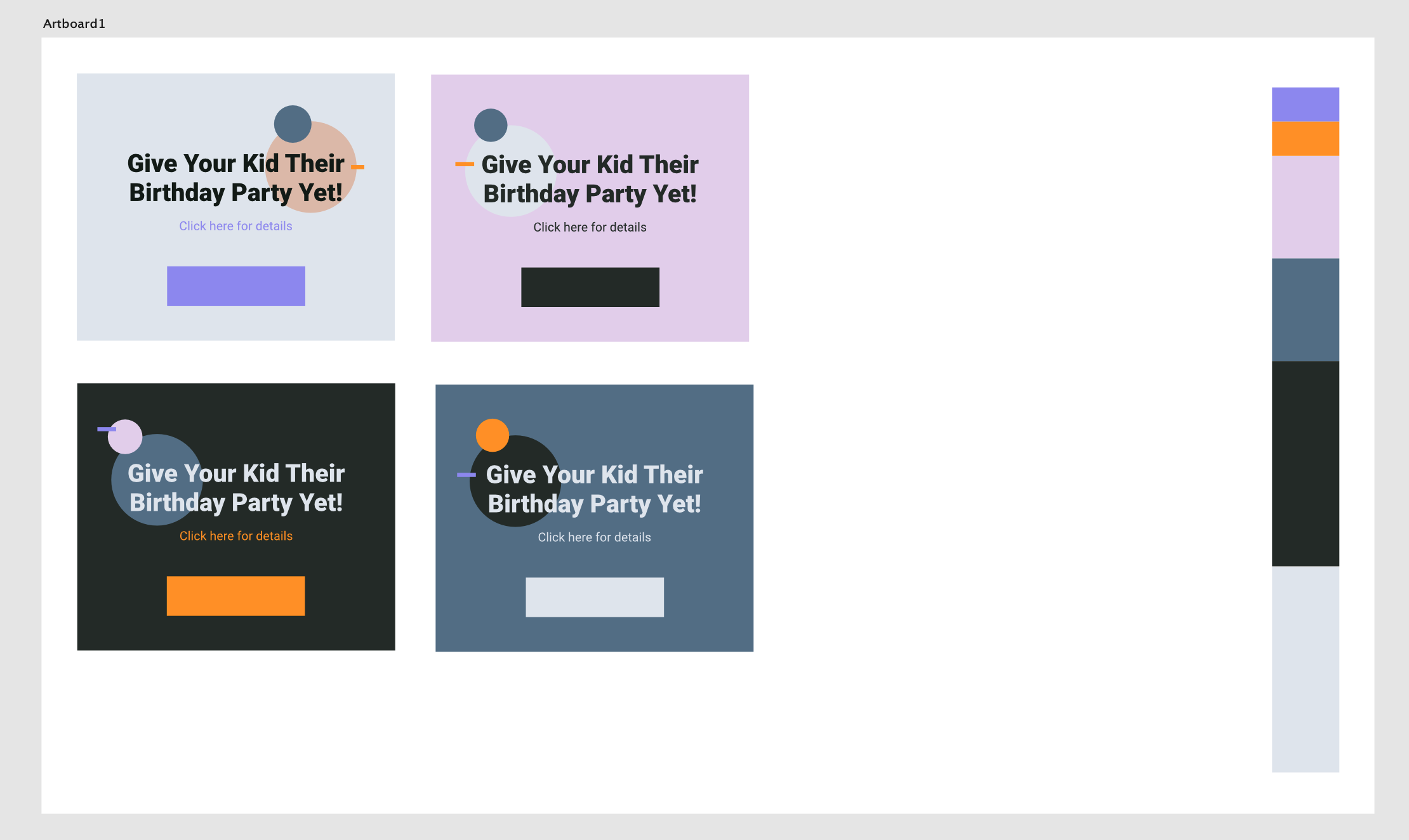
To use this template, open the color swatches panel, choose the 'unnamed' palette and change colors from there to experiment.
-
I made this based on this Youtube tutorial by Greg Gunn. It is an Affinity designer document, that lets you quickly test your color palette. Mainly aimed at website designers. Nothing fancy, it uses global color swatches, so you can quickly visualize it by changing in one place. Here are some screenshots from the file Download the template - Color test 2.afdesign