Washishu
-
Posts
73 -
Joined
-
Last visited
-
Hello everyone. Way, way back in the olden days I once had the need to create a vector artwork map. I used a method that I’ve not had call for since then and have thus forgotten and I’ve also forgotten from where I learned the technique. The object is to create road intersections quickly and easily using (I think) Graphic Styles. The technique I used previously allowed me to create the paths and then apply the style to create my example illustration: my example illustration is for illustration purposes only and was created by cutting the paths. The technique may have involved also using an additional stoke on the basic path, and creating the style from this. Sorry to be so vague but it was a long time ago and I had a better memory then. Any ideas anyone? map.afdesign
-
Keep an object in its layer when moving it?
Washishu replied to Santinacci's topic in Desktop Questions (macOS and Windows)
Santinacci has not responded but my suspicion is that s/he, like me, is confused by the use of the term layer in Designer. I suspect he means Layer, as in the AI sense not layer as in the object sense as used in Designer. It’s a confusion waiting to happen. Why use the same term for two different things? Makes no sense. -
I also used that other-vector-application for many years (the one that’s offered by a company beginning with A). My very old copy of that other-vector-application will no longer function on my MacBook Pro and as I’m no longer working professionally I couldn’t justify the subscription. And that’s why I moved to Affinity Designer. So, I have a lot of habits that developed over the years. Some of them—perhaps many—were not necessarily the best way to do things, they were just the ways that suited me the best. This causes big problems with Aff.Des. because many of these habits don’t work anymore. Once I got over the frustrations, I found that there are many ways that Aff.Des. is better than that other-vector-application, but there are also things that I miss or are (slightly) more involved with Aff.Des. Although it’s now years since I have even seen the interface of that other-vector-application, my memory is that it was more intuitive than AD, but I’m old now and my memory is sometimes unreliable. Probably my biggest frustration and annoyance is still the Layers panel in AD. And the fact that every object (element) is a ‘layer’ and most people here refer to (what I call objects) as layers. A layer to me is a ‘container’ that holds any number of objects that you care to place on it. Therefore when I might have forgotten how to do some rarely-used function and this function concerned a vector object, I would look under (what I think was called) the Object menu. I wouldn’t look under the Layer menu—that’s for things to do with the Layer and the Layers panel. I recently posted a question here and was directed to the Layers menu. Had I thought to look there I would have seen the answer for myself. But my query concerned an object, so why would I look for the answer in the Layers menu? These habits can be hard to shake off and the use of the term layer in this way makes no sense to me. Yes, in AD I can create a layer in the olden-days manner, and it’s called a layer. I can create ‘objects’ on that layer and they are called layers; how does that make sense? How do I know which layer is which?
-
 George-Frazee reacted to a post in a topic:
Artboards: is this normal?
George-Frazee reacted to a post in a topic:
Artboards: is this normal?
-
Artboards: is this normal?
Washishu replied to Washishu's topic in Desktop Questions (macOS and Windows)

-
Artboards: is this normal?
Washishu replied to Washishu's topic in Desktop Questions (macOS and Windows)
George. Thanks. I'm still more than a little puzzled as to why, in the first experiment the artboard was visibleas a retangle but I could still see the document around it. Second time, I'm in danger of being boring now, everything outside the artboard was invisible. If, a you suggest, the second time is the way they are supposed to behave why did it not behave that way the first time. Also it's not referred to in the help which is a significant omission(?) I've looked at slices and I think you're right: it'll do the job I want. Thanks -
Artboards: is this normal?
Washishu replied to Washishu's topic in Desktop Questions (macOS and Windows)
Thanks for your responce. Perhaps I wasn't clear. The first quick test I did (to ascertain if artboards behaved as I supected) only the area outside the document bounds went black: I could still see the rest of the document: the colour is irrelevant in this situation. The second time everything except what was within the dragged artboard went black: I could no longer see any of the document other than the artboard area. Nothing I could think to do changed this: therefore all I've done is to crop the document area. Not what I wanted to do. I've just tried again after having changed the grey level to zero—it was only very low anyway—and it makes no difference. -
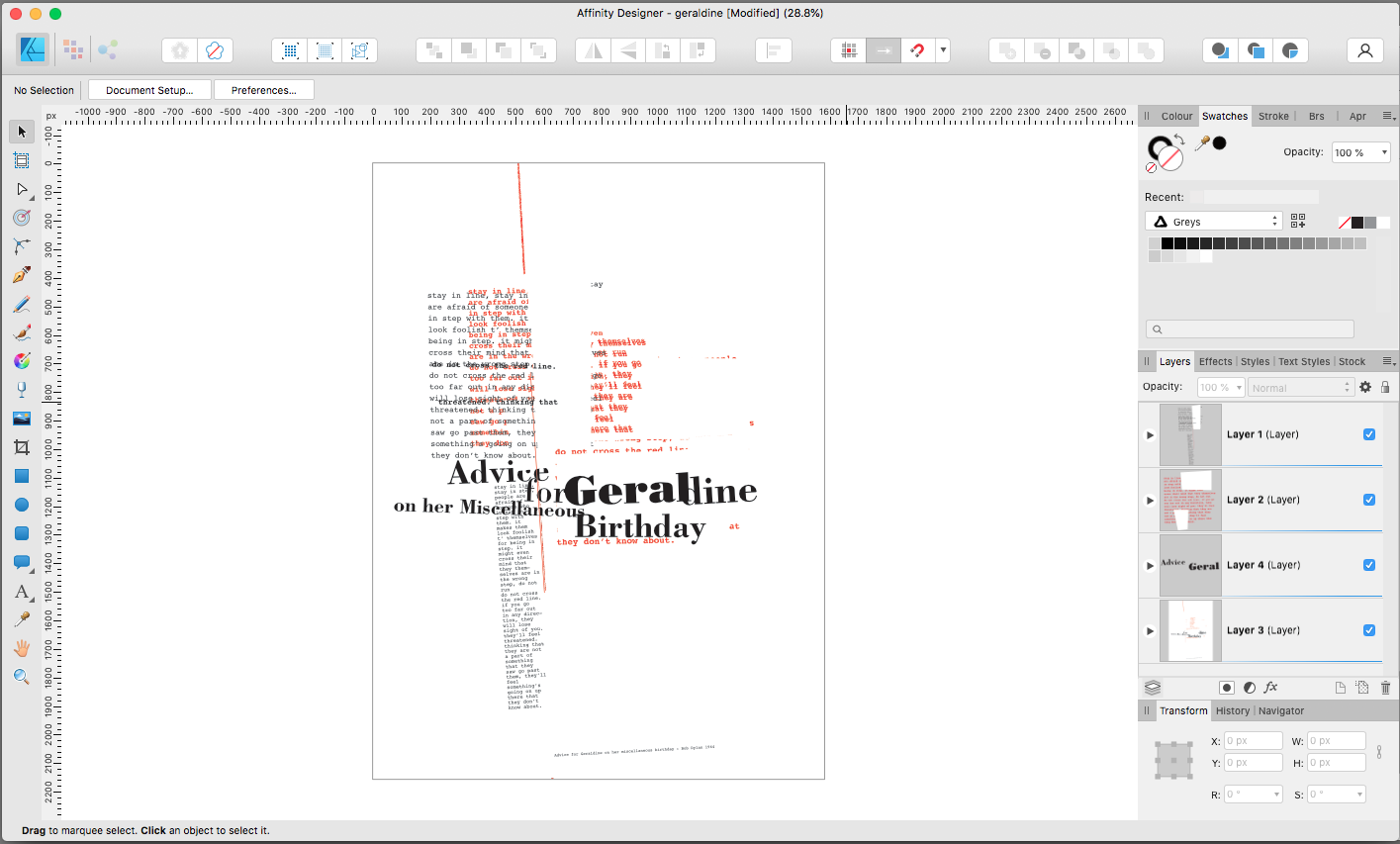
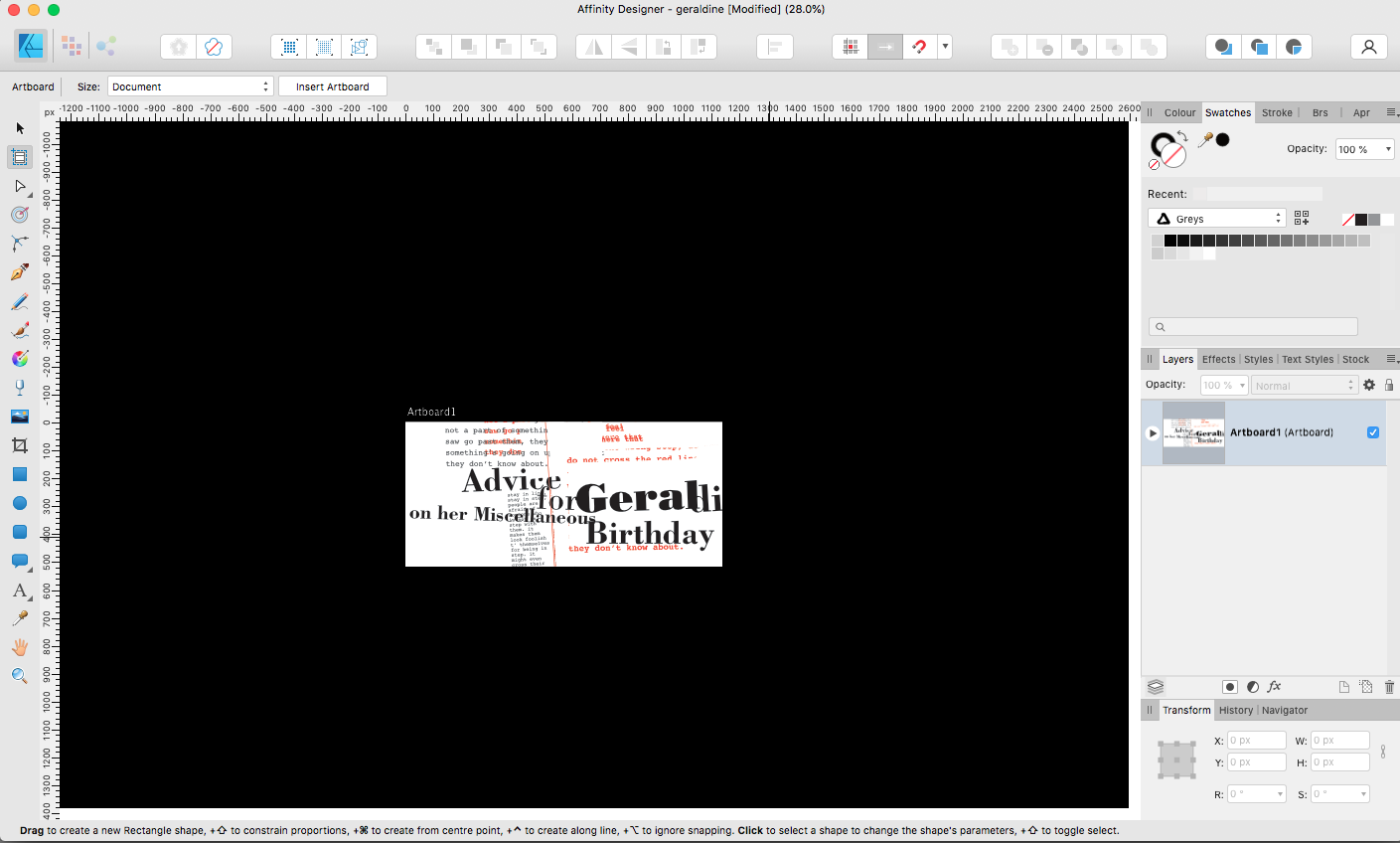
It’s about the artboard tool. And artboards in general I suppose. And I’ve searched the forum first but there are thousands of discussions on artboards. None of which are titled Why has my screen gone black after I've used the artboard tool? I’ve searched the Help too—it doesn’t help. I’ve looked in tutorials but there are thousands of them and a search on artboards redirects to the forums. Here’s the problem. To date I’ve not had a need for artboards so I’ve just not bothered with them. However, I want to do a particular thing and I figured artboards might be the way to do it. I thought I understood the concept and would just have to learn the how. What I want to do is to export particular areas of an artwork I have created that is entirely text and a few vector objects. I want to save small areas of this document as jpegs. I opened the file, dragged an artboard, the area outside the document bounds went black. I exported as jpeg and got what I expected and was hoping for. Ok, it does what I want. Time to make the artboards more thoughtfully. I closed the file (without saving), made a cup of tea, opened the file, dragged an artboard and the screen went black. Everything outside the artboard area went black. I can’t see the rest of the document. Is this normal? Surely not. As usual (for me) I need maybe to say that as I don’t have the need to use AffDes every day, I’m still on V1. So far it’s done what I want. MacBook Pro if that matters.
-
Thanks for responding each and all. The ‘what I’ve always known’ was sometimes inconvenient but was at least simple and straightforward. Now—perhaps in an attempt to cover every probable variation (plus some that are not very likely) it seems it has become a quite complex operation to scale something—it used to involve just the one key: to constrain or not to constrain. Some behaviours have become so ingrained and thoughtless that to have to change dependent upon a list of circumstances creates a lot of frustration. That might explain the situation. I can’t be sure now but it is possible that some of the objects, although all vector objects, were grouped objects. That’s another thing I find frustrating. A Layer is a thing that can have multiple objects upon it. The things on it are objects or vector shapes if you like. AffDes has layers like we had in the olden days, but objects, shapes, curves, text, everything are also referred to as layers. Does that make sense? You say layer I say object. You say layer, I say layer. Spray the word around like that it becomes almost meaningless. I prefer to work with layers like we did in the olden days, but ok, I’m willing to adapt. I’d like a little consistency though and I don’t understand why it was felt necessary to change things that way—or with the shift-constrain either. I know it sounds like I'm whinging, but I'm not: I do like AffDes and I just have a lot of ingrained behaviours from years of using graphics software, I just struggle to understand its logic often.
-
 Bound by Beans reacted to a post in a topic:
Shift-constrain
Bound by Beans reacted to a post in a topic:
Shift-constrain
-
I’m not complaining, I’d just like to know. Pretty much all graphics software I’ve known the shift key constrains the proportions when scaling. It annoyed and puzzled me at first that AffDes appeared to be the opposite. I understand that there are option as to how this behaviour works, although I’ve not altered any so it must be default, which I believe is ‘Automatic’ which I also believe retains proportions “For objects with an intrinsic aspect ratio (like images or text frames)”. That makes some kind of sense. So why does it appear so random? Recently I’ve been creating some vector letterforms with the pen tool. I’ve been copy–pasting some of these and I can detect no logic in when the pasted object is auto-constrained and when it’s not. I should perhaps add that if it makes a difference, I'm still using V1.
-
I haven’t looked in here for a while. Thank you for your input each and all. However— My now ailing memory told me, perhaps erroneously, that the Divide operation didn’t work with an open path. In AfD it does, so that solves the matter. Re Outline Stroke: there’s nothing in my Appearance palette that suggests this operation. The Contour tool offsets the stroke and I can’t see how that helps(?) Outline stroke converted the stroke around an object into a compound path, to which I could apply, for example, a gradient fill. Yes, I could create the compound path myself but Outline Stroke was quick and easy and gave more satisfactory results in some cases. Layer–Geometry–Divide (when I tried) doesn’t work with an open path as the ‘dividing’ object. There is no Cut Curves with Key Object in my Layers–Geometry menu. I should probably have said at the start that I’m using v1. My now occasional need for vector imaging doesn’t really justify me updating. Apart from the things discussed here (which I can find a way around) v1 does what I want. Thanks again everyone.
-
Designer v1. I don't have the need to use Designer very often now (retired), but when I do use it I've often searched in vain for a Divide Objects Below function. In the olden days I used to find this very useful. Another one from the olden days is Outline Stroke; I used to use that a lot too.
-
Yes. So that the frames are easily rescalable for different sizes. And also because I'd prefer it that way. Thanks for the links. But I'd prefer to create something of my own.
-
I paint landscapes in acrylics and sometimes I like to see how best the painting might be framed, also, in submitting work to galleries, they sometimes request to see a jpeg of the framed artwork. Being able to create this digitally is a lot less expensive than framing. In the olden days I used a woodgrain filter (or was it an effect? It’s so long ago now I can’t remember) which worked well enough. Designer (V1) doesn’t have filters or appropriate effects. I’ve created something that looks…well, ok…but does anyone have a technique/method to create a woodgrain appearance? I’d prefer to stay vector if possible. Thanks. I've searched woodgrain with no results.
-
Hide selection temporarily?
Washishu replied to LostInTranslation's topic in Desktop Questions (macOS and Windows)
This thread needs to be retitled "how to copy a link". -
Thanks for your suggestion. I'm on Mac too. The work in question is tends to be something that I create/edit perhaps a number of times, but I don't need to do so very often so it's not a folder that I'd need to access frequently. I considered that it was an OS thing rather than an affD. thing but other software does show, in Recents, the folder that the file was opened from. My very, very limited understanding of such things would suggest that, if it is the OS that controls such things, then there's something about affD. that the OS doesn't recognise and so defaults to…what?…the last used list? It's irritating at times but not something I'm about to write to my MP about.