marlies09
-
Posts
13 -
Joined
-
Last visited
-
 marlies09 reacted to a post in a topic:
Correct method of creating vertical text - ie on spine text
marlies09 reacted to a post in a topic:
Correct method of creating vertical text - ie on spine text
-
marlies09 reacted to a post in a topic:
Suggestion Underline options - confusing dialog
-
marlies09 reacted to a post in a topic:
Suggestion Underline options - confusing dialog
-
marlies09 reacted to a post in a topic:
Suggestion Underline options - confusing dialog
-
marlies09 reacted to a post in a topic:
FREEBIES Hub! FREE Images, Vectors, Videos, Templates, Music, Fonts & More
-

Is it possible to not name an artboard?
marlies09 replied to marlies09's topic in Desktop Questions (macOS and Windows)
@debraspicher Oooh thank you so much! Really helpful! -
Is it possible to not name an artboard?
marlies09 replied to marlies09's topic in Desktop Questions (macOS and Windows)
@GarryP Oops, I guess I accidentally posted it in the wrong place. Thanks for thinking with me! -
Is it possible to not name an artboard?
marlies09 replied to marlies09's topic in Desktop Questions (macOS and Windows)
Hey, thanks for your response. Those are indead the things I've tried, but I'm still hoping there's an option to fully get rid of them. 🙂 It would be great if you could just toggle the names on or off. -
Hi all, I wonder if it is possible to remove the names of the artboards? I've been looking for that option, but I can't find it. Thank you. 🙂 Marlies
-
marlies09 reacted to a post in a topic:
Adobe Photoshop PSD smart object compatible with Affinity Photo
-
marlies09 reacted to a post in a topic:
Golden Ratio Template
-
marlies09 reacted to a post in a topic:
Golden ratio tool
-
marlies09 reacted to a post in a topic:
Exporting as PDF in X1a with bleed
-
Oops! Too busy looking at the topic. Yes, I'm using Affinity Designer for Windows 10.
-
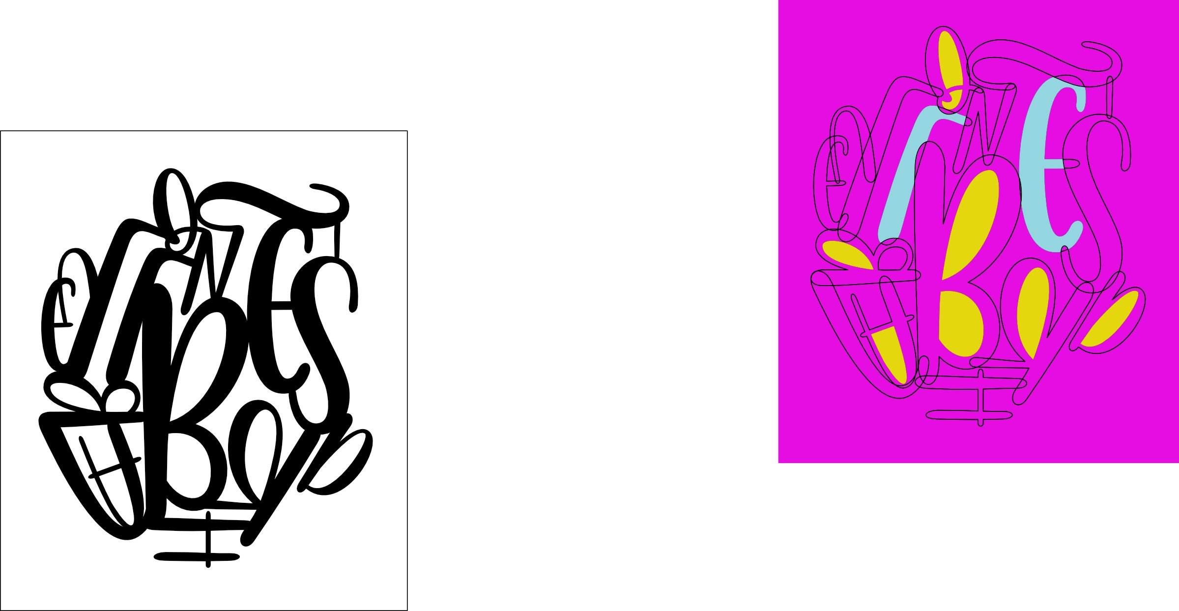
Hello, I think I'm at the right topic for my question. I am new to Affinity Designer (Windows) as well as graphic designing as a whole. I'm following an online course to learn about the basics and there's is something shown in Adobe Illustrator that I can't find in AD. (I've never worked with Illustrator.) For this exercise I need to separate the letters ánd the background shapes, so that I can colour each shape individually. In Illustrator there is a step to make this an 'active painting area' after which you can start colouring the letters, the background shapes and the overlapping shapes with live paint. I'm struggling to find that function in Affintity Designer. I've tried all the boolean options, with the rectangle in front of the letters or at the back, but I can't get the result I'm looking for. I hope I've explained it well enough. Does anyone know how to do this? Issue Cutting Text.afdesign

-
No smooth brush strokes using pen with pressure
marlies09 replied to marlies09's topic in V1 Bugs found on Windows
Hello, I wonder if there's any update on this issue? I'm still experiencing the same problem and I have no idea if anything is done about it or if there is anything that I can do myself to solve this problem. I would love some help with this! -
walt.farrell reacted to a post in a topic:
How to Add Text Shapes?
-
marlies09 changed their profile photo
-
How to Add Text Shapes?
marlies09 replied to Kaje's topic in Pre-V2 Archive of Desktop Questions (macOS and Windows)
Thank you all for clearing that up! I am totally new to grapic designing and I saw a short tutorial of text warping in Illustrator. I wondered if that was possible in Affinity as well, so I grabbed an image of the internet that looked like it to quickly illustrate what I ment. I obviously still have a lot to learn and I'm definitely going to try to do it manually. Thanks! -
How to Add Text Shapes?
marlies09 replied to Kaje's topic in Pre-V2 Archive of Desktop Questions (macOS and Windows)
Hi, I've recently started working with Affinity Designer and I'm also struggling to combine text to shapes. I know how to place text in a path, but I would also like to know how to form the text in the actual shape. So instead of the text following the path of a circle, how do I shape the text in an actual circle as in the image below? Thanks in advance!
-
No smooth brush strokes using pen with pressure
marlies09 replied to marlies09's topic in V1 Bugs found on Windows
It's a tablet from Lovidia. Not sure if you know it, here's a link to the website: Lovidia Official – Electronics and Office Supplies Yes, I've also changed the pressure options on the brush. It's definitely already much better than in the beginning, because of the high precision settings and just getting used to working with Affinity, but it would be great if I can get these tiny hitches out of the lines as well. -
No smooth brush strokes using pen with pressure
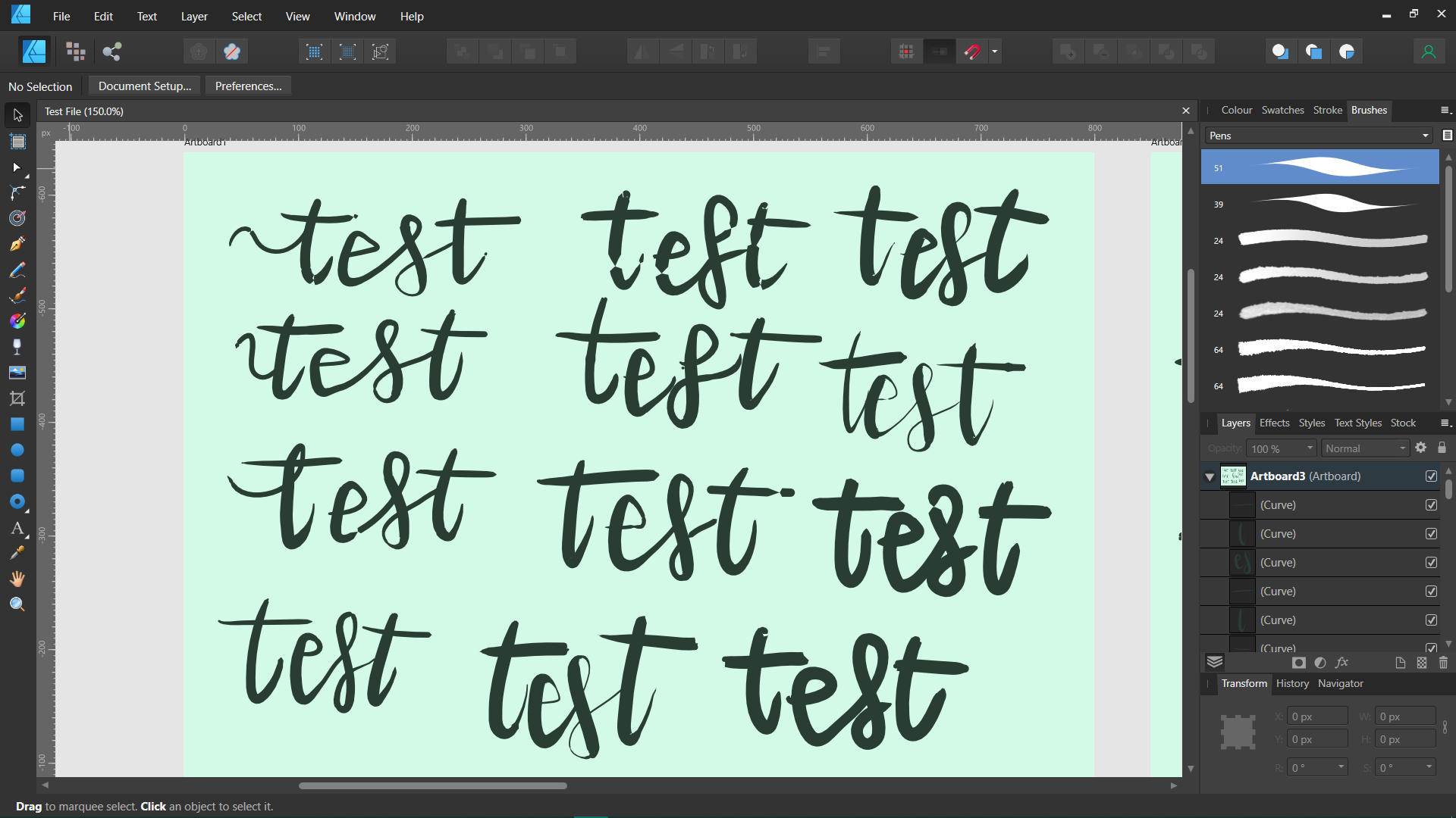
marlies09 posted a topic in V1 Bugs found on Windows
Hello, I am a newbie when it comes to digital designing, so please answer in child's language. 🙂 I recently bought Affinity Designer and a simple graphics tablet, but I am experiencing a problem: whenever I use a brush with pressure, I get weird hitches in the lines. (See screenshots.) I've checked this forum numerous times and actually posted my issue earlier. I've changed my pressure settings, as well in Affinity as in de tablet software, and tried all kinds of things, but I can't seem to get it right. Especially when using the stabiliser, the lines turn out really weird. Just now I've read on the forum to change the sensitivity settings in Affinity to the highest precision and I can see that the lines turn out more precise, but still not completely smooth. I sincerely hope someone can help me with this, because I'm stuck. Test File.afdesign
-
marlies09 reacted to a post in a topic:
Unpredictable stroke artifices in brush tool. (split from iPad beta)
-
Hi Sean P, Thanks for your respons and the extra info. I could probably use a whole tutorial video on this topic, I reckon.. 🙂 I'm totally new to digital drawing, so to find the right settings for these brushpens is quite a struggle. I'm trying to recreate my real life brushpen, so that a downward stroke is thick and an upward stroke is thin. In Pixel Persona this works quite well, but in Designer Persona I can't seem to figure it out. Also I keep getting these weird hitches in the lines, especially when I use the stabiliser. I would love to understand more about how this works with those pressure points. Thanks again! Test brushpen.afdesign
-
marlies09 joined the community
-
Hello, I think I'm experiencing the same kind of problem. I'm only just trying out Affinity Designer for the first time (3 days left), and I've already spend hours to try to find the right settings for a brush to be able to write with it like a real brushpen (for handlettering). As soon as I set the size variance, to create these beautiful thick and thin lines, the lines turn out kind of frayed and not smooth. I've literaly tried every option to see if I could fix this, but I keep running into the same problem. https://1drv.ms/b/s!Agf44Dz9Bsu-yXaWKXrt0Hsjxjsk?e=7Q6ot6 I hope someone can tell me what I might be doing wrong or if this is a problem within the program.