MoonaticDestiny
-
Posts
476 -
Joined
-
Last visited
Everything posted by MoonaticDestiny
-
*Post edited and will be turned into its own separate forum post.*
-
*Post edited and will be turned into its own separate forum post.*
-
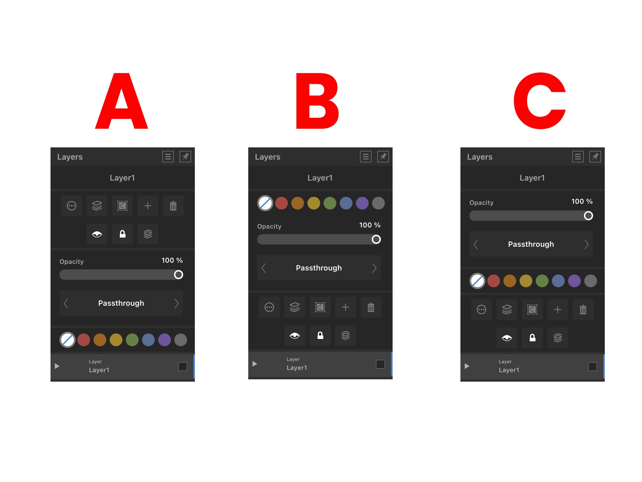
My design opinions A - I dont really like A because I need my buttons at the top to be as close to my layers at the bottom. When Im working with layers Im going to be hitting those button. They need to be as close to my layers as possible so that Im not doing all this reaching at the top. I cant have this huge gap between them. This gap of opacity, blend mode, and tags. Theres a disconnection there. B - I like B because my buttons are now close to my layers but eye wise Im not really liking the rainbow tags at the top. Somethings off. Theres too much hierarchy up there and its weighing everything down. The tags feel like they dont belong up there. C - I like C a lot. Id go with C. My buttons are close to my layers. Layer name, layer opacity, and blend mode feel balanced at the top. Moving the rainbow tags to the middle balances everything out. Its pleasing to the eye. I look at it and Im satisfied.
-
So theres an issue with the Layers studio and the issue is that you have basic layer properties that are hidden in the layers options button. Its the button with the 3 dots and circle around it. It shouldnt be like that. It shouldnt be like that because users are being forced to do an extra step to get to basic layer properties. The extra step of tapping the layers options button when everything basic should be in front of them in the layers studio. The basic layer properties Im referring to are layer name, layer opacity, blend mode, visible, lock, solo, and layer color tags. These are basic layer properties that should be in the layers studio when you open it. I need to able to select my layer and change its name, lower its opacity, change its blend mode, debate if I want it to be visible, locked, or soloed, or change its tag color. It should all just take 1 click. 1 finger. 1 step to change all this. I shouldnt have to click the layer option button, click what I need to change, AND THEN have to do another extra step of exiting the layer options. Its too many steps/clicks for something so, SO basic. So the serif team needs to take these basic layer properties from inside the layer options button, remove them, and put them in the layers studio. I went ahead and did that for you. Below are 3 versions of how you can do it. I dont know how you want to organize it but the basic layer properties are there and they need to be here. Everything is here. You just need to decide how you want things organized and which version is better for the viewing eye.

-
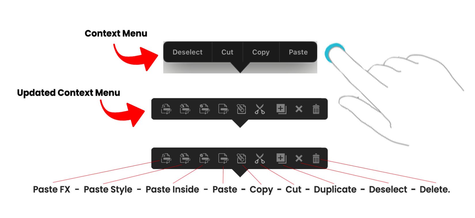
So right now there is something called the “Context Menu.” I think its called the context menu. The way to bring out this menu is to press down with 1 finger on the screen, release, and a menu should appear with deselect, paste, copy, and cut in it. This is called the Context menu. Its has your basic copy paste actions. I like the menu, but I don’t like it design wise. The reason why is because its designed in a style that doesn’t belong in the app. Its like a menu from the very earlier ipad apps. Right when apps were just starting to take off. I also don’t like it because there are some actions that I want on this menu that aren’t on the menu. I want to see those actions on this menu. I also don’t like it because its a “spelled out” menu meaning instead of using the icons for cut, copy, paste, and deselect the menu has been spelled out for you. I hate when things are spelled out. Its just wordy and over time you prefer icons because you know what the actions do already that you don’t need them spelled out for you anymore. Plus, icons take up less space. This menu is needed. Very needed. I saw an affinity designer user use this menu the other day and it just blew my mind how they used it in their workflow. It was so awesome that it made me love this menu a little more. So this menu needs the following updates done to it. 1. I think it should be called the “Clipboard Context Menu” because it has “clipboard” actions in it. 2. It needs to be redesigned in the style of the toolbar which is just a thicker gray/black bar. 3. Other clipboard actions need to be added to it. 4. Its needs to be turned into icons. No spelling. Just all icons. So! I did it. I updated it. I redesigned it, added other needed clipboard actions, and just used icons instead of words. The way it works is you select an object and then press down on the screen with 1 finger. You release and your clipboard context menu appears. Its going to give the following actions. Paste FX, Paste Style, Paste Inside, Paste, Copy, Cut, Duplicate, Deselect, and Delete. So what you do is select your object, finger press release, hit the copy button, finger press release again, and then just paste it. Or you can select your object, finger press release, hit the copy button, select a different object, finger press release again, and then just Paste FX, Paste Style, or Paste Inside. Or you can just select your object, finger press release, and just cut, duplicate, deselect, or delete it. Everythings right there at your fingertips. Its this finger press down release gesture that youll be doing in your workflow to get to your actions. The reason why these actions are in this clipboard context menu is because Fitts Law. You can’t be having users go to the top left corner to the edit menu and reach these clipboard actions. Its too the edge and it requires an extra click to get to them. Its a lot for a simple action. This work flow of going to the top left corner to reach the edit menu to reach your actions is slow and too much. Its better if users just finger pressed on their screen, release, and all their clipboard actions are there in finger reach. Theres no reaching to the edge. Theres no clicking the edit menu icon. Its just finger press down, release, and all your actions are there. So users can easily duplicate, deselect, delete, copy, cut, and paste an object, style, or fx. I want to note that I did redesign the icons the serif team uses in their app here in this context menu. Ill make a whole post later called “The clipboard paste command icons need to be redesigned" and ill explain why. Right now I’m focusing on updating the clipboard context menu. Let me know what you think. Below is an image of the old context menu and the updated context menu.
-
So I was using the app the other day, and I wanted to try out each boolean operation. The boolean operations are Add, Subtract, Intersect, Divide, and Xor. So what I did was I created 2 squares on top of each other and those were the shapes I was going to boolean. I wanted to see the results of all 5 boolean operations so I told myself to duplicate the 2 squares 5 times for each boolean operation. So what I did was I selected both squares, moved them with my move tool, and then did a 1 finger modifier on the screen to duplicate them. What happened next was my squares were not being duplicated. They were being moved at a 45 degree increment. I quickly realized that the gesture to duplicate an object requires a 2 finger modifier. Not a 1 finger modifier. I dont know what i was thinking but I had this mindset that if I just selected my shapes, did a 1 finger modifier, moved my shapes to duplicate them i could just duplicate my shape multiple times. I think the reason why i had this mindset, in this moment, was because I use Photoshop. In photoshop, if you select the pixels you want to duplicate, if you just hold down on the Alt key and move your selection you can make several duplications of the selected pixels. Its easy. You just hold down Alt and drag to duplicate. So I had this mindset that holding down a 1 finger modifier resembled my Alt key in photoshop and dragging with my apple pencil would just duplicate my squares. So it got me wanting to change my gesture for duplication because I dont want to use a 2 finger modifier to duplicate. I want to use a 1 finger modifier to duplicate. For me, a 1 finger modifier would be better and easier to duplicate. Im going to be doing more duplication operations in my work more than I am going to be moving objects at a 45 degree increment so allow me to change my duplication gesture from a 2 finger modifier to a 1 finger modifier for a faster workflow. I already have this 1 finger duplication motion mindset from using photoshop, so I'm requesting that users be allowed to change their gestures for certain tools and actions. Specifically here the gesture to duplicate. I had already talked about the need to allow users to change their gestures in other posts but I wanted to give the serif team another reason why changing gestures are needed for users in the app and how I personally needed a gesture change for the duplication operation here in this moment. So the issue is having pre set gestures for certain tools and actions that were put there by the serif team. The solution is to allow users to change those preset gestures to their liking. For me, here, the duplication gesture. I dont know how to go about it. My solution was to create a "Gestures" category in the preferences, there you would lay out all the gestures for each tool and action, and there users could change/swap the gestures to their liking. Ill sketch something up later.
-
Who was the one who threatened to get "personal" with me again over asking a question on how to better understand them on a discussing topic?........sounds like you wanted to attack me for trying to understand you......very friendly and nice of you. I deeply love and believe in this app. There is a burning fire 🔥 inside of me thats wants to help the serif team with this app because it deeply, deeply, needs work. I have dedicated my time these past two weeks leaving several posts on this forum on how to improve this app. Im the only recent one who sees issues in this app that others dont and i want to point out these issues so we can fix them and have a better app. Im the only one whos been leaving recent feedback on how this app could be better improved. I have provided several feedback posts with honest critiques and solutions on what to do, how to solve them, and how these problems can be fixed to have a better operating app. That is everything the serif team would want to help better their app. I need to be honest. I can NOT lie and leave lying critiques to the serif team because that wouldnt be helpful to them. I need to be blunt while providing logic and solutions. If I sound heated 🔥its because of my love for this app and my urge to want to solve problems in this app so that we can have a better app for users.
-
Its just summarizing my posts with to the point named titles while being honest with what needs to be done to solve these issues.
-
I still think this view tool should be removed. It does nothing but pan. Something our gestures can already do. The feature to customize our toolbar and just hide this view tool from our toolbar would be nice though.
-
No. Its a simple "what are you talking about?"
-
Im very serious. What are you talking about? Im trying to understand you so we can have a discussion. The view tool just pans. You brought up all this deactivation and missing functions that I'm not even aware the desktop version even has. What are you talking about when this view tool just pans? Thats all it does. Pans. Our hands do that already. I get the function of the zoom tool being integrated into the navigator panel by swiping down or up. Its the other part I dont get. Help me to understand you my friend.
-
What are you talking about? 😅
-
It just hit me that the hand view tool is literally our hand. Our hand on the ipad screen. Our hand is literally the hand icon.
-
Its the same logic with the magnifying glass zoom tool. 🔎 Why is this magnifying glass zoom tool available on the desktop version of AD but NOT on the ipad app? Why? Because its unnecessary to have the zoom tool in the ipad app when you can already zoom in and out with your 2 fingers in the app!!! Youre not going to need to click on the zoom tool to zoom in and out in the app because youre fingers do that for you. So why have the hand view tool in the app when you can already pan with your 2 fingers?!?! Come entirely on.
-
A solution has been for this post.
-
You know what you could also do? Make the undo and redo buttons part of the toolbar, make them act like tools, and move them upwards on the toolbar so that theyre closer to the range of where your left thumb is so that you can tap on them easily instead of reaching for them ALLLL the way down at the bottom.
-
I also didnt add the artboard tool or the image place tool on the toolbar on the left side because theres already too many tools in landscape mode. Something needs to be done. Less spacing between icons or the feature many ppl have requested to removed unwanted tools to make room for these tools. I talk about the artboard and image place tool here in this forum post. Again, you cant have the artboard and image place tool hidden under the document menu. They are tools and they should be in the toolbar.
-
I removed the snapping magnet icon on the bottom left corner of the interface because it shouldnt go there. I'll make a whole post about it later. I also removed the trash icon and the deselect "X" icon because these 2 icons should be placed on the NEW context toolbar of the move tool. I talk about the NEW context toolbar of the move tool in this forum post here.
-
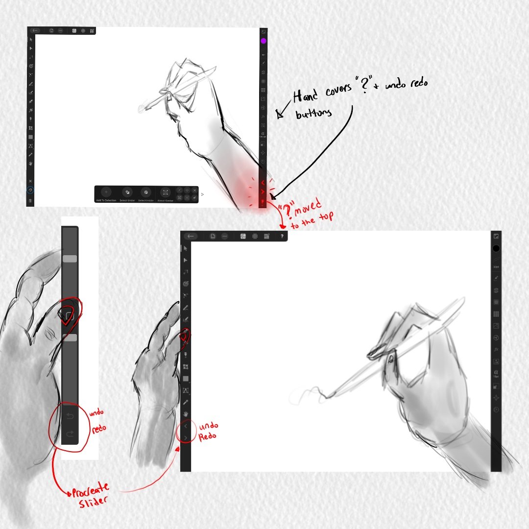
In a previous post, I had said that the "?" tool tip icon at the bottom right corner of the interface should not be there because it triggers when you enter persona mode to draw. Your wrist is triggering the "?" icon and its disrupting your workflow. So nothing should be there at the bottom right corner of the interface. You can read all about it in this forum post I made below. However, i wanted to make a post dedicated to the undo and redo buttons because they too are located at the bottom right corner of the interface and they shouldnt be there as well. I did leave a comment about the undo/redo buttons in the post below, but I want to talk about them here in THIS new dedicated post. The undo/redo buttons should not be at the bottom right corner of the interface. They shouldnt. They shouldnt because our wrist is going to trigger them and theyre going to disrupt our workflow. Its the same situation with the "?" icon. In the preferences, you can turn off the undo/redo buttons. Which is great because now your wrist wont trigger the undo redo buttons but you still shouldnt have them at the bottom right corner if users are going to want to turn them on. Heres why you REALLY shouldnt have them on the bottom right corner of the interface. Its because of the way digital artists work on tablets/cintiqs. If youre right handed, your right hand holds the stylus(apple pencil) and then what you do is you use your left hand thumb to slide against the left side of the tablet/cintiq to press buttons that help your workflow. So your left hand thumb should be on the left side toolbar of the interface to easily and quickly toggle through your tools. On your toolbar, the undo and redo buttons should be moved there so you can press them with your left thumb. Thats how it should be. You use your left thumb to press the undo and redo buttons while you work. If you have the undo redo buttons at the bottom right corner of the interface you cant really touch them with your left thumb. You have to use your stylus to tap them which is going to be bad because your stylus is dedicated for your work and now it has to take on this new task of undoing and redoing. It shouldnt be like that. Right hand stylus is dedicated for building your work while the left hand thumb is dedicated to toggling through your tools and undo/redo button. So I need the serif team to take the undo redo buttons and move them to the left side toolbar and place them at the bottom of your tools. Not at the VERY, VERY bottom but at the bottom of your tools. Which is still going to be problematic because now you have to use your left thumb to go ALLLLL the way down since theres so many tool but I was hoping Serif could give us users the feature to remove unwanted tools from our toolbar. That way as you remove tools the tools in the toolbar move up, get shorter, and your undo and redo buttons can move up so that theyre at a closer, reachable range for your left thumb. I want to also note that procreate places their undo/redo buttons on their sliders so they should be placed here on the left side of our toolbar as well. Bellow is an attached image of what I mean.
-
I love this video by youtube user brave the woods. It shows exactly what I mean here about needing a new context toolbar for the move tool because everything is far away and going to studios along the edges is the user workflow. Which is fine. Im not saying get rid of studios. im just saying to bring important building operations/tools closer to our objects and apple pencil.
-
I need to see a list of gestures for each tool and each action for the app. I need to see that in this affinity designer app. I'm still learning the gestures but i'd like to see a list of ALL the gestures for each tool and action. I dont want no tutorials. I dont want to go to the affinity site and watch that 1 OUTDATED video called "Gestures." Only a few gestures are shown in that video. I need a FULL gesture list of each tool and action. I need that in the app. Adobe Illustrator does this on their app and its awesome. Its well designed. Everythings there. Its awesome to reference gestures when you forgot them. Its awesome to learn a new gesture you didnt know. I need something like this for this app. This is why there needs to be a "GESTURE" category in the preferences. So you can see all these gestures and change them.
-
So when you select an object with the move tool, at the very bottom you have a context toolbar that appears for the move tool. On that toolbar is a "+" icon called "add to selection." This icon you have to turn on by hitting it and then what you can do now is tap other objects on your canvas and its combing other objects to your selection. So it allows you to "add to your selection." It lets you select multiple objects so that you have this 1 big selection of objects. OR there is a gesture for it where you select your object and then use a 1 finger modifier to select your other objects to "add to your selection." My issue is sometimes the gesture works. Other times it doesnt work because your pencil has trouble selecting your objects. Like, the app doesnt want to select your object. Its weird. It works and then it doesn't so it needs reworking. I guess like a bug is there or something. Its just not letting me select objects. I have to tap a couple of times on the object to select it so this gesture needs fixing My other issue is you dont need that "+" icon called "add to selection" on the context toolbar if theres a gesture for it already. Remove it. Its not necessary and no one works that way. No one says, "oh! i need to select multiple objects. let me turn on this button, select my objects, and then turn off the button since I now have my selection." No one works like that. Just use the gesture. Its easier. On top of that making users turn on the "+" "add to selection" icon is not good. Its not good because you have to turn it off. If you dont turn it off you now have us making all these selections and wondering why that app is behaving this way. Why cant I select a single object and why is the app selecting multiple objects. Why is it behaving this way? Oh! Thats right. I have "add to selection" turned on and i have to turn it off. I completley forgot I turned it on. I wish the app had turned it off for me. A lot of users are going to go through this. Youre going to confuse us. I already know it going to happen so its best to not have this turn on/turn off button to make a selection because its going to confuse users. Let us turn on/turn off this "add to selection" operation through a 1 finger modifier . Its better. 1 finger turns it on. Removing the finger turns it off. The gesture is already in the app. It just needs reworking or fixing. Also, remove "add to selection" from the context toolbar of the move tool.
-
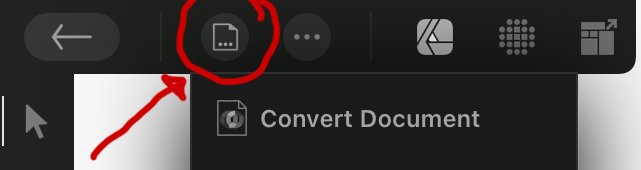
Its not my terminology. Its serifs terminology. They have something called "document." Its not a tool. Its not a studio. I guess its a menu? Not sure but its the icon at the top left after the back arrow icon. They call it "Document" so I just said "Document icon." Not very helpful. Sorry. Below is an image.
-
What is going on? The artboard and place image tools should not be inside the documents icon. Its not like that in the desktop version so why do it here in the app? I dont know when youre going to edit your artboard but it should take 1 click to get to your artboard tool. I shouldnt have to click the documents icon and then do another click to get to my artstudio tool. Its too many clicks. Everything should be 1 click. Anything more than that is slow workflow and bad design. Same thing with the place image icon. I dont know when you'll place an image into your document but dont hide this tool from users. Again, its this game of hide and go seek that the serif team is playing with users. I dont want to go seek. I want my tools at first time glance. Sigh. Some icons in the document icon should not be there. I really need to redesign everything inside the documents icon because things are not working out. It is annoying to want to duplicate an object so many times and have to click the document icon so many times to do several duplications. It shouldn't be like that. Artboard, place image, and other icons inside the documents icon shouldnt be there. Theres so much work to do. smh. Again, artboard and place image should not be in the document icon. Ill upload some images later of the redesign.
-
Somebody requested renaming layers with a double tap in 2018. 2018!!! 2018 and it still hasnt been implemented in to the app. Im honestly upset right now. 😡 This is basic. This should have been in the app a long time ago. Its an easy fix. I dont know whats going on. I said this in another post about renaming a layer. Why does it require 4 steps just to change the name of a layer? It shouldn’t take 4 steps to rename a layer. It’s honestly 6 steps. Not 4. 6 steps because after the 4th step you have to hit the ok button, that’s step 5, and then hit the "<" icon to return back to the main layer menu. It’s just too many steps. Too much time wasted. It’s ridiculous. I should be able to tap the name of my layer, have a menu open where it already has my layer name highlighted so that I can just start typing the name of my new layer, hit ok and done. Tap layer name, rename, hit ok. Simple. But no. You have to click the layer studio, pick your layer of choice, hit the "..." icon, hit the name of your layer, rename layer, hit ok, hit the "<" to exit the 2nd menu, and done. Its just too many steps. Such nonsense for a simple action.
- 1 reply
-
- 1
-