Stephen_H
-
Posts
269 -
Joined
-
Last visited
Everything posted by Stephen_H
-
 If I close a document and keep Publisher open, I get this strange display. Not critical, but it does feel like a bug.
-
Affinity Video Editor?
Stephen_H replied to Epic-dude9807's topic in Feedback for the V1 Affinity Suite of Products
No. Just consider your statement a moment... After Effects is industry leader because it's a cinematic-level tool for film professionals.To unseat it, Affinity will need to to make something light years superior to it in both features and ease of use. That just won't happen in any time period under 10 years. There would have to be a fundamental shift in the motion graphics industry for those professionals to even consider jumping ship. If Apple can't do it with Motion despite having an existing video user base of fan boys, then how can we expect Affinity to do it? Affinity has entered the design & print market at a time when designers are frustrated by Adobe and are very limited by its alternative options. It's recognized there's a pain point and is delivering a solution. The video industry does not have this problem so they'll just be seen as the "Johnny come lately" of editors to the world of video. It's way more important for Affinity to get their products up to Adobe's level than start entering new industries. It would be strategic suicide that will drain capital and water down the brand. If you want Affinity to make other products, getting Publisher finished would be a way better idea. Then perhaps focused supporting apps like a Preflighting tool for PDFs, a tool to preview/manage fonts, Affinity's own font pack or a discounted membership at a stock library – all useful tools for designers. If there's an industry they might be able to break into, that might be website design. Frustration being caused by FreeHand being discontinued plus the Adobe subscription model made for perfect timing to launch AF Designer. Now that Muse has been discontinued, a WYSIWYG website creator might be very well received by designers as the same set of circumstances has occurred again. -
I must confess, there are a few features I'm desperately missing when I design logos or infographics... - Arrow heads on paths (or any graphic at the start/end of a path) - Warp transformations (pre-set envelope distortions for vector objects) - Transform function (rotate multiple copies of an object around a point. Illustrator does it, but it's horrible – FreeHand had a tool that did it brilliantly) - Zig-zag filter (turn a line into a telephone cord or stylized ocean waves – it's a pain to do it manually) - Image trace If these are in Designer but I can't find them, please tell me.
-
Thanks MEB for clearing it up. Maybe my screen is supremely bad.
-
Hi. I'm not quite sure what I'm looking at... all the text seems mostly the same (Affinity's column is slightly different, but I'm really pixel peeping here) Are you saying Affinity should be using a different font to achieve the same legibility rather than font size?
-
Ahh... the "layer" not the "layer". Got it. (Maybe "Object" would've been a better term? This didn't cause confusion during internal brainstorms amongst team developers that might've hinted at our confusion later?)
-
I notice the dark mode is easier to read than the light mode. The letter shapes are a bit blotchy and merge into each other reducing the legibility. I suspect 2 reasons for this: 1 - The font size. When I export a file from Designer, the system font in Apple looks perfect. It's a few points bigger which gives my screen a few extra pixels to render the letters. I think the fonts need to be the same size that Apple uses. (Large font in the preferences doesn't affect this – just panels etc.). If it's not the size, perhaps the font being used? maybe use Apple's system font, as is? 2 - The higher contrast in the light mode. Black text on a 10% grey BG has a 90% contrast difference. In dark mode, we get 20% grey on a 80% grey BG (figures are guessed) which results in a 60% contest difference. This lower contrast makes the fonts seem better aliased and more consistent. The think the black text needs to be a bit grayer to reduce the contrast. This goes for all the elements like ruler markings. This is what I'm referring to. You can see the difference side-by-side: : Any thoughts on the topic? Am I being difficult? I like the light mode, but the dark mode seems a bit more refined.
-
I'm a bit confused by this instruction: When I right-click on the layer in the Layers Panel, I don't et the "Properties" option. Is this a Windows vs Mac thing? So I have to ask the same question... how do I change the color of a bounding box? (especially that horrible pink and yellow highlights I get when working with text)
-
Painter's Color Wheel
Stephen_H replied to WREN's topic in Feedback for the V1 Affinity Suite of Products
Ah yes. The days when we had to hack the system to get fancy results. I still remember attaching Pantone swatches to litho positives. -
Very old school for longtime Mac users. This is how all graphics programs worked 15 years ago.
-
Whoah dude!!!!! How are on earth you getting 2 columns in the right studio?????????? (I'm almost exclusively working in separated mode to achieve this kind of layout) Phil_rose
-
Painter's Color Wheel
Stephen_H replied to WREN's topic in Feedback for the V1 Affinity Suite of Products
No difference. AD's global colors act like all other applications' global colors. Peter was just surprised to discover that Quark Xpress has had them all along. Maybe he thought they were introduced as a new feature or was surprised that it doesn't have different types of swatches? (I can't really speak for him here, but that was the message I got from his post) For me, Quark Xpress 3.0 was the very first graphics application I ever learnt and it ONLY supports global swatches. Quark's global swatches is so ingrained in me that I find all other "regular" swatches unintuitive, frustrating and very risky to use. As a side note... InDesign also only supports global swatches. I guess this speaks volumes about color management in professional layout applications and I expect this to be the default swatch usage in the soon-to-be-released Affinity Publisher as well. (Non-global swatches in Publisher will be a fail of epic proportions.)- 26 replies
-
- 1
-

-
- Affinity Designer
- Affinity Photo
- (and 2 more)
-
Painter's Color Wheel
Stephen_H replied to WREN's topic in Feedback for the V1 Affinity Suite of Products
100% agree. I really can't think of any reason to have swatches if they aren't live.- 26 replies
-
- 1
-
-
- Affinity Designer
- Affinity Photo
- (and 2 more)
-
Display the color mode of the document
Stephen_H replied to Stephen_H's topic in Older Feedback & Suggestion Posts
I've just checked... (I think you mean the Move tool?) Yes just like that, but it should be permanently displayed. If I have to select a tool, I might as well use a pull down menu. Incedently, if you use the space bar to access the move tool, you don't get the move tool's contextual menu. I use the tool all the time, but I never select it which is why I didn't know about it. Strangely, we don't get the same info when the move tool is selected in Designer. I think this is an oversight that needs fixing. -
Display the color mode of the document
Stephen_H replied to Stephen_H's topic in Older Feedback & Suggestion Posts
No, it's not a solution. Try this experiment: 1 - In a CMYK document, draw a box in 100% cyan 2 - Duplicate the box and rasterize it 3 - Convert the document to RGB 4 - Convert the document back to CMYK (effectively the same as your exporting a CMYK PDF solution) 5 - Now analyze all the colors in your document. (Selections & color pickers) You'll see you no longer have 100% as it's color mix. Visually, you probably saw no change, but if it's a corporate color in a logo, you've now got 2 versions of this color. One is right, and the other will lose me a client because I can't keep to their global corporate image. -
Painter's Color Wheel
Stephen_H replied to WREN's topic in Feedback for the V1 Affinity Suite of Products
Ah, yes because document layout has color consistency as a core principle. I cut my teeth on newspaper and magazine layout so I naturally believe all swatches should be live/global and essential to professional layout & design (though not important for illustration).- 26 replies
-
- 1
-
-
- Affinity Designer
- Affinity Photo
- (and 2 more)
-
Display the color mode of the document
Stephen_H replied to Stephen_H's topic in Older Feedback & Suggestion Posts
Oh really. Strange. I feel it’s equally important in both apps. Perhaps more so in Designer since it’s more likely to end up producing artwork intended for print. -
Painter's Color Wheel
Stephen_H replied to WREN's topic in Feedback for the V1 Affinity Suite of Products
What are live colours? Is it like illustrator’s global swatches? Change a swatch and all instances are updated? -
Excellent thanks!
-
In the vector handles, there are small lines crossing the. Sometimes they are there, and other times they aren't. Here is a screen shot of what I'm referring to: Please can some one educate me on what they are and how I take take advantage of them. (please excuse my poorly drawn arrow, but unfortunately AD doesn't support arrow heads on strokes. Nudge, nudge, wink, wink.)
-
Painter's Color Wheel
Stephen_H replied to WREN's topic in Feedback for the V1 Affinity Suite of Products
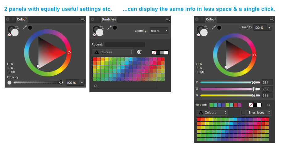
I played with an updated color palette a while back as well. This was my contribution... just combine the wheel, the sliders and the swatches into one palette.
- 26 replies
-
- 3
-
-
- Affinity Designer
- Affinity Photo
- (and 2 more)
-
Display the color mode of the document
Stephen_H posted a topic in Older Feedback & Suggestion Posts
It's a very simple mistake to make... working in RGB when you should be in CMYK. Export your PDF and... whoops, the publication rejects your PDF because it's RGB instead of CMYK. Please can you add the color mode of the document to the display somewhere. Just a bit of text in the file name (like illustrator does) would be sufficient. At the moment, we have to go digging into the document setup to find out. The odds are, if I am looking for the color mode, I haven't made this mistake. We need it displayed somewhere so it can raise a red flag when we're accidentally working in the wrong format. Look at my screenshot. Can anyone tell me what color mode my document is in? I can't, but it's obvious in illustrator which gives me a nice, secure, safe feeling. Surely this must be simple to implement... (Or am I just missing a feature I need to turn on?)
-
I hear you. I don't know it well enough to comment on whether Apple Motion or Blackmagic's Resolve Studio are decent replacements, but Affinity doesn't cater to the video market, so I can't expect you to jump ship due to Affinity's products. That's the point of my post here, on the Affinity forums – I have cancelled because Affinity's tools have finally enabled me to make the jump.
-
InDesign has also been a sticking point, and Acrobat for its preflighting features, but I do have a legal copy of CS3 to get me through. All upgrades in those 2 apps have been for ebooks & digital platforms. I use them for print and neither have had any useful print features added in the last decade so I'm fine with old an copy. (I'm experiencing the benefit of owning my software, rather than renting it)
- 161 replies
-
- 1
-
-
- subscription
- adobe
- (and 1 more)
-
Well people, I have done it. I've cancelled my Adobe CC subscription. Here's the proof. Anyone else packed it in with them? (It's a bit off topic, but I can't find a general/misc category for posting my own news.)
- 161 replies
-
- 11
-
-
- subscription
- adobe
- (and 1 more)