Alann
-
Posts
35 -
Joined
-
Last visited
-
Must be a Windows problem. Thanks for confirming it works on a MAC. Maybe this will post will be forwarded to the Development group!
-
I used Filters>Blur>Gaussian Blur, which are the same keystrokes James used in his video.
-
According to James Ritson's video https://affinity.serif.com/en-us/tutorials/photo/desktop/video/334256548/ when I select the Blue Channel, and I apply an adjustment, it should only affect the Blue Channel information. In James' video he applies a Gaussian Blur Filter. When I apply the same filter to my test pixel layer the filter actually affects the Red and Green channel information and not the Blue channel information. So, unless I am missing something, this does not seem to be working correctly.
-
Library and Macro Short cut keys
Alann replied to Alann's topic in Pre-V2 Archive of Desktop Questions (macOS and Windows)
That's exactly what I wanted! alt+shift+L alt+shift+M Thanks! -
I use the library and create macros quite alot. However, I get tired of constantly going through all the keystrokes to get to the Library and Macros and then to close the Libraray and Macros I have to go through all these keystrokes again. I would like to see short cut keys to open and close these two windows or buttons on the toolbar to provide these functions.
-
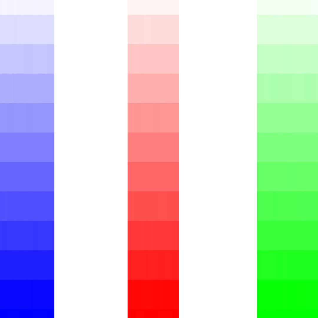
Affinity Photo Version 1.8.5.703 Windows 10 This is a test of the Channel Selections to isolate the blue channel and apply adjustments to just the isolated channel When I grey out the Red, Green, and Alpha edit pencils I expect to be just looking at the Blue Channel of my selected image. When I right click on the Blue Channel and select "Load To Pixel Selection" I expect the marching ants to be selecting ONLY all the saturated Blues in my image. However, in the attached screenshot it can be seen that the marching ants are selecting all the saturated blues at well as the saturated Reds and Greens that are less than 50% grey, and the white alpha areas. In addition when I select the Brightness/Contrast Ajustment layer and adjust the brightness I see the whole image getting lighter and darker. I would expect just the Blue saturated colors to be brightened or darkened. This same Channel Selections test of the Red and Green channels also exhibits the same issues. See Screen Shot Attached See Blue Channel Test .afphoto file See Primary Colors jpeg file (selected image) Blue channel test.afphoto

-
Thanks Chris26 I reviewed the Hahnemuhle website and saw the ICC profile download button. I am in Texas so do you know where I can get custom profiles done in the US?
-
I have seen some youtube videos on soft proofing and how to view the ‘out of gamut’ colors . However, when I look at the soft proof adjustment on Affinity Photo I do not see any profiles for printing paper. How do you get soft proof profiles for photo papers? Also what I was still confused about when watching these videos is does the make, model, of printer and the color inks affect how well the printed photo compares to the image on the monitor. This all leaves me confused which takes me back to my original question. So how do I get the printed photo to closely match what I see on my monitor?
-
When I print out my photo on my home photo printer the photograph does not look like what it does when viewed on my monitor. How do I fix this issue?
-
Affinity Photo RAW color space
Alann replied to Alann's topic in Pre-V2 Archive of Desktop Questions (macOS and Windows)
If I understand correctly the RAW file only contains the color hue and does not contain any saturation or luminance information. Therefore when Affinity Photo processes a RAW file it must assign some nominal amount of saturation and luminance to the hue in order for the image to be displayed. Is this correct? -
Develop Persona 16bit or 32bitHDR
Alann replied to Alann's topic in Pre-V2 Archive of Desktop Questions (macOS and Windows)
Thanks Old Bruce for your reply. I also set the Output Profile to Adobe RGB 1998 which I understand to be the correct output profile for printing out photos from my personal printer. I am curious as to what Output Profiles others use in Affinity Photo and why. -
Develop Persona 16bit or 32bitHDR
Alann replied to Alann's topic in Pre-V2 Archive of Desktop Questions (macOS and Windows)
If I understand correctly, then the RAW file output from the camera only contains hue information about a color and does not contain any saturation or luminance informaition. Is this correct? -
Color issue
Alann replied to Johan Abrahamsson's topic in Pre-V2 Archive of Desktop Questions (macOS and Windows)
sRGB (Standard RGB) was color space defined by HP and Microsoft for displaying images on the Internet. sRGB and Apple RGB are close in color gamut Adobe RGB (1998) is a color space defined by Adobe in 1998 that enables images edited in RGB to translate accurately to most color printers (CMYK printers). -
 Chris26 reacted to a post in a topic:
Color issue
Chris26 reacted to a post in a topic:
Color issue
-
Affinity Photo RAW color space
Alann replied to Alann's topic in Pre-V2 Archive of Desktop Questions (macOS and Windows)
Thanks to all, I think I got it now! -
Color issue
Alann replied to Johan Abrahamsson's topic in Pre-V2 Archive of Desktop Questions (macOS and Windows)
Use Adobe RGB for printing photos. 1. Go to Develop Persona 2. Select Basic tab 3. Find Output Profile at bottom of the list 4. Select Adobe RGB (1998) 5. Click Develop