

AntiqueFlaneur
-
Posts
201 -
Joined
-
Last visited
Posts posted by AntiqueFlaneur
-
-
10 hours ago, sfriedberg said:
@AntiqueFlaneur There was an extraneous line break at the end of the first paragraph immediately before the paragraph break, and an extraneous paragraph break between the 2nd and 3rd paragraphs. Once I got rid of those, I selected all the text, most of which had the "normal" style applied, and (re)applied the "Body" text style. Voilà!
Thanks so much!
When you say, "I selected the text," is there some sort of "select all" function that covers not only the current text box, but all the linked text boxes so you don't have to go through page by page?
-
@sfriedberg - Thanks for offering to take a look and help me out. It is very appreciated. I'm attaching the file to this post.
-
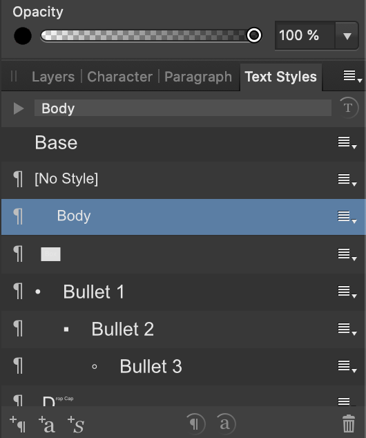
@sfriedberg - I believe I've done what you've suggested by editing the body style dialogue. There are now indents, but the spaces are still there.

-
1 hour ago, sfriedberg said:
@AntiqueFlaneurAre you already using text styles for the body paragraphs? By selecting all the text and assigning a style, you can then change the properties on the style and it will automatically propagate to all the styled paragraphs. So clean up any extraneous extra paragraph marks as has already been suggested. Then control the inter-paragraph spacing and indenting in just one place, by editing the properties of one text style.
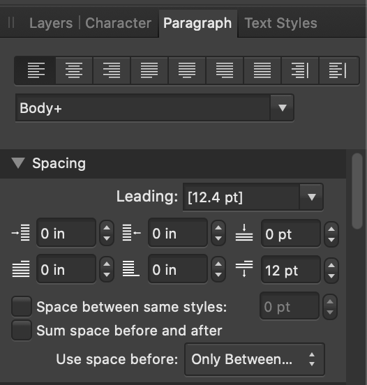
There are no extra paragraph marks as far as I can tell by turning on special characters. And I just looked at the paragraph styles inter-paragraph spacing and indenting and it seems like they are both set to zero. What am I missing?
-
3 hours ago, anon2 said:
Try this:
It appears that there is only one paragraph return between the lines (see attached), and yet there is a large space between the paragraphs.
-
Is there any way to automate the deletion of extra spaces between paragraphs or the creation of indents in front of paragraphs? It would take me at all day to do it manually with this 300-page text file I've got to get into Publisher, and I'd love to find a shortcut. Whether it's something I can do inside Publisher or something I need to find externally, it would be worth my time. See attached file for the current situation.
-
4 minutes ago, Old Bruce said:
Further to what v_kyr has said, I use fixed width spaces for this sort of thing, check out the Text > Insert > Spaces and Tabs >
You'll find a number of different sized widths. I tend to go old school and use En spaces.
I'll check that out, thanks!
-
5 minutes ago, MikeW said:
Select the space after the Wingding character. Set the font to Arial.
Thank you!
-
2 minutes ago, Old Bruce said:
Could be the font used. Could be that the diamond is a different point size than the text. Is it all one font?
The diamond is "Wingdings 2" font.
The words and the page number are "arial".
All of it is 12 pt font.
-
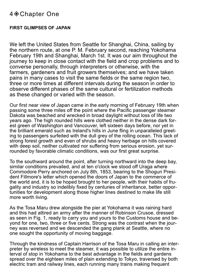
I've attached a picture below from Affinity Publisher.
I've got a page number, then a space, then a diamond symbol, then another space, and then "Chapter One."
But the space between the diamond and, "Chapter One" is about double the size of the one between the page number and the diamond.
Why is this, and how can I fix it?
-
Interesting @Joachim_L
So you paste the text into a Publisher document, save that somewhere, and then place that document into the linked text frames of another publisher document? And the text frames of the second document are updated when you edited the original document's text?
-
Got it. Thanks. So just to clarify: If I set the image placement policy to, "prefer linked," and the image is saved outside of an affinity file, modifying it externally will update what I see in Affinity, correct? But that won't happen with the text files. Once loaded, you'll have to modify the text within publisher.
-
I've got a 300 + page book I'm trying to lay out in Publisher.
After watching some tutorials, it seems like my best bet to allow for easier editing later is to have each chapter held in a series of linked text frames. The text for these frames would come from an externally-held linked text document ( a separate one for each chapter). Does that sound about right? Any other suggestions?
-
7 minutes ago, v_kyr said:
See the Glyph Browser panel, select the font in the drop down and perform a double click on the char of interest ...
Got it! Thanks.
-
I'd like to put one of these diamond shapes into a book I'm designing in Publisher. Is it a character I need to put in somehow, or a image I have to add? How do I get them in?
-
I'm about to start designing a book (in Affinity Publisher), a project that also requires me to edit more than 100 photos (Affinity Photo).
I'm wondering how I should do this in the most efficient way possible.
Right now I've got a folder for the project with a subfolder with my original unedited photos. I've locked this folder so the originals can't be overwritten. I'll create a second subfolder for the edited photos I will create.
I think it makes more sense to edit each image as I come to the page it will be on in the layout process rather than doing them all up front, since its sizing may vary depending on how it needs to go on the page. Would you agree?
Does anyone have any suggestions for organization and workflow that might be helpful before I start the project?
Thanks!
-
4 hours ago, John Rostron said:
One problem that you might have is if your images are half-tone, that is they are made of lots of different-sized dots on a grid. One way to fix these is to apply a Fast Fourier Transform or FFT DeNoise Filter (Filters > Noise > FFT DeNoise). It is a bit fiddly, but once you have practised, it becomes fairly straightforward. See this tutorial and this thread. Note that the tutorial is an old one (and therefore deprecated), but I cannot find a more up-to-date one.
John
That's a really cool tool! My photo did not really seem to have a lot of noise to remove, and when I did there wasn't much of a noticeable difference. But that's a really cool option to keep in mind for future use.
-
5 hours ago, GarryP said:
Welcome to the forums.
You will probably get good advice if you tell us what kind of "improvements" you want to make to the pictures.
Since you haven't given us any examples we can't know what state the pictures are in and, thus, can't give any specific information.Hi! Thanks so much for your response.
I'm attaching three scans to give you an idea of the type of photos I'll be working with on this project. One is an agricultural field, another is a portrait, and a third is a group portrait.
Basically I want to photos to stand out and be as clear as I can make them. I'm looking for suggestions for which tools/settings/filters I should be experimenting with to make and/or what tutorials I should watch to make that happen. I'm afraid I don't have enough of an eye/the technical vocab to describe in more detail what specific effect I'm looking for, so I'm hoping someone can give me some ideas.
Thanks!
farmersoffortyce00kinguoft_orig_0008.jp2 farmersoffortyce00kinguoft_orig_0034.jp2 farmersoffortyce00kinguoft_orig_0439.jp2
-
Hi.
I'm fairly new to image editing.
I've recently received high resolution scans of an old old-of-print book that is now in the public domain. I'd like to make it and its black-and-white photos available to the public.
I am not super experienced with photo editing, but am keen to learn.
I need to crop off the parts of the page that are around the photos and then do my best to enhance the scans to make them look great. Can anyone suggest a guide/tutorial for doing this kind of work in Affinity Photo? I think I can probably figure out the cropping part fairly easily, but I particularly need to know the best tools for improving the black-and-white photos.
Any advice welcome.
Thanks!


Can you automate the deletion of extra spaces and the creation of indents?
in Pre-V2 Archive of Affinity on Desktop Questions (macOS and Windows)
Posted
Thanks!