konstantnnn
-
Posts
201 -
Joined
-
Last visited
Everything posted by konstantnnn
-

MULTIPLE DROP SHADOWS
konstantnnn replied to konstantnnn's topic in Feedback for the V1 Affinity Suite of Products
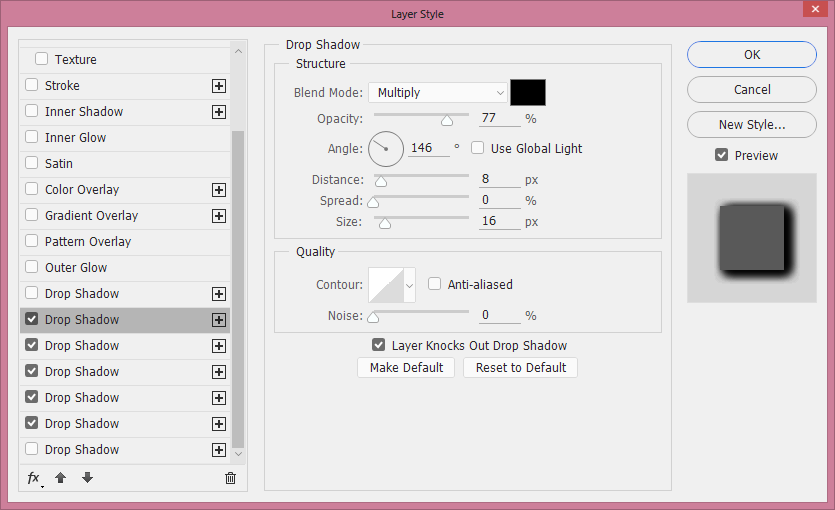
Hey, ive tried to make it a bit more prominent. Isnt the difference big? Look at how the complex shadow touches and molds around the object in almost 3d space, the shadow on the left (basic one) almost looks like the object is elevated in random space with no context.
-
MULTIPLE DROP SHADOWS
konstantnnn replied to konstantnnn's topic in Feedback for the V1 Affinity Suite of Products
That above is a cool effect, it is ever so easy achievable with clipping masks and 0% fill blend and such. But its like such a specific scenario, I would like never request a specific app button and feature to do that easily. But long drop shadows, tho, are like the basic of the basic, and especially multilayered effects like multiple glows and gradients, really a standingstone for nice and subtle effects. The single-shadows are quite rather harsh, arent they? Kinda also reminds me of turning on ambient occolusion in C4D when I was like 11 and being so amazed by the difference Perhaps, I think the best way to see the difference is to look at the shadows from your document and then look at the shadowing of multi-drop-shadows on my first image! Quite profound -
MULTIPLE DROP SHADOWS
konstantnnn replied to konstantnnn's topic in Feedback for the V1 Affinity Suite of Products
Hope the team makes the ability to add multiple effects of all kinds to a single object/layer! -
MULTIPLE DROP SHADOWS
konstantnnn replied to konstantnnn's topic in Feedback for the V1 Affinity Suite of Products
The first thing I could find. No offense but like, I really dont know whats confusing about multiple drop shadows on a single layer lol, like, its, a single layer, like, "1" layer, and you apply, like, "more than one" drop shadow to it -
MULTIPLE DROP SHADOWS
konstantnnn replied to konstantnnn's topic in Feedback for the V1 Affinity Suite of Products
I think its just, you know, *really simple*.
-
MULTIPLE DROP SHADOWS
konstantnnn replied to konstantnnn's topic in Feedback for the V1 Affinity Suite of Products
Plus, a huge issue arises where I'm not only adding an aditional drop shadow to my original content (let's say a shape), but I'm also drop shadowing my shape+drop shadow, and the next round I'm adding a drop shadow to the shape+shadow+shadow, where things may start to get a little bit ugly. In reality, I need to add a shape+shape's shadow+shape's shadow+shape's shadow, not shape+shadow+shadow of shape and shadow, etc. Shadowing a shadow is resource intensive as well. A real solution to all this is to duplicate an object, where you set "fill" to 0 and apply different shadows, but then you cant edit it. Then you have to use symbols, for example, which might be a solution, but at this point you are changing your workflow too much to accommodate somebody's lacking features and you might as well just run Photoshop. But it must be said, Illustrator sucks at this. They "allow" you to add multiple shadows, but what they really are doing is they are adding a shadow to a grouping of the object+previous shadow, so its ugly. If Affinity were to implement this feature, each subsequent shadow must be the shadow of the original object only, ignoring any existance of other shadows and not adding them in the total shading, reducing resources and making it more pretty. -
MULTIPLE DROP SHADOWS
konstantnnn replied to konstantnnn's topic in Feedback for the V1 Affinity Suite of Products
This is not a real solution, this is a quick patch. I'm already doing this. Pro tip, use "New Layer" instead of "new group" to keep alignment. -
Aligned objects not actually aligned
konstantnnn replied to konstantnnn's topic in V1 Bugs found on macOS
This happens cross platform, on macOS, iOS, Windows, Linux, in exported JPGs and PNGs, in printed PDFs from my printer, everywhere. No, they are propertly aligned in the program. No, shifting everything "closer" or adding a stroke or doing anything else as a quick patch is not a real solution. -
Aligned objects not actually aligned
konstantnnn replied to konstantnnn's topic in V1 Bugs found on macOS
Screen Recording 2021-08-07 at 17.58.04.mov Objects in clipping masks have colors bleeding from portions that BY DEFINITION should not be visible. This is ok on this high resolution document, but on lower res content like more than 2% of the whole object is just this red bleeding that shouldnt be there. Its virtually unusable. My workaround was for YEARS to just match the color of the circle to the image, or to set opacity to 0, but this is NOT a solution! This is a temporary bandaid to a core rendering problem so many apps have. Please find a way to fix this. Please! This is not just a rendering in the app, it affects EXPORTS! -
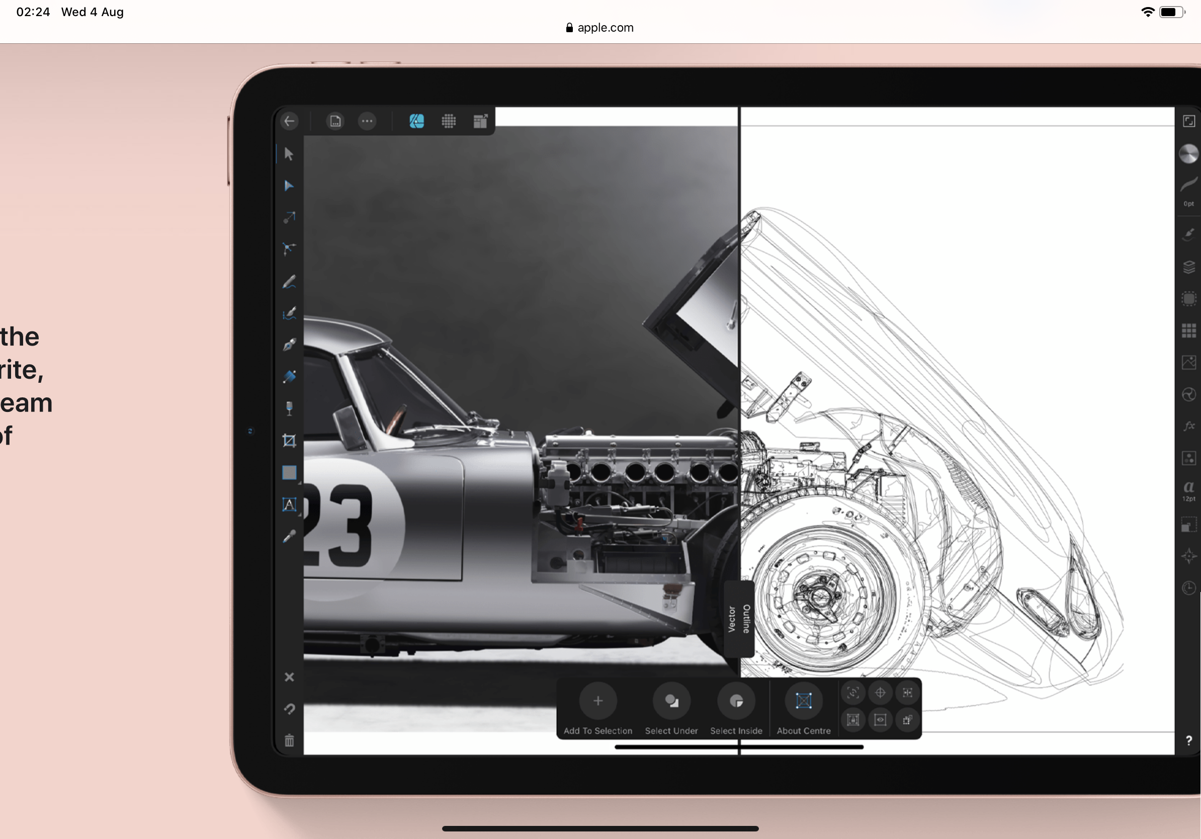
When I perfectly align one image next to another, a tiny gap appears between them, a tiny seem appears. Example 1: Let's put these three images one next to another When exported, the final result has a tiny gap between each photo. When zoomed in, this is pretty visible. This is also visible while editing in the program. Yes. I have perfectly aligned it. Yes. I am not a two year old. Yes. This is actually, how, it, works. Example 2: Drop shadows not aligned, Case study: masterclass logo . png Example 4: No, this is not just an issue with exported PNG files. Even tho the objects are perfectly next to one another, its the same path just flipped, the background bleeds in not only on the center, but also on the sides where the orange flap is peaking through — even tho, technically, the orange flap is behind both objects. Screen Recording 2021-08-07 at 17.55.13.mov
-
Let me add many of them
-
I would DIE if adfinity used ordinary notes’s technology (actually called Pencil Kit and can be found in the screenshot ui, for example). There’s a wonderfull app called Ink (from the same developer of “Noto”) that uses pencilkit
-
Thank you so much
-
This was a few months ago in the app, it was an amazing smaple.
-
If I want to duplicate a view of my document on a second display (without the UI) I must go to "New View" and then "Separated window mode" and then drag it out, but now I have got this ugly confusing UI where my windows and panels are scattered everywhere and its inelegant and i just want like, to drag out a view on a second display with my main display and my main window and my main app being held in place.
-
- 1
-

-
When I highlight a character, I want its glyph to be shown immeadiately in the glyphs panel. I want to be taken to it, where I can find similar alternatives to it.
-
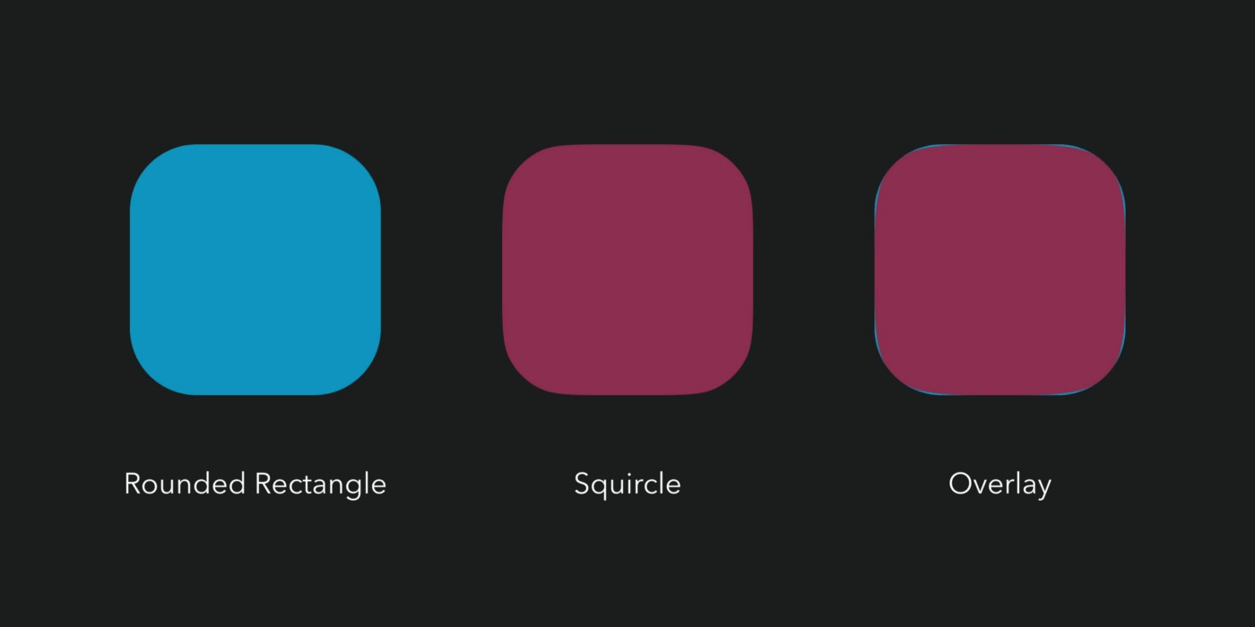
Even better, instead of this additional button, make it so that “Squircle” option is under the “Corner Type” list This way, this feature could be implemented in the Corner tool as well under it’s dropdown list.
-
Smooth corners and radius-ed corners are different things. Read: https://prog.world/ios-icon-shape-secret-is-it-a-squirrel-parsing/ Please let us define — while creating a rounded rectangle, if we want to use radiused corners or superelipse smooth corners. I have provided an idea on how this could be implemented. This is crucial for design work of good taste, and the building block of all iOS design, and good design Let's beat illustrator to this one, and catch up to sketch
-
Provide a glyph browser now!!!!! Please!!!!!!!!
-
I’m ever so curious, what functions do you see missing?
-
I just went to use Illustrator for a few moments at school yesterday. I havent used it for years. I couldnot believe my eyes, from the shaggy antialiasing, to the way the snapping works very weakly and unsurely, to the way basic operations are so much more harder and hidden, effects and dropshadows render stupidly, and NO MIDDLE MOUSE zooming and panning. I have been really spoiled over the last few years. Installing Affinity on that machine was like a fresh breath of air. I love your app guys, your APPS, and how incredibly they work together. Keep it up, and thank you for making my work possible.
-
- 3
-
-
Affinity Photo ignoring iOS edits
konstantnnn replied to gionaguidi's topic in V1 Bugs found on iPads
WTF i thought this was intentional? seriously? -
A basic UI design feature of all apps on all platforms on all systems of all time of all history is creating an extra margin around any given tap area, that enables you to drag your finger outside the tap area to cancel the tap operation if you change your mind. Your app is a huge honk. It has operations that take a long time especially with serious documents. I find myself so often accidentally hitting the Save button or a CLOSE button (FOR WORSE), and I just like watch my mistakes happen in the glass reflection on the ipad questioning my life choices. FIX that, thanks
- 1 reply
-
- 1
-

-
More Spring-loaded tools on iPad?
konstantnnn replied to Randall1028's topic in Feedback for Affinity Photo V1 on iPad
+1 on the springloading, on the zooming part, i just forced myself into getting a magic mouse