

Louie Morais
-
Posts
18 -
Joined
-
Last visited
Posts posted by Louie Morais
-
-
Hi fellas,
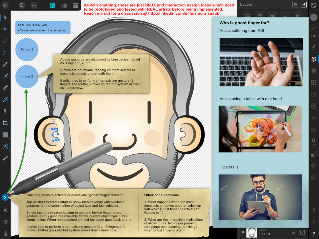
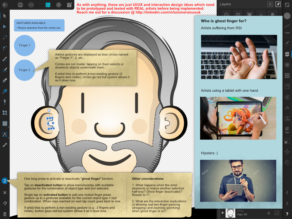
I am suggesting the creation of a feature that allows designers to use the Apple pencil to emulate finger gestures when they are unable to use both hands, either because they are holding the tablet or are suffering from repetitive strain injury.
This feature works by tapping the amount of "ghost fingers" to emulate in the ghost finger button (where the stylus is pointing). As you tap the Ghost button, blue circles named Finger 1, 2, etc appear on the screen and a tooltip hints what gestures are available. The artist then can use the pencil to manipulate the object or canvas as if their fingers were on the screen:

-
Perfect, thanks Sean!
-
-
18 hours ago, Louie Morais said:
How about a pen area? Like an empty circle underneath the studios, where designers who work holding their tablets with one hand or have motor disabilities can tap and each tap emulates a finger pressed on the screen.
Just to illustrate:
QuoteHow about contextual menus that show all my layer functions like Procreate and Autodesk Sketchbook do? This is the sort of mobile-first thinking that is missing in AD.
Example:
-
Hi Sean,
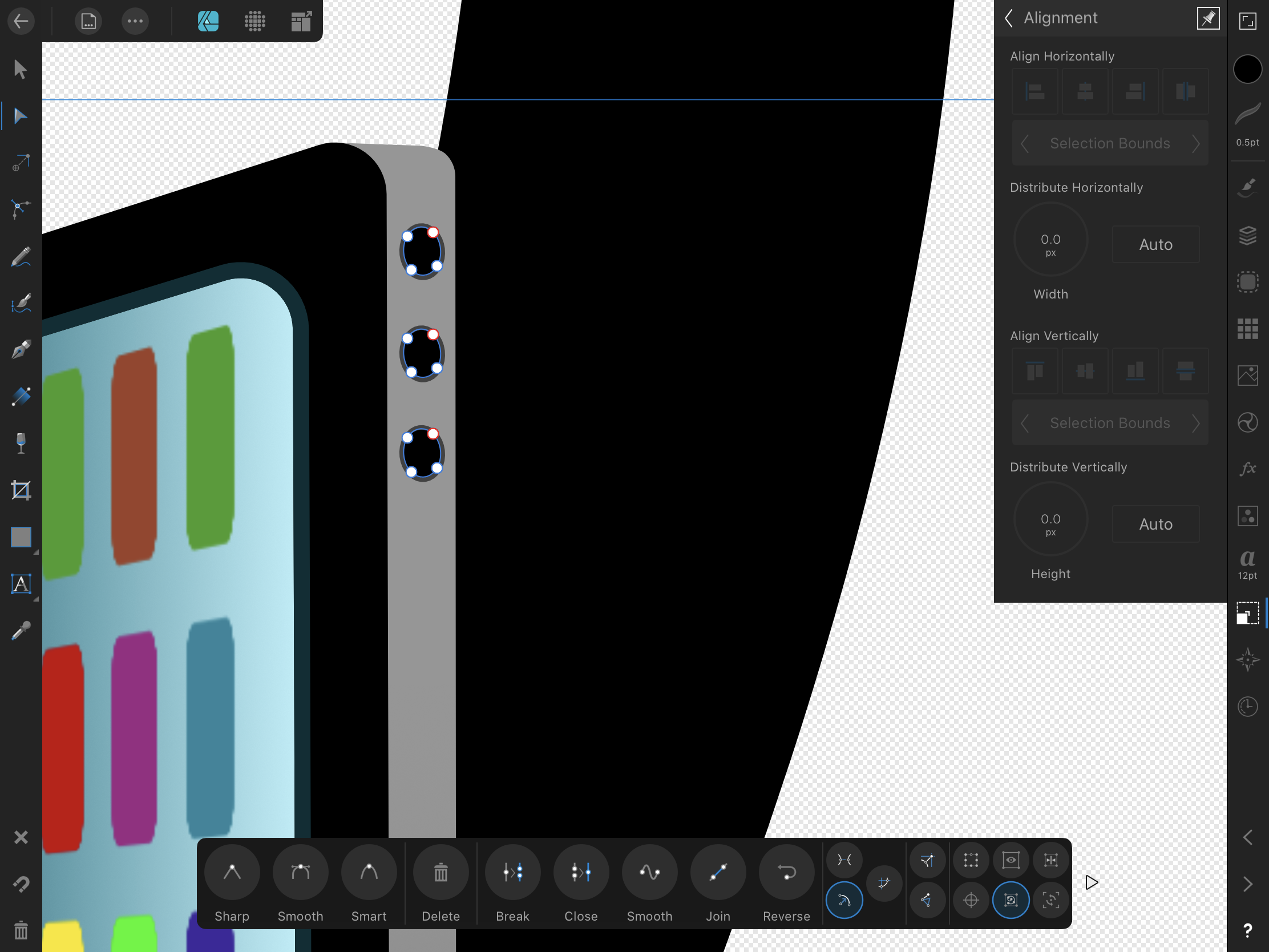
I don't think these issues are inherent of complexity and form factor restrictions. You see, in other parts of the AD UI, you follow the principles we are talking about without any hiccups. Please, Look a the first screen.
In the alignment tab, AD behaves just like any modern software does, if there are at least two objects selected but they don't have a bounding box, then the options are greyed out and the artist can't change values. Greying out gives the user a visual feedback indicating that a requirement (firstly select at least two objects to align and then select them with the move tool) hasn't been fulfilled yet. The artist will realise that the objects are selected with the node tool and once they change to the move tool the options will come to life.
That is the expected system behaviour, but on a side note, perhaps (everything is perhaps until we test with real users) it would be ingenious, if AD went one better and just were a bit smarter to "assume" that if the artist now is opening the transformation studio without having changed from node or any other tool to move, it is because they intended to select the move tool and forgot it and so the system should change the selection from node to move temporarily and then revert back to the users original selection upon the user closing the transformation tab.
But wait a minute, you guys already implemented this smart behaviour elsewhere in AD. Just create an object with no stroke and then go to the colour studio and select a stroke colour and hey presto, AD automatically adds a stroke for the colour the artist chose:
Now go back to the strokeless object and open the colour studio again, don't pick a stroke colour, just try to change the opacity or noise. See what happens now? Nothing happens, much much worse, AD allows the artist to move the slider and plays all the interaction design roles (the button turns blue to show it is being tapped and is active, it slides, the percentage value changes) and then as soon as the artist releases the button it springs back to zero. This illustrates what the issue with Serif products is, it is not complexity but UX and consistency:
In the example above, Serif could have copied one of two behaviours you guys already use in AD: 1) grey out the opacity and noise sliders or 2) add a thick (black?) stroke automatically as one slides the controls. In this specific instance, I would go with option two for several usability reasons: using an initially thick black stroke would warn the artist they still need to pick a colour and select a size; changing a system selected colour is not a big effort and; it is less disruptive. Instead a third behaviour was created, one that unintentionally deceives people and wastes people's effort whilst not giving them any clue of what they need to do.
Now please take a look at the second screen:
By looking at the UI, can you tell which objects are selected to receive the effect? Can you tell which effect I am working on? Can you tell which tool I had selected initially? This is another example of lack of a consistent interaction and visual design language which has nothing to do with software complexity or platform limitations.
QuoteIt has been left in, as it is still possible to modify and edit strokes on vector objects whilst in the Pixel Persona. For example you may be in the Pixel Persona to adding texture to some vector shapes, but realise you want to adjust the stroke size or pressure profile, it means you don't have to switch back to the Designer Persona to make a small tweak and then switch back to continue adding texture.
This is just the same as having the Stroke Panel available on the desktop - unfortunately its just a side effect of complexity of the application crossed with the limitations of a small touch only UI.
Starting from the end, I understand one has to start from somewhere but from the moment you crossed the device threshold, you need to be more mobile-first (at the moment AD is mobile-also but not mobile-first) and refer less to the desktop as your point of reference. As a customer, although I have the desktop version, I only started using Serif products on the iPad and only because unlike Adobe you didn't butcher your vector software and repackaged it into two or three dwarf apps.
Referring to the limitations and complexity, I believe we are well past this kind of argument not only from the moment you yourselves set the example by porting AD and AP to the iPad but also because as I illustrated above, the issues AD has are basic and elementary UX which, I suspect, spring up from not going deep enough into a mobile-first Product Design mentality. Just as an example, in the AD preferences menu, you have an option for "shortcuts" which are all desktop-based, I’d rather have “gestures” with the option to switch two and three fingers gestures with pencil taps and presses instead. How about a pen area? Like an empty circle underneath the studios, where designers who work holding their tablets with one hand or have motor disabilities can tap and each tap emulates a finger pressed on the screen. How about contextual menus that show all my layer functions like Procreate and Autodesk Sketchbook do? This is the sort of mobile-first thinking that is missing in AD.
Yes, I find the consideration for use cases where creatives are using varied digital formats (pixel and vector) to do their art commendable, but that kind of shows that the idea of segregating features and brushes between “personas” based on whether one is using pixels or vectors doesn't work because that is not how creatives work and think (but that is another thread); that is how developers think, and now you find yourself having to create holes in the dividing wall between personas so that the real and most times chaotic creative process may flow.
Finally, perhaps I didn't express this the right way. I never suggested that you took any functionality away, yes allow artists to do vector operations in any mode even in export mode if you will. The problem I am highlighting is that 1) it is a basic principle of software design that if a function is not available for an operation then don't offer it until it is ready, just grey it out until it is available: what is the use of having the corner tool available and displaying its contextual menu when the object selected is a raster object? See third screen:
2) The focal point I am making is that on top of not greying out a function that is not available, AD is duplicating the same function on the same screen and the duplicated function doesn't work like its copy. Once again please see the fourth screen:
The solution is either a) you grey out the duplicated function that doesn't work like its copy or b) you make the duplicated function work equally as its copy as I have illustrated in the beginning of this thread with the fifth screen, which is something AD already correctly does:
-
-
-
That's really confusing and inconsistent. If functionality Is not available in one mode, then the interface shouldn't offer it at all...
-
No I don't, DM1. But looking at it again, I see that I accidently created a margin and that was what was appearing/persisting before.
It is the UX, DM1. Margins and guides look the same, but if one selects a guide and moves to the next set of controls, which is margin, the guide stays selected so one can easily create a margin thinking they are entering the numbers for the selected guide appearing on the screen. I think you are trying to cram three different pieces of functionality (guides, margins and columns) into just one label (guides). I would recommend:
- that instead you keep them separated like you guys did with bleed and grids, and provide individual links to each functionality (guides, margins, columns) from the document menu.
- Make margins look different from guides.
- Although I understand margins shouldn't be easily changed by direct interaction like guides, at least make them show the margins contextual menu when someone taps on them. The same for guides, if someone taps on them show the guides contextual menu.
- Offload the document menu to contextual gestures. You are missing an opportunity to use the long press/tap on an empty part of the canvas to show a menu linking to/activating the grids, bleed, guides, margins and columns contextual interface. The same could be said for layers.
I hope this may help but if you want I can provide a few wireframes showing more visually what I mean. Or hook me up with your UX professional. It would be a pleasure to help.
Louie
-
Hi fellas,
I'm using AD 1.8.2 on an iPad Air 3rd generation, software version 13.3.1. Yes, AD acts funny when I use it for a few days In a row. First thing that goes downhill is the gestures that go with the pen stop working and then the pen becomes harder to select elements. Saving and closing the file misses the last change and then the app starts to crash. Yes, even a simple turn off and turn on brings the iPad back to normal and AD works fine again. Quite frankly, I'm still impressed on how much work AD can do in a small iPad, so no real complaints.
Sean, I'm sorry I really don't remember what I was doing.
-
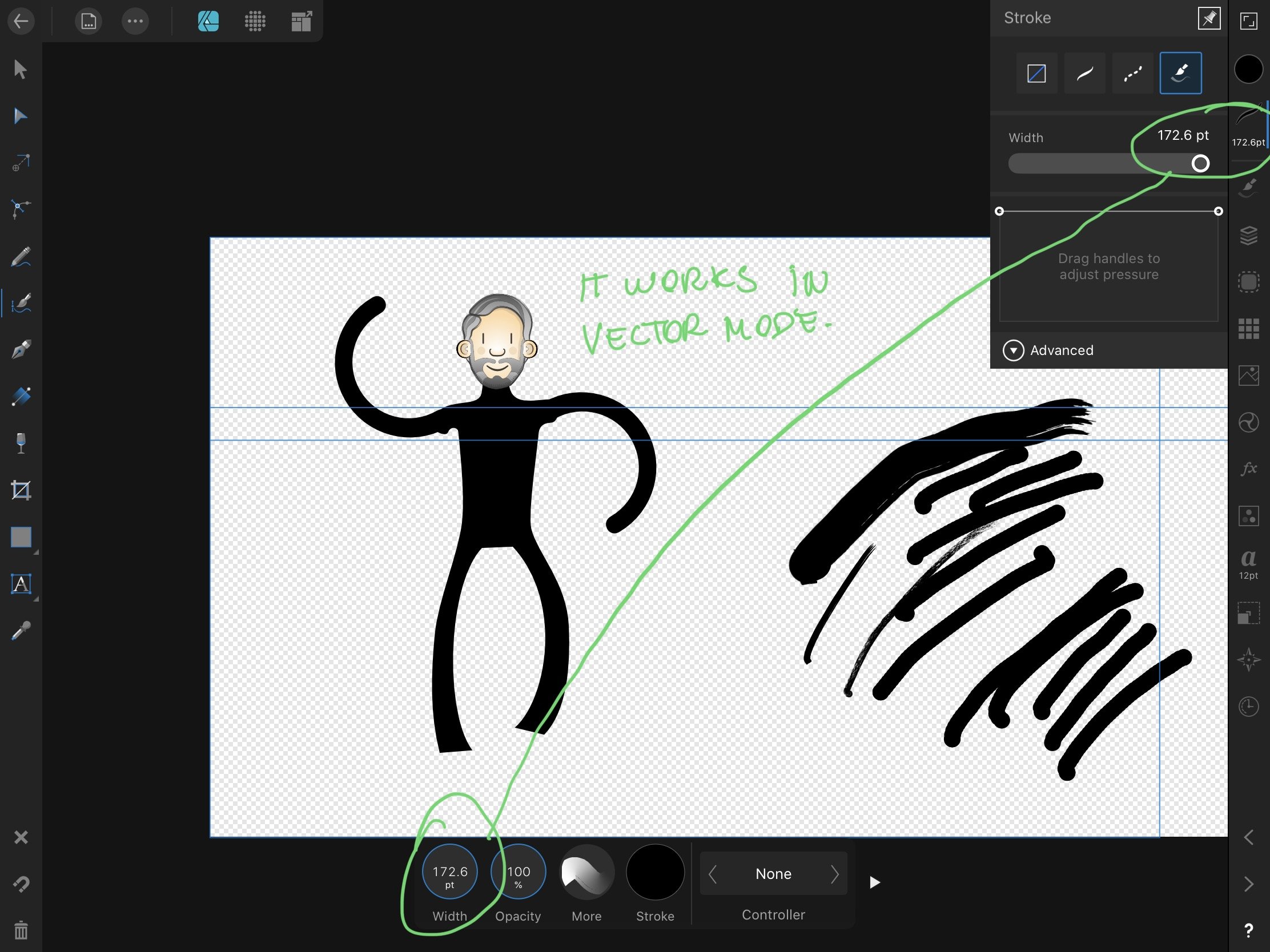
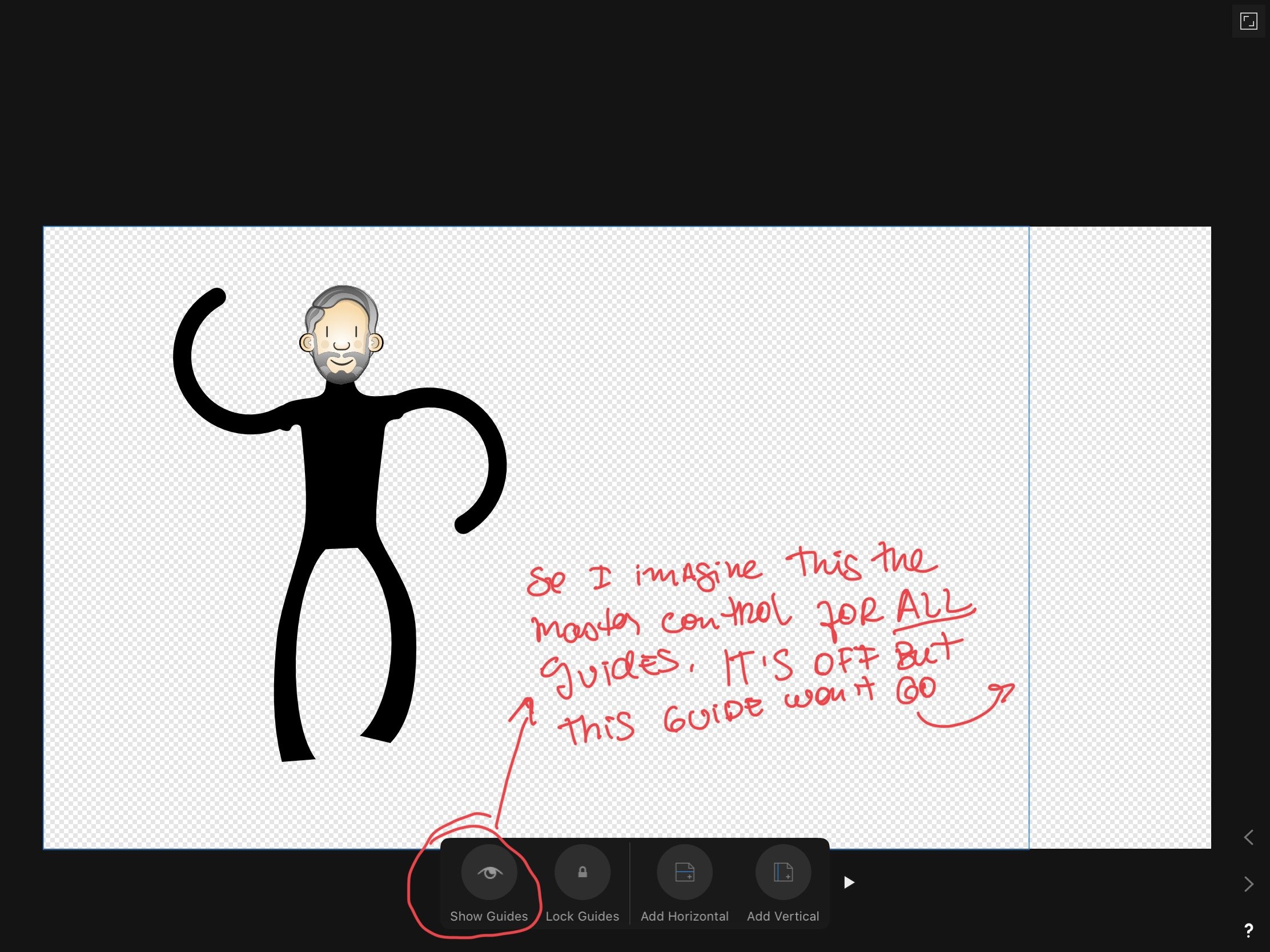
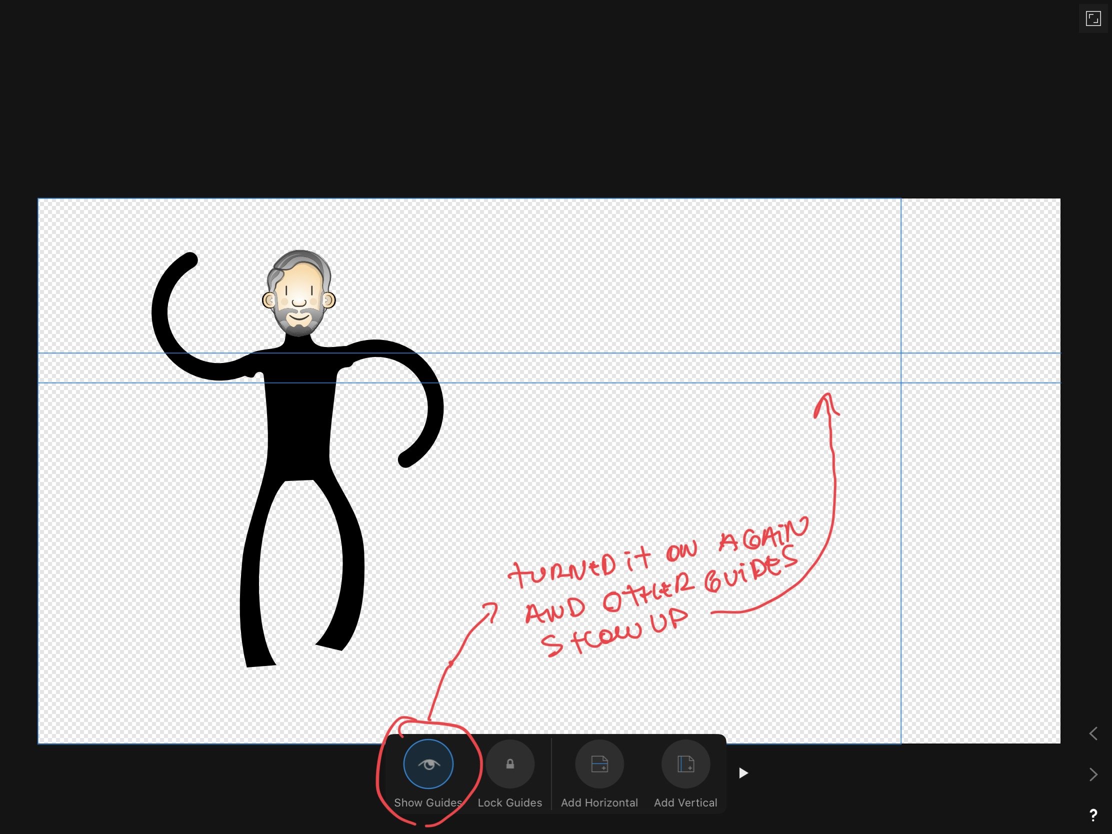
Another one that I can't tell if it is a bug or poor UX again.
I expect that if you provide one master control to turn on or off guides that will override any other, since you have 3 (!) controls I am not too sure:
-
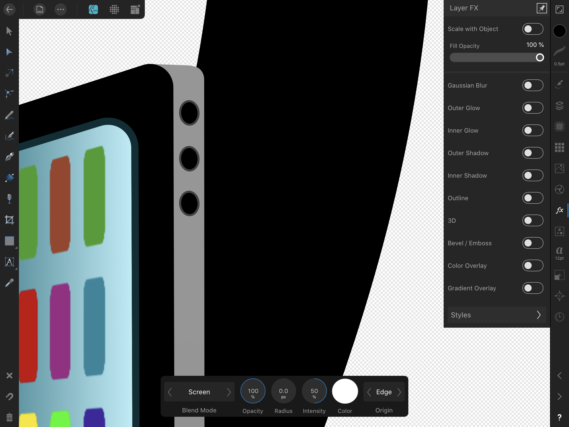
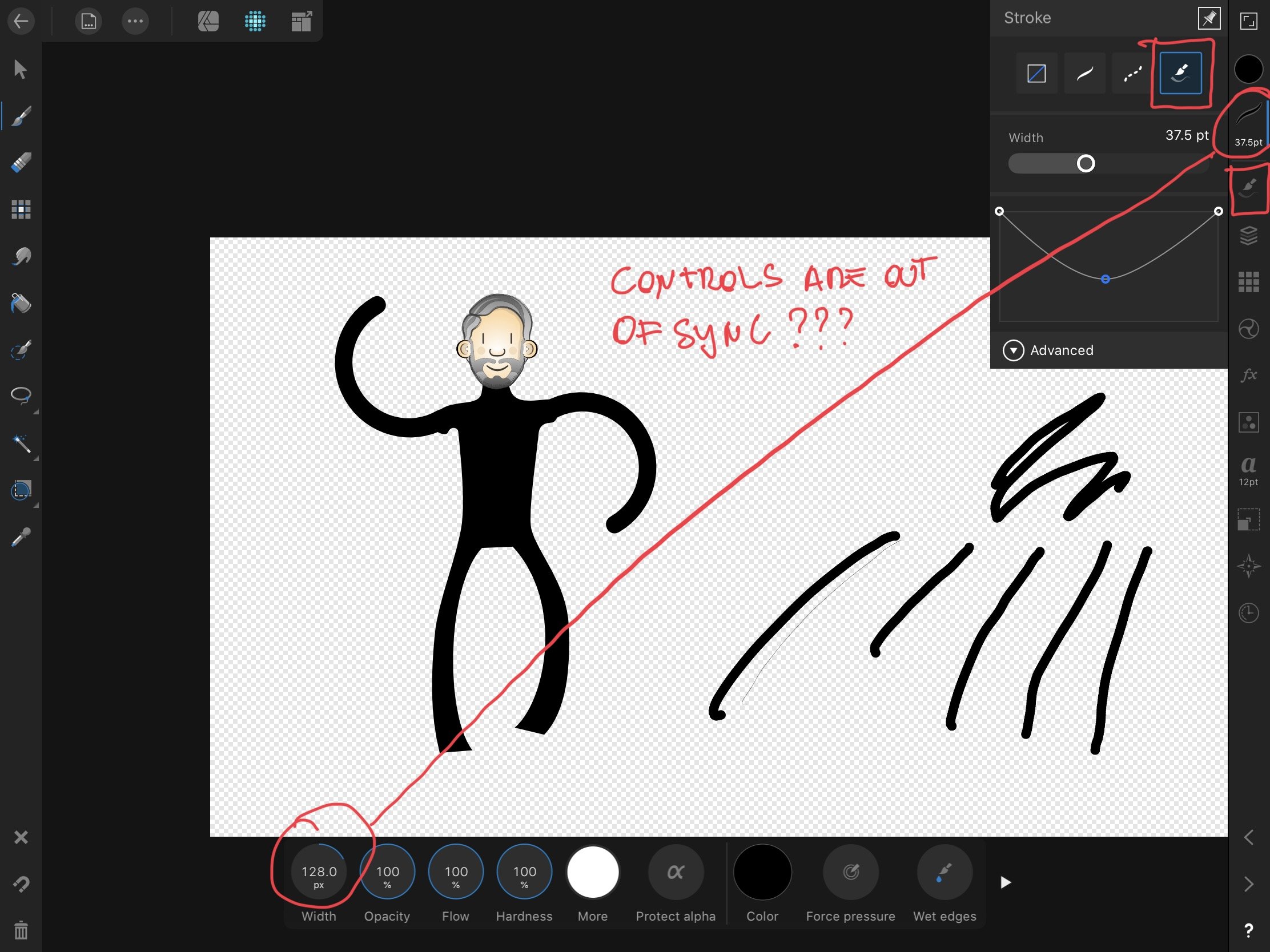
Not sure if a bug or just bad UX. But if I am picking up a brush from the brushes studio and inside the stroke studio there is an icon of the brush studio from which the controls promise me to change the stroke size of the brush I'm using, I can only expect it to change it.
Also, why doesn't the icon of the stroke studio changes to indicate what type of stroke is selected? It always shows three stroke icon although it is the brush icon that is active.
It works as expected in Vector Mode:
-
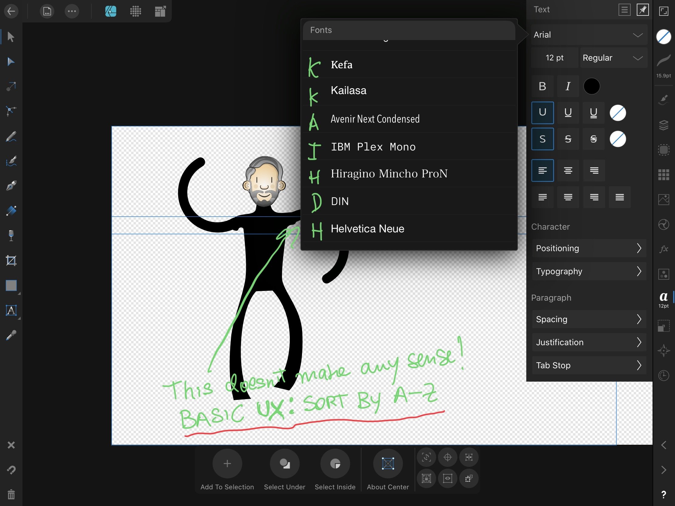
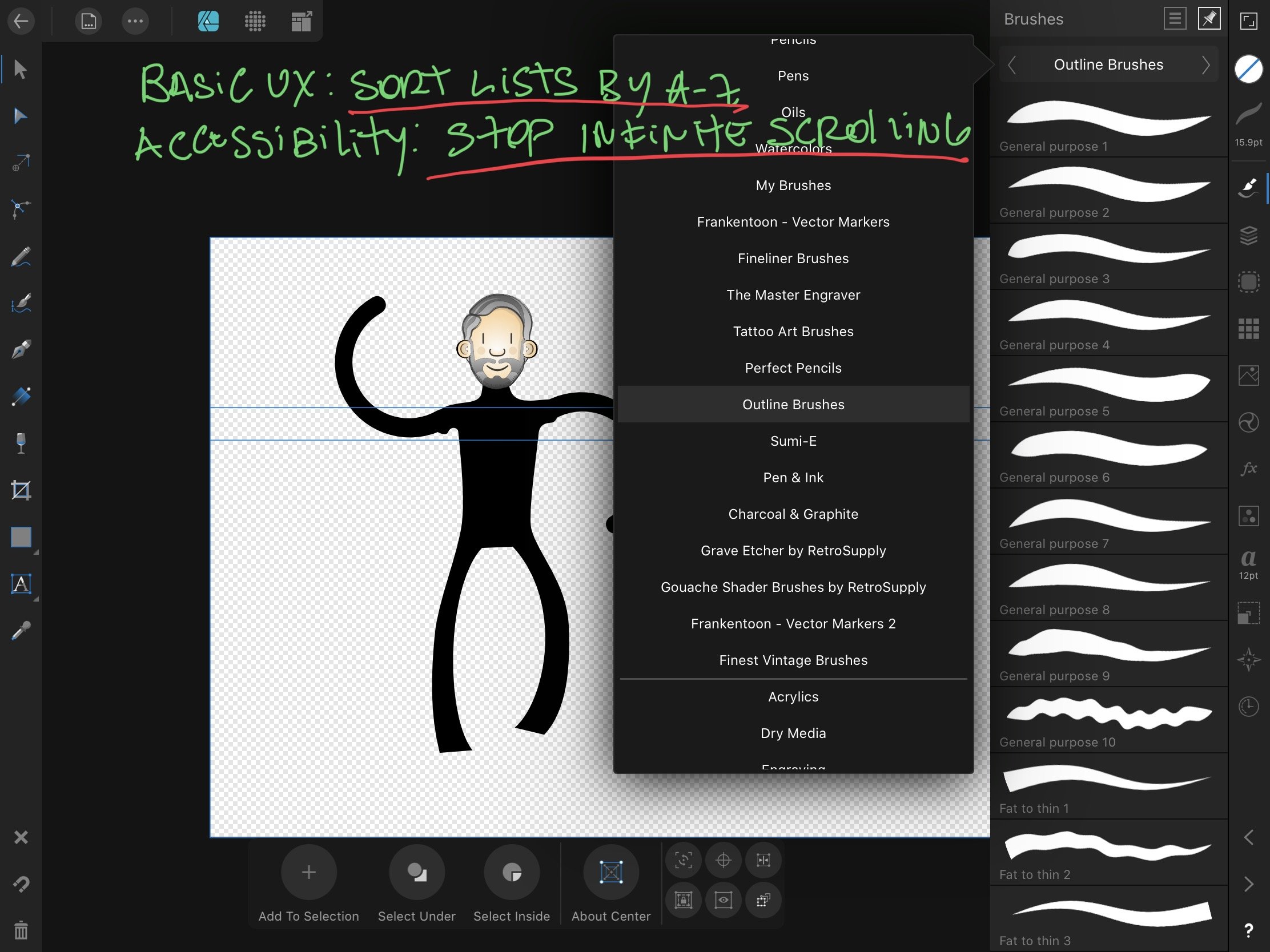
This is basic UX, if you have a list, sort it. If you can't offer the basic sorting options (date created, etc...), by default sort it by A-Z. This is also an accessibility requirement. Infinite scrolling takes the experience from bad to sufferable.
-
On top of that, you guys never use the alphabetical order (a-z) to lists, not in brushes categories, not in fonts, in nothing. And that continuous scrolling in brushes categories names and in other listings is a nightmare and it is not accessible for people with dyslexia.
-
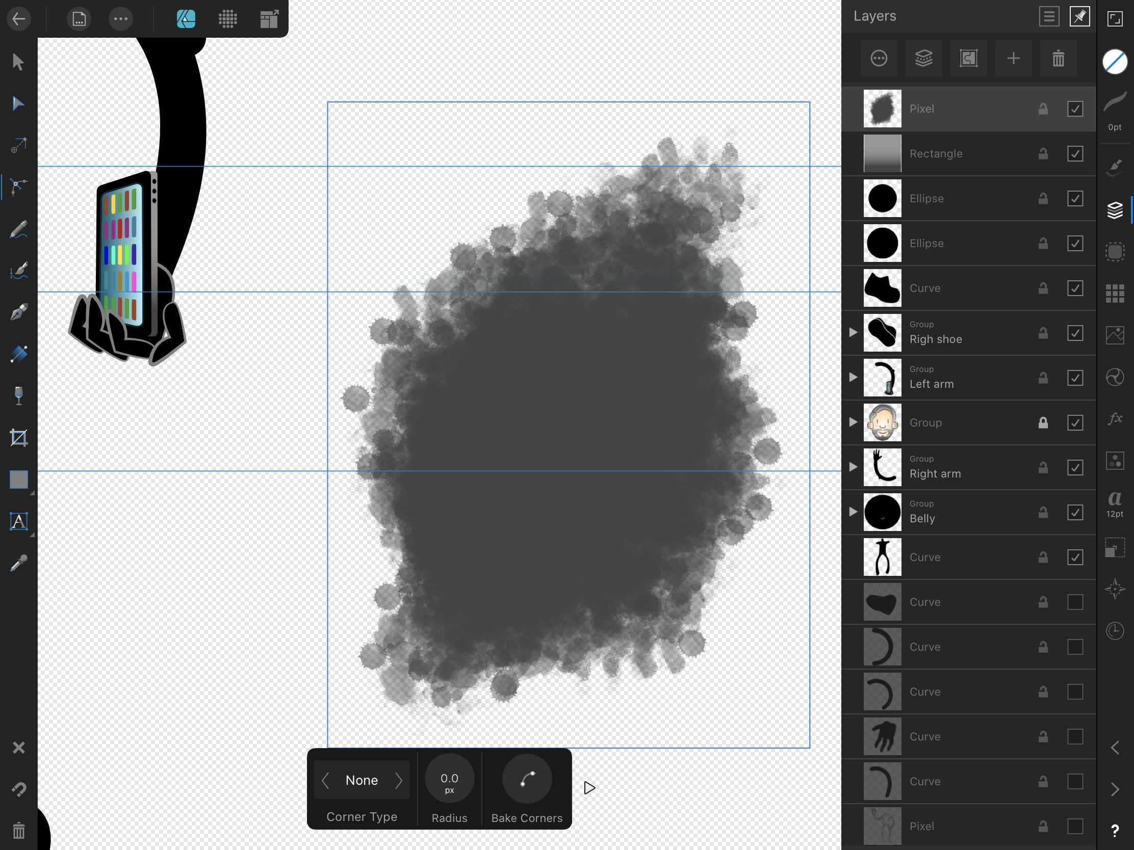
Interface displaying ghost areas.
-
Scrolling of the brushes category listing doesn't work when trying to move brush.
-
Hi fellas,
Does Serif read the questions in this forum?
Two years on and nobody realised that placing the same icon for help ("?") for two completely different types of information is misleading? The help one finds in the work area (where images are created and edited) is barely a help at all, it just shows the tooltips for the main buttons but not for the ancillary buttons (the unlabeled smaller buttons) at the contextual menu that appears at the bottom.
The iPad app is very inconsistent with regards to displaying tooltips, it will show the tooltip with the name of the button on tap just on the tools buttons but not on any others. The problem you create for iPad-only users is that we never know what the ancillary buttons are called to even make a Google search for them. Just try: "what does the button with two arrows pointing to each other under the Move Tool does in Affinity Designer?"
After I used the "?" in the work area and just got a listing of tooltips, I ignored the "?" in the file listing area as I expected it to do just the same too. These two guys above, two years ago, had the same experience.
Ok, here are the issues Serif needs to be aware please:
1. The help in the file listing screen and the tooltip switcher in the work area screen which are both labelled as "?" need to be differentiated and re-labelled:
-
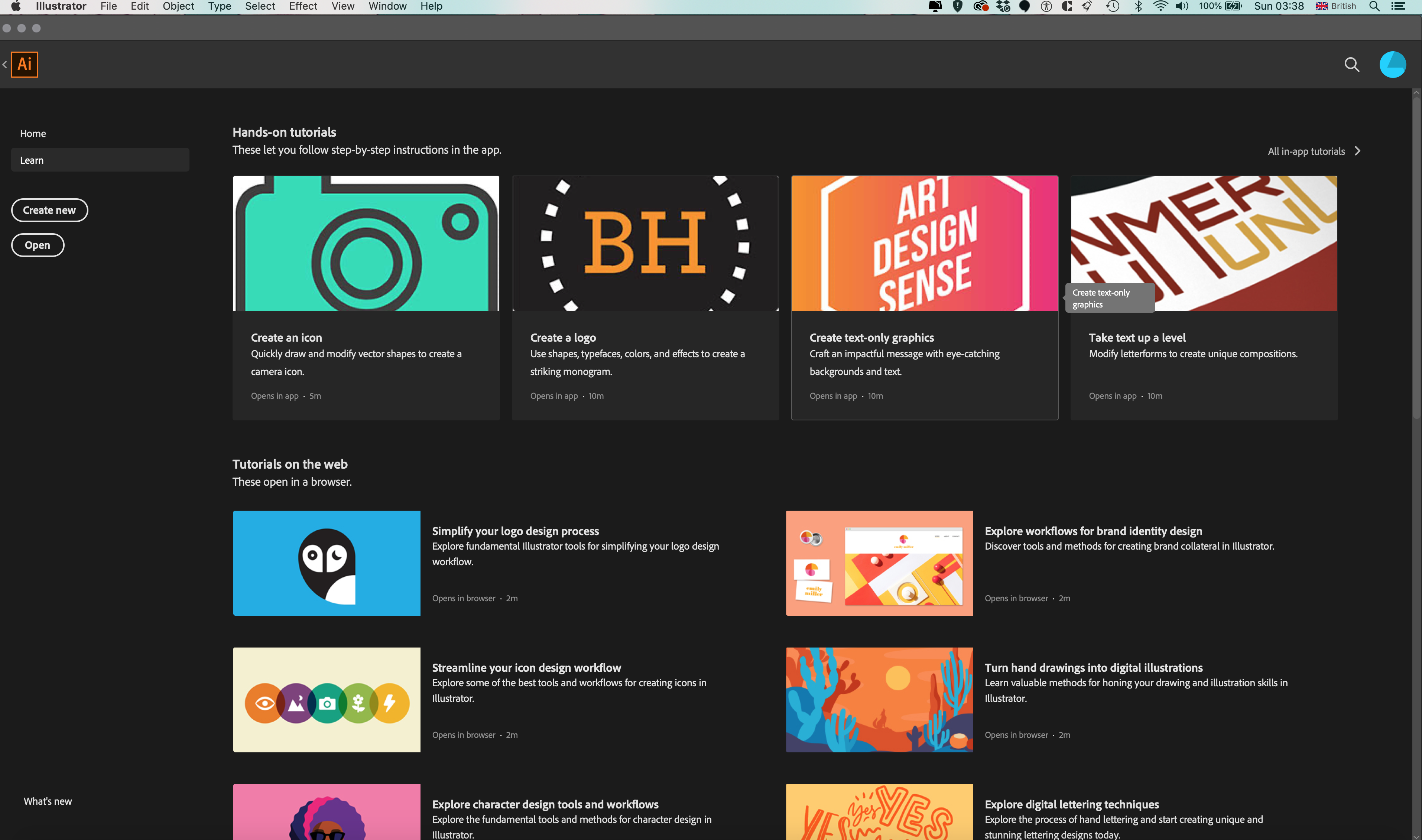
Please rename the real help link in the file listing area to "Get started" or "Help", spelled out. Ideally, you should also have a "Learn" link or a "Learn" area in the app too, listing the few videos you already recorded. Just check how welcoming and beginner-friendly Adobe Illustrator is in comparison (ok, tried to upload two screenshots and it failed, see the link at https://helpx.adobe.com/illustrator/tutorials.html?mv=product&mv2=ai).
- As to the tooltip switcher, anything but a "?".
2. When the tooltip switcher is activated it should show ALL the button labels including the small ancillary buttons, otherwise there is no way for us to learn the names of the buttons we need help with. For sure, you would have the challenge of making the switcher contextual as I can see the reason you haven't done that already is because the tooltips are just being served as a static overlay.
3. As both a UX professional and a Educational professional, I can confidently say that the content you have for help needs professional attention with regards to organisation, labelling, instructional design, content design, information architecture and visual design. This is the help content for one of the best creative tools out there at the moment but it is served as a really messy technical documentation. For example, just in the Introduction section:
- You start with an introduction explaining what AD is and then next follows "About Personas" but then you break the sequence with two sub-sections (Key Features and New Features) just to talk about Personas again at "Switching Personas". Down in the Tools section you talk about "Vector Design Tools" and "Raster Design Tools" but make no mention of Personas any more. Then several sections below, in Workspace, you finally show what the Personas toolbar looks like. It is really difficult for beginners to make sense of that.
- "Key Features" and "New Features" link to the same content but there is no explanation, initially I thought the page was broken.
- "Workspace" which should definitely be part of the introduction is one of the last sections. It doesn't make sense to show screenshots of the interface last.
4. All of that content, with barely any screenshots of the UI to serve as a memory aid or reference.
5. Lastly but not finally, if you have an index with links to content, a basic UX practice is to show whereabouts in the index the content one is seeing is. If someone reaches your help via Google, one never knows which section they are because you provide no clue, no visible selection or a "you are here". The fact that you several times label the links in the index slightly differently from the titles in the content just makes it more difficult to try to find which section the content is in order to follow a sequence of instruction.
Hey, I can help you with that, I would love to, that is what I have been doing since the 90's and still do today. Just give me a nod.
Regards,
Louie Morais
-
Please rename the real help link in the file listing area to "Get started" or "Help", spelled out. Ideally, you should also have a "Learn" link or a "Learn" area in the app too, listing the few videos you already recorded. Just check how welcoming and beginner-friendly


ipad description of all tools
in Pre-V2 Archive of iPad Questions
Posted
Great Andy. Many thanks!