JimmyJack
-
Posts
1,350 -
Joined
Everything posted by JimmyJack
-
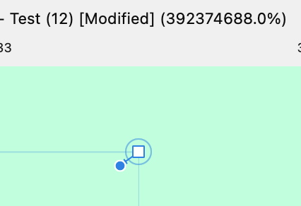
It's a dot in a square... Are you selecting the adjacent node (below) and looking at the problem node? The problem node will be an unfilled square (it's not selected) with a solid dot in it (the handle). In the case of the OP's file the corner tool is already invoked so all of that will also have another circle around it. If you select the problem node, it's selected therefore filled with blue. Because of that you can't see the round blue handle dot inside of it...but it's there. So, back to the OP's, if you select the problem node itself, it'll just look like a blue square in a circle (the circle might be hard to see because of the black fill of the object. I've changed it here).

-
I actually shouldn't have said that (will amend). The dot in square visibility is only affected by the handle size in prefs. Whichever one's comfortable with works at any zoom.
-
It's down there alright! But you really don't have to get in there. The circle in the square (at a relatively "normal" zoom) is the giveaway. 👇 🤣 .... 👁️ 🔍
-
If you click on the adjacent node below the problem node, the problem node (...there are actually a few of them, not counting the double corner) shows as a square with a solid circle inside. This means it has a handle very very close to itself ( @Old Bruce keep zooming, you'll see it). As far as it interfering with the corner tool.... usually it's because the little handle is pointing in the wrong direction. But here it just looks like it got confused. Guess it isn't equipped for odd cases at that scale. You could call that a shortcoming (or bug) in the corner tool I guess, but I think it's more the fault of the expand stroke or "merge" (not sure what "merge" the op is referring to though). Those little guys should never be created in the first place.
-
What I'm saying is that all the pixel could be exactly in the same spots with only a change in gamma setting and you'd still get the halo. Doing the 50% opacity shows they are exactly in the same spot. So the difference blend alone might not be enough. example file attached, play with the opacity: halo.afdesign
-
Well, neither stroke is actually selected in that image. But..... If the description is true, I'm going to guess that you have the stroke width field set to show three decimal places, and the thicker line is in between .001 and .0015. (You probably scaled the curved line a little bit with "scale with object" clicked in the stroke panel) Increase your decimal points in preferences to see. Both of these show as .001" when selected.
-
Mmmmm, close. Yes, if the same the result should be black. But, the difference mode is combining the two so as to give the appearance of a halo around the the whole of each letter so you don't really know which direction one or the other is off, just the total effect. Keep and blend and give either layer a 50% opacity and you'll see the actual offset. Or, just give them normal blends, get in close and toggle the visibility of the top one.
-
Not in the same spot. I suggest making one master (vectot) file and opening in various programs rather than trying to recreate something multiple times.
-
dexterous schmexterous. Option three. Click and drag left/right on the letter Y. No modifier key. Leaves a hand free for....... 🍺. Now that's dexterity!
-
If your willing to draw it one more time using a symbol... (Sorry it's stars...I first posted it a while ago for a different thread) symbol move.mp4
-
There is no resizing being done. Therefore the resampling methods are irrelevant. Kinda the point 😉. Yes same color sRGB 2.1. Yes.
-
😅 You give me waaaay too much credit 🤣 ! My brain's not that big. I got all mixed up putting the comparison together. I kept looking at the screen going "geez, that one sucks.... which one is that again??" (he says as he has to check layers panels). But you're right. I waited 5 pages for a head to head. Had to do it myself. Which reminds me, I think someone posted something right before me. Gotta check that out.
-
Yes I do think one is better.
-
Thanks, AGAIN @Alex M. Gonna let this hang out there a bit as well. Promise I won't forget.
-
Actually there are no variables. Everything has been treated the same. What I think you want is to see a 100% output. It's just harder to see, but all the same stuff is there. Here you go. (original text is also attached in AD file. I did not attach the file with resulting pngs, yet, as that would give away the answers.) text test original text.afdesign
-
Not sure I understand. The zoom in Affinity. Other apps give the same result. Affinity is the only one, though, that I've been told not to trust except at 100s, ....in a variety of situation.
-
Hehehe. That didn't take long. Tempted to let that remain a mystery. 😈 But.... okay. Two from AI. Two from AD. 😇 (maybe there should be two from PS also. Hmmm. That's a clue 😉)
-
Not really sure how that works. All I can tell you, is that if I go from 800% to 700% to 600% on an on screen detail nothing changes. I mean none. With any resample option.... big changes (some bigger than others, obviously). The image I posted, at 100%, looks exactly like the 400% on screen magnification. An output in scale, or even an on screen rasterization, does not. And, time and time and time..... and time again we have been told not to trust what we see on the screen unless it's at 100% or multiples. I guess exporting at a multiple, would be okay simply because all would be treated equally keeping the playing field level. It's just adding another layer on top of the issue at hand, as Bicubic, lanczos etc etc yield very different results. But changes nonetheless. Looking at a result that has been altered further would confuse the perception and therefore the experiment (imho). In order to get up close to the differences, (I think) this is the way to go. But I'm all ears....
-
400%. AFAIK any multiple of 100 is true. (Gotta use zoom. Getting the pixels to show up at any reasonable size on output would require resampling..... and that is a whole other can of worms. 🥴)
-
Ohhhhh-Kay. Here we go. Nothing about this is pixel perfect (except for original page size and final placement of images on the page for comparison) Step right up! (to me there is a clear difference)
-
Thanks for playing!! You are the only one to venture an actual guess. I applaude you 👏. I would think, if the difference is so outstanding, there would be many takers: "x is AD, x, x , x, x" I'll let it run for another day or so in case others want to weight in. (I won't forget to reveal) Yes, there is a very slight difference (good eye). For me to really see it I had to zoom in much farther (and my image above is already at 700%). I also did an overlay of the two which reveals a tiny "halo" around the whole object. But the halo is complete around the edge so the OP's original complaint about just the 90º tangents isn't consistent. The exact data really isn't important because it IS the same identical file used in both. It's a PDF, not an SVG, but that shouldn't matter. I can assure you though, that the circle image, inside diameter, outside diameter, size and placement is all absolutely pixel perfect. But this raises a good point.... in being pixel perfect perhaps I am coddling Affinity too much. I personally think it's absurd (if not impossible) to expect a creative person in a creative app to always be pixel perfect. Snapping overrides it, scaling destroys it. Text can never be pixel perfect. Affinity needs to be "smarter". Next experiment coming. And that will be anything but pixel perfect!! Good test, will do. Another head to head coming right up!
-
FWIW (disclaimer, I did not read all 5 pages. But I'm assuming this is about straight output quality and not what happens when things are resized within Affinity products.) This is my head to head comparison. Simple stroked vector circle (created in AD) exported to PNG in current AD and AI (not saying which is which atm). If you guys say there's an appreciable difference I will leave you to your solutions. 🍻
-
But if the stop values are identical then the midpoints are irrelevant... and (trying) to place them exactly actually increases the likelihood of color invasion across shape boundaries. Especially since interior gradient nodes don't snap to geometry. Sloppiness is easier AND safer 😉 😅. These are identical in terms of color after all: (Again assuming transparency between shapes here.) LOL. Okay okay. I get it (I struggle a bit with it myself). That's all I'm gonna say 🤐 😊
-
Hi @G13RL, Okay, two mentions of @NotMyFault's special sauce!! I really wish someone would post a link. I’m interested to see it. What are the input perimeters?. How does it work with uneven sections or gaps? Until then I guess I’m a little perplexed regarding the diagram above. Why do the many gradient stops need to be so precise? Any haphazard placement in the gaps will work fine. But more to the point… (and this is still assuming equal sections) Why enter multiple things (whether it’s individual values or many gradient stops) at all, when typing one number will do the job? 73 sections…. type 73 done.
-
Care to share the sauce? Sounds delicious 🍽️ . For clarity though, the simple gradient worked perfectly... Granted the stripes are evenly spaced. What didn't was using absolute values of 0%,25%, 50%, 75% % 100% for the brush segments. (I didn't try 0-255 values, just %s)