DJP
-
Posts
54 -
Joined
-
Last visited
Everything posted by DJP
-
Thanks very much for taking time to look at this. I think I know how the strips got in there (long story I won't bother you with). The lack of bleed is an Ingram thing. If you create a 6 x 9 book in Publisher with bleed of .125" all around, Ingram rejects the file. They want you to make a document of 6.25 x 9.25" and place your text and images where you want, taking the bleed into consideration. It's weird, I know . . . .
-
I believe I did, but it was a while ago and my memory may not be perfect. I do know for certain that the file creation guide from Ingram specifies 2001.
-
Werfox, thanks for the reply. Publisher can export PDF/X using the 2003 specification, but Ingram requires the PDF/X-1a:2001 version. I inquired about this before and was told that the library that Publisher uses does not support the 2001 spec. See the attached files. The back cover and spine are blue rectangles and the front is an image with text on top of it. Lines appear everywhere. PAPERBACK_book1 70 lb Ingram PDF-X.pdf PAPERBACK_book1 70 lbIngram.pdf
-
I created a dust jacket and case wrap for a book in Affinity Publisher. I exported PDFs and then converted them to PDF-X using the PDF X-change editor (which I have done many times before with no issues). When printed by Ingram Spark, white horizontal lines appear on both the jacket and the case; see attached photo. I have looked at this file every way I can in Publisher and can find no cause for this. The lines are not visible even under very high magnification either in Publisher or PDF viewers. We filed a claim with Ingram for the first sample, and they replaced it. They can be fussy about files, and I assume that if they had spotted anything wrong with the uploaded files they would have told us. We just received the replacement and it still has the lines. I am flummoxed. Has anyone ever seen anything like this? IMG_0628.HEIC
-
Publisher 2.6 Pages panel no longer shows numbers
DJP replied to DJP's topic in Desktop Questions (macOS and Windows)
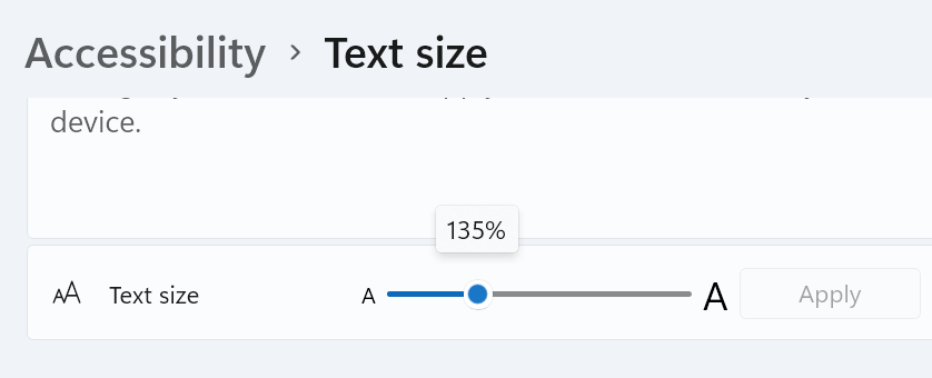
I hadn't realized that the text size in the Accessibility settings was different than the Display Scale in System settings. Using the Accessibility feature, I found that my text size was at 135% (see screen shot). Reducing it to 130% (or less) caused the master page names and page numbers to reappear in the Publisher pages panel -- I didn't even have to restart Publisher. So I'm good for now, and thank you again for your help!
-
Publisher 2.6 Pages panel no longer shows numbers
DJP replied to DJP's topic in Desktop Questions (macOS and Windows)
Thanks, Mike, but this does not solve the problem. My monitor has a native resolution of 1920 x 1080 (listed as 'Recommended' in windows display settings). Ever since I got this computer, I have set the scale for text etc. at 125% (also 'Recommended' by Windows) and there has never been a problem with Affinity Publisher until 2.6. I did try setting the percentage down to 100 but the page numbers are still missing. I understand what you are saying that the Pages and Master Pages label look bigger than usual, but I think that's a function of how I took the screen shot. When I compare my screen shot with how things look in Publisher, the labels are a little smaller. Maybe I need to revert to the previous version of Publisher? I really want those page numbers. -
Publisher 2.6 Pages panel no longer shows numbers
DJP replied to DJP's topic in Desktop Questions (macOS and Windows)
I just opened four documents, ranging from today to a month ago, and they all are missing the page numbers and master names. -
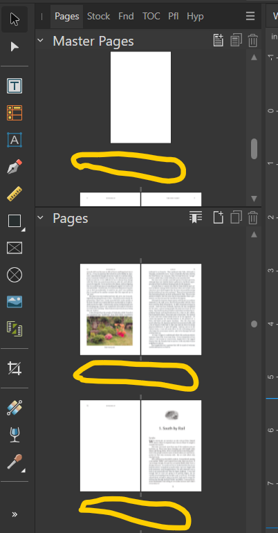
Since updating to 2.6 on Windows 11, the Pages panel no longer shows the page numbers below each page. Also, the names of master pages no longer display. I rely on those page numbers and have not found a way to get them back. The screen shot shows with yellow circles where this information used to appear. Can I get the numbers and names to display? I know 2.6 made a lot of changes to the page functionality.
-
Custom keyboard shortcuts for non-menu items
DJP replied to DJP's topic in Desktop Questions (macOS and Windows)
That's it, thanks! -
I am using Publisher 2.5.3 on Windows. Some time ago, maybe a year (using an earlier version of course) I was able to create keyboard shortcuts to assign some character styles that I use frequently. I am no longer able to do this. Just spent time poking around in the Settings/Shortcuts menu, where I can change the shortcuts for already-defined items such as Find (Ctrl-F; not that I would change that one). But I can't find a way to add a shortcut to something that doesn't already exist. My memory is that I used two modifier keys (maybe alternate - shift) to access my character styles. The Handbook is not helpful. Does anyone know how to do this?
-
Splitting long URLs in Publisher
DJP replied to DJP's topic in Desktop Questions (macOS and Windows)
Ahh . . . I did not realize that I included anything other than the URL with the hyperlink style. I will examine this more closely — I bet it’s the source of the problem. Thank you! -
Splitting long URLs in Publisher
DJP replied to DJP's topic in Desktop Questions (macOS and Windows)
See the attached. The afpub file shows how it looks if I copy the URL from the web page and paste it in as plain text. This works both inside Affinity and in an exported PDF. If I add a space before '1999' by editing the text directly in the text frame (as shown in the PDF), I get an error message when I attempt to visit the wURL sample 2.pdf eb page. URL sample.afpub -
Splitting long URLs in Publisher
DJP replied to DJP's topic in Desktop Questions (macOS and Windows)
Thank you, Mike. If I choose Text/Interactive/Go to hyperlink target within Affinity, it works. But I cannot get the split URL to work in any PDF viewer I have tried (three). Any ideas? -
I have a couple of long URLs that create very loose line spacing. If I manually add a space (either in the Insert URL dialog or later directly on the page) so that the line breaks are better, the URLs no longer work. How to handle this? Note that MS Word has a good arrangement here: you enter the actual URL and then at the bottom of the dialog you enter the text to display in the document, which can be the URL plus spaces to help with line breaks. That's what I'm used to but I can't find anything similar in Publisher.
-
Fuzzy text in exported PDF on certain pages only
DJP replied to DJP's topic in Desktop Questions (macOS and Windows)
Many thanks! It does seem like a transparency issue. I went to the master page, selected the text frame, and the Color tab shows 100% opacity (same as other text frames in the document). I would really like to get to the root of this, but I think I have found a workaround that will let me submit the project on time. I exported from Affinity using PDF/X-4. I opened this file in Acrobat Pro and converted it to PDF/X-1a. I can't see any rasterized text when I examine the result on screen. We'll see how the proof from the publisher looks. EDIT: just received an updated e-proof from Ingram; it looks OK. -
Fuzzy text in exported PDF on certain pages only
DJP replied to DJP's topic in Desktop Questions (macOS and Windows)
Thank you. So the problem does lie in Affinity rather than the conversion to PDF/X-1a, which is very helpful to know. I have looked carefully at the master pages (Color tab, Layer tab, whatever else I could think of) and cannot find any difference between recto and verso. I did not intend to apply any effect or adjustment, but I suppose I must have somehow. Do you have any further suggestions about where to find the difference? I just don't know where to look. -
Fuzzy text in exported PDF on certain pages only
DJP replied to DJP's topic in Desktop Questions (macOS and Windows)
Update: I've been poking around some more. I now suspect that the problem is not in Affinity Publisher. Publisher cannot export PDF/X-1a:2001 files. I export using the PDF for Print preset, and there is no visible problem in this PDF. I then convert to PDF/X-1a:2001 using a PDF editor (PDFX/Change). I still don't understand why only verso pages of one section are affected (could there be something in the PDF exported from Affinity that is not visible or in effect until I convert??). -
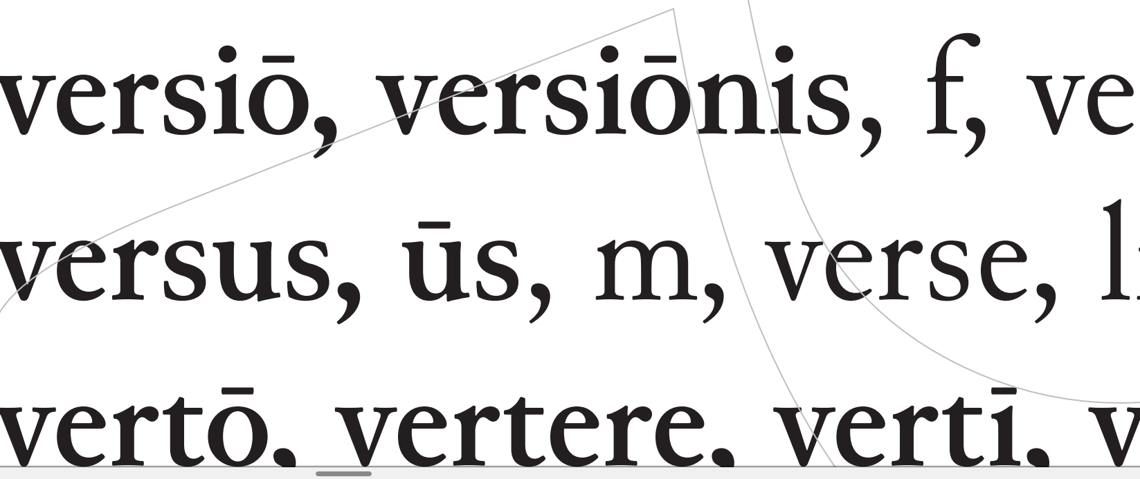
The final section of a textbook project consists of a Latin to English dictionary. In this section -- and not elsewhere in the book -- the verso pages have text that is fuzzier/lighter than that on the recto pages. See the two samples, which are screen shots from a PDF sent me by the printer for approval. In Affinity Publisher, the text on the recto pages looks OK; it _might_ be a tiny bit lighter, but it's really hard to tell even when zoomed in to a high percentage. This explains why I never saw a problem until I got this proof to review. My printer (Ingram Spark) requires that the PDF be a PDF X/1a-2001, if that has anything to do with what's going on. 1. I have a paragraph style and a character style used here. The same styles are used on all pages in this section, so the styles are not the culprit (I doublechecked them anyway). All text is set to CMYK 100% black. 2. I have a master page spread used for this section. It seems logical that something might be different about the verso page master compared to the recto. The text in the running heads is sharp on both recto and verso, as are the horizontal and vertical rules. So the problem is confined to the vocabulary entries. I cannot find anything different on the master pages between the recto and verso. I'm totally at a loss for how to fix this and would greatly appreciate any suggestions.
-
Thank you both for the replies. @thomaso, thanks for pointing out the possibility that exported black might get changed. I usually leave the default alone but will watch out for this more carefully. I have sometimes used "based on" styles but will do this more consistently for the reason you state. @lacerto, the video is helpful as is your detailed discussion of color spaces and how they might get changed. I did some more experimenting. It appears that Publisher includes a style 'Base' which is applied by default to new text frames, with 100% black (at least when a document is created with CMYK). When I change to one of the built-in styles, such as 'Body' or 'Bullet 1' (which are based on 'Base'), the text still shows as 100% black. But if I open the style to edit it, I see CMYK sliders set to rich black (I guess . . . ), but these values are not applied when I check the box next to Text Fill. The fill remains at none until I change one of the slider values. I now see how it works, but it's not exactly intuitive.
-
I create a new document using CMYK, add a text frame, and type some text. Then I apply one of the built-in paragraph styles (bullet, line below -- I tried a few and they all worked the same way). If I select a few words and click on the 'font color' rectangle in the toolbar (or font color on the Color tab), it is shown as 0, 0, 0, 100 -- that's what I would expect for text. But if I right-click on the style name in Text Styles and choose to edit the style, then go to Font/Color and Decoration, I see something like 72, 68, 67, 88. a) Is this supposed to be a rich black? It adds up to more than 240, which can cause problems. b) I want to be sure that all my text is 100% black, since that's what my printer recommends. What's controlling the font color? What's the easiest way to ensure that I get only black? I make extensive use of styles; do I need to edit each one to be 0, 0, 0, 100? I will appreciate any clarification on this.
-
You make an interesting point about the blank lines at the bottom of p. 127 not being distracting because of the page turn. What do you think about the ones that come at the bottom of a column where a page turn is not involved? There are many more of these than there are that come at a page turn. Throughout the book (except on some glossary pages) text ends at the bottom of the text block, as it should. So I wish there were a better solution. The authors and I had long discussions about the typography of the glossary. No italics for gender (I did suggest that). All Latin words, not just lemmata, are in semibold (full bold would create a very black appearance). I don't think sans-serif for the Latin words is a good option. Throughout the book, we use sans-serif to distinguish introductory sections and comprehension questions written by modern authors from the ancient texts. I also noticed that 'to' at the ends of lines does not always look good. I did put manual line breaks before the worst offenders; maybe I should add some more.
-
Followup: after posting that screen shot, I noticed that there were 24 pt of space above the 'Q' heading, not 12 pt as the style calls for. (That was probably a result of changes made by the authors; they kept adding to and removing words from the glossary as a result of changes they made in the body of the book. I have now put my foot down about this issue.😖) Fixing the spacing above made this spread come out OK, but I do still have a few with one blank line at a column bottom.
-
Thanks to you both. I have used Balance Columns but only on the last page of a two-column section. I'll experiment and see what happens (if anything) when applied to a page other than the last. I am reasonably familiar with the usual considerations of font size, line spacing, line length, etc. I did the math carefully and pages work well as long as the paragraph at the bottom of a column requires only one line. See the attached screen shot. The left-hand page is fine, while the right-hand one is the worst in the book, since the entry that should come at the lower right requires three lines. Text is 10/12. The book is 6 x 9 inches. Sample printouts look good to my eyes, except for the occasional issue at the bottom of columns.
-
I think I understand all the information in the posts above. My issue is really more a general book design question then one specific to Affinity Publisher, but I’ve searched the web and haven’t found a good answer; so I will ask here. I am working on a textbook that has a glossary at the end, set in two columns. Many of the definitions take only one line, while some take two and a few require three. I’ve set up the leading and line spacing so that many pages come out properly at the bottom. However, if a two line-definition comes at the bottom of a column, the whole paragraph (two lines) moves to the top of the next column since I have widow and orphan control turned on. The same thing happens with a three-line definition. I could tell Publisher to vertically justify the text, but I don’t like the extra white space introduced in one column and not the one next to it. I don’t like leaving, in effect, a blank line at the bottom of one column. I could turn off widow and orphan control; again not a good solution, but perhaps the least offensive one. I think this is particularly true when a three-line definition is involved, since this results in only one (not two) single-line elements. Which of these do you think is the way to go? Or is there another option that I haven’t considered? The glossary is somewhat different than the body of the book. Readers will be focusing on the latter to understand and remember it. They will turn to the glossary when they need help with a specific word or concept, but won’t focus on it the same way. So perhaps a few widows and orphans are acceptable here.
-
Thanks for all the replies, and particularly to @MikeTO for the very detailed instructions and explanations. I have copied this info to the folder where I store files for my new book. It will help tremendously.