Nieck
-
Posts
39 -
Joined
-
Last visited
-
How to fix/ anchor an image to the text
Nieck replied to Nieck's topic in Desktop Questions (macOS and Windows)
In the meantime i found the answer, it is float with text. -
I have a publication that has two columns on a page. Is it possible when i move the text from one column to the other that my image moves with the text?
-
 walt.farrell reacted to a post in a topic:
publisher crashing on newly installed hyphenation file for Dutch.
walt.farrell reacted to a post in a topic:
publisher crashing on newly installed hyphenation file for Dutch.
-
Dear Walt, thank you very much. This solved the problem.
-
MacOS 13.3.1 on a MacbookPro 16inch Publisher V2 The Dutch hyphenation will not work for me, Publisher keeps craching. I did follow the rules gives in this page https://affinity.help/publisher/en-US.lproj/index.html?page=pages/Text/hyphenationInstalling.html?title=Installing hyphenation dictionaries In the Library/Settings I made a folder with the name: nl_NL From the page: https://raw.githubusercontent.com/LibreOffice/dictionaries/master/nl_NL/hyph_nl_NL.dic I copied the file hyph_nl_NL.dic to a text editor and saved it with the name: hyph_nl_NL.dic and put i the the new folder. Start Publisher and I can see the Dutch hyphenation but the moment I click on the name Publisher crashes. I also did the same as with the file: hyph_nl_NL.dic I copied from the github page with: nl_NL.aff and nl_NL.dic Copy them into a texteditor and save them under the name nl_NL.aff and nl_NL.dic I placed them also in the new folder and start Publisher. Publisher keeps crashing, can anybody give me some advice please. Thank you
-
Dan C reacted to a post in a topic:
Full cover cover with black and white barcode
-
Thank you Dan for your reaction. After spending a lot of time on this forum and reading a lot posts about this topic I finally found a workaround that seems to solve the problem. The cover is send to the printer a few minutes ago and hopefully all is good. I found the solution in 'Document Set Up' in color profile. The profile was set on sRGB in stead of CMYK. The moment I made a High Resolution pdf I choose the option take over the document prefenrences as color profile. It was a combination of the setup and the 'More' dialog box that really confused me. Fingers crossed the problem is solved now.
-
I made a full colour cover and for the publisher I placed a black and white barcode. When I export to an high resolution pdf the black and white barcode convert to CMYK. What do I do wrong. Document made in Publisher 1.8.4 Barcode is black and white eps Export to pdf: press ready with all the printers marks on. OS system 10.15.7 Thanks for the help
-
Thank you Lagarto for this extensive research. I wished that Publisher behaved just like InDesign, but I understand the developers from Serif have there own way of designing a program. I understand now that Publisher is not able to use the same values for metrics as InDesign does. I can work with that the moment I know it is not somewhere hidden. I was looking for something that did not exist in Publisher (yet). What @MikeW showed in his screenshot was a good one for understanding the space of a character defined in a typedesign program, thank you for that. @Lagarto The values are not completely arbitrary, you had to define the Capheight, X-height etc. yourself. There is a maximum of 1000 or 2400 units height available for the characters included the accents. That is for fonts that use the Latin script, I do not know how that works for other scripts like Arabic or Thai.
-
Oh, this is great, thank you! Nice to know more font developers are on this forum. I will ask Dave Harris how Serif handles these issues around the metrics values. This is of great help, thank you!
-
Sorry, what do you mean?
-
The name of the font Typist, but is at this moment in development, so not yet available for the market. That is why I am busy testing in several programmas. I do not mind submit an ID file or idml file but that does not make sense without the font i guess.
-
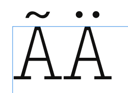
The leading is on default, I have the idea – but correct me if I an wrong – default gives me the leading that is built in in the typeface. I am testing the vertical metrics of a new typeface and noticed that in Publisher nothing changed, while in InDesign the characters did what I was after. I like to have that result also i Publisher, but maybe that is not possible yet.
-
firstdefence and MikeW: That is true, but the same typeface in InDesign CS5 gives me the result you can see in the enclosed screenshot. As you can see the accents are a small bit above the text frame. That is were I am after. Old Bruce: Thanks, that is a good thought, but that gives me a lot of other problems. The size of the characters is in this example 72pt. When I use the baseline grid as you suggest, it has to be 21pt otherwise the accentends are still outside the textframe. 21pt for regular typesetting in a book is to much. I could also define a startposition at the top of the textframe, unfortunatly that does not work. If my grid is 10pt (most average that I use), the start position can go to 18pt and the accents are still outside the textframe. I am not sure if there is a (for me) good working solution at this point in the development of Publisher, but I keep hope.

-
Thank you both for this answer, but it is not what I am looking for. In InDesign it is done by default, depended of the typeface used. In both suggestions the distances would differ between the different typefaces and needs calculating the moment the typeface change. Is there not a way AP does this also by default?
-
Sorry, I forgot to mention that I work currently in Affinity Publisher on a Mac.
-
Hello, can someone please tell me where I can find the option that my accented characters stay inside the text frame? The blue line is my text frame. Thank you