Evgenii
-
Posts
28 -
Joined
-
Last visited
-
Combining marks break kerning
Evgenii replied to Evgenii's topic in Feedback for the Affinity V2 Suite of Products
Windows 11 -
 Evgenii reacted to a post in a topic:
Harfbuzz and How It Can Improve Fonts in Affinity
Evgenii reacted to a post in a topic:
Harfbuzz and How It Can Improve Fonts in Affinity
-
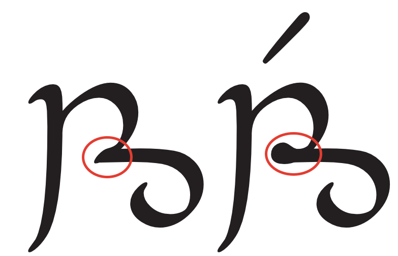
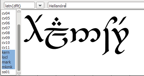
[I suppose this should be moved to bug reports rather than feedback] It seems that the IgnoreMarks flag is not correctly implemented. Scenario: I have a combining mark setup with mark feature, and kerning with IgnoreMarks flag. Expected behavior: the kern between two base characters is set, and the mark is positioned according to the anchor. Actual behavior: the kerning is applied between the first base character and its mark. Minimal test font (two characters a, b and a combining acute), tested with harfbuzz and showing correct result: Same font in Affinity apps (tested in Designer 2 and Publisher 2): Note the shifted position of the accent.

-
Evgenii reacted to a post in a topic:
[AfPub] Export to PDF breaks Combining Diacritical Marks
-
[AfPub] Export to PDF breaks Combining Diacritical Marks
Evgenii replied to Evgenii's topic in V2 Bugs found on Windows
Hi @Dan C! I must admit, I'm a little confused regarding 'morx' table, as this is an issue recorded on Windows, not MacOS, and none of the fonts tried have 'morx' table at all. In the very first thread the issue was (potentially) narrowed down to PDFlib third-party library that Affinity uses for the pdf export. In the previous thread I attached the pdflib.log which shows that which is consistent with the rendered look. Perhaps you were talking about a different issue in the backlog? -
Evgenii reacted to a post in a topic:
[AfPub] Export to PDF breaks Combining Diacritical Marks
-
I have been patiently reporting this bug for V1 since 2019, and looks like it was not resolved in V2 (or perhaps I'm doing something wrong?). Glyphs with combining marks that use anchors for positioning (and don't have a dedicated glyph on its own) lose their positioning after the export to PDF. The app itself renders the font correctly. App: PDF:
-
Vertical position of sidenotes
Evgenii replied to Evgenii's topic in Desktop Questions (macOS and Windows)
Oh, fair enough. But still, the lines of the split note are raising on each page separately, the note doesn't get fitted into the new available space. (there also some weird stuff going on with highlighting, but that's secondary). Disallowing splitting still sends the whole note onto the next page.
-
Vertical position of sidenotes
Evgenii replied to Evgenii's topic in Desktop Questions (macOS and Windows)
That doesn't work. The following note doesn't readjust itself and stays split.
-
Vertical position of sidenotes
Evgenii replied to Evgenii's topic in Desktop Questions (macOS and Windows)
So I suppose the best workaround for now would be to make the sidenote 27 manually with a pin, and then restart the automated ones from 28 onwards. -
Evgenii reacted to a post in a topic:
Vertical position of sidenotes
-
I am trying to understand whether it is possible to adjust the location of the sidenote so that the note frame starts higher than the reference point. In my example notes 27 and 28 start close to each other, and 28 gets split to the next page. This could be easily avoided, if I could adjust note 27 vertically a bit higher. But I did not figure out how to do that. Simply disallowing split notes doesn't help, as it changes the text flow in the main body.
-
Evgenii reacted to a post in a topic:
Publisher 2 and ICML files
-
Evgenii reacted to a post in a topic:
Publisher 2 and ICML files
-
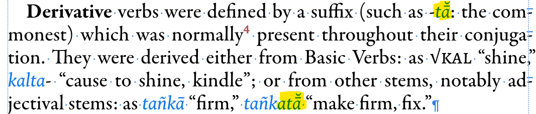
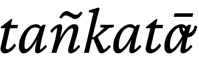
APub version 1.10.5.1342. I have a project with heavy use of combining marks, like in tañkatā̆ or mātā́. The font supports them and they are rendered correctly within APub itself (Fig. 1). However after the export to PDF the anchoring of the marks is incorrect (Fig. 2). Different fonts produce the same result. Word-exported PDF is rendered correctly. A sample file is attached (fonts which should render it correctly are Crimson Pro, Gentium or Vollkorn, for example), as well as resulted PDF and PDFlib log. This is not a new problem specific to this version (here I reported it 3 years ago). However this time I can't use the work around of exporting fonts as curves (which works), as I need text to be selectable in the output. How do people handle this problem when working with languages with diacritics, like Vietnamese? UPD: After playing around some more, it seems that the conversion code puts the diacritics before the glyph it is supposed to get attached to instead of after. (Fig. 1, APub) (Fig. 2, PDF) export-bug.afpub export-bug.pdf pdflib.log
-
Evgenii reacted to a post in a topic:
add some Interactive functions
-
Evgenii reacted to a post in a topic:
Publisher and ICML files
-
I'm not exactly sure this problem appeared with a new update, but I haven't encountered it before. OpenType substitution is not working if the first character has a mark, that's despite having IgnoreMarks flag Left: how it should be, works without accents; Right: substitution doesn't happen if accent is placed It does work in Word however But to make sure I checked another font I know worked correctly in the past: same problem The ligature breaks if the first character is accented: that should not be happening
-
Evgenii reacted to a post in a topic:
Marks positioning in exported pdf
-
I got the trial FontLab and used a minimalistic font, with main GSUB/GPOS features preserved. Now FontLab Metrics Tab renders it correctly: Publisher renders it correctly: Exported PDF not: Printed PDF loses GPOS completely: NotoTeng-Regular.ttf For those interested: a workaround I'm using for now is to add a seperate glyph for each instance of vertical alignment needed. It's a poor solution, but at least it works.
-
Then why InDesign's export works right, and Publisher's doesn't? I checked the print to pdf option, and it seems that all positionings are discarded with tengwar font. It does work with dieresis sample though, hm.
-
lacerto reacted to a post in a topic:
Marks positioning in exported pdf
-
Yes, exactly I didn't create the features in FontForge, I wrote them in seperate files, that I attached above, according to specifications and imported in FF. If I export these features from FF, the syntax I believe will be different. But I feel like the topic is deteriorating: the problem was with the Publisher render differing from exported pdf. Here's a minimalistic example font I have used above, stripped off all unnecessary features which might be causing you problems in different software: it has only two glyphs defined - a for 'a' and b for 'dieresis mark', as well as mark table to place it above. vertical_test.ttf
-
What might help with FontLab is to load .fea files directly if possible [attached below] For the FontForge metrics view, there's one screenshot above, but here's one once again GPOS_basic.fea GSUB_test.fea
-
It objectively didn't resolve it though; ä got exported with dieresis god knows where even though it is rendered right in Publisher