Pyanepsion
-
Posts
951 -
Joined
Everything posted by Pyanepsion
-
 Thanks, @garrettm30. Well, this feature seems to be difficult in this case. See the attached file. 🔴 By the way. Another translation error by the French translation team. They translated "Toogle Unicode" as 'Activer/Désactiver Unicode" (Enable/Disable Unicode) which has absolutely nothing to do with! And is in fact impossible. a-grave.afpub
 -
Hello everyone. Sometimes the text copied into Affinity Publisher contains Unicode characters that do not exist in the font used. How can I find out what the Unicode number of this character is? Example: It looks like a [à], but it is actually a combination of a dead letter [grave accent] followed by a lower case a. What is this particular character or these two characters? How to find it? Thank you for your explanations. 🔴 Note. Once again, the French translation is more than just a mess. This time, the translators of the French team didn’t even check if the translation appeared in full! ‘Unsupported characters used’ should be translated as ‘Utilisation de caractères non supportés’. Here, what is written means absolutely nothing.

-
I hadn't seen @Wosven's message. We can indeed remove the setting of the auto-replace, but it makes the DTP text correction undrinkable. The developers should really look into this. Ideally, though, we should be able to manage our own dictionary of automatic spaces before and after each punctuation mark, as we do with QuarkXPress and Indesign. This is the kind of thing that makes the difference between a simple text editor like LibreOffice or Page, and a real DTP program.
-
The writing of the apostrophe adds an inappropriate space when written in a word. For example in ‘Alice’s Restaurant’ which becomes ‘Alice ’s Restaurant’. In many languages, including French, the apostrophe is only used to indicate the elision of a vowel. Only in English is it used instead of the opening and closing inverted commas. It should never be preceded or followed by a space in a word. In French, it is a disaster. alice’s-restaurant.mp4
-
Thanks, @Old Bruce, @walt.farrell, and @David in Яuislip. By your answers, I have understood where my mistake was. Note: The first solution ([0-9a-zA-Z'"])(n) is not relevant in French, and in some other languages, because it does not find paragraphs ending in an accented letter (e.g.: accentué) or weird punctuation (e.g. `).
-
Hello everyone. I would like to automatically add a full stop to all paragraph ends that do not contain the characters . ! ? : … (i.e. full stop, exclamation mark, question mark, colon, suspension mark). Example : Will have to give: How do I do this? Thank you for your explanations.
-
Affinity Suite: New documents
Pyanepsion replied to Pyanepsion's topic in Feedback for the V1 Affinity Suite of Products
Yes. American paper sizes, French paper sizes (AFNOR standard), Canadian paper sizes (CAN 2–9.60M standard), Japanese paper sizes (JIS standard), etc. are hardly ever used outside their own country. All these formats will disappear and be gradually replaced by the International Paper formats (nothing to do with the American formats of the same name) A0 to A10, B0 to B10, C0 to C10, and DL (ISO 216 [and ISO 217] standard). Added to this, each DTP technician is in fact dependent on the paper formats of his printer company, and this printer is himself dependent on the formats of his printer’s manufacturer and his paper manufacturer. The multiplicity of all these formats argues for no longer imposing a non-modifiable list, but rather for continuing to offer the list while allowing the user: to modify some of the settings of the format (orientation, resolution, facing page, colour format, margin, etc.), to delete certain formats that he thinks wich are deemed useless, to be able to insert others, And, of course, to be able to return to the original settings. -
Affinity Suite: New documents
Pyanepsion replied to Pyanepsion's topic in Feedback for the V1 Affinity Suite of Products
We are big people, and often professionals. In the worst case, the person who makes a mistake can always reset, possibly with the help of technical support, in the delivery conditions of the software. Should the reset be complete or partial? Well, both options are debatable. The very idea of a separate list (My Preset) makes the list unusable, either because the presets are only used rarely and you can't remember what's in them, or because there are too many and it becomes unmanageable. The separate list also loses much of its usefulness when the setting is a simple variant of defaut preset. It should be possible to insert these presets in the right place and also rename the default ones when necessary. It should also be possible to remove unnecessary items such as the American architectural paper formats, which are totally archaic elsewhere in the world. On the other hand, the whole series of C0 to C10 formats is missing, as well as the AFNOR formats (Carré, Cavalier, Cloche, Colombier affiche, Colombier commercial, Coquille, Couronne écriture, Couronne édition, Demi-raisin, Double raisin, Écu, Grand Aigle, Grand Monde, Jésus, Petit Aigle, Pot ou écolier, Raisin, Roberto, Soleil, Tellière, Univers). I also know that I use a resolution of 96 dpi in all cases for screen documents, and 110 dpi for A4, 350 dpi for A5 and 450 dpi for 6×9 inch paper documents. There are other settings that come up all the time, for example in A5 : It is a source of error or forgetfulness not to be able to preset them once and for all.
-
Affinity Designer: Clipboard dimensions value error
Pyanepsion replied to Pyanepsion's topic in V1 Bugs found on Windows
Here is another topic about dpi: -
😁I wonder where you looked! It seems that only Serif uses in French the English term dpi (dot per inch) instead of ppp (Point par pouce). All the major software, really all the major software, including your main competitors, have been using ppp for many years. Perhaps you should reconsider your position. The correct translation of dpi is ppp, or possibly Résolution. Etc. I have obviously only put in one or two screenshots when it comes to a software suite (Adobe, Microsoft). This follows the recommendations of the Office québécois de la langue française in Canada, the Société française de terminologie in France, and the ministerial recommendations of most French-speaking governments.
-
Affinity Designer: Clipboard dimensions value error
Pyanepsion replied to Pyanepsion's topic in V1 Bugs found on Windows
It is not PPI (Pixel per Inch), but PPP (Point per Inch). There are 3 other translation errors reported: – Print has been translated as Imprimer when it refers to printers. The correct term here is Imprimante. – Press ready has been translated as Prêt à imprimer, which is meaningless, or rather a misnomer, perhaps with confusion with Bon à tirer, (misunderstanding). The correct term is Imprimerie. – Architectural has been translated as Architectural when it refers to specific American architectural paper formats. The correct term is Architecture. Note that in most other countries, plotters of architectural drawings use the international A2 to A0 formats. -
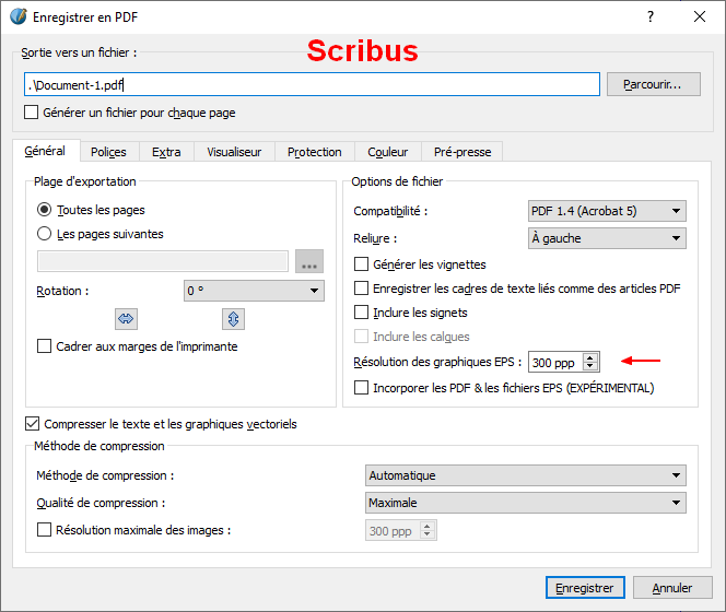
Hello to all, I was pointing out an error that is all the more surprising because it seems to be deliberate. Copying an object to the clipboard and then creating a new document from that copy changes the unit of measurement (mm to px): Clipboard measurement unit error. Here is another one. Copying also changes the dimensions of the object. We create a 210 × 297 mm page in 300 dpi¹ mm units. We create a 210 × 297 mm red rectangle on it. ¹ (In French we say PPP (Point par pouce). It is becoming very annoying to find systematically gross errors of translation in French everywhere, showing a complete lack of professionalism of the French translator. No, you don't translate with Google Translate, and no, you don't copy translations from another software! You ask native speakers who know the product. An also: DPI → PPP, Imprimer → Imprimante, Prêt à l’impression → Imprimerie, Architectural → Architecture.) If you change the values of the new document at once. The dimensions seem to be correct. If you change them twice, first the unit of measurement, you save, then the resolution, the dimensions are not the same. clipboard.measurement.mp4 These repeated errors, here the units of measurement which should not be changed, but are, and there the dimensions which should not be changed, but are, raise serious doubts about the overall reliability of the tool. The new document created when copying from clipboard should obviously use the same settings as the original document. Really.
-
Affinity Suite: New documents
Pyanepsion replied to Pyanepsion's topic in Feedback for the V1 Affinity Suite of Products
Of course, user predefined page sizes are useful! If only to create templates with predefined content and their own master pages. That's actually the only real use I see for them. When many page formats are used, however, it is tiring to have to make the same changes to the Serif's preset standard over and over again, with the risk of error or omission each time, whereas it would be sufficient to be able to change the presets once and for all for all the presets of a category or a selection to avoid this problem. Being able to easily adapt the tool to one's own working conditions is obviously an advantage and not being able to do so a limitation. I will never understand those who want to explain to us that if you want to drive in a country that drives on the left, it is useless to position the steering wheel on the right because you just have to lean a little to the right... 😀
-
Affinity Suite: New documents
Pyanepsion replied to Pyanepsion's topic in Feedback for the V1 Affinity Suite of Products
One does not prevent the other! Many software programs use setting palettes with the possibility of permanently modifying some of the parameters. In fact, not definitely, but fortunately with the right to make mistakes: if the user realizes that he has made mistakes in his modifications, he can simply select the menu Reset settings. The possibility of resetting the parameters solves this objection. The possibility of resetting the parameters solves this objection. There are values imposed by a standard, e.g. ISO 216 for paper dimensions, and others that are free. It is sufficient to put a limitation on the values that follow a standard and that the modification of this value forces to create a new preset with another name. The possibility of resetting the parameters makes it possible to repair a corruption. Who is seriously going to want to recreate hundreds of personal settings that will clutter up the personal tab, when the problem of imposed settings only concerns certain values that have sometimes been poorly chosen by the project manager and other times are unsuitable for personal use? -
Affinity Suite: New documents
Pyanepsion replied to Pyanepsion's topic in Feedback for the V1 Affinity Suite of Products
Yes and no. To be really useful, all these settings should be user-adaptable, and with a right to error (partial or total factory setting). If I could, for example, change the default settings of 72 dpi by 96 dpi, and 300 dpi by 350, the presets would be really useful. Here, it's a ridiculous waste of time to have to select a preset each time and then adjust it when I know I'll never use certain default size variants. It is equally ridiculous to redo all the presets offered in My Presets just for 3 or 4 variations per dimension. Sometimes you wonder why such obvious things are overlooked by the project manager. -
Affinity Suite: New documents
Pyanepsion replied to Pyanepsion's topic in Feedback for the V1 Affinity Suite of Products
This is exactly what I want to avoid. I know that my documents on the screen will always have 96 dpi and note 72, will always have the same margins, will always have the same colour format, etc. I find it ridiculous to have to add personal settings, and therefore clutter the screen, when I could just change the default settings. I haven’t found where these default settings are stored and therefore how to change them. At the very least, it should be possible to change them as in any good software and eventually revert to factory settings if necessary! -
Hello everyone. When creating a new document, we are offered a whole palette of formats. How can I change some of the settings in this palette without having to create a new preset? Example: The A5 web format would suit me perfectly except for certain parameters. I would like, by example, this format to always default to 96 dpi, always single pages, and with very specific margins. Note in passing: a big translation confusion. dpi (dot per inch) should be translated by ppp (point par pouce) in French.
-
They are gone! Will they have to wait until Friday 13 May 2022 to come back? It’s a shame. They are cute!
-
Well done.
-
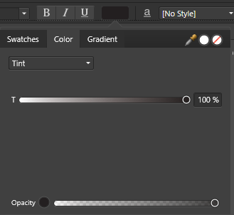
Okay. So now I get the slides. Thank you. So now, I get the sliders. I would like to get CMYK by default, but I get RGB by default.
-
Hello everyone, When I first select a colour in a new document, the colour management is always the tint. I would like it to be systematically in CMYK Sliders as soon as the software is launched. How can I do this? Thank you for your explanations.
-
Affinity Publisher: Bad PDF export on Small caps
Pyanepsion replied to Pyanepsion's topic in V1 Bugs found on Windows
Yes, I had used the public version, but the problem still exists in the beta. File sent. -
Affinity Publisher: Bad PDF export on Small caps
Pyanepsion replied to Pyanepsion's topic in V1 Bugs found on Windows
@Pauls In fact all fonts. In this case, the font is the original Windows font ARIAL.TTF, which has a size 14 for the yellow headings and a size 12 for the black subheading. The PDF export crashes when using the Small Capital style and not unchecking ‘Embed fonts/Subset fonts’. -
Affinity Publisher: Bad PDF export on Small caps
Pyanepsion replied to Pyanepsion's topic in V1 Bugs found on Windows
Nice one. Thanks Walt. What is the explanation for this? Is it not just a character style? -
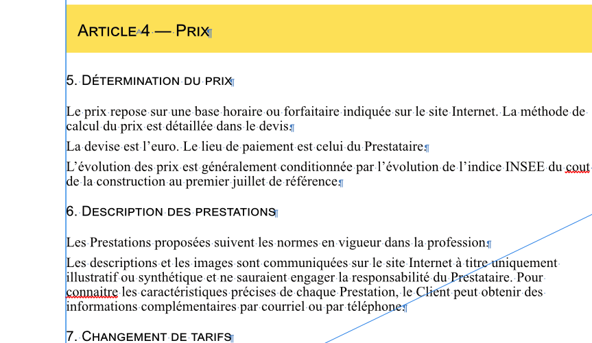
Hello everyone. The PDF file created by Publisher does not handle small caps correctly. They look fine on the PDF, but if you convert the PDF file into a Word file, or re-import the PDF file into Affinity Publisher, all the small caps turn to rubbish. Note that capital letters (A of Article, D of Détermination, D of Description, C of Changement) in small capitals have a correct appearance. Original Imported PDF