lacerto
-
Posts
6,440 -
Joined
Everything posted by lacerto
-
Invisible Pantone Special Channel in PDF
lacerto replied to Nayaril's topic in Desktop Questions (macOS and Windows)
There are basically two ways to define a spot color within Affinity apps. If you want to use PANTONE palettes, you can use PANTONE Formula Guide Solid Coated (or Uncoated) v5 or Metallic Coated to pick e.g. PANTONE 871C (which is often used to designate "gold"), or PANTONE 877C (for "silver"), or basically any other spot color as long as you agree with your printer the significance (usage) of each used spot color definition. All colors in those mentioned palettes (that are included also in Affinity apps) are spot colors. You can tell that a swatch color is a spot color by its having a small dot (circle) at the bottom right corner. In your document, you have picked a color from PANTONE+ CMYK Coated palette, which is not a spot color palette, but a process color (CMYK) palette, and you cannot convert a process color to a spot color within Affinity apps. However, you can also create a new spot color of your own by choosing Add Global Color command within the context menu of the Swatches panel, and then check the Spot box in the Global Color panel. Whichever way you define the spot color, you can rename it so that it has an expected name in the exported PDF and makes a plate of its own, and is recognized as agreed with the printer.
-
My advice would be to keep both environments for a while and be patient about the transfer. It requires some time to realize the differences and workarounds. My personal interest was similar, to make a complete transfer, but it took longer than I expected, so I am now a happy user of both of these environments (so you can see I am an economical disaster). My point is, different ecosystems have different strong and weak points, and much depends on workflows you are dependent 3rd-party-wise. You really cannot replace one with another.
-
Can I outdent a numbered list?
lacerto replied to Ross Burton's topic in Desktop Questions (macOS and Windows)
I do understand what it means. My point was that in Affinity apps there is no intellect as for applying optical alignment. The "early" apps applied true optical alignment based on font (glyph) bearings, and were not intended for any other use, hence the limited redraw. But this is just guessing, based on experience. -
Can I outdent a numbered list?
lacerto replied to Ross Burton's topic in Desktop Questions (macOS and Windows)
Yes, I had a recollection of something like this, though my acquaintance with QXP was very short (2017 and 2018). I did not get your other reference, was it to Ventura Publisher? That was my first page layout app at the end of the 80s, and I would not be surprised if this feature was supported already there... And if so, definitely not RAM related, just a different way of thinking. -
Can I outdent a numbered list?
lacerto replied to Ross Burton's topic in Desktop Questions (macOS and Windows)
I am not sure if I understand what you refer to. If InDesign, its optical alignment is a genuine feature that works pretty much differently than that of Affinity Publisher, which basically does not have anything "optical" about it. On the other hand, the trick to use kerning to achieve "outdent" off the text frame is a true hack that has occasionally editing-time redrawing issues (though not ones that appear in exports), but I do not think that this has anything to do with memory management. This "apology" is not to diss the Affinity way of implementing "optical alignment". It is a fine and useful feature and uniquely Serif. I sincerely want to see more of this kind of development!
-
Thanks, I had not noticed this. I wrongly assumed that the list is identical with the one that is on the Windows versions:
-
Can I outdent a numbered list?
lacerto replied to Ross Burton's topic in Desktop Questions (macOS and Windows)
I do not think that an outdented list achieved by character optical alignment is a hack, but rather a regular feature (the way the left-side optical alignment is supposed to work), and it can be coded as a paragraph style, and it can use list formatting and have optical alignment applied to its "bullets": outdented_list.mp4 -
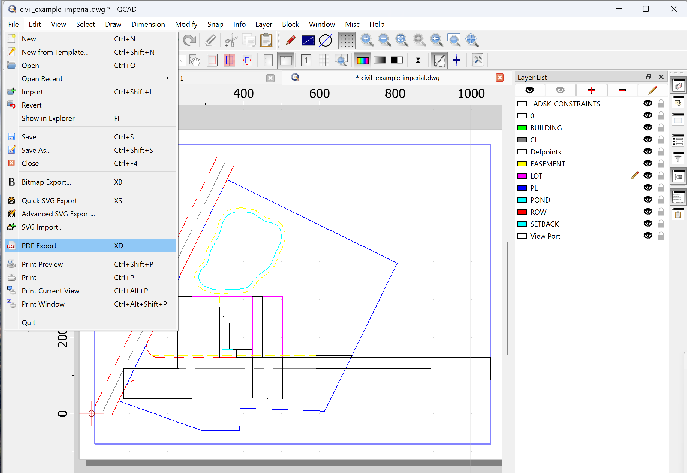
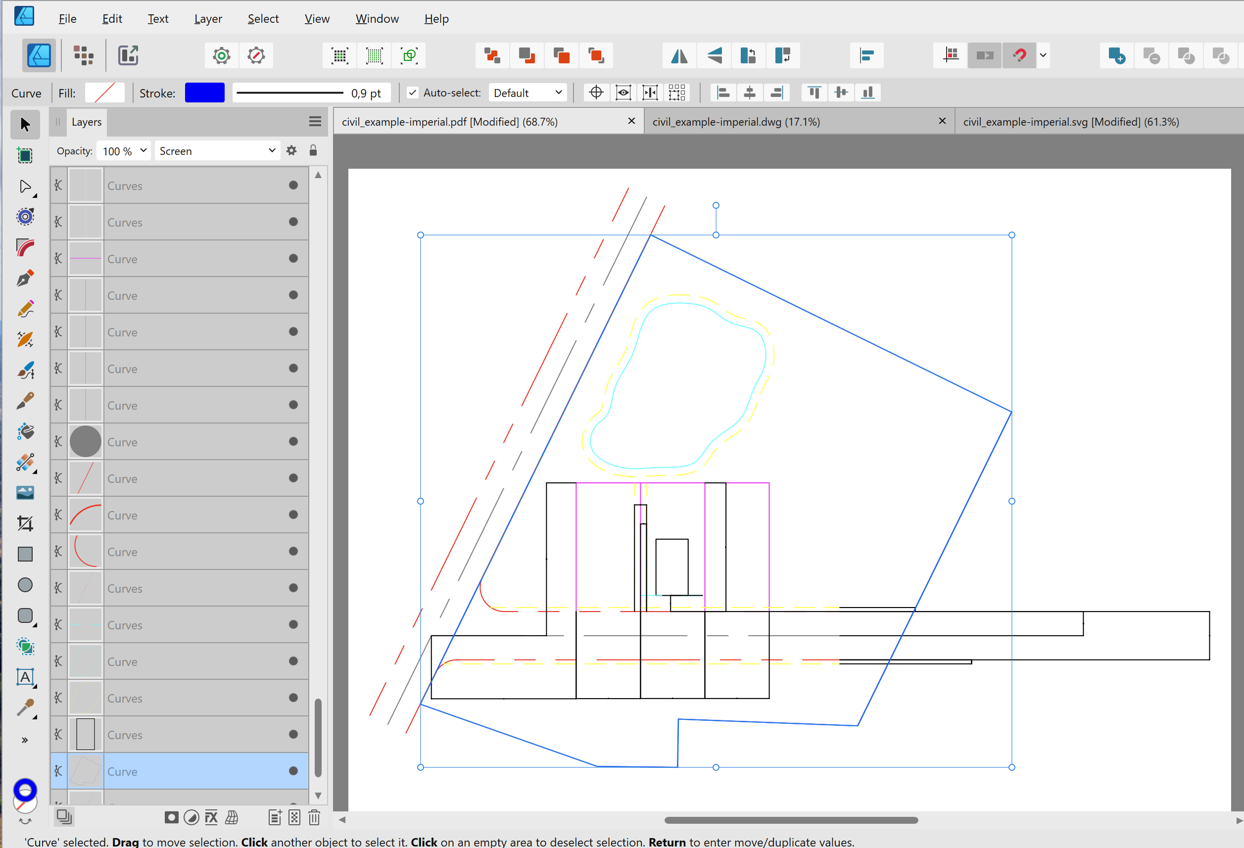
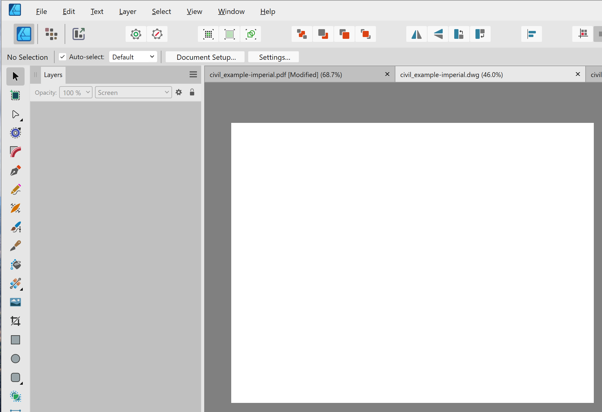
Issue with Importing DWG
lacerto replied to bailey80x's topic in Desktop Questions (macOS and Windows)
Hi @Kevin B -- yes, if layers are not relevant and saving / printing to PDF retains vectors, I think the PDF is the way to go. You could also try if EPS exports (or .WMF, if you are on Windows) make sense in certain cases, but Affinity apps generally open PDF files quite well, so that would be the first choice. DWG import filter of Affinity apps is indeed very elementary. You can test its capability by trying to open these AutoCAD sample files: https://www.autodesk.com/support/technical/article/caas/tsarticles/ts/6XGQklp3ZcBFqljLPjrnQ9.html One possibility could be getting a low-cost CAD app and export from there: ...which, when exported to PDF from QCAD, opens in Designer like this: This is much better than the DWG import by Designer from the native AutoCAD file, which is this:
-
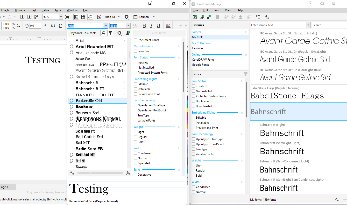
There is nothing like this on Windows, and I think it is unlikely there ever will be (considering that the old Fonts interface is now deemed legacy and the shiny new interface -- I have the latest 24.H2 installed -- is very basic). I am not sure if you would benefit much of the macOS way, either, as I am not sure if the user collections can be selectively exposed within macOS apps when accessing their font lists. The feature you are asking is something that is traditionally covered by font managers, which would make it possible not only to create user-specified collections and expose/hide them to applications by quick installation / uninstallation / activation / deactivation, but also by making them available to supported clients via plugins, etc. [E.g. Extensis claims to be Affinity compatible so you might want to have a look on it -- but not of course a free solution.] Apps like CorelDRAW (available for both Windows and macOS) even make their own Font Manager and allow creating collections that are available within Corel apps (where advanced filtering is available dynamically also collection-wise): Because of these kinds of features are available in font managers, there is no specific need to develop advanced OS based font management, and most apps (like Adobe ones) focus on developing other kinds of, dynamic, font selection tools, based e.g. on similarity of a selected font, and other properties:
-
Issue with Importing DWG
lacerto replied to bailey80x's topic in Desktop Questions (macOS and Windows)
Since layer-related information is very often important in CAD files, and PDF as a file format is ill-suited for transferring that kind of information (it is possible but basically relies on custom / app specific implementations, e.g. Illustrator including this kind of information by embedding an AI file within a PDF shell, or Affinity Designer using OCG layers in a specific way), delivering a .DWG file (possibly limiting the content specifically for export purposes) is often the best choice. If a CAD application could create an AI file, layers and probably some other native features could be included in the exported file, as well, but as far as I know, e.g. AutoCAD only supports .WMF and EPS as vector-based export formats (and PDF only as a kind of output format, rather than a specific export format), and they are both quite limited file formats. Some CAD apps might also be able to export in SVG format, but that does not support layers, either. -
Anyone running on a 'mini PC'?
lacerto replied to jimh12345's topic in Desktop Questions (macOS and Windows)
I am not sure if I understood you correctly, but I think that some models of the late Intel NUCs came with an NVIDIA GPU, but I suppose there was then also some kind of an active cooling system involved. Those that only have an onboard video card are typically without a case fan (just having a tiny CPU fan). If you mean a "mini-PC" (without a dedicated GPU), any modern mini-PC is adequate for running Affinity apps and performing tasks that do not need heavy processing. One option might also be getting a laptop with a GPU, e.g. Lenovo 9iPro with 64GB RAM, 1TB SSD, NVIDIA GeForce RTX4070, which can be purchased at best below 2,000€, and which can be run either with GPU actively on, using on-demand GPU processing, or turning GPU off (completely silently). -
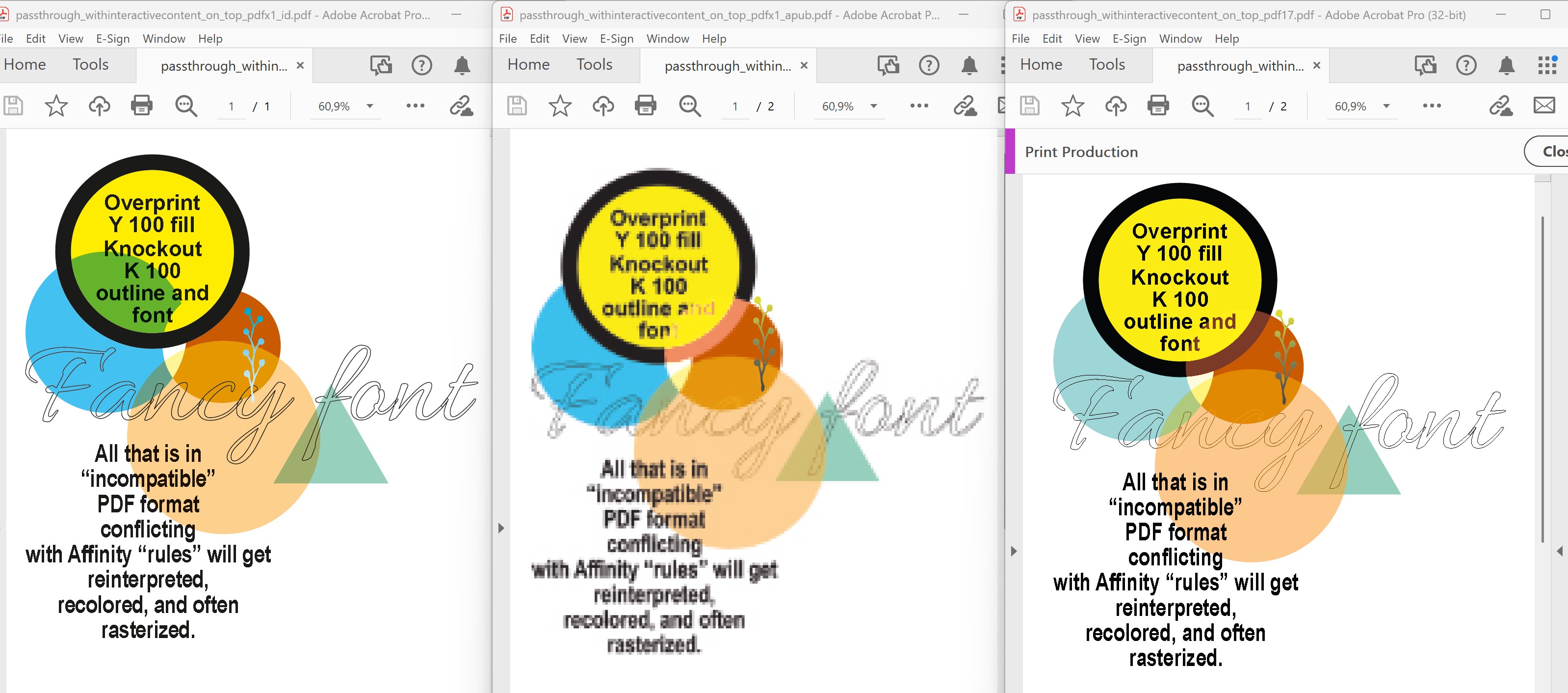
I am not sure what you mean by "on top", but certainly a placed PDF with passthrough option turned on can be placed under or above native Publisher content and interact expectedly in an exported PDF. The problem is that Affinity apps have issues with honoring placed PDF content. E.g., overprint setting of a placed PDF seems to be ignored even when so called Affinity rules are honored. The following screenshot shows exported PDF where text (using an ornament font) and an orange ellipse using Color Dodge blend mode have been placed on top of a placed PDF (to be passed through), and a turquoise triangle placed below it (having a partially transparent larger orange circle of the placed PDF affecting its color). The placed PDF was created using PDF v. 1.7 (basically press-ready setting) from within Affinity Publisher 2.5.7. On the left, a PDF created with InDesign CC 2025 using PDF/X-1a:2001 export, in the middle a PDF exported with PDF/X-1a:2003 setting using Affinity Publisher 2.5.7 (DPI set to 25 to show what gets rasterized), and on the right a PDF exported using PDF 1.7 ("Press ready") from Affinity Publisher 2.5.7. As can be seen, overprint setting of Y100 circle in the placed PDF is not honored in Affinity created PDFs (even when using "by rule" compatible PDF 1.7 export). In addition, colors are distorted in Affinity created PDFs (in rasterized version, all colors, rasterized black also becoming rich black), and also in the PDF 1.7 version (the turquoise circle has wrong color values, probably as a result of wrongly treated overprint setting in the yellow circle). The point is, however, that once the software handles passthrough as designed, the user can place native objects on top and below placed PDF content and have "passthrough" content exported as expected, affected, if the native content interacts with it, and passed through otherwise. As can be seen, when exporting from Affinity Publisher using the "compatible" 1.7 version, much works as expected (text is retained as text (fonts), the orange circle with blend mode (on top of a placed PDF) is rendered correctly, as is the triangle below the placed PDF), and nothing is rasterized. On the other hand, when there is a version conflict (Affinity PDF compatibility rule is violated), affected objects are rasterized (both native and placed, if interacting), and colors are distorted.
-
Yes, passing it through whenever the content can be transferred without altering the appearance, not exposing it for inadvertent changes. The point is that competent graphic design software (and graphic designer) can transfer the content as intended even if there is need to convert from one PDF version to another, or use PDF/X standards (disregarding the version), by request of the printer, so there is no need to make strict PDF requirements for content providers or ask them re-deliver in specific format. To be able to do this using Affinity apps requires often additional tools and extra knowledge and skills, not typically needed when using some other software.
-
I think it means: let content pass through, as long as it does not need to be interpreted or converted in any way. If the PDF content needs to be interpreted or opened, it needs to be converted to another PDF version. Then skills like flattening transparencies without rasterizing, recomposing to a specific PDF version or standard while being able to keep embedded fonts and color values and overprint attributes, become handy. That is, you convert the "shell" and keep (pass) the intended content. This requires a lot, so I would not call it (yet) a draw 🙂
- 11 replies
-
- 1
-

-
- affinity publisher
- publisher v2
- (and 2 more)
-
There are strict limitations within Affinity apps as regards what can actually be passed through, especially considering color information and inadvertent rasterization, so Affinity "Passthrough" may suddenly become a kind of a Pythonesque circus: "None shall pass": jagged, uneven appearance because text and transparent parts have been rasterized, color mistakes because overprint attributes have been lost, recalculated color values resulting in incorrect color rendering and e.g. K100 parts becoming rich black, etc. You would not want to explain these errors to your advertizers...
-
I did this just for simplifying the demonstration. As mentioned, in my calendars, I have multiple source fields accesses per record, like Week number, moon phase, holiday, color (free holidays), etc.m, so it is certainly not a limitation. Yes, there are multiple ways to "flatten" Excel data, but having the end result converted to .CSV is the simplest. I always keep the .XLSX as a source (I occasionally also use Libra Office Calc and Numbers, but mostly just for testing). I hope you manage to find the most suitable method for your purposes, for me the "vertical" alignment, as you call it, feels most natural, but the way source data is organized, and technical reasons (like limitations in using record offsets) may certainly encourage to use alternative layouts!
-
Yes, there are issues with refreshing of previewed record (when that is changed). The limitation with the offset seems to be a weird macOS related bug. As can be seen, it is possible to work around this issue. I personally find the offset feature pretty handy as that allows rather complex merge layouts. Please find attached my data merge layout, perhaps it helps you to spot the issue with your setup. Calendar.csv calendar2025.afpub calendar2025_merged.afpub Btw, I normally work with Excel sheets as that allows very effective processing (e.g. date calculations), including macros and scripts, e.g., to create language- and year-versions of calendars, with images, and variable data (holidays, moon phases, etc.) easily. There are still many bugs though, so e.g. results of string functions are not transferred to data merge, and therefore it is often necessary to create a .csv source (or flatten Excel files in other ways).
-
No, the merge would be performed only once (for the whole year), but using negative offsets to do multiple iterations within the same data table (per page, main calendar month). Offsets can be a bit tricky but you should be able to preview their working by choosing appropriate preview records. Offsets need to be equal for each month. I have months aligned in a 6 row 7 column table so that dates of successive months are aligned by weekday, so i have negative offset of -42 when iterating through month before and month after (after having fetched day data for the main calendar).
-
I think that you need to have data for previous and next months in the same source as the data for the main calendar. Separate sources are useful when there is a consecutive layout where you first fetch information for one part of the document, and then for another part, but when you need to fetch complex data (e.g. date information for three successive months) for each composed page, you need to use common data source. After getting data for the main calendar, you would use negative offset and go back to iterate through the previous month, and when done, again use negative offset and start iterating through the next month. You would need three data merge layout tools for this.
-
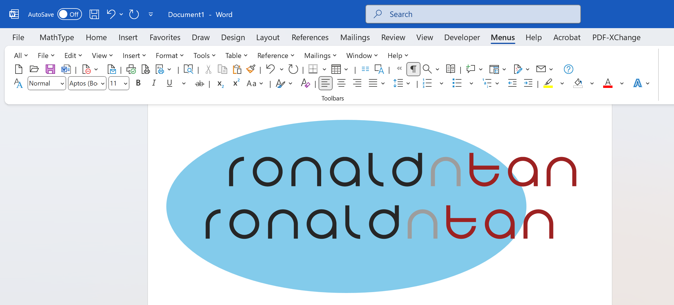
When you have all elements (whether linked or embedded) in an .afdesign file, export it to EPS format, then open it in Designer, set the background transparent and export to WMF. This should have everything in curves and at least in Word 365, the transparent background stays. RONALDNTAN-Letter-Head-2025-TYPE-DIRECT_from_eps.wmf
-
That is really odd. I have the transparency retained within WMF placed back in Designer no matter if exporting the area or the whole document. However if I open a .WMF or an .EMF file with transparency, Affinity Designer does not open the document with transparency turned on, but again, there is no difference between .EMF and .WMF. Perhaps this is related to missing font somehow. Designer always converts this font to curves even without checking the export option so I cannot export this text so that the text is retained as a font. This is a font activated from Adobe CC and installed for all applications. This could also be a Windows version difference. I have Windows Pro 11 2004.H2 installed. UPDATE: If I change the font to e.g. to Anivers Regular, Affinity Designer converts the text to an image within WMF export, and that export loses the background transparency. Strange.
-
I have here both .wmf and .emf exported from Designer 2.5.7, placed in Word (Microsoft® Word for Microsoft 365 MSO, Version 2412 Build 16.0.18324.20092), and both retain transparency: ...so it seems to depend on version of Word, whether transparency works or does not work.
-
Export it with PS v2 and it exports fine (Illustrator opens just fine the v3 EPS export, too, so this limitation seems to be specific to Affinity apps). Note though that Affinity apps always convert to curves fonts, both when exporting and importing (or opening) EPS.
-
How to turn off color management
lacerto replied to JamesFrankel's topic in Desktop Questions (macOS and Windows)
You can have your images rendered with native colors by using your monitor color profile as you RGB color profile (In Preferences > Color), or using it explicitly when assigning and converting to monitor color space. (Rendering would of course then be device dependent so basically pretty much random...). Note though that Affinity color management is a bit inconsistent and you may still get sRGB factory default color space assigned to opened images without a color profile (instead of having the default working color space assigned), and get colors rendered identically even if you have placed images with multiple embedded color profiles, and have distinct color values rendered only in Export Preview (with document color profile selected), or after exporting. As sRGB is still probably the most common display color gamut, it might be a good idea to use it to approximate a typical color rendering and user experience, even if color management is not supported in the end product, and exports are created without embedding a color profile. -
DESIGNER - keep groups together when import
lacerto replied to rulo's topic in Feedback for the Affinity V2 Suite of Products
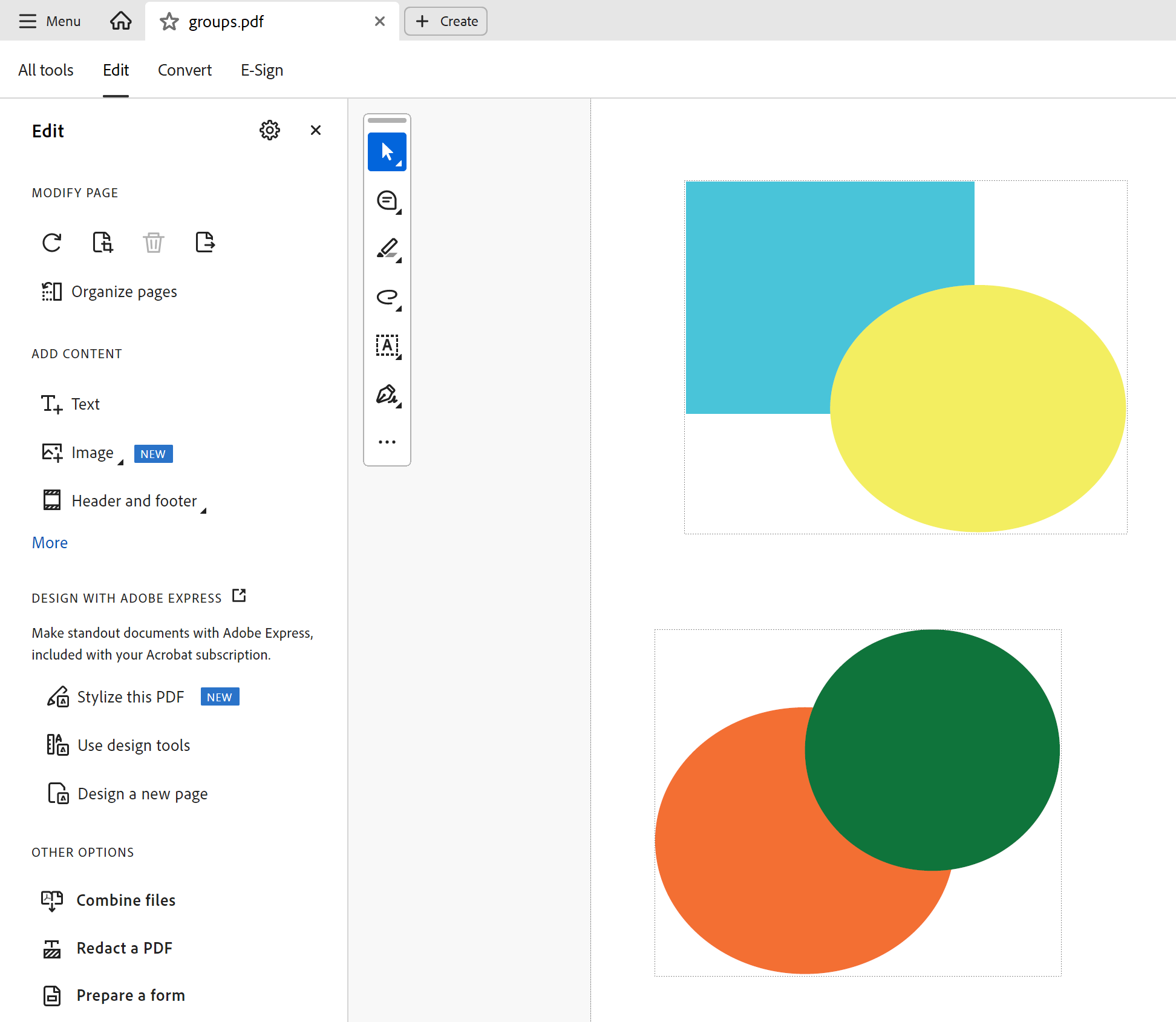
PDFs have "group"-like capabilities and behavior but terminologically they are "ContentStreams" and "Optional Content Groups" (the latter also called as "PDF Layers", which can be global within a PDF document). It is possible to create page-wide ContentStreams, select them individually, change their Z-order, combine and delete them, set OCG visibility, printability, etc. Perhaps this extract from Foxit Quick PDF Library SDK documentation clarifies somewhat the terminological confusion (which is further complicated by the functional difference "layers" have in Affinity vs. Adobe apps): UPDATE: As an example of group-alike behavior of content streams, here is how Adobe Express opens a PDF page containing two of them (initially groups within Adobe Illustrator but saved as PDF without AI content), which show as two "groups" already when edited in Adobe Acrobat Pro, but here also terminologically "grouped" (and ungroupable/regroupable objects, which can be edited much as any regular group objects in any design app), and which can subsequently be saved back as a PDF once "edited and enhanced" in Adobe Express (but losing again the conceptual grouping information and meta data when saved back): In Adobe Acrobat (CC2025), when editing the content: ...and in Adobe Express, when choosing "Use design tools" in Adobe Acrobat: groups_in_pdf.mp4 UPDATE: Affinity apps actually utilize OCG (optional content groups) specifically as page-specific groups. This is achieved by adding a "Layer" layer in the document, and then exporting to PDF so that layers are included. In Adobe Acrobat, the user can then show and hide page-wise these individual "groups" as Adobe layers. Serif has also implemented a feature where these optional content groups are read back in Affinity apps as "Layer" layers, thus utilizing a PDF feature as a way to smuggle in proprietary document information and hierarchy. Other apps reading PDFs do not support this Affinity implementation, which in a way converts a limitation (lack of global layers) into a beneficial feature (page-specific grouping). layer_based_pdf_grouping.afpub affinity_layer_layers_as_page_specific_groups.pdf