lacerto
-
Posts
6,440 -
Joined
Everything posted by lacerto
-
Yes, the same happens on Windows. Artifacts appear in context of whole page export. Good to know that a background rectangle fixes this (and the other odd workarounds 🙂). Hard to say if only the artifact thing is a bug, or if the whole thing is an accidental but useful feature , that works with a hard twist.
-
Note that it is NOT an 8-bit image, but truly a monochrome bitmap. Affinity UI is misleading (stating 8-bit, or document color mode, which is CMYK: there are no CMYK PNGs).
-
Both the exported image and the Publisher document are zipped as attachments, and as can be seen on Photoshop document title, it is truly a 1-bit image (bitmap in PS terms).
-
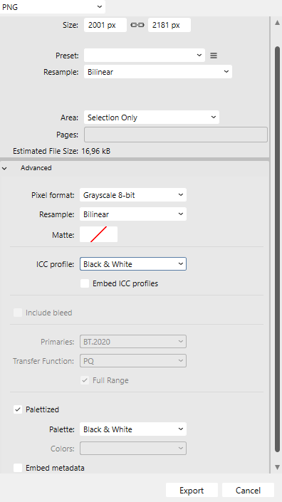
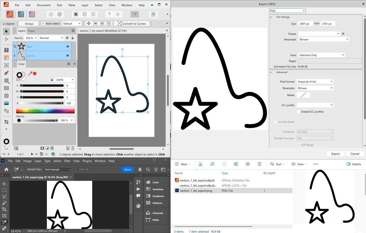
You can actually export 1-bit black and white PNGs from Affinity apps. This seems to work reasonably well at least if you have a CMYK document and export to Grayscale using Black & White palette: It does work with some other combinations, too, but with other color spaces the "black" might be rendered dithered, and there may be artifacts. With some combinations results will be 8-bit indexed bitmaps. It is a kind of tweak but might work ok for some limited purposes. Note that even if 1-bit b/w PNG exports are possible, Affinity apps themselves open these images as 8-bit grayscales. UPDATE: When I later tested this on macOS, I noticed that in order to avoid dithered output, I had to specifically use Black & White ICC (which is not explicitly defined above). Only then the pure black would produce compact (undithered) black. I later re-tested this on Windows using explicitly the default (RGB-based) Greyscale D50, and the same happened also on Windows, so it seems that "Black & White" profile was implicitly in force in the situation I first tried this on Windows. To make sure that you get compact black, choose "Black & White" as your ICC (but do not select the profile to be embedded in the exported file). So in combination of CMYK, ensure that you have these kinds of settings turned on when exporting: vectors_1_bit_export.afpub 1bit_from_affinity.zip

-
Congratulations! We have record warm February in Finland (Helsinki) and no snow, at all -- It is nice, though, to be able to cycle throughout the year. Next week it is our traditional "skiing week" (free from school etc.), have not been on skis or skates for years now. In the childhood there was no winter when we would not go skiing on the frozen Gulf of Finland, and we had an ice rink, ski jumping tower and slalom slope practically in the backyard, in good use for months per year! I'm glad that you got your Affinity traction control off and managed to steer through the snowy conditions, my recollection of such conditions is so strong that I still seem to be able to offer some help!
-
NOTE: Having re-read the message, the Lulu specific note was not about color space but for page sizes, so please ensure first that your PDF was actually exported as "All pages", and NOT as "All spreads". Did you create a PDF 1.7-based export with Grayscale and Color Profile set to GreyscaleD50, as I mentioned in my last but previous post? If you did, and you did not get other warnings from Lulu, it is a good chance that you can use that file, once produced page-wise. The only concern when creating non-PDF/X-1 and non-PDF/X-3 based outputs is that your document contains transparencies (less than 100% opacity, or blend modes), as these would most probably not accepted by Lulu. If it is so, you either need to flatten your transparencies manually, or use PDF/X-1 or PDF/X-3, or produce all-rasterized output (no-one wants that). Affinity apps do not support PDF v1.3, which would also automatically flatten transparencies.
-
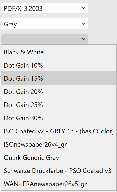
I am sorry to hear that the problems continue. I do not know what Lulu requirements are exactly, but this sounds as if they specifically required PDF/X compliant file, so my suggestion for using PDF1.7 to produce a DeviceGray document using Greyscale D50 profile would not be accepted. To produce a genuine PDF/X compliant grayscale document you would need a press-based grayscale profile, since otherwise Affinity apps would use the factory default U.S. Web Coated v2 as a fallback profile, and that would produce four color CMYK for grayscale content. DotGain and Generic Gray profiles that are common in the industry are something that come with Adobe apps and apps like QuarkXPress, and I am not sure if it is ok to share them, but you can go to https://www.colormanagement.org/en/isoprofile2009.html ...and download ISOcoated_v2_grey1c_bas.ICC for the purpose. It should work well for basic greyscale jobs for coated stock. The following file has been produced with this profile as PDF/X-3, and it can use RGB composite PNGs and Greyscale D50 and have grayscale color intent by embedding image ICCs: pdfx3_compliant.pdf Could you try if this file is passed at Lulu, and if it produces acceptable gray levels? If this does not work, the only solution would be producing a PDF/X-1a:2003 document and converting the document to CMYK color mode using the recommended ICC profile (Affinity apps come with U.S. Web Coated v2 for coated stock and U.S. Web Uncoated v2 for uncoated stock), convert all RGB PNGs as genuine grayscale files (they can be D50, but you could also use the above mentioned ISO grey profile), and then specify all text and pure black objects from G0 to C0Y0M0K100. While this may sound an overwhelming task, it can actually be performed pretty fast (also within Affinity apps) once you know the procedures. E.g. using Select Same Fill Color, and/or Select Frame Text and Select Artistic Text operations you could change grayscale based color definitions to K-based, in a few steps. Images would be DeviceGray in this case. This would be the kind of file described above: PDFX1-compliant_konly.pdf But I do not think that you need to go this far (to produce PDF/X-1a file). E.g. at https://help.lulu.com/en/support/solutions/articles/64000255582-image-formatting-the-basics it is specifically mentioned that for black and white books grayscale is required, and for "color books", sRGB, instead of CMYK. Also, word processing apps like Word (to which they constantly refer to) produce text and grayscale images typically as DeviceGray, and based on this, requirement specifically for CMYK color space sounds odd. Standard grayscale images with press-based profiles will also be output as DeviceGray when exported to PDF/X-1a:2003 (even if K100 text will be DeviceCMYK and C0M0Y0K100), so definite requirement for CMYK only does not sound plausible. Other than that, their general instructions mention about transparencies needed to be flattened (which PDF/X-1a and PDF/X-3 both do automatically). More specifically, they mention the following: The requirement for "vector images" needing to be rasterized is odd, but if you do have vector images placed, rasterize them in-place within Publisher if your document color space is grayscale. The note on page orientation and size might refer to your PDF output be created spread-wise, so be sure that when you export, you export "All pages" (not "All spreads", which is the default for Facing Pages PDF output in Publisher). Anyway, if the PDF/X-3 based file above is not accepted, then try the provided PDFX1-based. I would try to contact someone on Lulu and ask them what specifically they need.
-
Faded colors when opening TIFF files
lacerto replied to GregD's topic in Desktop Questions (macOS and Windows)
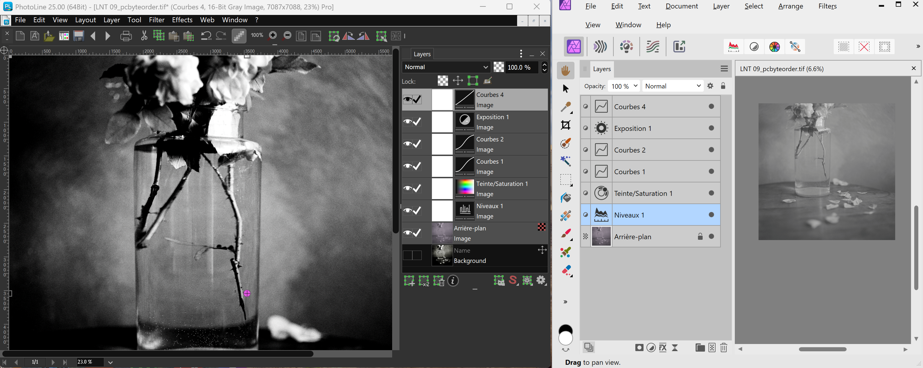
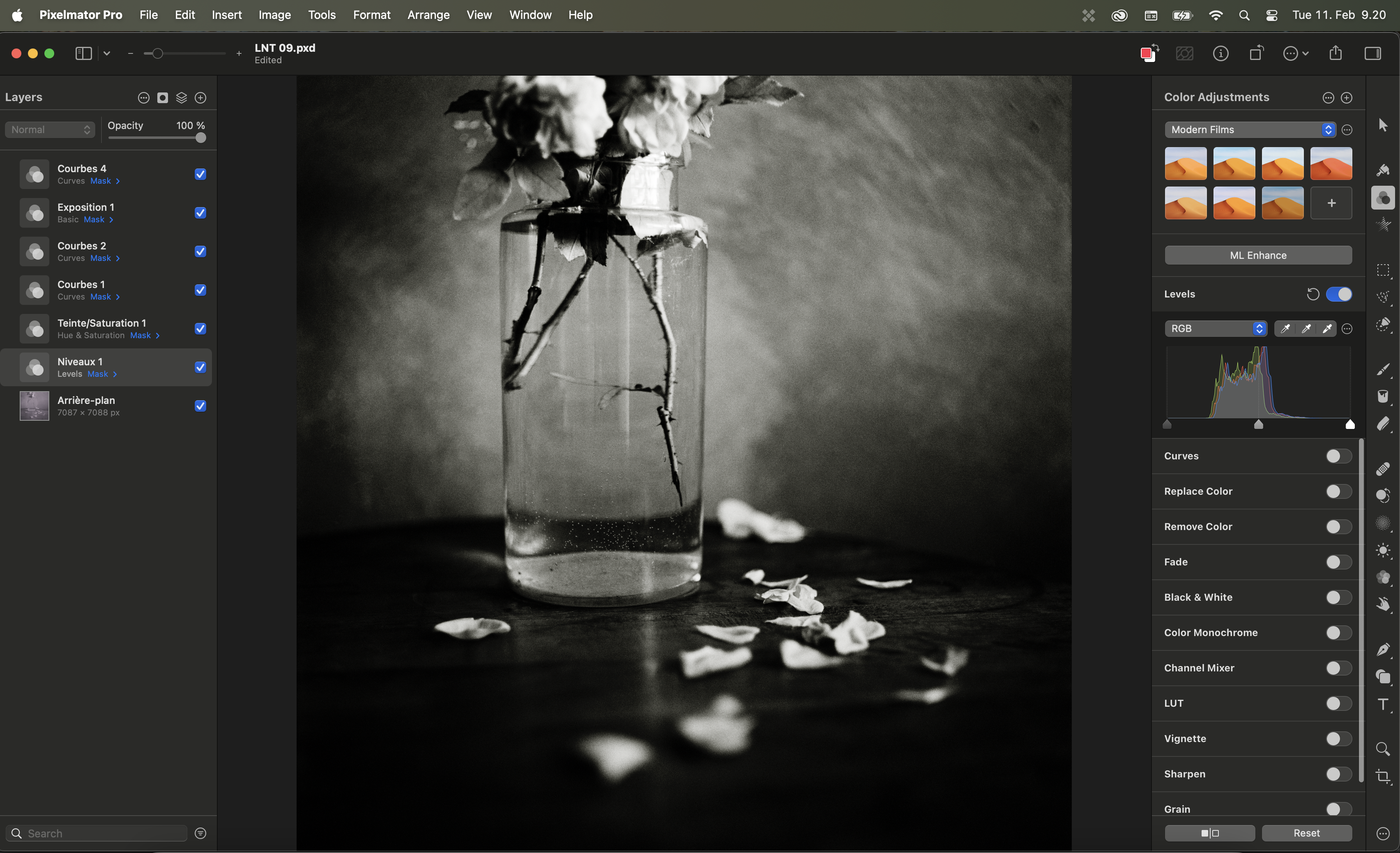
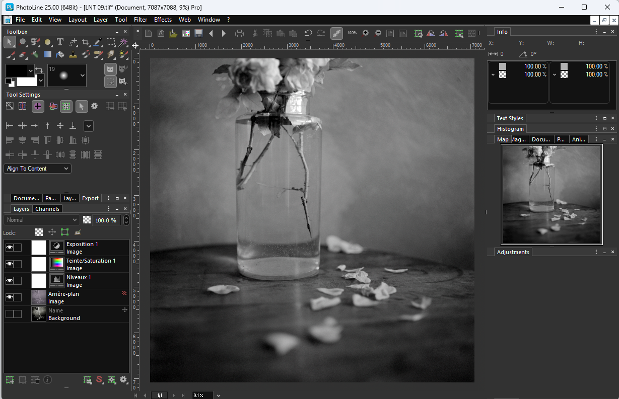
I agree with what @lepr says above: adjustment layers are basically app-specific, and while other apps can read in layer information and parameters, they need to interpret them to native controls. Pixelmator shows that it can be done (at least in this case), and to me it appears that there is a clear error in the way the Levels adjustment is applied in Affinity Photo (the image could be corrected to match the original by adjusting this single layer). It would also be beneficial to import the thumbnail (I am not sure if it is full-resolution flattened image, though, or something scaled), simply to have correct tones. This screenshot, showing how PhotoLine opens a layered TIFF file saved from PS CC2025 (using PC byte order), with a thumbnail, and how Affinity Photo2 does it (all wrong), shows that there is room for improvement in the code: ...to have something like this, instead: LNT 09.afphoto
-
Faded colors when opening TIFF files
lacerto replied to GregD's topic in Desktop Questions (macOS and Windows)
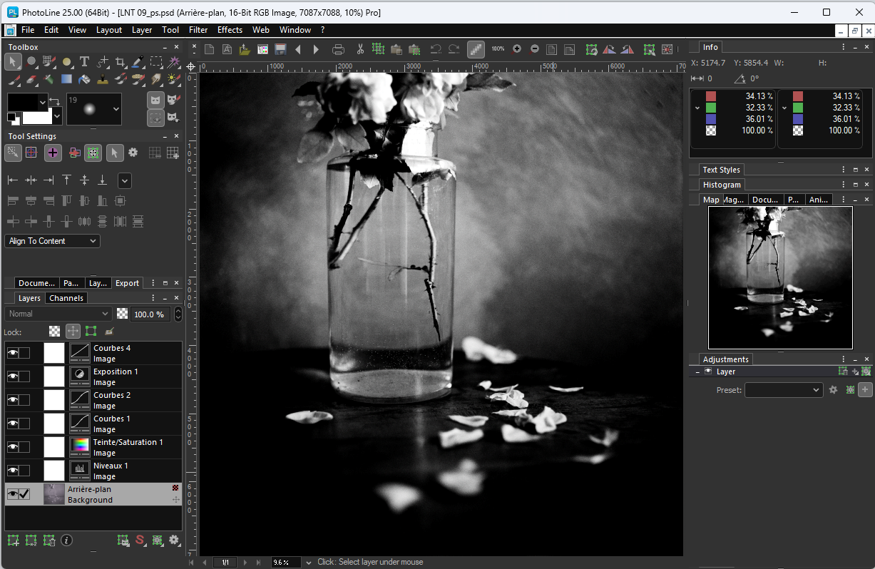
One option might be to use Pixelmator Pro (possibly becoming part of macOS in the near future): It seems to read the TIFF adjustments correctly. Interestingly, and oddly, when exporting to .PSD file from Pixelmator (trying to retain adjustment layers), Preview can render the resulted image correctly, but not Affinity Photo, nor even Photoshop (CC2025). The tint and exposure adjustment layers are dropped, for some reason (but can be copy pasted back in PS from the original image to retrieve the correct appearance). Anyway, in case retaining the original adjustment layers is important, Pixelmator might be worth a try. UPDATE: PhotoLine, yet another capable editor, opens both the static background, and the image with adjustments, but oddly also omits a couple of layers so that the correct appearance is not achieved: UPDATE2: If PS is still available, one possible scenario to have TIFFs with adjustment layers archived and editable off PS is to use PS to batch convert TIFF files to PSD. Both PixelMator and PhotoLine appear to be able to open correctly the PSDs with adjustment layers (while Affinity Photo opens them similarly as the TIFFs). That would also be a Windows compatible solution, as PhotoLine is available on both platforms (one price).
-
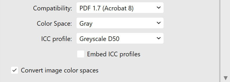
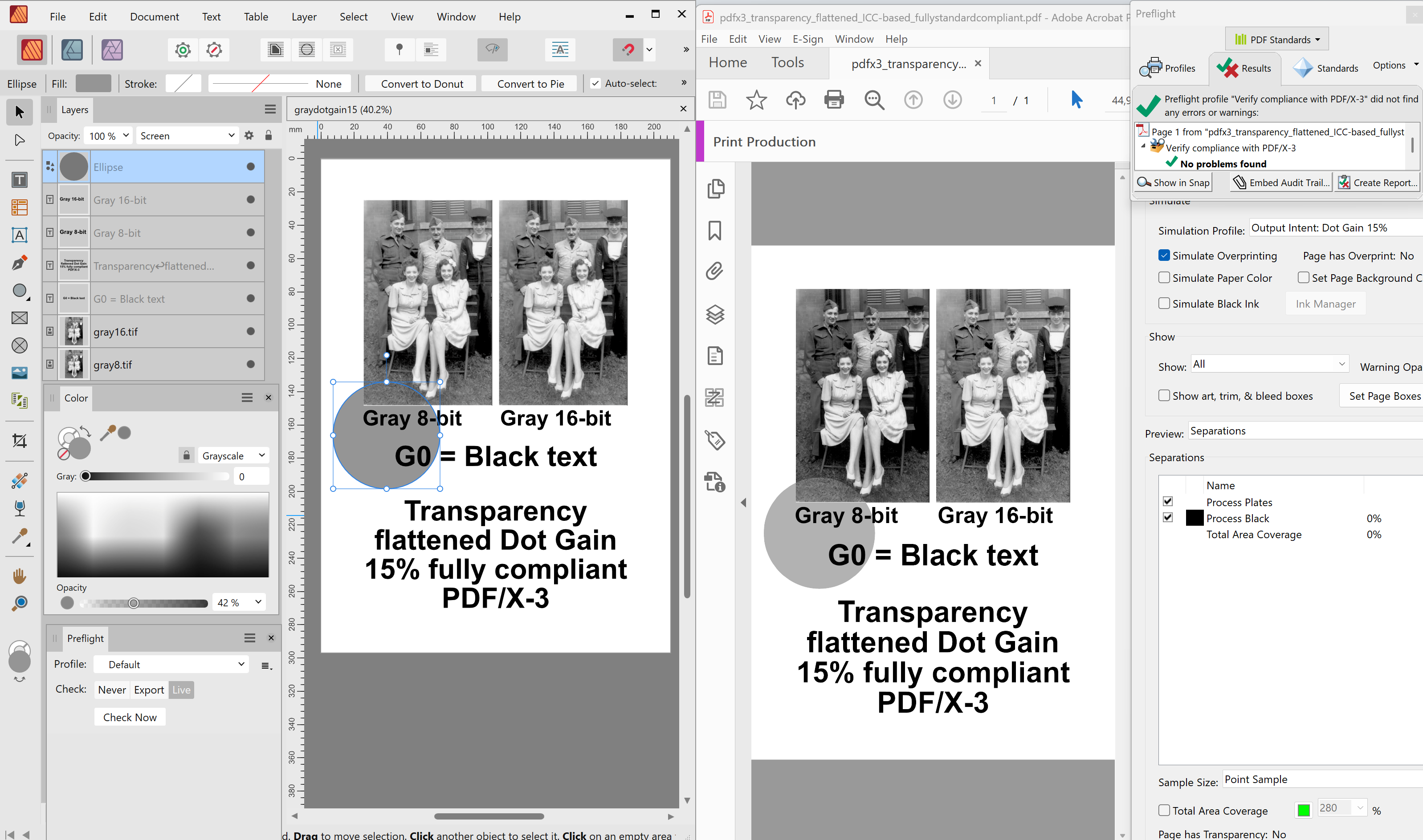
Having PNGs is fine. When you place them (even color images) in a grayscale Publisher document, Affinity handles them as composite grays. If you use Greyscale D50 document color profile, then you would use the following settings to produce DeviceGray output, and force converting the RGB-based PNGs to grayscale (notice the difference in handling; if your document were in CMYK color mode, or if you exported to CMYK PDF, your RGB based gray PNGs would be converted to four-color black, and this is something you do not want): I would process the PNGs so that they look good in sRGB color space, but I'd imagine you have that, already? UPDATE: Here is an example of how an sRGB handled gray PNG would look when placed in Greyscale D50 document and exported to Grayscale, forcing image color spaces converted: pdf17_greyscale50_devicegray_with_compositegrays.pdf
-
You would need a press-based grayscale profile (e.g. Dot Gain profiles that come with Adobe apps, or some Generic Grayscale profile) to be able to export to PDF/X. PDF/X-1a is a CMYK profile, but PDF/X-3 and PDF/X-4 allow other color spaces, as well, though I suppose they will convert Gray-16 to Gray-8. PDF/X-3 has the benefit of automatically flattening transparencies (even if this happens in Affinity apps always by rasterization), which may be useful, since services like Lulu typically require transparency flattened PDFs. You could also use e.g. PDF 1.7 (the most compatible PDF version that Affinity apps support), and Greyscale D50 profile (that comes with Affinity apps), to force a grayscale PDF, but then you should also have the grayscale photos processed with that profile (to avoid dark grayscale PDF output, and export time color changes). Other than PDF/X-1a and PDF/X-3 would also leave transparencies unflattened, so if the printer requires flattened transparencies, you should do this manually. On the other hand, exporting to non-PDF/X mode allows you to produce DeviceGray output, which may be useful, if the printer does not accept ICC-based PDFs. Whenever using a grayscale document color mode, remember to specify your black components using the grayscale definition G0. K100 would be converted to dark gray within Affinity apps whenever creating grayscale PDFs. Attached are two Affinity produced grayscale files that would probably be good candidates to be accepted at Lulu. pdfx3_transparency_flattened_ICC-based_fullystandardcompliant.pdf pdf17_greyscale50_devicegray.pdf UPDATE: For clarification: when using PDF/X-3 or PDF/X-4, you need a press-based grayscale profile, something like this: Greyscale D50 would not be listed (and therefore you might get a Preflight warning that the currently used D50 profile is incompatible with PDF/X). But as mentioned, you can use Greyscale D50 if exporting with non PDF/X-based presets. To get a DeviceGray output, remember to leave "Embed ICC profiles" unchecked.
-
Illustrator is "hard coded" to 72dpi document resolution, and basically the same is the point unit (1/72 of an inch), the desktop publishing and press industry standard unit. Pixel dimension in Illustrator becomes meaningful when vector graphics is exported to pixel images, and in context of document raster effects (the resolution can be set using the Effects menu). If you change your ruler units in Designer to points (or any non-pixel unit), you can see that objects have identical dimensions in Designer and Illustrator.
-
TROUBLE WITH KDP AND AFFINITY
lacerto replied to E.M. Wolfram's topic in Desktop Questions (macOS and Windows)
True. At least the identical file linked to another location gets handled as passthrough even if the same file from another source chosen to be handled interpreted gets identical handling. On the other hand, it does so, even it is embedded! Personally I consider this a bug, since the selection can be made object-wise. If it is supposed to be a resource-wise option, it should be made in Resource Manager (in connection of parent item under which individual references get listed). -
TROUBLE WITH KDP AND AFFINITY
lacerto replied to E.M. Wolfram's topic in Desktop Questions (macOS and Windows)
Yes. If you let interpret, you need to have all resources of the placed content, and also need to make sure that you have the same color profile, but you avoid rasterization. Interestingly, Passthrough / Interpret setting is document-wise, so if one of the placed files uses Interpret, they all do, disregarding whether Passthrough is subsequently used in any other reference. -
It can be worked around, though a bit tediously:
-
TROUBLE WITH KDP AND AFFINITY
lacerto replied to E.M. Wolfram's topic in Desktop Questions (macOS and Windows)
Basically the referred instructions are fairly "relaxed" (assuming production from apps like Microsoft Word), so you should be able to create an acceptable PDF as long as: 1) It has been exported per pages (rather than as spreads, which is the default setting in Affinity Publisher). 2) If you have bleeds, make sure they are as instructed, and do not include any print marks (e.g. bleed or crop marks). 3) The maximum file size is 650MB. 4) The transparencies have been flattened; you can do this manually before exporting, or use PDF/X-1a:2003 or PDF/X-3 export method (all other export methods within Affinity apps retain transparencies). If you flatten transparencies manually, you can use more compatible PDF 1.7 method (e.g. PDF (for press). Note that Affinity apps do export time transparency flattening always by rasterization so make sure that the export Raster DPI is at least 300dpi. This is what they recommend for general raster DPI (for images), as well. The instructions do not specifically mention anything about color profiles but since e.g. PDFs created from Word (using e.g. Microsoft Print To PDF or Save as PDF, or Adobe PDF, are typically DeviceGray or DeviceRGB and sRGB based (note though that e.g. black text from Word will always be DeviceGray, so this is what they might expect from text and other pure black objects), it is probably a good idea to produce device colors and NOT embed ICC profiles, so leave the "Embed ICC profiles" unchecked whenever possible (by default it is checked). Note that if you export using PDF/X-3, the ICC profiles will be included, and you cannot turn the option off (they do not instruct against using PDF/X-3, but it might be something they do not expect to have). Since KDP is basically a hobbyist print service, there should not be any strict policies as for color space (e,g. requirement for using CMYK, or specific document profiles for specific papers, since these kinds of options are not available when producing PDF e.g. from Microsoft Word). You would achieve best results, though, by planning your workflow appropriately and producing as compatible and coherent output as possible. This would typically involve choosing a document profile that suits best for your job (e.g. considering printing to coated or uncoated stock), and exporting "simply", without needing to make export time profile changes. As they specifically mention PDF/X-1, working in CMYK color mode should be the most compatible mode, in which case you would define your text and other pure black elements in K100 (and C, M and Y zero), then have placed images in grayscale and /or RGB color mode, and export to PDF/X-1a:2003. This will produce a flattened DeviceCMYK output where black elements are K100 (if defined so). KDP should have no problems processing this kind of a PDF, as long as you have the other specs as defined (points 1 - 3 above, and 300 DPI raster resolution). However, exporting to PDF/X-1a has limitations within Affinity apps, related to placed PDF content: if you have ones, make sure that they are PDF/X-1a, as well, otherwise this kind of content will be rasterized and their color values are recalculated. -
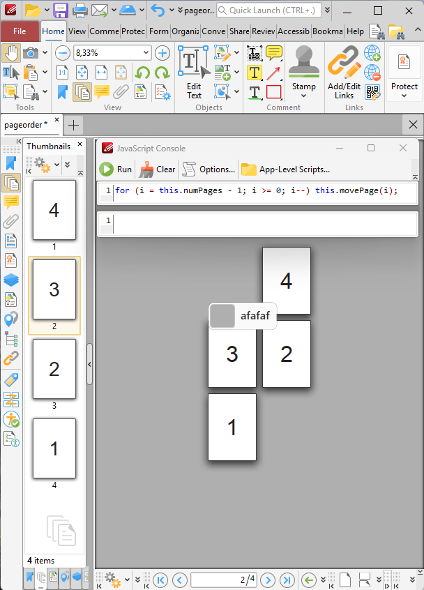
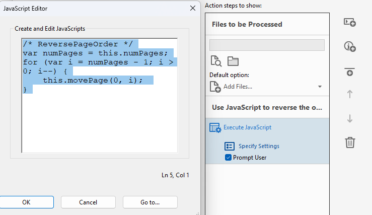
Arranging pages to be published back to front
lacerto replied to Ayun's topic in Desktop Questions (macOS and Windows)
Thanks, @Oufti, printing and exporting in reverse page order probably most often resolves the problem. In situations where it is important to make sure that the content is not changed, you might need to use proper PDF editor to do the task. Other than Adobe Acrobat, there are more economical options like PDF/X-Change (for Windows), and PDF Studio Pro (for Windows, Linux and macOS). Using these tools, you would reverse a copy of the publication, and subsequently merge the two PDFs. In case of PDF/X-Change (and PDF Tools), JavaScript is needed to do the actual reverse job: A JavaScript is needed also when using Adobe Acrobat to do the task: When using PDF Studio Pro, the reverse page order functionality is built-in:
-
Ensure that you have the same document color profile applied both in the placed Designer file and the Publisher file (you might have the default U.S. Web Coated v2 in the other, and e.g. Coated Fogra 39 or some other common European press profile in another.
- 1 reply
-
- 1
-

-
DCP camera profiles, which Adobe RAW automatically reads in a camera profile list, once installed in expected location, used to be provided (I think) for most common camera models along installation of Photoshop and Lightroom, but nowadays need to be acquired or created separately e.g. using e.g. ColorChecker Camera Calibration software (currently 2.2.0 for Windows 2.3.0 for macOS), which is free software (as is dcpTool, an opensource project). By reading in DNG files containing a ColorChecker Passport Photo, it is possible to create general purpose double-illuminant camera profiles, and single lighting condition camera profiles, and also single lighting condition ICC profiles. This allows easy creation of a profile for any camera for RAW (DNG) processing and accurate color production. Camera profiles are also supported at least by DxO PhotoLab, Exposure and CaptureOne. UPDATE: I was wrong, Adobe still provides free DCP camera profiles (the most recent version comes with profiles for 1,306 camera models) with Adobe DNG Converter (available both for Windows and macOS).
-
One option would be to use cross references to heading titles as page numbers (they can be easily spotted using style filters). They would be automatically updated when the location of headings changes.
-
Exporting monochrome zine to PDF?
lacerto replied to Roman Rogner's topic in Desktop Questions (macOS and Windows)
If you choose PDF/X-1a:2003, you basically need to have a press-based grayscale/black and white ICCs available to be able to choose Grayscale color space. On Windows there are by default none available (e.g., Dot Gain based ICCs become available with Adobe apps, and if you have other, they are ones that have been acquired separately). If appropriate grayscale profiles are not available, Gray option will not be available, explaining why CMYK will be the only option. However, if you want to force exporting to grayscale, you can do so by choosing e.g. PDF 1.7 (which is the most compatible of PDF versions that are available within Affinity apps) and then choose e.g. the generic Grayscale D50 profile that comes with Affinity apps, and to make the exported PDF DeviceGray, leave "Embed ICC profiles" box unchecked. This workflow would give you a PDF where you only have gray values. The problem with this method, as shown in my previous post, would be that if you have K100 definitions of black, they will be converted to dark gray, not G0. To fix this, you should have all native objects that you intend to be pure black as Grayscale values (G0) (they could also be RGB 0, 0, 0, but it is clearer to have them explicitly in grayscale, if not already RGB 0, 0, 0). An alternative option would be producing a CMYK PDF with output only on the K plate, and none on C, M and Y plates. Your printer most probably referred to an issue that your exported PDF has inadvertently had grays produced as "rich black" (not with mere K values, but mixing all four inks). This would happen if you have blacks specified in Grayscale or RGB. To keep grays and blacks in CMYK color mode and export as "non-rich", you need to specify them using K-values only. As you obviously do not have press-based grayscale profiles (and appropriate choices to choose the most suitable grayscale profile for the media you use, e.g. for uncoated paper), you would probably get best results if you choose the closest CMYK profile that fits the purpose (ask a recommendation from your printer, if you do not get any, choose U.S. Web Coated (SWOP) v2 if the media you use is coated, or U.S. Web Uncoated v2, if it is uncoated (these are kind of basic choices and I mention them because these profiles come with Affinity apps, so there is no need to download specific ICC profiles): You can check and change the document color profile by choosing File > Document Setup, and then activate the Color tab. When changing the profile, you can retain existing color values by making sure that you have the "Assign" tab selected when you press OK. Otherwise existing CMYK definitions of native objects change, and e.g. K100 definitions are translated to four-color black. If you use CMYK color mode, make sure that all native objects and text are defined in K-only color values, before exporting. It is important that you export using the document color profile, so make sure that you do not change the CMYK color profile when exporting, otherwise all CMYK values will be converted, and you again end up in getting four-color blacks and grays. As you can see, producing grayscale PDFs can be a challenge in Affinity apps. If your printer can give you some recommendations, they most probably cannot give detailed instructions because it is not likely that they know Affinity Publisher specific workflows and limitations. But once you know more, you are welcome to ask on the forum. Grayscale issues are well-known here and someone can certainly help you out producing what is required.
-
Exporting monochrome zine to PDF?
lacerto replied to Roman Rogner's topic in Desktop Questions (macOS and Windows)
Note though [if you end up converting to Grayscale] that if you currently have your text and solid blacks defined as K100, they will be converted to something like G5 (instead of G0), the exact value depending on the color profiles used. If you want to produce G0 black, the color definitions should be given in grayscale G0, or as RGB 0,0,0. The difference is not big but might be noticeable (here the converted K100 grays on top of true black):
-
Affinity publisher - resource manager
lacerto replied to Iztok's topic in Desktop Questions (macOS and Windows)
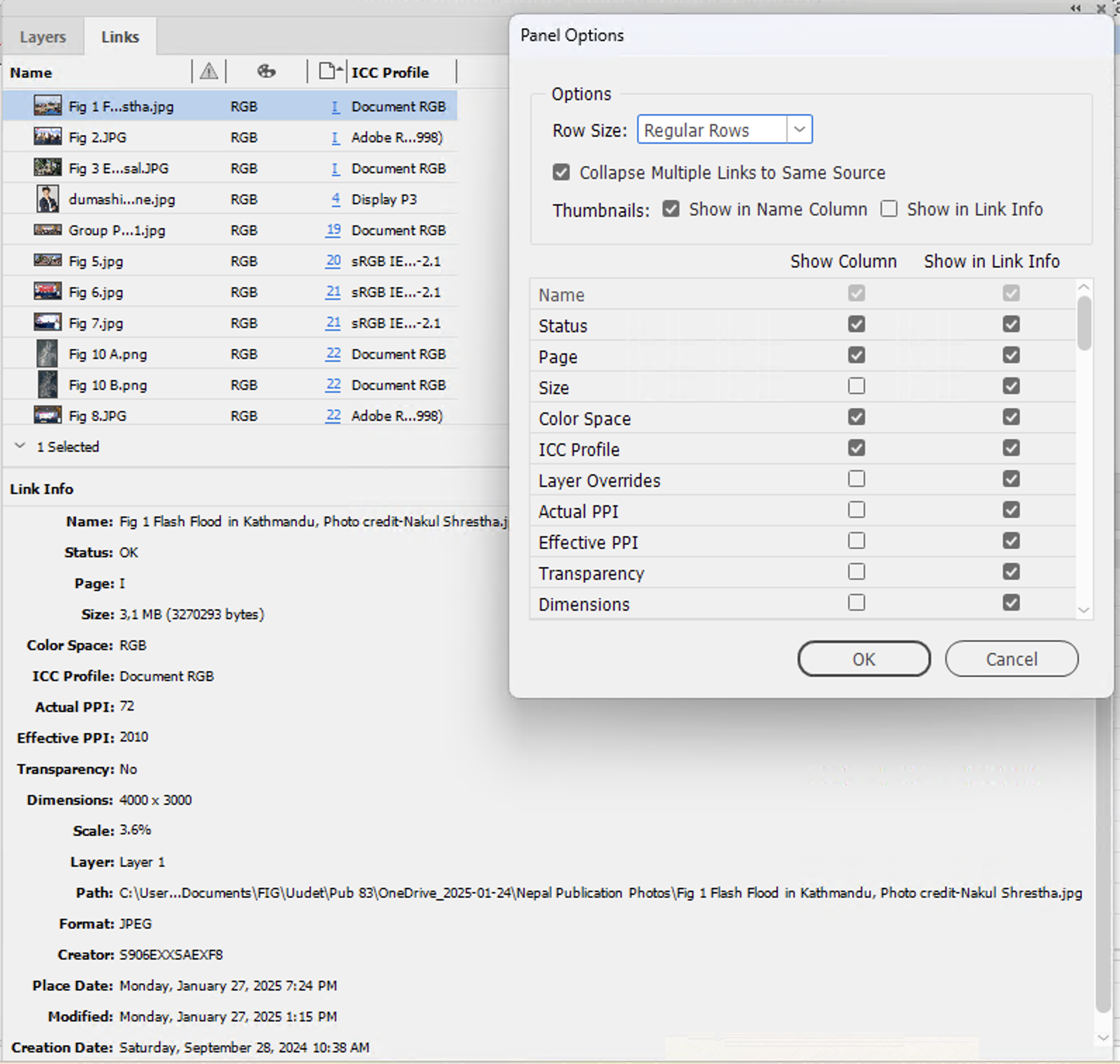
The reasons for having diverse information listed in columns can be varied, especially as images can also be arranged by any of the shown columns, so any page layout app would definitely benefit of having something like this (below with a total of 62 items to be chosen to be shown as columns):
-
Sorry, I might myself have misunderstood... This is what I meant (replacing mere \\ (in \\n) with \ typed from the keyboard, so that Affinity automatically replaces \n with a paragraph special character): findparabreaks.mp4
-
Unless you happen to have also a Windows computer and Windows version of Publisher (where this issue does not happen),one thing what comes to mind is selecting the \\ special character and typing \ from the keyboard (Option+Shift+7 on my MacBook), which would turn \\n to a paragraph break special character (that might be a bit faster than selecting \\n and picking the paragraph special character from the menu). Personally I think it was a mistake to add this functionality [macOS version only] for the backslash character, because single backslash still works as a search character within Normal (non-GREP) searches, and because keeping GREP searches plain text (retaining e.g. \n instead of using a special character) is more compatible.