ericGa
-
Posts
69 -
Joined
-
Last visited
Everything posted by ericGa
-

Master Pages / spread vs page
ericGa replied to ericGa's topic in Feedback for Affinity Publisher V1 on Desktop
Still nothing on v2 about that... -
I just realized that it's not fixed in v2...
-
Publish is a software that I would love to love but is packed with irritating UX/UI decisions I struggle to achieve Little/basic things like drawing a shape with specific values (let’s say 10mm x 25pt) With the competitor software (Indesign to name it) select rectangle tool, left click + enter values… done With publisher I have to draw first and go to the transform palette to change values (am I missing à contextual menu or something here?) And I'm not talking about spread pages visually similar to a page in the spread page and page palette. A spread composed of two pages should be draw with two rectangle…
-
Master Pages / spread vs page
ericGa replied to ericGa's topic in Feedback for Affinity Publisher V1 on Desktop
OK this is my yearly jump on the subject... Is this a bug? ... a feature. I still don't get why a spread of 2 pages are not visually shown as two pages. -
Master Pages / spread vs page
ericGa replied to ericGa's topic in Feedback for Affinity Publisher V1 on Desktop
Following my first post (one year old now), I still don't understand why spreads are not visually made up of two pages... -
I tried to find the discussion without success. I am curious to know what justifies this.
-
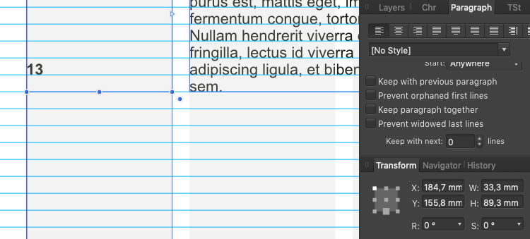
The text frame with Top Align doesn't have any problem with descenders. Bottom Align should react the same (without the need of tweaking anything).

-
Tweaking in a case-by-case basis is not a good option. I used Snap to basline grid so we should have consistent results. That should be fixed. affinity.mov
-
That is strange... Please find attached my test file Affinity_test.afpub
-
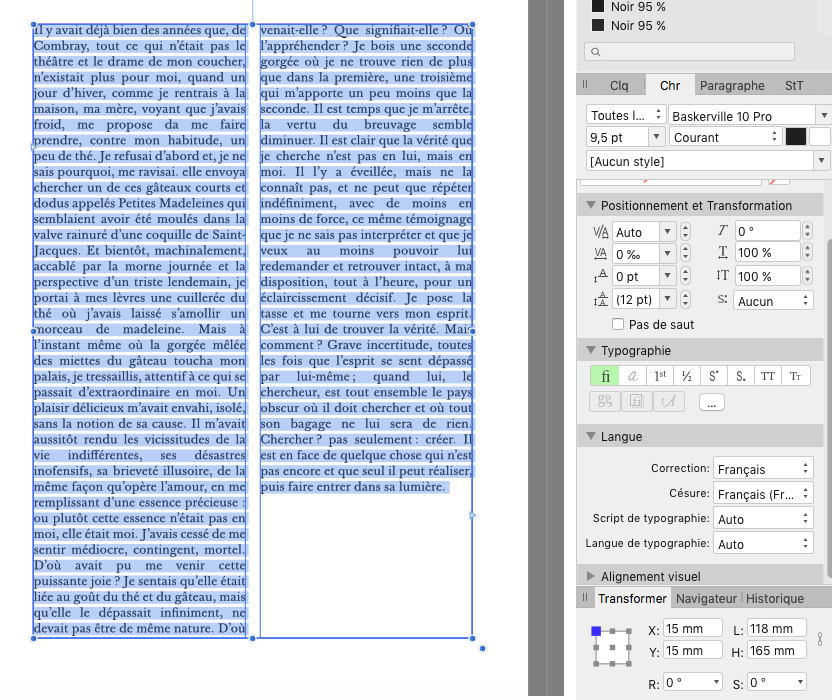
I have two text frame seating in the same baseline (snap to baseline grid is on) with same Y value from bottom. The folio 13 is not going to the last line. (this is not à bold type issue as regular does the same.) the text is Top align, the folio is Bottom align...
-
Swatchs palette has no effect on Frame Text
ericGa replied to ericGa's topic in V1 Bugs found on macOS
Well, if I wanted to add a color to the text, I would rather select the text, not the Text frame. If the text frame is made out of paragraphs with different colors, I will have to select the text anyway. -
The Swatchs palette should interact with every elements of the page. I can't apply colors to a frame text as I can to a rectangle or a picture box without going to the Text Frame window... Why not? affinity.mov
-
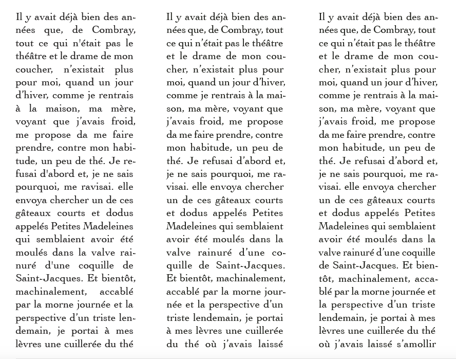
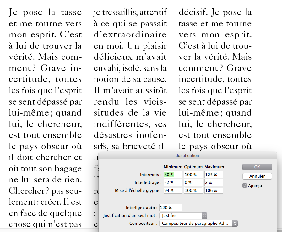
As I am new to Publisher, I'm testing the quality and weaknesses of Publisher compared to Indesign. I am interested to find the limits. See this as a crash test. Her is another test with a column length of 35 mm set in cochin 9pt/11pt. first row Publisher, second row Indesign (same settings as Publisher) and third row, Indesign (with Glyph scaling (98%, 0%, 102%)) and a column at 43 mm (very common in newspaper). Publisher and Indesign (with glyph scaling) Y a pas photo...
-
How do I creat a shortcut for the Text Frame window? I don't see it on creat Shortcuts in preferences.
-
Yes, that is what I was looking for. Tkank you!
-
Nothing wrong with groups, my concern is to organise manually the different groups. Ideally, when I select a group and then draw a text frame, the frame text will be part of this group. Publisher adds a new layer out of the group even if the group is selected.
-
does Publisher support hanging punctuation?
-
When I am working on a publication I like to organise the layers like that : one for images, one for texts, one for translation, for varnish, guides and so on... In affinityPublisher, one object = one layer, wich in my case is quite annoying as I have to merge manually the layers... Am I missing an option or is it the only way publisher's layers work?
-
Hello thomaso, In a typographer point of view, stretching a glyph is heresy. But in a text set in 9 pt, no one will tell you that the glyphs are distorted? On the other hand they may tell you about the big white gaps between words... the setting you suggest doesn't affect the comp.
-
Indesign as a very good composition engine. I try to compare how Indesign and Affinity Publisher work with small column size using Caslon 540, 9 pt on 25 mm column width. Indesign as an extra setting (Glyph scaling) who makes a big difference. Affinty Publisher
-
In my case I can select a Pantone one time and then when I try to select another color I can't import it to a document palette. Very frustrating
-
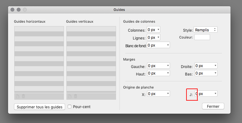
In colonnes and Lignes the unit px is irelevent. It is not a mesurement but the number of columns or lignes that is required
-
In French: There is a small typo in the guides window: Y instead of J. Also : Blanc de fond should be Gouttière And strangely Colonnes and Lignes are display in px
-
Strange... the hyphenation settings are set to french.
-
When I add a global color I get this palette witch is quite useless for choosing a pantone color... The name of the patches appear only on mouse over (after one second)