NoLongerHere
-
Posts
773 -
Joined
Everything posted by NoLongerHere
-
AD's not even close to AI in terms of functionality and at this rate won't be for a long, long time, so no. AI might be showing its age in some areas but it's hard to think of anything it can't do. Of course it depends on your requirements, not just current ones. AI hasn't moved on that much since CS6, PS gets most of the new goodies, and you can still pick that up cheaply, so no subscription.
- 161 replies
-
- 1
-

-
- subscription
- adobe
- (and 1 more)
-
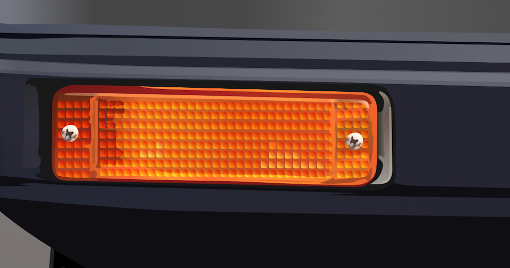
affinity designer 1966 Batmobile v2 (AD)
NoLongerHere replied to NoLongerHere's topic in Share your work
Thanks, haven't seen that before. -
affinity designer 1966 Batmobile v2 (AD)
NoLongerHere replied to NoLongerHere's topic in Share your work
Don't know what that is but thanks. Still need to do some finishing touches sometime. -
affinity designer Mk1 Golf GTI, v2 Progress (AD)
NoLongerHere replied to NoLongerHere's topic in Share your work
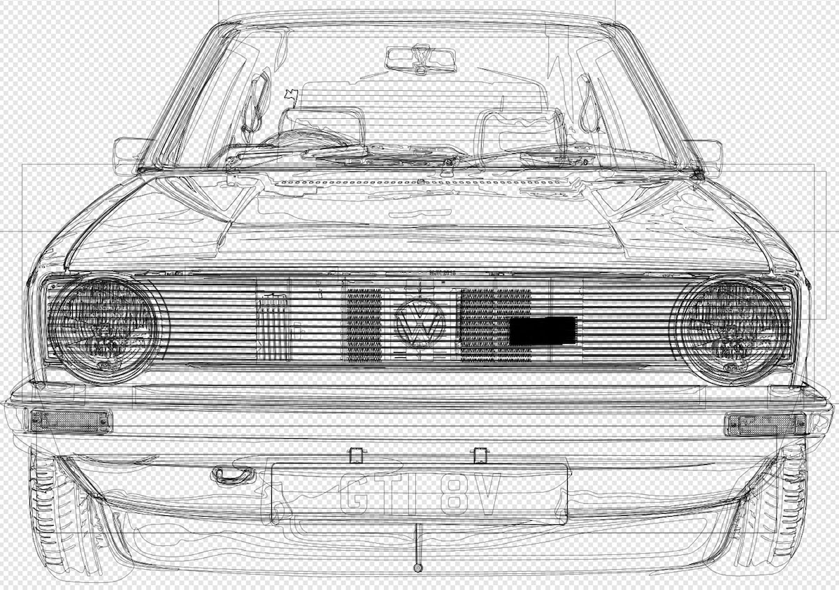
Just split it in to enough groups, although I didn't have too many in this one, 20 main ones and a chunk of sub-groups. It looks more of a mess than it is because of the sub-objects or however you term them, so overlapping paths, although this one is quite neat. Sometimes it takes a bit of time to work out where in the group you need a new object to be but it's not bad. Selections can be a pain sometimes though. -
affinity designer Mk1 Golf GTI, v2 Progress (AD)
NoLongerHere replied to NoLongerHere's topic in Share your work
Not sure about that but thanks. It's still quite a lot of layers but if you want it to be anything like realistic it's always going to be. -
affinity designer Mk1 Golf GTI, v2 Progress (AD)
NoLongerHere replied to NoLongerHere's topic in Share your work
I haven't had time to do much but have basically finished the car itself, yeah I know I'm slow. Ignore the background. I've carried on with the real background but still not sure about it and might change to something else.
- 18 replies
-
- 20
-
-
affinity designer 1966 Batmobile v2 (AD)
NoLongerHere replied to NoLongerHere's topic in Share your work
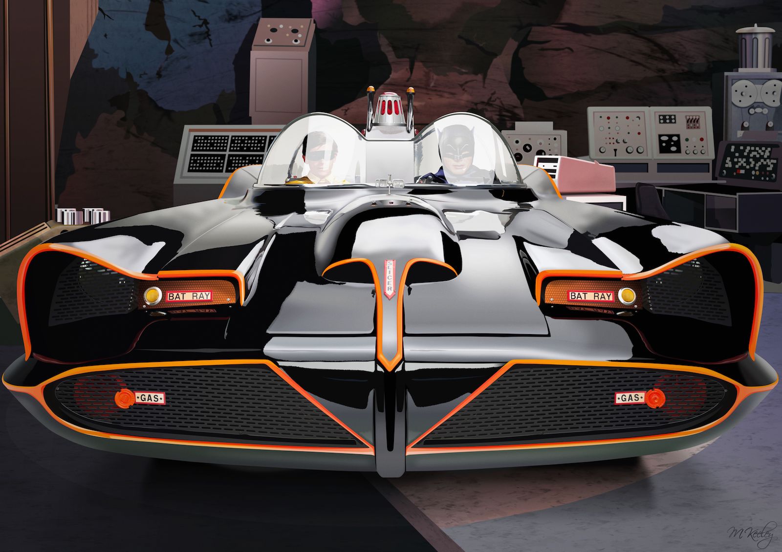
Erm... I found a decent quality reference photo but it wasn't quite head on, which is weird as it was a studio shot, and I didn't like that so I drew it straightened up. That made things easier as I could often draw bits for one side and then flip and modify them rather than doing them from scratch. But trying to move the reflections was a bit of a pain. As for actually drawing things it's basically breaking it down in to lots of parts, then it's no harder than any other drawing. In a way using blurs makes things easier. Batman and Robin were low'ish poly ones I'd done. With it being behind the screen it hides most of the polygons so it wasn't worth redoing them properly. The background's pretty simple, it's based on a low res photo, couldn't find any decent quality ones. But the rocks turned out OK, I used gradients on those then a couple of my vector textures. -
affinity designer 1966 Batmobile v2 (AD)
NoLongerHere replied to NoLongerHere's topic in Share your work
Thanks. Still need to mess with the reflections a bit but will come back to it and do that after a rest from it. -
This is my other v2 drawing I've been working on. I did a side view a time back but quite liked the front view too, looks more aggressive. To start with I was just going to do the car as a studio shot but I thought try adding Batman and Robin. Then when I'd done that I thought I may as well add a background too. The background's pretty simple partly because there aren't too many decent quality pics. I also toned it down a bit as the batmobile blended in a bit too much otherwise. I'll go back over it in a few weeks, perhaps change some of the reflections and possibly darken the back end of the car but I'll see then.
- 12 replies
-
- 25
-
-
affinity designer Mk1 Golf GTI, v2 Progress (AD)
NoLongerHere replied to NoLongerHere's topic in Share your work
Thanks. It's going to be a country road scene as the background, or at least I'm going to try. I'm trying to do that without any blurs too but haven't done much yet so no idea how it will turn out. -
affinity designer Mk1 Golf GTI, v2 Progress (AD)
NoLongerHere replied to NoLongerHere's topic in Share your work
Have done some more including finally finishing the headlights. Have more details to do in the shut lines, the main body highlights and shadows and finish the wipers and interior, nothing much. The background's not going to be anything like this and was starting on it today, still not sure it will work.
-
affinity designer Mk1 Golf GTI, v2 Progress (AD)
NoLongerHere replied to NoLongerHere's topic in Share your work
Are you sure you've not seen better looking lol. I did think about doing an Audi Quattro S1. By the time of that Quattro 90 (don't know when it started happening) it's just a pretend body over a race chassis. But it's an easy one for anyone to do as a vector image as there's not a whole lot of detail in the body. No headlamps, no grille, no obvious shut lines etc, the decals would be the hardest part but you could just do the main ones. My list of good looking race cars would include things that probably run in classic touring cars. Like someone wants me to do their BMW 3.0 CSL for them sometime. -
affinity designer Mk1 Golf GTI, v2 Progress (AD)
NoLongerHere replied to NoLongerHere's topic in Share your work
I'm not sure, I guess you could try and see if it interests me. But I'm not interested in anything more modern, well I might be persuaded if it was a commission but not sure. I've not progressed much more, just done a bit more of the interior and the headlights as I've another one I need to finish. But will get back to this properly over the weekend. -
affinity designer Mk1 Golf GTI, v2 Progress (AD)
NoLongerHere replied to NoLongerHere's topic in Share your work
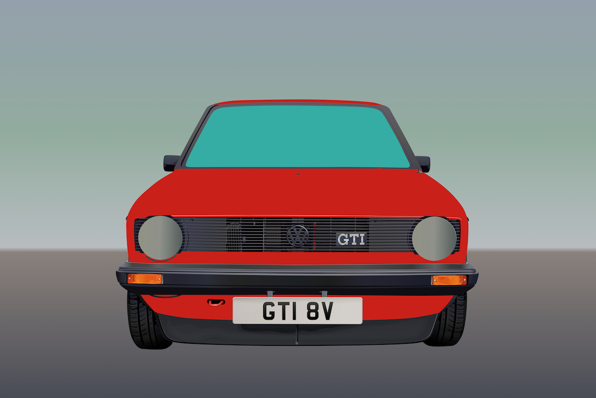
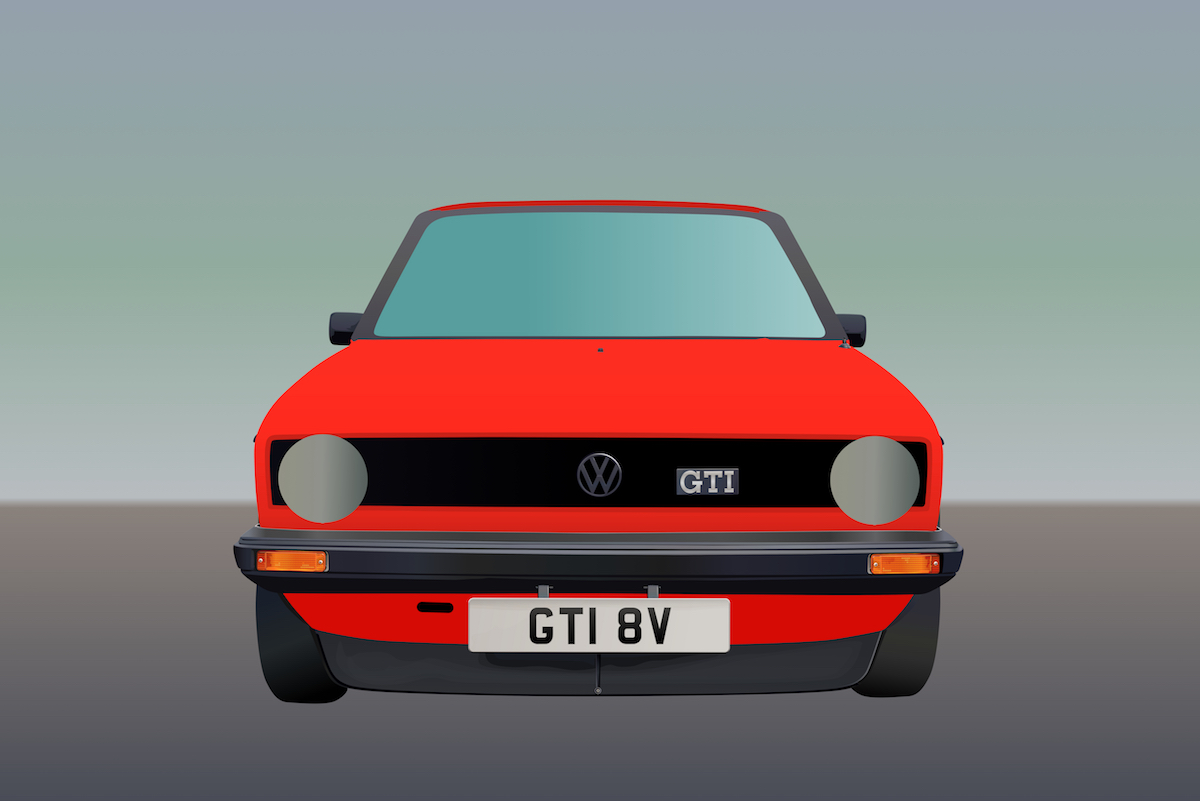
Progress 4 I've been doing bits all over, I've still not finished the headlights but will do eventually. Unless I'm missing something if you want them to look realistic however you do them it's a long winded job. Fortunately in this instance you can do one and just modify it a bit for the other side. Did a bit more of the interior, but plenty missing and nothing is finished. I also just started blocking in the wipers. I added a few temporary bonnet reflections to see how it's going to look and it's starting to look like a car, not sure what car but a car. Some of the shut lines are so large on a Mk1 Golf that you can see bits in there so in quite a few places a simple shut line won't do, so I've started adding details. After all those things are done then there's still a chunk of little touches to add. I'm thinking about trying the background without blurs too. Not sure it will look any good and it's lots of work but it's no fun if it's too easy or even works every time.
-
affinity designer Mk1 Golf GTI, v2 Progress (AD)
NoLongerHere replied to NoLongerHere's topic in Share your work
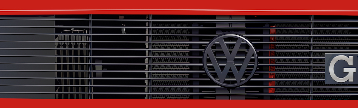
Progress 3 Where I got to over the weekend, sort of. I added some tread to the tyres, not finished but look ok and added the tow hook. I completed most of the grille. As it's meant to be realistic you also have to add any bits you can see behind the grille. I started on the headlights too which is tedious so also made a small start on the interior and some of the shut lines when I was bored of those.
-
affinity designer Mk1 Golf GTI, v2 Progress (AD)
NoLongerHere replied to NoLongerHere's topic in Share your work
Progress 2. The bumper, splitter, badges, mirrors, aerial and indicators are done. Well when I say done they might still have some finishing touches to be added but are basically there. The way I decided to do the indicators was use rounded rectangles with a diagonal gradient and a blend mode of overlay. Then I added dark bits underneath and added a few lighter gradient squares.
-
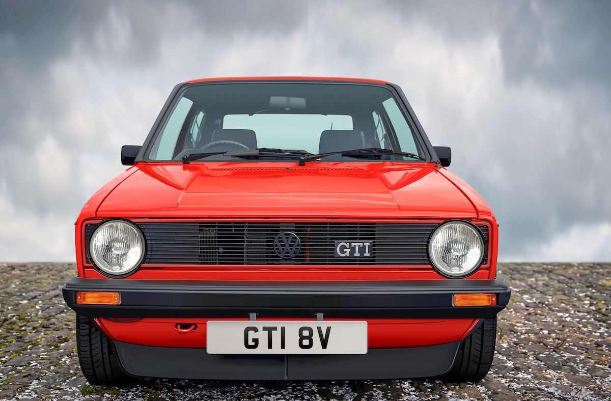
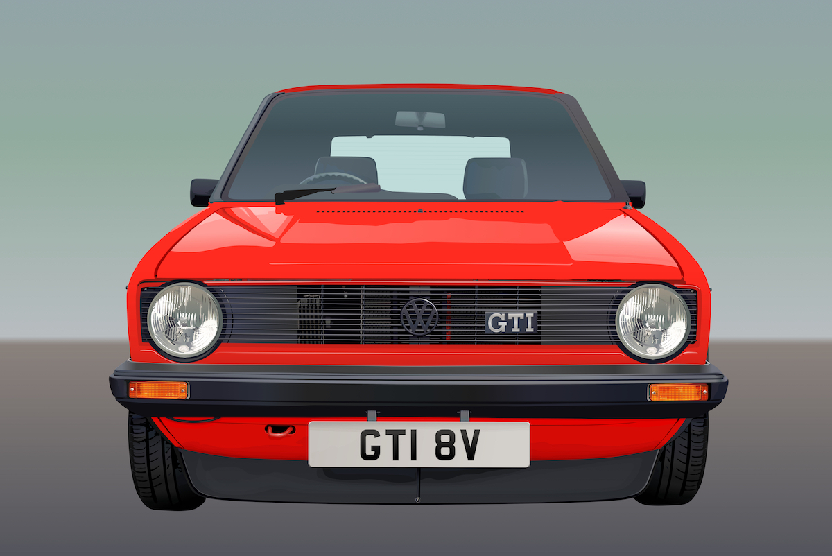
This is going to be another Mk1 Golf GTI but from the front this time and a standard series 2 in Mars Red, unless I change my mind. The car is going to be what I think of as straight vector so no blurs just gradients and blend modes, but it’s still going to be fairly realistic. Also as with the first Golf the background might use blurs but perhaps not, we'll see. This time I thought I’d post a few progress shots together with some notes. I’m not sure how long it's going to take. Anyway stage 1 was blocking in areas either flat or with gradients (some of which are only temp. ones). The body gradient is a best guess/averaging, you can’t always see an obvious gradient but you can see if it’s generally lighter or darker. As last time the body colour uses a single global swatch, so all the highlights and shadows are done with blend modes (somewhere between white and black, not reds, obviously). So if I want to change the body colour it's easy peasy.
-
affinity photo Local Vintage Photo Colourisation, The Faster Way
NoLongerHere replied to NoLongerHere's topic in Share your work
That's the trouble when you've not seen the original or thought about it. I did use masking and adjustments for that one and I have seen his work, it's right below. His face and hands are a fair bit lighter than it should have been but I didn't like it so dark. The b&w was very grey all over so he had a very decent sun tan but pasty legs, or did you think I did two completely different skin tones for the fun of it? So I also had to do an exposure layer on it to bring it up as it would have been so dark. And the neck is as the photo is, it's just the lighting/shadows, not sure what you think it is. But if you ever come up with constructive criticism that's always welcome. -
affinity photo Local Vintage Photo Colourisation, The Faster Way
NoLongerHere replied to NoLongerHere's topic in Share your work
You'd think it would be more blue but even in the middle of summer without a cloud in sight it's still basically a murky brown, a lot of sand gets mixed up in it. I did add a couple of tints of blue/green's to it, that's about as blue as it ever gets. -
affinity photo Local Vintage Photo Colourisation, The Faster Way
NoLongerHere replied to NoLongerHere's topic in Share your work
Yes England. He obviously has his bathing suit on underneath but it just looks a bit weird at first glance. -
affinity photo Local Vintage Photo Colourisation, The Faster Way
NoLongerHere replied to NoLongerHere's topic in Share your work
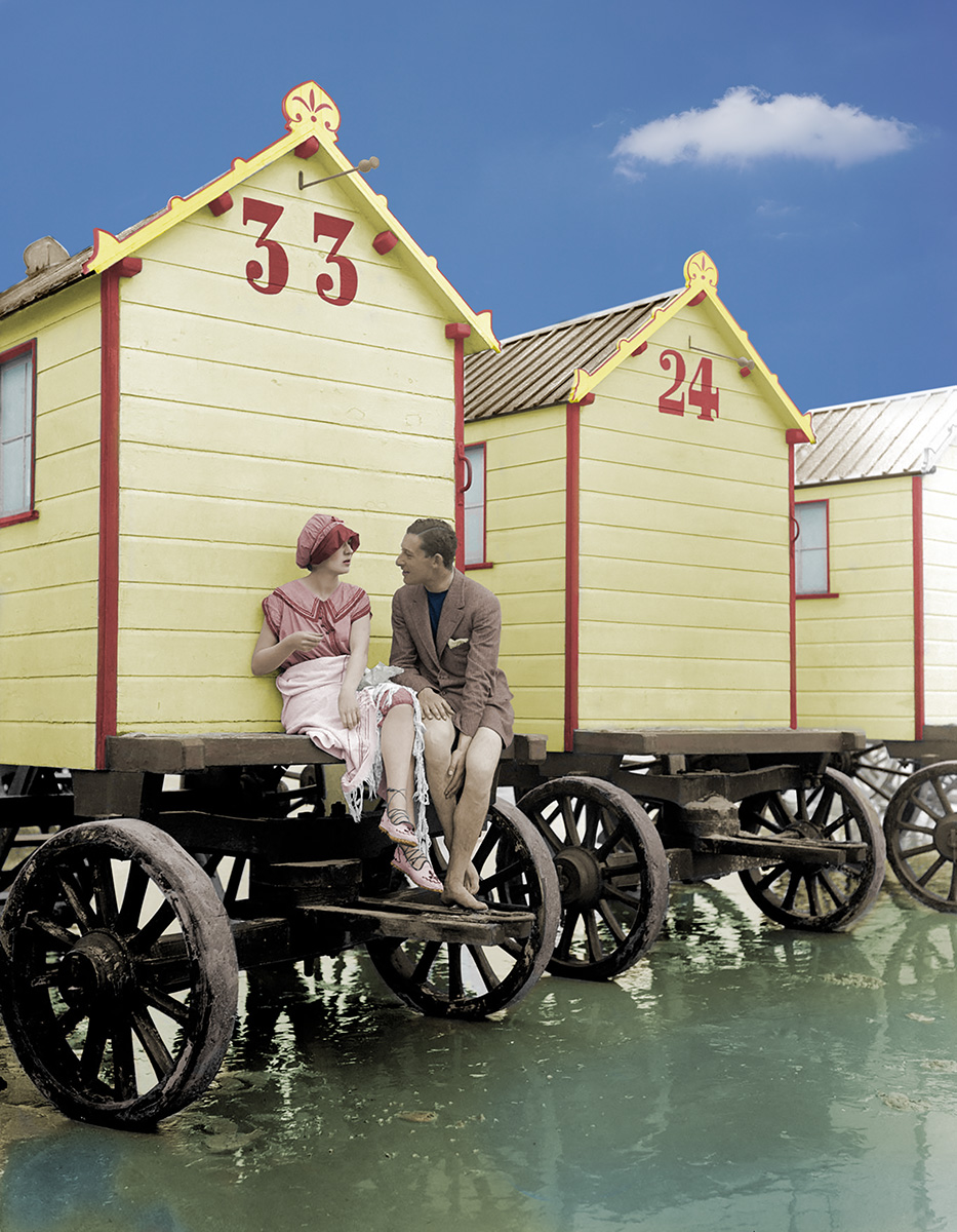
I found a better resolution local photo, still only 1300x1700 that I enlarged but then cropped at the end. But it's good enough that I could try the recolour adjustments on. It's of bathing machines in Margate 1915, I though it was quite a modern looking photo. I wonder if they all wore jackets and no trousers on the beach or is he a perv.
-
affinity photo Local Vintage Photo Colourisation, The Faster Way
NoLongerHere replied to NoLongerHere's topic in Share your work
I think it might have been, it was on reddit, I just remember that part. Sometime I'll do a proper one and have a play. -
affinity photo Local Vintage Photo Colourisation, The Faster Way
NoLongerHere replied to NoLongerHere's topic in Share your work
Oh I know, I'm not saying masking's a waste of time but sometimes you just want to have a quick play and not spend ages on it and, as you say, it works ok on low-res ones that are hard to mask properly. What blend modes do use then as one of the well known colourists said in a q&a that they do theirs in soft light and colour modes. -
affinity photo Local Vintage Photo Colourisation, The Faster Way
NoLongerHere replied to NoLongerHere's topic in Share your work
Forgot to say I changed it to CMYK mode as I was going to do it the normal way, I've not tried leaving it as sRGB... Also I'd imagine it's the same if you did it in AD's pixel persona instead.