Matthew Slater
-
Posts
12 -
Joined
-
Last visited
Everything posted by Matthew Slater
-
Illustration made using Affinity Designer on an iPad. Really pleased with the results, though vector work is more fiddly and time consuming than on a Mac/Illustrator. Love the mix of vector/pixel though. #matthewslaterart

-
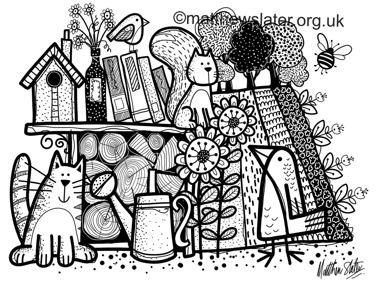
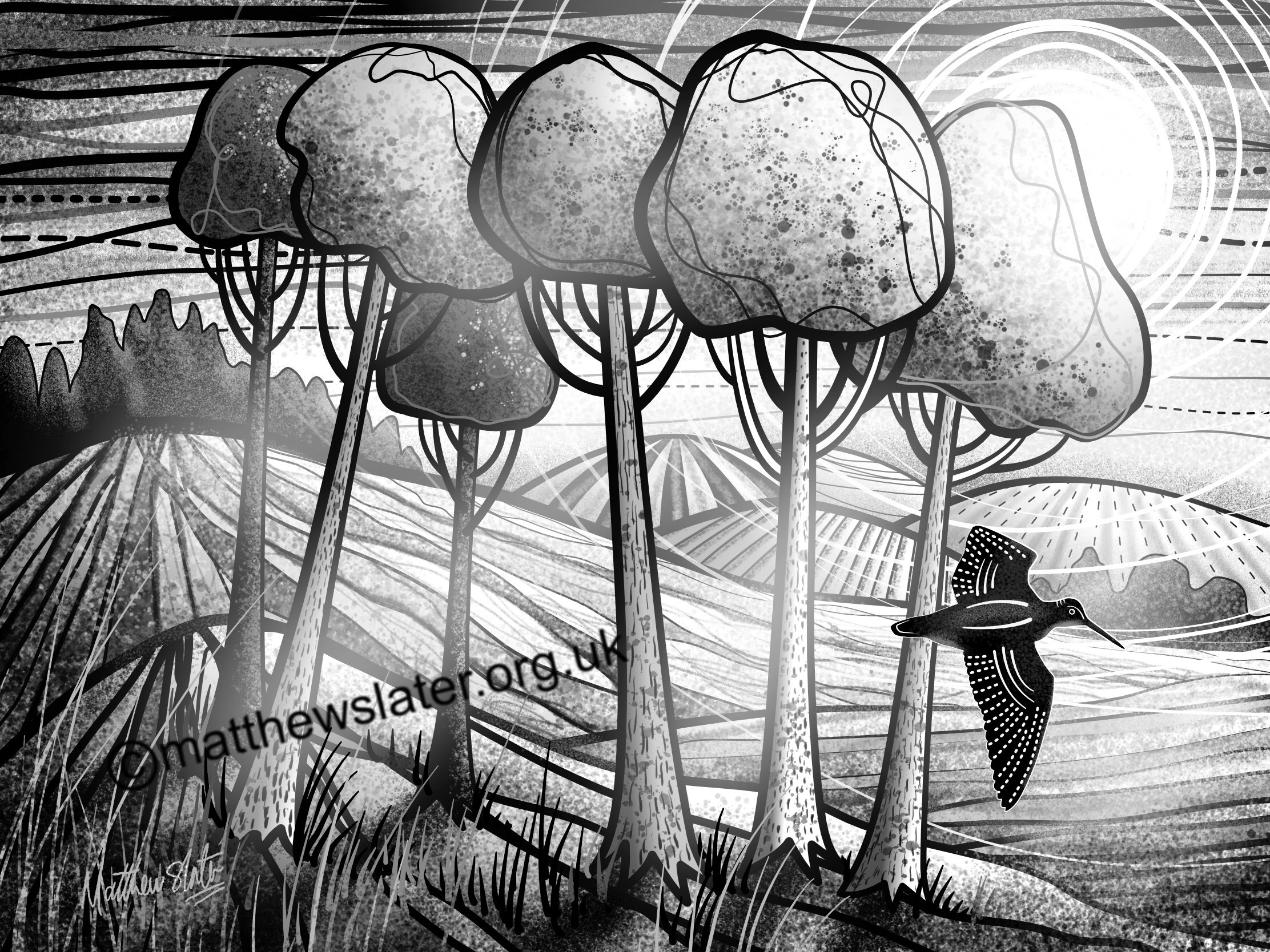
A little experiment in keeping things black and white. The main outlines were vectors with detail added in pixel mode. Used brushes/pencil tools to do the vector lines, not the pen tool as I wanted a slightly loose feel, but not too much. In fact, I didn't really know what I wanted!
-
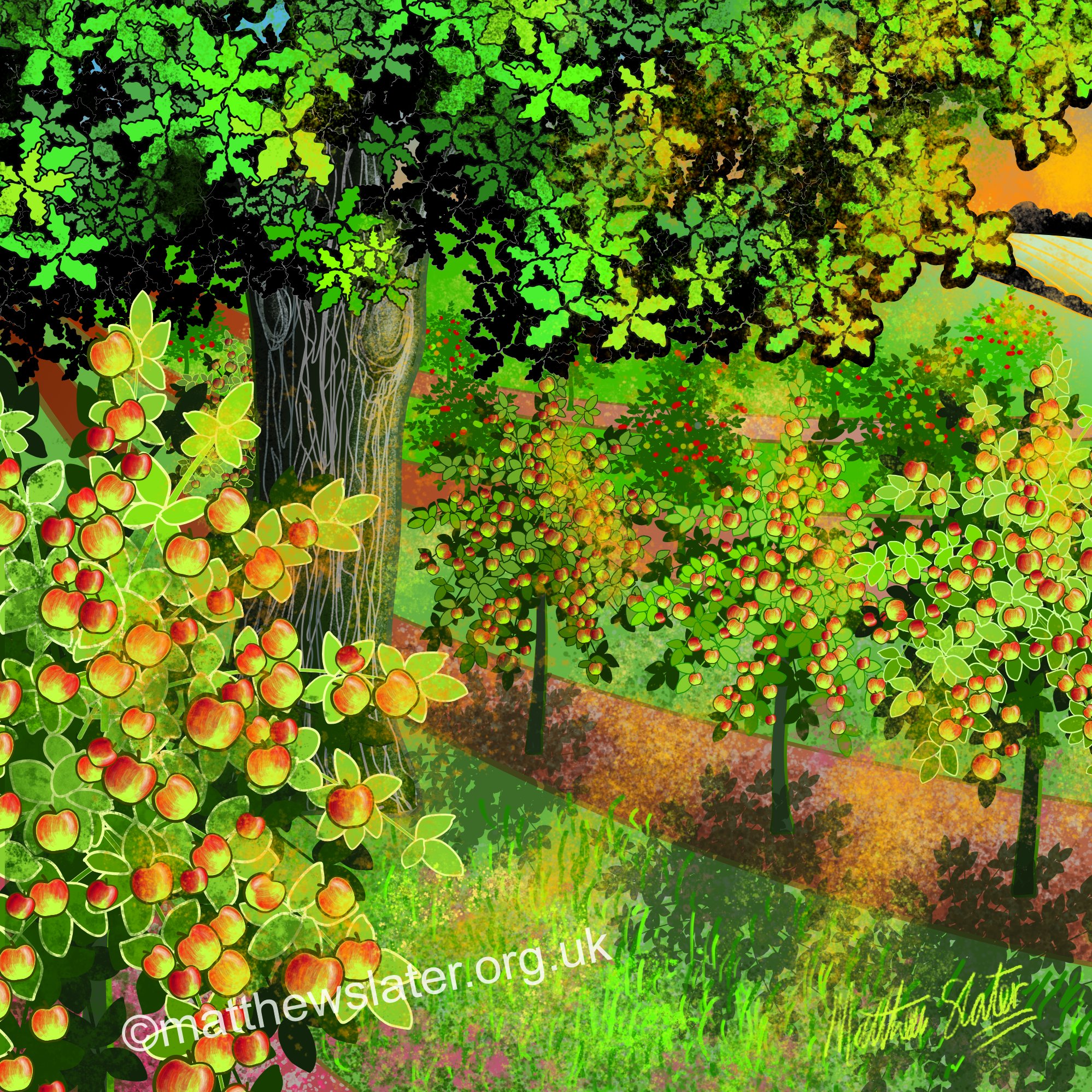
This image of an oak tree amongst cider apple trees at sunset was used to illustrate some writing at matthewslater.org.uk. It worked quite well, though I had no idea how the finished image would look. My iPad struggled hugely with the complexity of the trees and I had to expand and merge elements to reduce the number of paths and points. In the end it still became painfully slow to edit which was a pity as I could have tightened it up more. I tend to work in cmyk so this might look a little odd when posted as rgb.
-
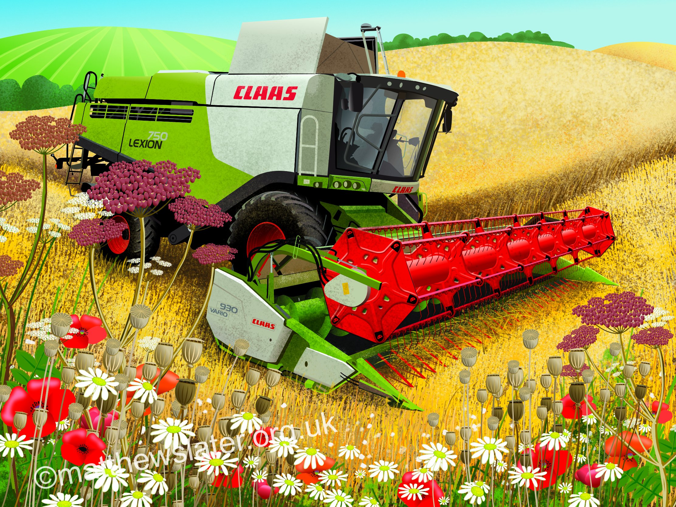
affinity designer Claas Lexion 750 combine harvester
Matthew Slater replied to Matthew Slater's topic in Share your work
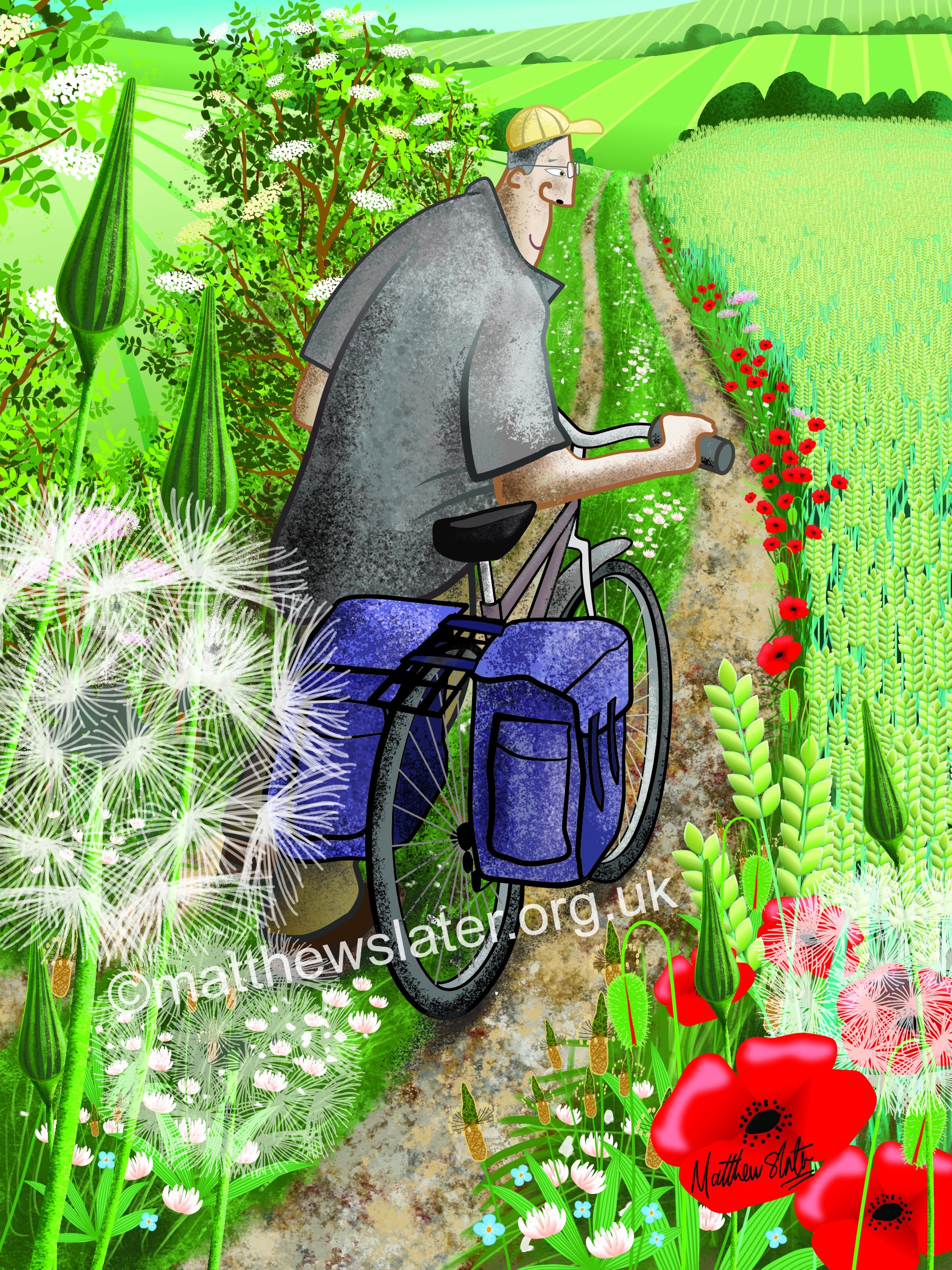
First I took a series of photos of the combine working and the various plants growing at the field edge (I happened to be cycling past one working just at the right moment where I could work safely from the roadside). I imported a photo of the combine into AD and then traced over it, keeping various elements in separate layers and sampling colours from the photo as I created all the vector shapes. Then I left it for a week as I wondered what to do next as I wanted to make sure the vector work blended into any pixel based work. The landscape is just vector shapes with pixel textures painted over or clipped within. A few poppy flowers and their seedheads, together with the chamomile flowers, were drawn in a separate file, about four of each to be copied and pasted into the main image. Here, I grouped and repeatedly duplicated these plant elements and scattered them around the base of the image. I have since tweaked the image to adjust some of the perspective which was bothering me, added some faint tramlines in the corn field and reduced the effect of the texture on the body of the combine. I could have worked into it more to define the crop as oats, add more vegetation etc but after approx 10 hours work I decided to move on - and my iPad was beginning to slow down processing the image. Oh, as I work in cmyk, the rgb colours on the web look rather bright and not as balanced as the original looks. -
affinity designer Claas Lexion 750 combine harvester
Matthew Slater posted a topic in Share your work
It took a while to draw all this in Affinity Designer on my iPad. Wasn't sure how it would work and I am enjoying seeing what I can get out of this way of working.
-
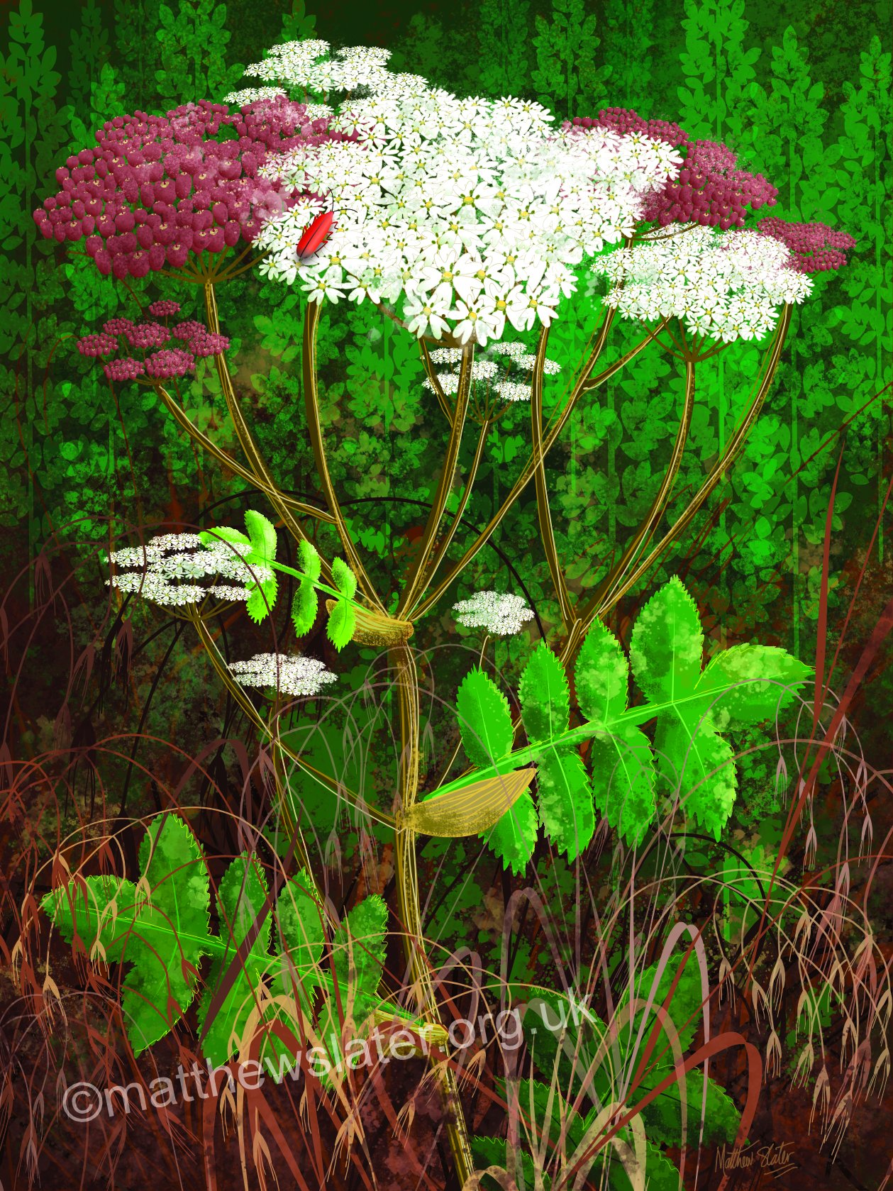
I am enjoying the challenge of using Affinity Designer on an iPad, particularly when wondering how to create images like this and blending vector and pixel modes. I took a few reference photos whilst out on a walk. Then began with a few vector shapes (and a little bit of duplication) adding pixel textures to bind it all together. By the way, I always work in cmyk mode, never rgb. I am used to doing print work and rgb gives different colours.
-
- 4
-

-
It can be fiddly using Affinity Designer on the iPad, but the results are well worth it. The ability to add pixel textures to a vector illustration is a huge bonus over Illustrator. My iPad Pro did start to slow down a little and it didn't like it when I tried to use symbols for all the plants. I then printed this out on a plotter at 50x40cm for framing.
-
An exercise in working in black and white using Affinity Designer. What I need to do is find a few brushes I like and save them in a new folder of favourites as I find there too many options in the standard brushes and I loose track of where I am. I like the sprays and splatters as they give good textures. Need to play around a little more to find pencils/charcoals I like. For this image I sketched an idea in Procreate, then placed it into AD where I created basic vector linework before adding textures in pixel mode. I'd be happy not using colour anyday.
-
- 5
-
-
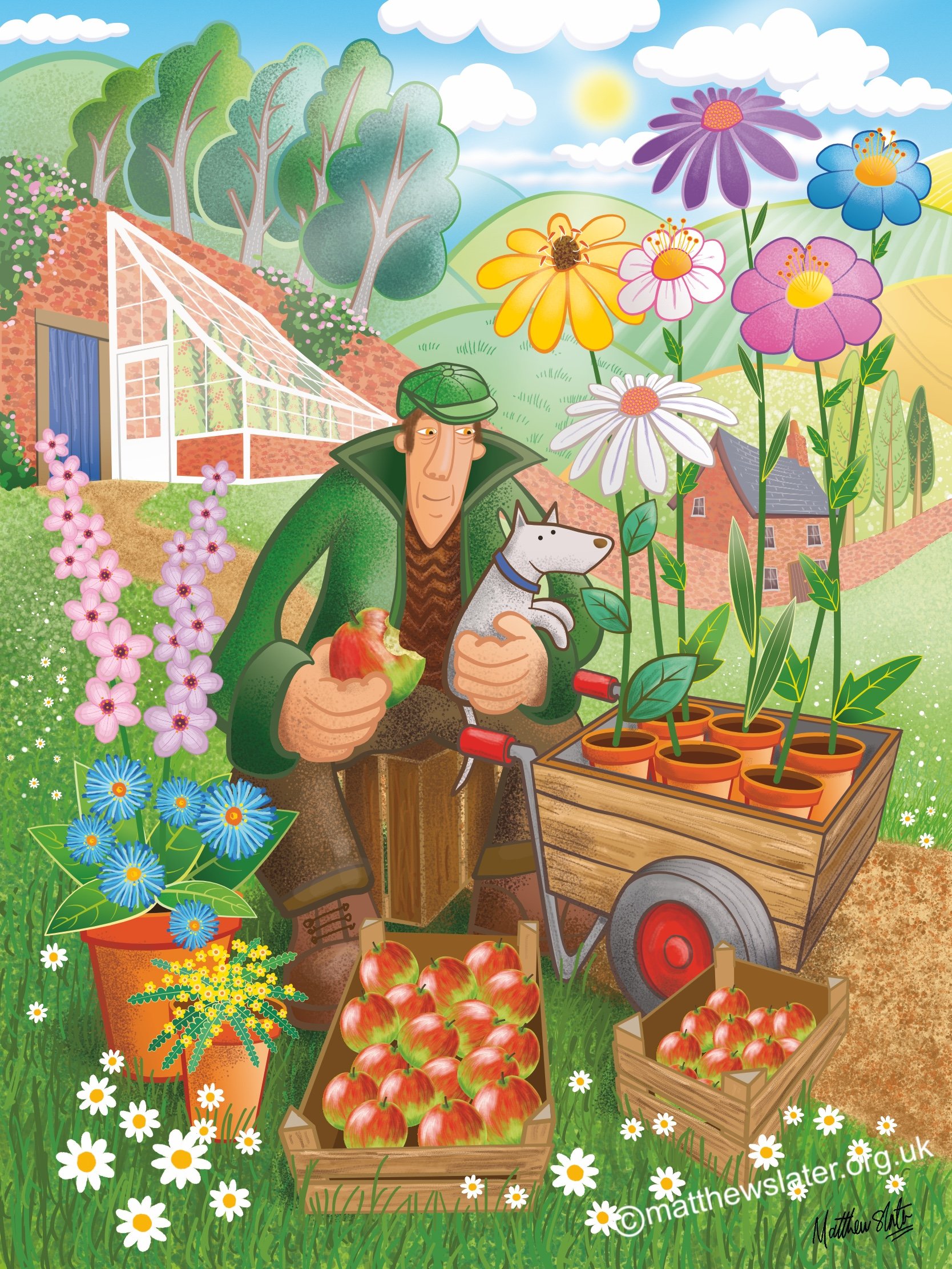
affinity designer Gardener's Lunch
Matthew Slater replied to Matthew Slater's topic in Share your work
Hi. I drew a very rough initial fountain pen sketch in a sketchbook, photographed it on the iPad and imported the photo into Designer. I then used this sketch as a template for creating groups and layers for all the parts. I always try and group/layer everything so that I can easily move or hide elements. The process is more fiddly on the iPad than working in Illustrator on a Mac with a drawing tablet but the results were well worth the time and effort. I currently find Procreate a better app for sketching with than using the pixel mode in Designer, is is just more efficient. However, I need to explore it more. It is just a matter of sitting down and playing, or finding a challenge to get excited about. -
A picture inspired by a Herefordshire apple orchard I visited a few years ago where there was a carpet of daisies between the trees. Enjoying using Affinity Designer on my iPad rather too much!
-
- 8
-
-
. My first attempt at using Designer - and on an iPad. Very pleased with the results.