casterle
-
Posts
512 -
Joined
-
Last visited
Everything posted by casterle
-
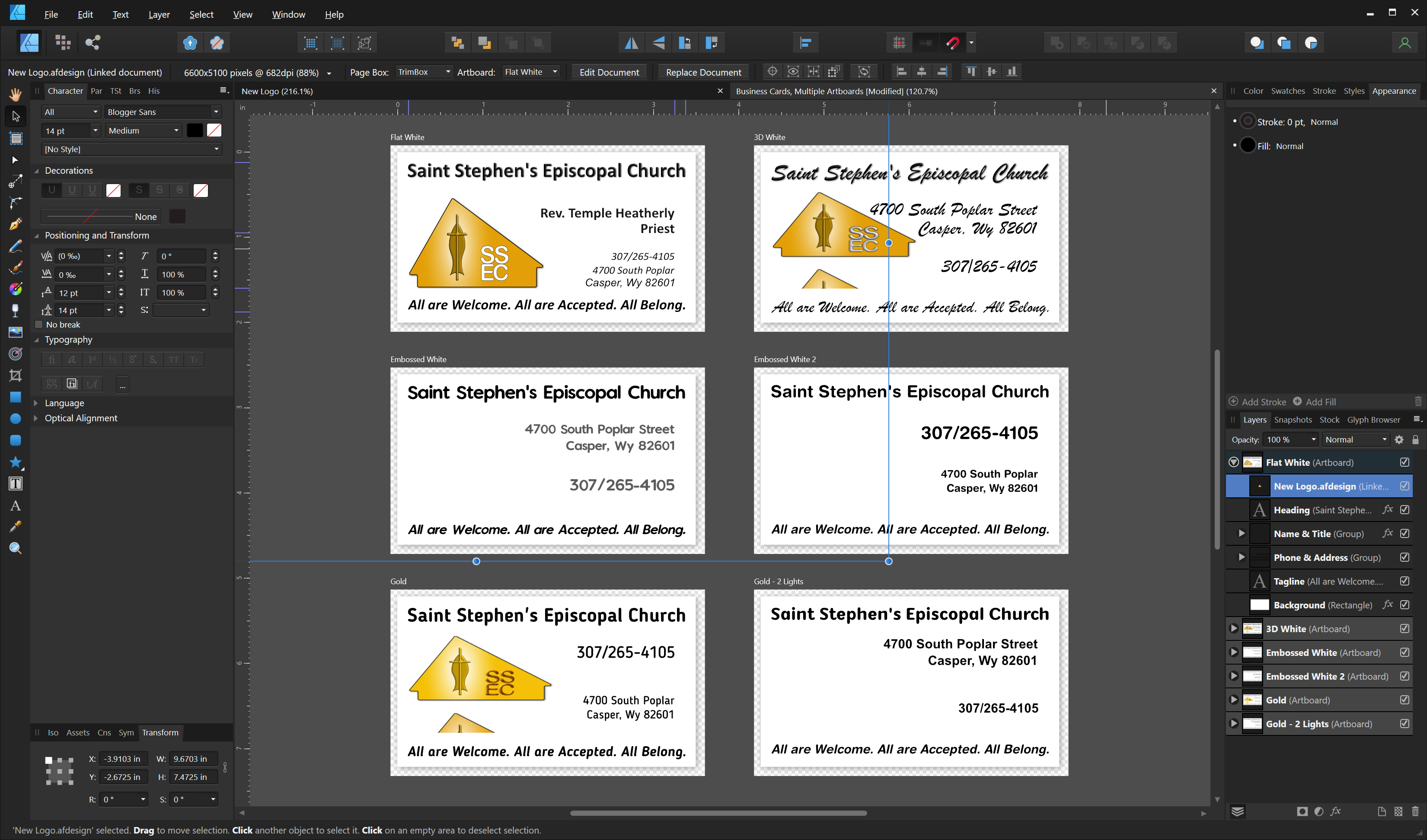
And I wish I had done that with the business cards as it would have saved me a lot of manual work with setting guides. As it was, I created the artboards first, then created guides on the first and found no way to copy them to the others. Fortunately, artboards have separate coordinate spaces so I could just copy settings for the new guides without having to calculate new offsets.
-
I'm sorry, I was on a short timeline and didn't try anything beyond embedding the document which solved my issue. In a previous post I mentioned that I had deleted those of interest, but if there's interest I *may* have them on a disk backup image. Let me know and I'll go hunting.
-
I also have APub to complete the suite, but I've never used it. It wouldn't occur to use APub for a single-page document...
-
I did not need to clip the linked content. I did adjust the size of the logo on a couple of the cards to fit proposed card text layouts. One thing artboards give me is a unique coordinate space for each. That way I can set my guides on one artboard, then add guides to the same positions on the other artboards without doing any math in the process. Lordy how I wish I could copy/save/restore guide settings!
-
In this case, yes. When I switched to embedding the document rather than linking it everything worked as expected. Of course embedding isn't what I wanted because the embedded logo won't update with the embedded document, but now that we've finalized this it doesn't matter.
-
Sorry for the late replies. Turns out that someone wanted my car more than (he thought) I did and helped himself; it's been a week so I'm not getting it back. I'd solved the issue by using an embedded image by that time and forgot to check back until this evening.
-
Interesting. I hadn't considered that I could embed non-Affinity files.
-
I resolved the issue by removing the linked artboards, changing the document to 'Prefer Embedded' and embedding them. Worked perfectly. I'm sorry I didn't include the original files and, once vestry made their selection, killed the losers.
-
I choose 600 DPI because it's the native resolution of my printer and I thought I might get better results that way. I need lots more education on printing!
-
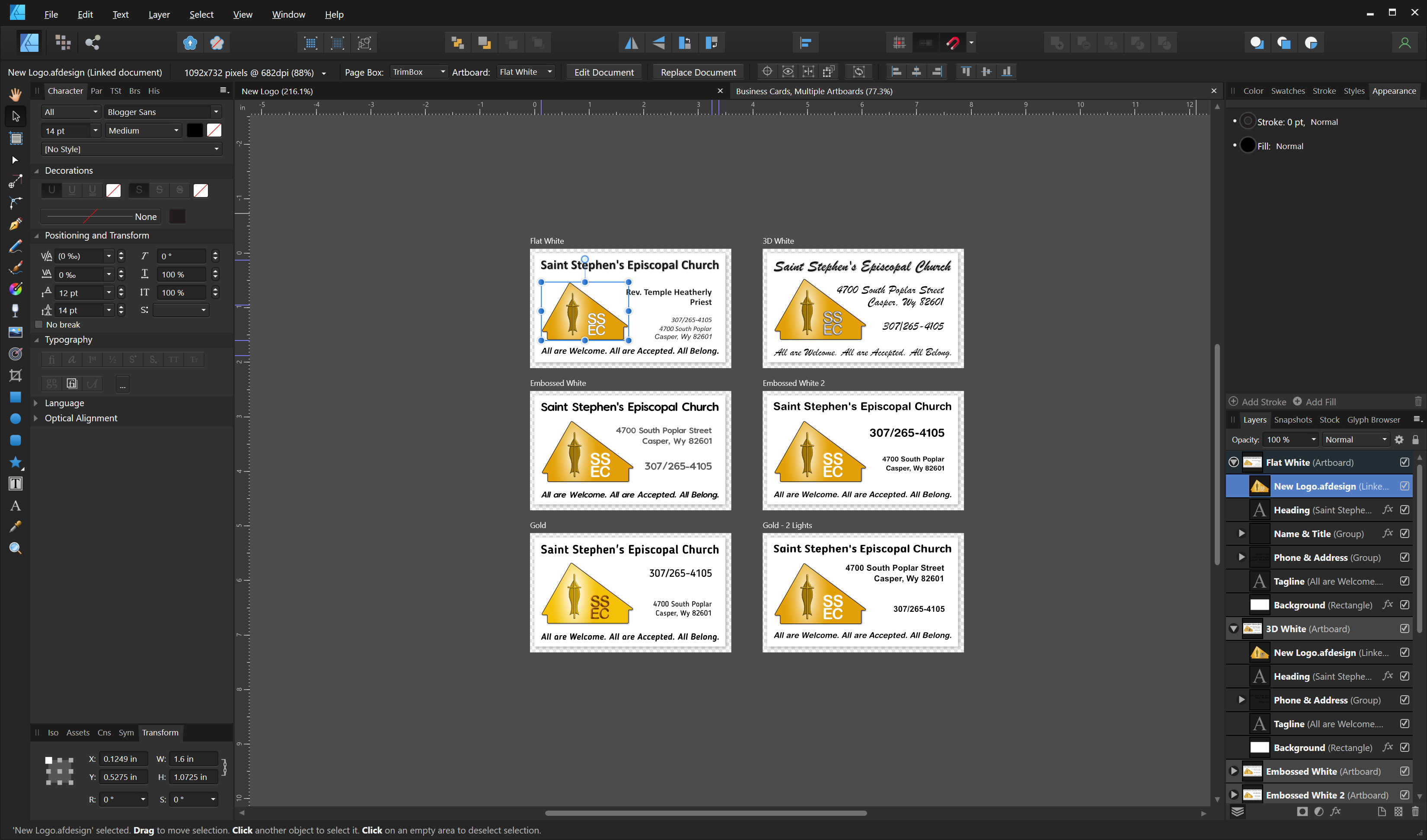
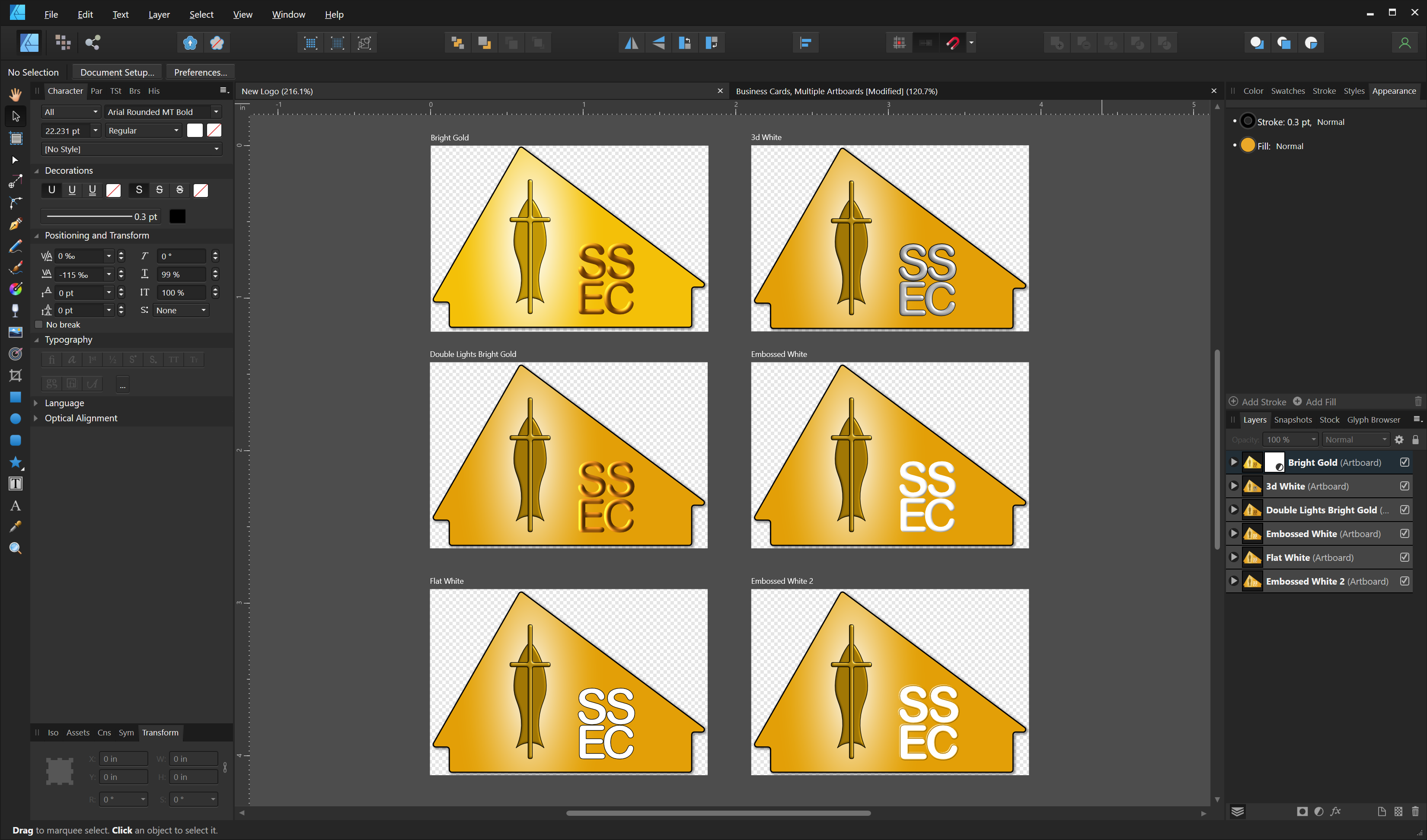
Each logo is indeed on a separate artboard. Each artboard is 1.82" wide by 1.22" high. I don't think I had to reposition them, but I don't recall for sure. I resized a couple of them based on the text on the cards. I initially had them all on one artboard, but moved them to separate artboards because they all have independent coordinate spaces and I could name them, then select them by name when I used them. You mentioned that this was a complex way to do things; what would you suggest as a better way? I got things working as expected by simply deleting the linked logos, changing the document to 'Prefer Embedded', and embedding them in the same manner as I had linked them previously.
-
I've got a document with examples of business cards for our church. Each card is on its own artboard. I've used the Place Tool to place our logo on each card. Each logo, when selected, has an 'appropriate' size box as you can see in the image below: I close the file and immediately reopen it to find: I have the logo on the card in the upper right selected. Note the size of the selection box, and the distorted/invisible images on other cards. Here is the document with the logos: Both documents are 600 DPI, and the logos are sized at about the size I need for the cards. This wasn't happening yesterday - any suggestions?

-
AD: Color profile confusion
casterle replied to casterle's topic in Pre-V2 Archive of Desktop Questions (macOS and Windows)
I expect my main problem is my printer - a Canon MF630C. It comes with a profile, but I know of no way to 'calibrate' it. -
I'm printing at home, but the final copy will (probably) be printed professionally. I'm trying to create business cards for our church. The logo on the cards must be scalable for other purposes like banners for events. I've done everything in AD, the logo all vector; no pixel layers. I'm confused about what I set and where I set it. I started another thread here:
-
AD: Color profile confusion
casterle replied to casterle's topic in Pre-V2 Archive of Desktop Questions (macOS and Windows)
Are you suggesting sRGB because it has the best chance of matching my printer's color space? I have gradients that need to rescale gracefully, without distortion, so I selected a larger color space (AdobeRGB) and threw more bits at the problem with a RGB/16 format. Will I run into issues w/my gradients in sRGB? -
AD: Color profile confusion
casterle replied to casterle's topic in Pre-V2 Archive of Desktop Questions (macOS and Windows)
Yes, just last month, with Palette Master. -
Is there a tutorial that covers Color Management in Affinity products from document creation to getting printed output that matches my design? If it matters, I'm on Windows.
-
AD: Color profile confusion
casterle replied to casterle's topic in Pre-V2 Archive of Desktop Questions (macOS and Windows)
First, thanks for the pointer to affinityspotlight.com - I don't think I've run across that site before. The article to which you referred doesn't help directly as I'm on a Windows system. It did get me looking at my display configuration in Windows; I found HDR disabled - it must be disabled by default? Enabling it made an immediate difference in monitor brightness and color. Can you shed some light on any of my other questions? For example, when I create a new document, I can select a Color Format. The RGB settings make sense - I'm selecting how many bits I want to store for the red, green and blue elements of a pixel. Same with Grayscale - I'm selecting how many bits to store for the red, green and blue elements (although all three values would be the same). What is CMYK for? Since each pixel only has 3 sub-elements and none of them are cyan, magenta, yellow or black this seems to be a print setting. Same question with LAB - what's it for? I can also select Color Profile. I see choices for color spaces like Adobe RGB as well as my BenQ monitor profiles and a profile for my Canon printer. Am I supposed to choose a color space here? If so, why do my monitor profiles appear in the list? -
I'm having trouble getting my printed output to even come close to what I'm seeing on the screen. I'm trying to understand what's going on and how to correct the issue. There are apparently 3 places I can choose things that influence color; Preferences, Document Setup/Creation and the Print Dialog. In Preferences/Color I can set several profiles. RGB Color and 32bit RGB Color allow me to select profiles for my BenQ monitor. CMYK allows me to select whether my paper is coated/uncoated, sheetfed vs web - what does this do? Grayscale and LAB offer but one choice (Grayscale D50 and CIELAB D50 respectively) - does this affect what I see on my screen or what is printed or both? I have the RGB profiles set to the profiles I've created for my monitor and the CMYK profile is set to U.S. Sheetfed Uncoated. When I create a new document, I can choose document parameters like size, orientation and resolution. Can I assume correctly that the DPI I set here is for display purposes only and has no impact on printing? I can also select my color format. Included among the choices is CMYK/8 - isn't CMYK for printers? There's also a LAB option. What, exactly, am I setting here? The RGB choices imply monitor settings but CMYK implies printer settings and I'm not sure what the LAB format implies. Next I select a color profile - among the choices are my monitor profiles AND my printer profiles. Am I supposed to select my monitor or my printer here? Finally, when I go to print I can select the Rasterize resolution - should this be set to the native resolution of the printer? In Color Management, the Printer Profile defaults to Adobe RGB; I can select my printer from the drop-down list, but I can also select my monitor profiles as well as color spaces like sRGB (and the default of Adobe RGB). Why can I select something that isn't a printer here? I've tried all four Rendering Intents with Color Handling by the app as well as the printer with little difference in the output. Any help greatly appreciated!
-
I agree that the title is misleading - I watched it to find out what a 'Shape Builder' might be, not realizing at the time it was an AI feature. I posted the link here because the techniques he illustrates may be of use to the OP; being rather inexperienced in AD, I learned a lot from it.
-
Here's a video that delves into shape-building with AD:
-
Cursor crosshair extension
casterle replied to bcposi's topic in Feedback for Affinity Designer V1 on Desktop
I used to love those full-screen cursors from programs I used long ago. Now that I'm 72 with the accompanying aging eyes, I wish they would make a reappearance. -
Filled Curves and 3D Effect Interaction
casterle replied to casterle's topic in V1 Bugs found on Windows
Thanks for checking on this. Changing the lighting can recover some/most of the fill, but it also changes the effect I'm trying to get on the stroke. If the devs are trying to emulate 'real world' lighting on the fill they've yet to achieve it; consider my example in which the fill turns completely yellow w/o a hit of the gradient, or even its organ color, remaining. I'd appreciate a way to disable this as I really don't want this interaction, even if it were implemented perfectly. At any rate, I've got a work-around that does work as I'd like, although it involves a lot more work than being able to disable the lighting would involve. -
Done.
-
I started a thread a few days ago on an issue I found while playing with 3D effects on a curve filled with a gradient. The effects on the curve were effecting the gradient in odd ways. This thread illustrates the problem, complete with afdesign files and a functional work-around by JimmyJack:
-
As far as I can tell, Diffuse is set to the default at 100%, or at least that's what I see when I first apply a 3D effect to a shape on in a new document. If I play with the Elevation/Azimuth, the closer I get to directly overhead the brighter the yellows in the gradient become until yellow is all that remains. In the real world, the oranges would not disappear. And while I can play around with the parameters to get the gradient to work as you've demonstrated above, I can't accomplish this while retaining the appearance I want on the shape. The method you suggested above - creating a symbol - works perfectly. But IMHO this is a work-around to the issues I've presented in this thread. Does the Affinity team monitor this thread?