Search the Community
Showing results for tags 'AF-297'.
Found 3 results
-
 The software keeps crashing and has various bugs and cannot work at all.Please take a look at the ratings on the Apple Store. This is a software that people dare not trust RPReplay_Final1695367005.mp4
-
under the "character" menu, missing action labels. its across all applications. pls fix. thanks!
-
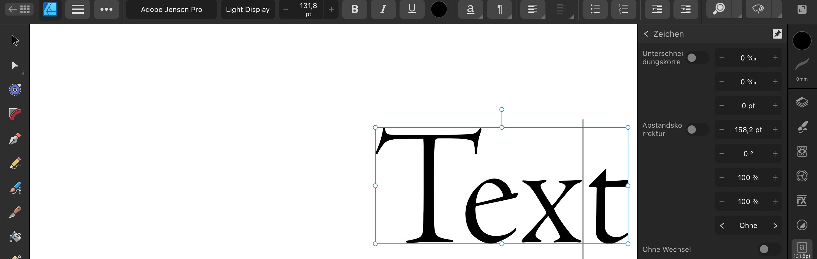
 I know it is - but it’s a very ”hidden feature” and now with 2.2 almost became unusable – at least in the German version. Something got very messed up with the describing text (if it is still there) … see attached screenshots. It‘s a problem with both, Designer and Publisher. If you wonder how to access that feature: you have to hit the arrow on the right side of the B I U S buttons in the text studio, and then select ”position” – now you would be able to do your corrections if you knew what value has to be changed. Adjusting kearning and letter-spacing is very important for a designer working with text. I suggest to completely reconsider this section of the text controls. Go back to icons, don‘t use text (this would also avoid problems with strange wording – nobody uses ”Unterschneidungskorrektur” or ”Abstandskorrketur” … ). Some information is over prominent, double or triple, even if not needed a lot, while other important tools are so hard to find. The whole interface here should be more like the desktop version and pick up the visual standards we have learned using Quark Xpress, Freehand, InDesign, Illustrator … Except for the text studio I am very happy with the current version of the IPad apps! Thank you, keep up the good work – I am sure you will have a nice Christmas present for us