Search the Community
Showing results for tags 'af-1758'.
Found 2 results
-
 The UI is a mess on this one. It took me 2 DAYS to find the little collapsible > icon which is terrible for legibility. The > is way too thin, why not use a solid triangle? The icons to the right of the Querie item/title are TINY and looks Dim/ Inactive when it is active. Should be the same color as query name The trash can icon is WAY too thin compared to the icons next to it, makes it look more dimmed out than neighbors All the icons on the bottom are too dim. Compare with Layer studio icons: The Highlight (orange in my screengrab) should span the entire width of the query item in the studio. Hard to see at a glance on a large screen.
- 9 replies
-
- 1
-

-
- states studio
- af-1461
- (and 6 more)
-
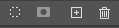
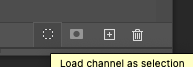
 Designer 2.4.0 (2222), macOS The low contrast ratio plus the unfathomably small size of these three small icons makes them inaccessible, i.e. not visible enough for the elderly or people with visual impairments. They must appear to be dot-sized on high-resolution screens. The Select icon is particularly small. It is also unhelpful and wrong that icons/buttons that can be used are so grey that they appear as functions that cannot currently be used because Serif wants them to appear white when clicked. See here from Photoshop how the default is for usable and non-usable functions: When you hover these buttons in Photoshop they are highligthed with a darker background instead: I assume that the varying and incorrect font sizes and the problems with parts of the letters being cut off at the bottom are on the Serif to do list.