William Overington
-
Posts
3,062 -
Joined
-
Last visited
Everything posted by William Overington
-
affinity designer Can label workshop
William Overington replied to William Overington's topic in Share your work
Ah, it was Switzerland in 2002 and I misremembered the title slightly. https://www.youtube.com/watch?v=EZEEvq1i7PA https://www.youtube.com/watch?v=2xCXY56aLZQ I think I watched it on the German channel ARD on the Astra satellite television system, so would not have heard an English translation. A fun pun would be a stalactite television system. William -
affinity designer Can label workshop
William Overington replied to William Overington's topic in Share your work
https://wise.com/gb/blog/calling-codes-for-france So the 06 seems to be a space where one may write one's mobile telephone number before handing the label to someone. Perhaps I should explain the pun in my earlier post. In French, the pink aeropane is "l'avion rose". There is a famous song "la vie en rose". So the Engloshman had mistranslated the title of the song. I was told that one years ago. I have now remembered one that actually happened to me was that one year in the Eurovision song contest, a song, either from France or Belgium, was in French and the title in French was either spoken or maybe displayed on the screen as "Le jardin de l'âme" and I mistakenly thought it meant "The garden of the donkey." Le jardin de l'âme Le jardin de l'âne William -
affinity designer Can label workshop
William Overington replied to William Overington's topic in Share your work
Can you explain the pun please? I only know one pun that involves French. It is that an Englishman asked the band in a French location to play the tune about the pink aeroplane. William -
affinity designer Can label workshop
William Overington replied to William Overington's topic in Share your work
In the United Kingdom there are similar rules over listing ingredients and nutrition. There always seems to be a desire to make the type as small as legally allowed. For me, getting enough calories is an issue. I keep a food diary, noting down the kilocalories of everything I consume, and keeping a running total. William -
So if Serif chose to do so, there could be an Affinity 2022 calendar and Serif could specify artwork rules and people could post images in the special Share your work thread, and Serif could choose twelve images and then sell the calendars and post them out. William
-
affinity designer Can label workshop
William Overington replied to William Overington's topic in Share your work
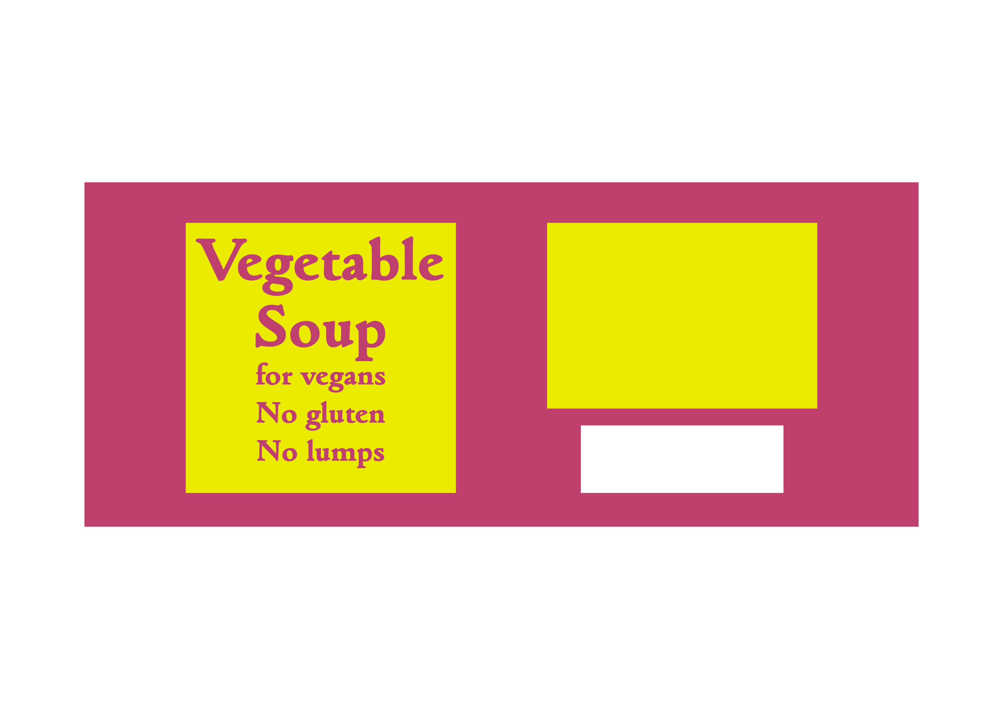
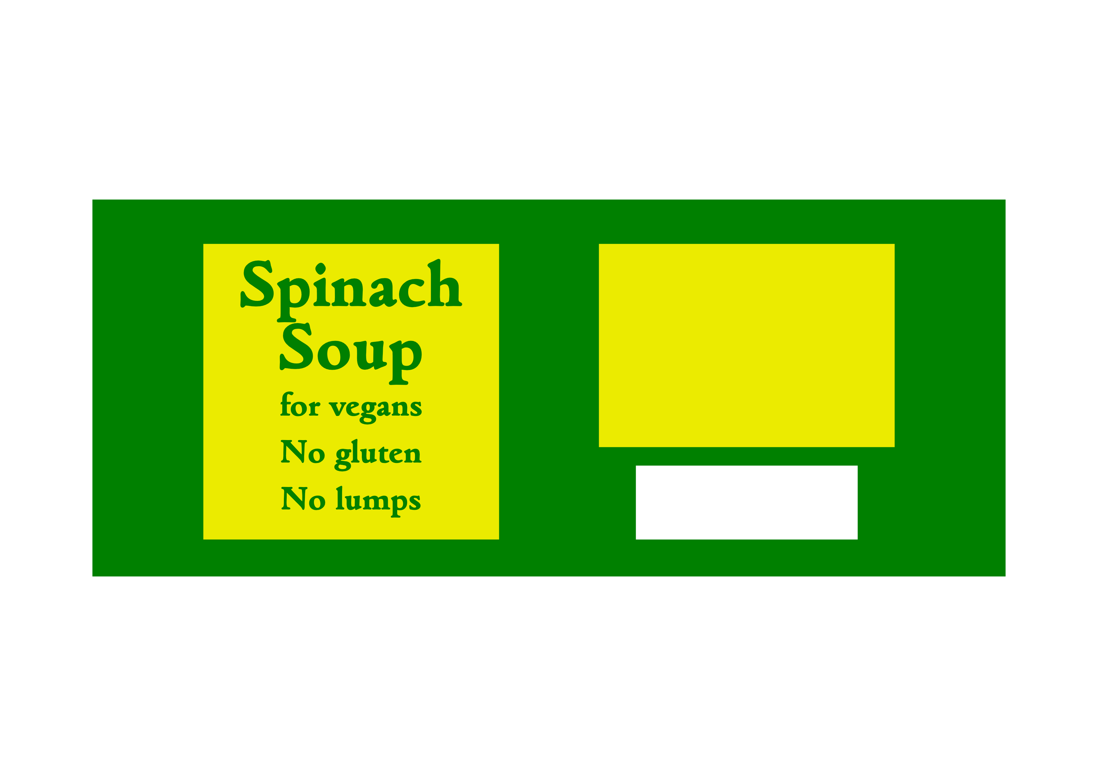
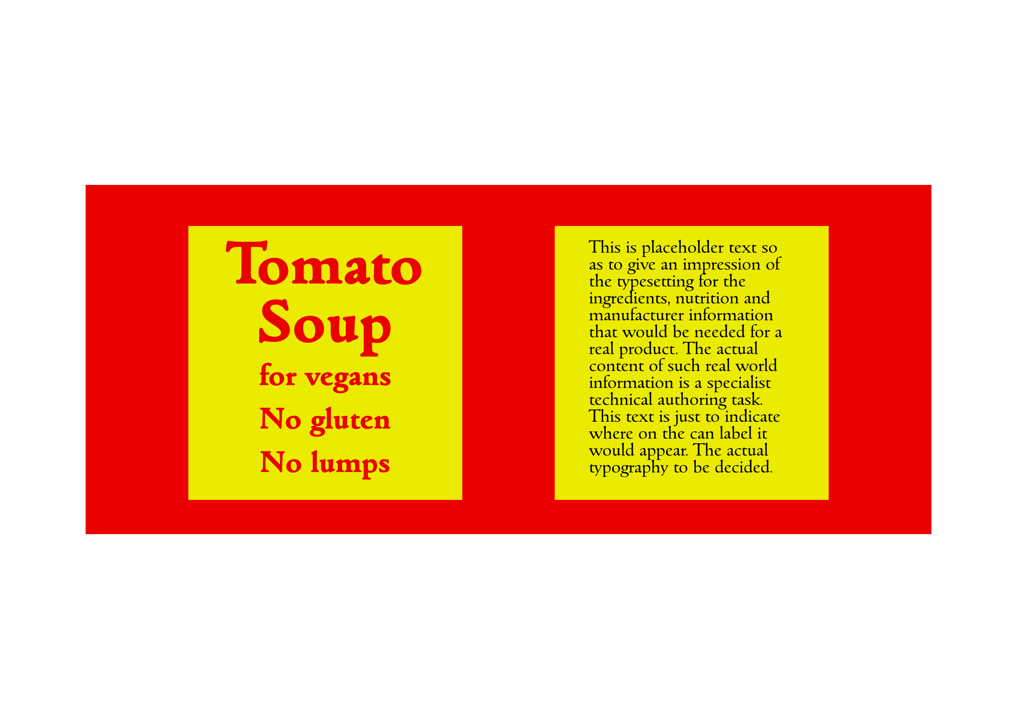
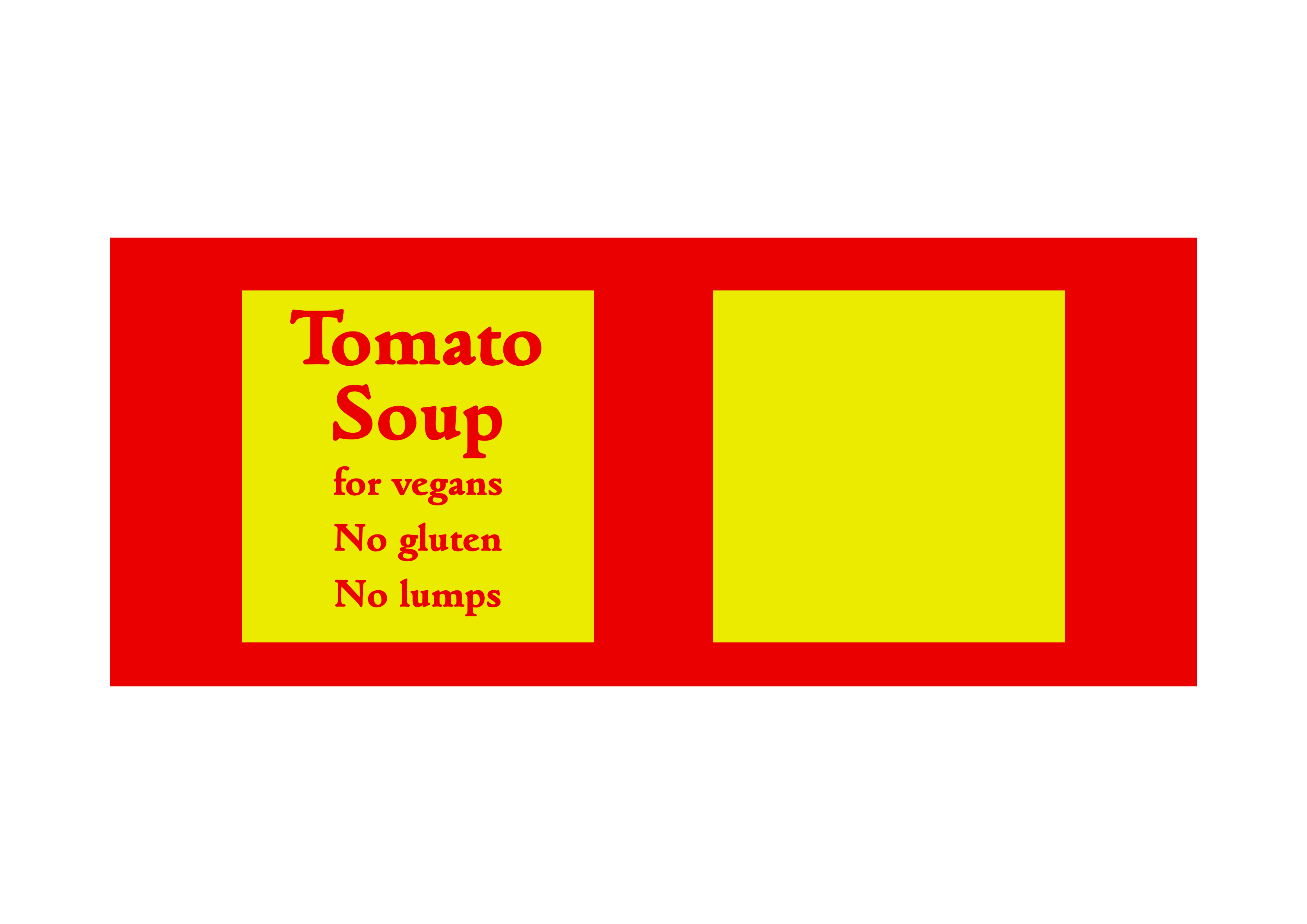
Although not quite touching each other, the 'g' and the 'S' seemed too close, so two paragraphs for the two upper lines, but the default paragraph spacing was 12 point and seemed too large, so the paragraph spacing was reduced from 12 point to 8 point. William
-
affinity designer Can label workshop
William Overington replied to William Overington's topic in Share your work
Yes, that looks good. -
I have now started a thread in the Share your work forum. The thread has some designs for can labels that I have now produced, using the information about can label size that Alfred has kindly supplied. https://forum.affinity.serif.com/index.php?/topic/145947-can-label-workshop/ William
-
affinity designer Can label workshop
William Overington replied to William Overington's topic in Share your work
Well .... http://www.barcodeadvice.org/barcodefaq.html has a section > How do I know which colours to use for my barcode? > Does my barcode have to be black and white? So the idea of the black on the dull yellow might possibly be permissible, but I am going to use the white panel. William -
affinity designer Can label workshop
William Overington replied to William Overington's topic in Share your work
I needed to reduce the type size for the top part due to the longer word on the top line, from 48 point to 42 point and then that needed two paragraphs and I needed to reduce the interparagraph spacing. William
-
affinity designer Can label workshop
William Overington replied to William Overington's topic in Share your work
William
-
affinity designer Can label workshop
William Overington replied to William Overington's topic in Share your work
Now with a panel for the barcode. William
-
affinity designer Can label workshop
William Overington replied to William Overington's topic in Share your work
Ah! Yes! So where can that go then! So a redesign is needed, perhaps of the second illustration. William -
affinity designer Can label workshop
William Overington replied to William Overington's topic in Share your work
Some placeholder text added. William
-
affinity designer Can label workshop
William Overington replied to William Overington's topic in Share your work
So an extra panel, ready to receive the necessary information about ingredients and nutrition and manufacturer. William
-
Here is a design for a can label. The original is on an A4 landscape sheet, the forum software has reduced the size of the image displayed here. The original label is drawn 247 mm wide by 102 mm high. I realize that for a real product that much more information will be needed on the can label and that the artwork would need bleed areas, but this is just a concept illustration as if a label has been saved from an experimental can and archived in an album. The font is Goudita Heavy SF, at 48 point and 24 point. This is just a design idea to support a project of mine. http://www.users.globalnet.co.uk/~ngo/Gluten-free_Vegan_Pur%C3%A9e_Foods_Futuristic.htm William
-
Thank you. Ah, I had forgotten that you had produced that. I had just remembered that you had measured a can label and posted the measured values. William
-
It looks like I can get 15 copies of each of 3 designs in colour on gloss paper printed onto A4 landscape for £7.73, so a resonable price for prototypes. William
-
Thinking about the facilities available at the Viking online print house, I realize that I can use that facility to make a bit of progress with a project of mine that seemed to have hit the buffers for a combination of frustrating reasons. At least one person who posts here knows of this. Here is a link. http://www.users.globalnet.co.uk/~ngo/Gluten-free_Vegan_Pur%C3%A9e_Foods_Futuristic.htm It looks like I can now design and get printed at high quality and at a reasonable low budget cost some experimental can labels. A gentleman did kindly measure a can label for me, but I do not know where the data is now. William
-
The reason I wondered is that back in the 1960s and 1970s, and possibly now, but I don't know, one could get rather rice machine made deckle edged paper for printing that was far thicker than ordinary paper, but was still quite obviously paper, with a soft surface texture. I seem to remember that it came from either St Anne's mill or Saint Agnes' mill, I am not sure of the name. It was beautiful paper. Apparently, I learned years later, that most (all?) machine made paper is deckle edged when made but the deckle is usually cut off as part of producing the product that is sold. The paper to which I refer was an option for people, often private press hobbyists (and often just using an Adana 8 x 5 press in a shed or on a kitchen table, not big facilities sponsored by the rich patron as were some historical private presses) who wanted to produce a historical style. William
-
CMYK export
William Overington replied to west1849's topic in Pre-V2 Archive of Desktop Questions (macOS and Windows)
I am not claiming to be an expert on colour settings, but I would like to mention something that may or may not be relevant. I have been producing one-off greetings cards using the facility of a business that advertises the facility as photo greetings cards, as in upload your photo. In fact, I have never used a photo as such, I have used artwork that I have exported from Affinity Designer. In fact, the Papier staff were very helpful in advising me how to do this. I have received the cards and framed them. https://www.papier.com/photos/photo-cards/ https://forum.affinity.serif.com/index.php?/topic/138654-artwork-for-greetings-cards/ I have got good, colourful results. It was only after I had decided to produce a similar card to one that I had produced before that I noticed that the colour was in RGB. Checking back, the colour on the earlier card was also RGB, but I had got a good result. When I tried to convert to CMYK, a blue went dull. Oh! I didn't like that. So I uploaded the artwork in rgb on the basis that it had worked before, so here goes! I got a good result. So I send them RGB. Now that may not work everywhere, I suspect that as the business advertises photo cards that a lot of people just upload a photo as taken on a mobile telephone, so out of necessity the software they use has to sort it out, just as it autofits to the template by scaling and cropping either horizontally or vertically as needed. So it may be different for your book cover, but maybe it would be a good idea to check with the printer because they might have software optimized to convert as best for their equipment. As I say, I am not an expert on colour formats, but I post this so those who are experts can comment. William -
I have fond that there is a Calendar wizard in PagePlus X7 too, which may or may not be the same as in PagePlus X9). I just had a go at making one for January 2022. I was pleased to find that I can have the names of the days in full (as a choice) and I found that I can change the font. I changed it to Goudita SF, one of my favourite fonts. I notice that the Viking facility gives a choice of colour for the wire that holds the calendar pages together. William Just wondering, do you change the colour of the number, such as red for Saint Days and Green for Bank Holdays? Does anybody do that these days? I mean the red, the green was my own idea while writing this post. I first learned of that when I was looking through a selection of postcards that were available in a bookshop in the mid-1970s, postcards at a small sum each, pick which ones you want, and there were some of an illustrated calendar from an illuminated book. Images from the manuscript are now available on the web. http://geowords.com/e_/months_pics/lesriches.htm The "examine the calendar" section has a page for each month. I found that use of CTRL + enlarged the image, I used it several times. https://en.wikipedia.org/wiki/Tr%C3%A8s_Riches_Heures_du_Duc_de_Berry William
-
It appears that they will do as many as you want from one upwards. For example, https://thecalendarprinters.com/calendars/a4-landscape-style-1/ If someone wanted, say, three for relatives and friends the price each looks good for such a customized product. Or have two for oneself as well, one to use, one to archive, that might get into the next lower 'per unit' price band. So for someone who is a hobbyist artist using Affinity Products it seems a reasonable facility. I suppose the artwork could be of text if one so wanted, or a mix of text and images. William
-
I have just found this one and they appear to have templates to which you can add your own pictures. https://thecalendarprinters.com/ https://thecalendarprinters.com/contact/ The problem with websites that are .com is that it is not obvious whether they are in the UK or elsewhere, but this one appears to be in Reading. William
-
Which leads to the more general question of where does someone obtain definitive information, and maybe artwork, of the calendar for 2022, with provenance that it is correct. I once saw somewhere that the responsibility for knowing which day it is is part of the job of The Astronomer Royal. William