William Overington
-
Posts
2,395 -
Joined
-
Last visited
Everything posted by William Overington
-
Thank you, Dan. William
-
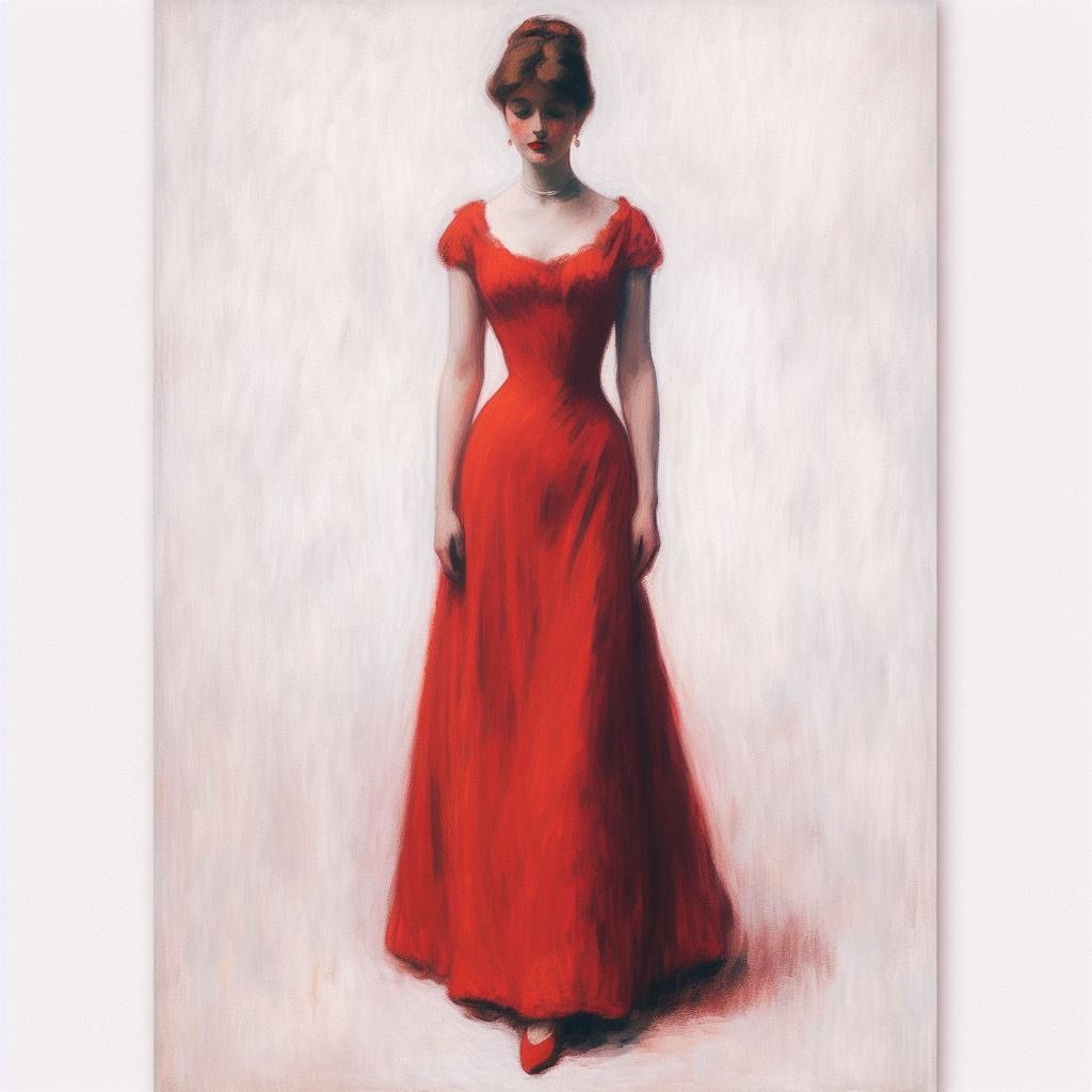
I have learned from that. Thank you. I have just made using Affinity Designer a transparent backed PNG item of clip art from a line sketch made with the Pen Tool. Well, regarding the jpg file, perhaps I have asked the question in not the best way. What I am trying to produce, as a learning example, is a line sketch in Affinity Designer using the Pen Tool of a part of an arboretum, with trees and shrubs, and then place the lady into the picture, then export as a bitmap image. So I need to remove the "sort of white colour" background that is in the jpg file and then export it as a png with a transparent background. But at present I do not know how to do that. William
-
Here is the file. It is a jpg at present. William

-
I am using the version 1 software. Does version 1 support PNG transparency? I have tried looking in the Affinity Designer Help system but have not found anything about transparency yet. Basically I have a picture on a sort of white background and I want to learn how to make a picture on a transparent background so that I can use the original picture as part of a new composite picture. William
-
I was looking in the export PNG dialogue and I could not fond anything like a checkbox for INCLUDE TRANSPARENCY. Maybe it is done a different way in Affinity products. William
-
Oh good. How please? I could not find. How does one access it please? William
-
I realized that I had made a mistake in the first post in the thread, so I have changed it. I changed it in the title of the thread too. William
-
Thank you. I remember producing 32 bit RGBA graphic files. Was it with Serif PagePlus? William
-
Will Affinity version 1 Designer and/or Photo export 32 bit PNG with transparency please? I have had a look and I have not been able to find any way to do that. William EDIT after two replies received. It was 32 bits in total, 24 bits for RGB colour plus another eight bits for the A channel. I had originally put 24 bit but I made a mistake, but I have now retrospectively changed it so as not to leave anything wrong in place.
-
An interesting idea. What would be reasonable rules? With a real reduction linocut, I think one prints first with a light colour ink, say, a semi-pale yellow, then with some other colours, then finally a dark colour, such as black or say, a deep blue. Alignment to pixel accuracy might be impossible, but that might not be critical if inks are 100% opaque. With a faux reduction linocut, say an A3 PDF document to upload to a virtual print house, I think that one can have that pixel accuracy. One could also have 100% opaque electronic inks. Yet should one use by choice, 90% opaque electronic inks? Or would that make no difference except making the print look as if it was done with inks of colours different from those actually used? It would not be like one shape printed over a different shape where the overlap would show through faintly. I am not sure at present but maybe a reduction faux linocut would be easier to do than trying to make a separate block for each colour. William
-
Yes, if starting a new picture. I was modifying the first picture, so although I had thought of that I did not do so, because I would have needed to record x, y, width, height for each smoke item as text in, say, a WordPad file so as to get the same positions and shapes. In the event, once I had adapted two of the smoke items the others did not take long to do. Your suggested method would however have the advantage of precise copies of the first shape rather than my adjustment by eye. William
-
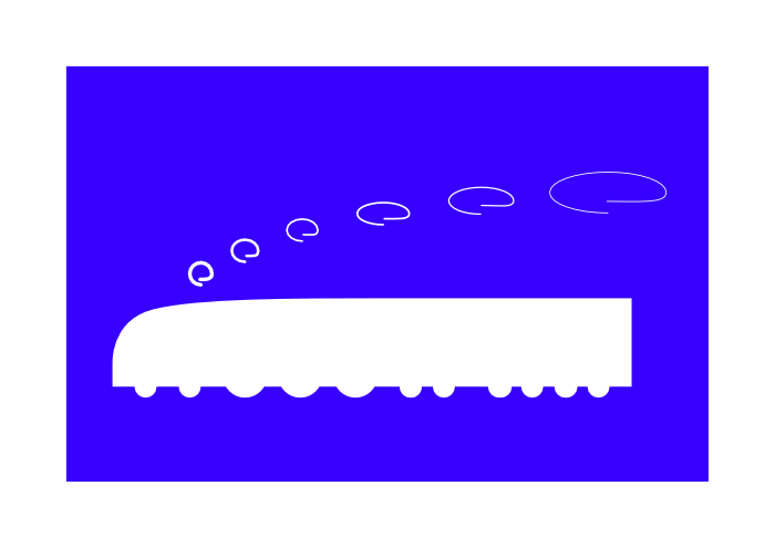
That seems to work in a qualitative sense that the faux linocut 004a is an image that could have possibly been made as a real linocut. I gradually reduced the point size of the stroke that depicts the smoke 4, 3, 2.5, 2, 1.5, 1 as I went from smoke item to smoke item from left to right in the picture, finding out that it is not only whole numbers of point sizes that can be used.
-
I begin my making a copy of the source file that I produced. I am not entirely sure how to complete the task at present. I am thinking, for each of the six smoke items, to make the line white and to have thickness, then convert to curves and then break the curve open at the lowest point. So I can try that to observe if that will give the desired effect.
-
The picture is not meant to be photographic, but this locomotive in its rebuilt form inspired the picture. https://www.lner.info/locos/W/w1.php Please note that the faux linocut has a 4-6-4 wheel arrangement and an 8-wheeled tender. William
-
Thank you. How did you draw the branches that are in the upper right part of the picture please? William
-
Could you possibly say more about how you produced this picture please. I look at this picture and wish I could produce something that good. Yet I do not know where to start. So, for example, the background. Do you do that first then draw the bird on top of it, or what? William
-
I notice that the version in your Share your work forum post is different. In that post > The 'Share your work' section of the Forums are designed for sharing work specifically created within or edited using the Affinity apps. The addition of the word "edited" is significant and helpful. William
-
Thank you for doing that. I am not confused. If there is a stated rule then I know what is the rule and I will comply with it. Until that post of the lady feeding the okapi was hidden I thought that the scope was otherwise. I now realize that some, maybe a lot, of my posts from before do not align with the rule that is now stated. At the time I posted the thread https://forum.affinity.serif.com/index.php?/topic/169391-language-independent-signs-for-art-galleries/ I thought that it was fine as a Share your work forum post. Yet it is in Affinity Designer use terms (only) setting out three items and producing a PDF document. I will, of course, comply with the rule that you have stated. William
-
Thank you. Could that statement be displayed in the heading of the Share your work forum please? William
-
That would be helpful please. William
-
In the post https://forum.affinity.serif.com/index.php?/topic/197254-write-text-for-image-creation/&do=findComment&comment=1164074 there is a statement as to what can be posted. > The 'Share your work' section of the Forums are designed for sharing work specifically created within or using the Affinity apps. When sharing work, we ask users to provide an explanation of the tools/workflows they used with the Affinity apps, so that other members can have a better idea of the possibilities of the Affinity apps functions - though this is not a strict requirement. Please note the use of the word "or" in bold type. By that definition my post that was hidden was perfectly fine for posting in the Share your work section of the forums. William
-
I have had a try but I have not been able to get a good result at this time. https://punster.me/serif/viewtopic.php?pid=4009#p4009 William
-
A quick note in case this thread gets locked. Some of us are discussing Ai generated art in another forum. Art & Literature (Page 1) — Alfred's Serif Users' Forums (punster.me) I hope this helps. We are finding that the AI system will do some things well but will not do others. https://punster.me/serif/viewtopic.php?id=537 William
-
I used Affinity Designer. I used the Transform panel to accurately place the wheels, setting the numbers to be centred on the centre spot of the lower edge of the bounding box, so that the wheels each sat on the (unshown) rails. I made the body of the locomotive by starting with an ellipse, converting to curves, then I used the node tool to delete the lower centre point, then I made the two end points to become sharp corners. Then I added a point to make the back of the tender. I lined everything up using numbers entered into the Transform panel. I made the smoke from ellipses, gradually making them bigger and longer to try to show that the locomotive is running at speed and that the smoke dissipates, then using various levels of opacity to indicate the dissipation of the smoke. I realize that doing the smoke that way could not, as far as I know, be done with a real linocut, so I am thinking of trying to have another version where the smoke dissipation is done with white swirls that gradually have thinner white lines farther apart. I made the wheels first, then lowered the body of the locomotive all in one piece onto them after designing it further up the canvas. I grouped it all, then I added the black rectangle and moved it to the back then I coloured the locomotive and its smoke white. As I drew the picture I saved what I had done in case I made a mistake and had to go back. William