Mark Oehlschlager
-
Posts
644 -
Joined
-
Last visited
Everything posted by Mark Oehlschlager
-
Add ability to group swatches into meaningful, user-defined groups within an Application/Document Palette (e.g. 'Primary', 'Secondary', 'Accents') Add ability to move swatches from one palette to another (as one can with brushes) Add ability to select multiple swatches via shift/command-click to move or delete those swatches in one move. (Presently, one can only delete swatches; and just one at a time.) Add ability to double click on a swatch to edit not only the color, but also it's 'global', 'overprint', and 'spot' attributes Change the default behavior when adding Pantone swatches to a palette such that the correct spot color name is applied rather than a generic name (i.e., "Pantone 105 CP" rather than "Global Color 13") Offer the user the option of directing an added Pantone swatch to a specific existing palette rather than creating a new separate document palette by default Add a live edit interface for designing custom color chords (Applies to the Color Panel as well.)
-
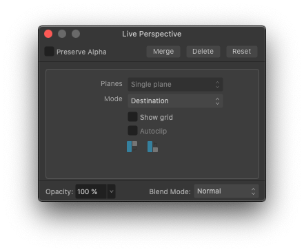
Currently working with Photo 2.0.0.0 on Mac OS 10.15.7. While applying the Live Filter layer for Perspective, I noticed that the 'Planes' option selector is greyed out and defaults to Single Plane (See attachment). It is not possible to select Dual Planes. Is this by design, or is this a bug?

-
It's my understanding that one cannot take advantage of "Family Sharing" for the Universal V2 license because the Mac App Store "Family Sharing" license does not apply to in-app purchases, and because the Affinity Universal V2 license is considered to be an in-app purchase if bought through the Mac App Store. What that means is that family members would have to log-in to the Mac App Store on all devices using just one family member's Apple ID. Not ideal. Can anyone from Serif or the forum here say definitively whether or not one can by a Universal V2 license directly from Serif, and then be able to install on devices for up to 3-6 family members? If so, what's the proper sequence of events?
-
@GRH Because the father-in-law and his wife want to take advantage of the "Family Sharing" license and the auto updates offered via the Mac App Store.
-
I don't see the V2 Universal license as an option in the Mac App Store. Just license options for the individual apps. If anyone has experience in purchasing V2 Universal via the Mac App Store, would you please advise me on how to go about that?
-
Helping my father-in-law with his desire to upgrade to V2 without losing V1. Is this possible? He's currently running V1 on OS X High Sierra (not able to run V2), but want's to take advantage of the 40% discount by purchasing V2 Universal now in advance of his planned purchase of a new iMac in January. He bought his V1 apps through the Mac App store. If possible, how should he go about purchasing the V2 Universal license today through the Mac App Store without losing access to his V1 apps?
-
Why is it that for so many "New ..." commands (new category, new swatch, etc.) the Affinity apps don't automatically throw up a naming dialog box? Seems quite logical to give the user the opportunity to name the newly created item straight away, rather than forcing one to go back into the menu structure with 3-4 extra clicks. EDIT: Allow me to apologize and to withdraw this post. I was watching one of the V2 tutorial videos (probably produced when V2 was still in Beta), and an Asset category first had to be created before it could then be selected and named. It reminded me of a complaint I had with the V1 apps. I should have checked this behavior in the release version of the V2 apps. As I now actively create new items in my copy of V2 apps, a naming dialog box does indeed now appear by default, with the notable exception of the command to create a Spare Channel in Photo 2. Sorry for the inaccuracy of the post.
-
@Ron P. Thanks. Hopefully Serif can get around to spelling that out in the online help files.
-
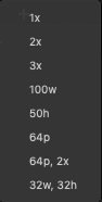
Within the Export Persona, for individual export slices, I assume that 1x, 2x, and 3x are scaling factors for the pixel dimensions of the art to be exported (i.e., that a 64x64 px image would go out as 64x64, 128x128, and 192x192. But I'm unfamiliar with the absolute units expressed below (see attached image). Would someone please explain the meaning of those absolute unit abbreviations and what effect they have on size of the exported slices? Thanks.
-
I believe it’s the document’s color space that determines what can be displayed in document, regardless of whether or not one uses a larger color model to define colors. CMYK < sRGB < Adobe RGB < ROMM RGB < Lab. What seems to be missing from the color palette is a warning when one chooses a color outside the gamut of the document’s color space. Also a clear explanation of how and when to use the Lock.
-
@lacerto Thank you for that. I think I'll need to read through that a few times to get it, but there are bits I can pick up on. Try this: Start a new CMYK document. The working color space by default is U.S. Web Coated (SWOP), and, of course, this is a smaller color space than any RGB or Lab color space. Next, draw a square shape and fill it with 100% Magenta. Duplicate this square to the right. Next, select the square on the right. Go to the Color Panel, insure that the color model Lock is "on", and then use the pop-up menu to switch the color model to Lab. You should see the following values: L: 52, A: 81, B: -7. You will notice that the Lab sliders allow one to push the A Opponent slider further to the right for a more intense Magenta – one that lies well outside of the color gamut of the CMYK color space. While the right square is still selected, If you then slide the A Opponent slider all the way to the right so that A = 127, I think you will notice NO change in the appearance of the right square's color. Why? My guess is that the gamut of the document's smaller CMYK color space is clipping the value of the more intense magenta color from the larger Lab color model and space. So, the fact is this (and let's leave the display monitor out of this for now): the working color space of your document determines the limit of the colors that can be represented. And although you may use the sliders from color models/spaces that are larger than your document's color space, you need to be aware that though you can dial in values for colors that are well outside of your document's color space, they will be clipped back to the nearest approximate color in the smaller document color space. There's more to be learned and said on this topic, including how and when to use the Lock icon. But perhaps others can chime in on this.
-
Well, you don't have to have an answer to this questions, but I'm hoping that someone from Serif has an answer. As long as everyone is designing in the sRGB color space for electronic displays, no one need worry about color gamuts. But if one is alternately designing for sRGB devices, then wider color gamut ROMM RGB display devices, and then much smaller color gamut CMYK print output, one needs to be concerned about specifying "in-gamut" colors. How does Serif expect one to manage these color space gamut issues? How does the Affinity software prevent someone from (or warn someone against) using the Lab color model sliders to spec an out-of-gamut color for their CMYK document?
-
So, If I understand you correctly, the Lock Icon does not actually function as a Lock to prevent one from accidentally changing the color model. Rather, the Lock Icon functions as filter, that interprets the color numbers of objects on one's page in the color model currently selected in the color model Pop-up. Maybe so. But if so, how is that useful? For example, how would this prevent me from picking an RGB color that lies well outside the color gamut of my document's CMYK color space?
-
Ha! No problem. I appreciate your reply. Perhaps you are just the expert user I need to chat with, but then what I need from you, in order to help me out, is an explanation that clears up the confusion. Perhaps you have some concrete examples of how to make use of the button that appears to do nothing.
-
Thank you, but I think this needs to be addressed by an Affinity staff member, or an expert user who can make it clear with concrete examples. At the moment, that Lock icon appears to have no use or effect. To which Affinity staff member should I direct this question?
-
Hi, @loukash. Here is the relevant passage: Still, It's not clear. The lock icon does not actually prevent me from changing the color model from the color model Pop-up. And what does the rest of that paragraph mean? Totally confusing.
-
I notice that within the Color Panel set to show Sliders, one can arbitrarily choose an alternate color model to build colors – a color model that differs from the established color model and space of the document. We know that the gamut of some RGB color spaces are larger than others, and that the gamut of most RGB color spaces are larger than CMYK color spaces. Question: Is the color gamut in each of the color model options from the Pop-up limited by the established Document color space? For example, if my document color space is CMYK, U.S. Web Coated, will the gamut of colors available to me in the Slider selectors for RGB, HSL, and Lab be limited to those colors that are achievable in the CMYK, U.S. Web Coated color space? And if not, if I'm able to select a color from the RGB or Lab model that is outside of the smaller color gamut of my CMYK document, am I warned or alerted to that fact in any way?
-
I've read the Designer Help page on the Color Panel, and I still don't understand the purpose of the Lock icon next to the Color Model selector when in Sliders mode. I'm free to change the color model from the pop-up selector, regardless of whether or not the Lock icon is set to "locked". How is one supposed to understand the function of this icon? How is one meant to use it?
-
I've noticed different results between the Alignment Pop-up Panel and the Layer > Alignment menu command when trying to align to a selected Key Object: Having selected a group of objects, then using the Option key to indicate a Key Object, if I then select the menu command "Layer > Alignment > Align Middle" (for example), all objects align to the Key Object as expected. However, if, after selecting a Key Object, I then bring up the Alignment Pop-up Panel from the toolbar and select the "Align Middle" button, the collection of objects will NOT align to the Key Object by default unless I also choose "First Selected" from the "Align to" pop-up option. Is this behavior in the Alignment Pop-up Panel by design?
-
I'm running Affinity Designer 2.0.0.0 on Mac OS 10.15.7 In a multilayered Designer file, when I select a layer, right-click to select "Hide Others", then right-click to select "Show Others", the hidden layers do NOT reappear without a quick zoom out / zoom in maneuver to force a screen redraw.
-
If you're designing in the sRGB color space, and then allow the Rendering Intent settings in Preferences to convert your color to CMYK numbers in a CMYK color space such as U.S. Web Coated (SWOP) v2, you're relying upon the color engines built into the Affinity Suite to propose a suitable/accurate translation. I presume that Affinity software translation will be quite satisfactory, but the CMYK numbers may differ slightly from another application, one that perhaps is also using a different Rendering Intent (i.e., Perceptual, Relative Colorimetric, Saturation, Absolute Colorimetric). Having said that, if you're preparing a visual identity manual, when it comes to specifying CMYK formulas for brand colors, I recommend that you refer to printed swatch books from printing ink companies such as Pantone. You want to be sure that the appearance of the printed inks are accurate. You can only assess the accuracy of a printed CMYK color from an actual printed sample. Evaluate the printed swatches under daylight or D50 lighting conditions, select the CMYK colors that best match the sRGB colors you're proposing, and then use the CMYK formula from the swatch book for those colors. (You can also refer to the electronic Pantone CMYK swatch collections included with the Affinity software to quickly add specific CMYK swatches to your document palette.) One other thing to note: if you're choosing color in sRGB first, and then seeking a CMYK equivalent, you should know that all of the RGB color spaces (sRGB, Adobe RGB, etc.) have a much larger color gamut than the CMYK color space. That means that there are many RGB colors that are brighter and more saturated than can be reproduced in the printed CMYK color space. For critical brand colors, make sure that those colors can be accurately reproduced in both the RGB and CMYK color spaces.
-
@MikeTO Brilliant! Thank you. And, yes, it would be helpful for Affinity to update their Help pages to include this reference material.
-
Does anyone know where to find a visual table of all the invisible characters (including but not limited to word space, paragraph, column break) that get revealed when one toggles on the "Show Special Characters" command in Publisher? I was reviewing a friend's Publisher document and could not interpret some of the invisible characters present. Thanks in advance for any helpful guidance.
-
The expectation seems to be that all documents will be brought into Publisher for typographic control, but I don't understand why Serif would enforce that workflow, as it's unnecessary and inefficient. The big distinction between Publisher and Designer/Photo is the question of whether or not the project is a book form. Multipage book form? Use Publisher. One or two-panel card or leaflet? Designer and Photo become relevant options. And so why don't we have the same typographic controls within Designer/Photo as we have in Publisher? Show/Hide invisible characters Threaded text frames Hyphenation controls (if you're offering Justification controls, why not Hyphenation?) Etc. It may be that Serif are not programmatically against bringing more typographic controls to Designer/Photo. It may just be a practical matter of time and the ordering of to-do's. I hope the reason is not some misguided notion that including these controls in Designer/Photo would somehow hurt sales of Publisher.
-
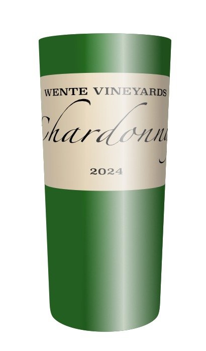
Note: I have had some success nesting vector warps to achieve the correct look of a label on a bottle/cup in perspective. I start with a simple Quad preset on my label, and pull the top and bottom borders out to create a bulge in the center, consistent with the foreshortening effect of label elements as they would wrap around to the back of a bottle form. I then nest this Label warp group as clipped child layer within a tall rectangle that will be my bottle. I then apply a simple Quad preset to the Bottle rectangle, and pull the top and bottom borders down or up to match the correct foreshortening of the bottle ends consistent with my imagined perspective, or POV. This warps both the Bottle shape and the nested Label layer group. Finally, I apply a third vector warp to the Bottle warp group layer: the False Perspective vector warp. I pull the top corners of the Bottle group up and out to match the foreshortening of the bottle consistent with my imagined perspective. Of course one can then add highlights and shading with gradients in Overlay blend mode. So, it is possible to creatively combine several nested vector warp groups.