kenmcd
-
Posts
1,715 -
Joined
-
Last visited
Everything posted by kenmcd
-
Which version of Bebas Neue? And where did you get it? There are a few different versions of the Bebas Neue family out there. And some of them are configured rather oddly. So I wonder if that odd configuration is confusing Affinity. (I have seen other issues where Affinity showed nothing in the font list) I have a version which has been "fixed" if you would like to test those. (then we would know if this is actually the issue)
-
 Marion is now an Apple "Document-support Font" in Sonoma. See: https://support.apple.com/en-me/HT213773#document Affinity does not support these Apple font controls. The Marion.ttc file previously included with macOS only had three styles. Regular, Italic, and Bold. Since you also have BoldItalic we can assume you actually own the full font family. So Apple in their unbelievable arrogance are blocking fonts you actually own. The only solution is to change the name of the fonts. (the commercial fonts available from MyFonts, etc. have the same names). There was a previous discussion about the Marion fonts, and changing the name.
 -
font compatibility problem on Affinity publisher
kenmcd replied to Sandy5767's topic in V2 Bugs found on macOS
Moving between macOS and Windows can cause line height issues (depending on the font), but usually the same OS should not be an issue. Can you post a PDF or image of how it looks on both systems? I assume Helvetica is the one included with macOS? And Blenda Script from Dafont? (or some other free font site) Which version of Ubuntu? -
font compatibility problem on Affinity publisher
kenmcd replied to Sandy5767's topic in V2 Bugs found on macOS
I assume that means there is some difference in the line height which can cause reflow and fit issues. What font? Is macOS on both systems? And is it the same version? Generally setting a fixed leading (line height) can avoid this. (and you should have the same version of the font) -
Text spacing issues.
kenmcd replied to revpub's topic in Affinity on Desktop Questions (macOS and Windows)
This looks like text that came from a PDF. Where the tracking is all messed-up by APub guessing at the spacing. (which is made harder if the text was justified or had tracking applied) And some space characters are missing or extras (which appears after fixing the tracking). The fix in the previous cases has been: - select all the text and set the tracking to 0 - delete double spaces or add needed actual spaces - delete extra paragraph breaks, or line breaks -
Also, if you have access to Office 365 you can probably coax it into giving you the static versions from the cloud fonts. Worked with Bahnschrift.
-
This font family was changed to variable with Windows 11. If you have access to a Windows 10 system, these fonts are static versions. Included with the Windows 10 Pan-European Supplemental Fonts Pack. But it only has 6 styles vs. the 16 style instances in the variable fonts. https://learn.microsoft.com/en-us/typography/fonts/windows_10_font_list#-pan-european-supplemental-fonts
-
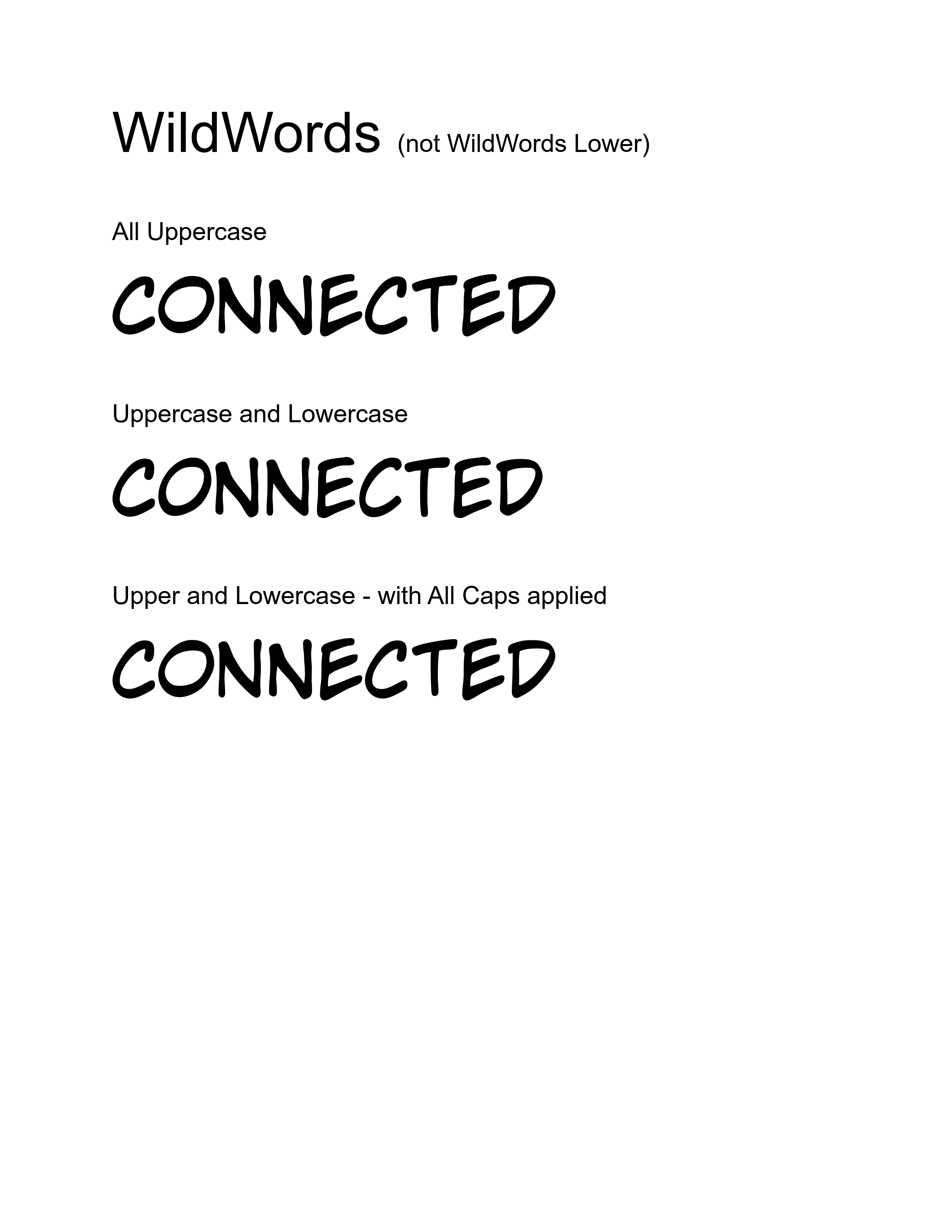
@Mark Favreau I tested WildWords and it does work. Re-opening the PDF in Affinity looks correct. But only because the font has uppercase glyphs in both the uppercase and lowercase code points. I tested text that is: - All Uppercase - Uppercase and Lowercase - Upper and Lowercase - with All Caps applied. The actual text codes for the text in the re-opened PDF are: WildWords (not WildWords Lower) All Uppercase CONnECtED Uppercase and Lowercase ConNecTed Upper and Lowercase - with All Caps applied CONnECtED But it still looks the same because of the font: @AdamW The substitutions are done differently in the WildWords font, but there are still quite a few errors in the embedded text (or ToUnicode table).

-
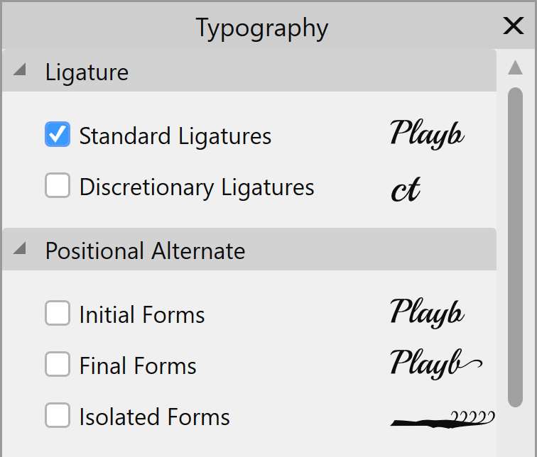
Playball has Positional Alternates which Affinity has set to On by default. Other applications set these to Off by default for Latin script. Which is why other applications do not have this problem. In the Typography Panel find the Positional Alternates section and turn those Off. Playball has Initial Forms (init), Final Forms (fina), and Isolated Forms (isol).
-
PDF Readers just display the shape that is there for that text object. Which is exactly what they are supposed to do. Show me the shapes. The shape that is placed in the PDF (and connected to the Unicode code point) can vary based on the OpenType features applied. For example you could apply the swash feature to the T in The and OpenType will substitute an alternate big swashy T glyph (shape) for the original plain T glyph (if the font has this OpenType feature). That swashy T shape is what gets embedded in the PDF. The underlying Unicode code point remains the same. So if you copy and paste that swashy text you will still get "The". When Affinity opens a PDF it is opened for editing, so for text objects it reads the underlying Unicode code point, and then goes to the font to get the character (and the normal shape associated with that character). Since there is no OpenType feature applied to that text, you see the normal shape. Same thing happens with small caps. The underlying character code point remains the lowercase character. If you copy-and-paste small caps from a PDF, you will get lowercase text. So what shape gets embedded/displayed in the PDF can be multiple different alternate shapes - for one same Unicode code point. In this case the characters should have all been converted to uppercase code points - but for one character it displays/embeds the "correct" uppercase glyph (shape), but applies/embeds the lowercase code point. Something is not working correctly. My guess is that there is some odd interaction between the All Caps feature and the OpenType ligatures. Make sense?
-
@Mark Favreau You could use the CC WildNames font (not CC WildNames Lowercase). It is all caps and the ligatures/alternates are handled differently. The lowercase is all caps also, but the shapes are different from the uppercase. And the OpenType code for the alternates works differently. The substitutions are between the uppercase and lowercase versions, not with any oddly named ligatures. That font may work-around these issues.
-
No, does not appear to be. In those cases it is completely off (like the character mapping is off). In this case it appears to be some weird interaction between the All Caps function and the OpenType replacements - and those ligature names. My WAG is some code does not play well with those glyph names.
-
The error is in the creation of the PDF from APub. CC WildWords Lower has ligatures for uppercase characters when there are two of the same character next to each other. Like: CONNECTING The NN is replaced by a ligature in which the two Ns look slightly different. The name of that ligature is n_N. All of the ligatures are named like that. a_A, b_B, c_C, etc. This appears to be confusing APub. Note: these are Standard Ligatures (liga) so they are On by default. APub should embed in the PDF two uppercase characters. But the code behind the first character is instead for the lowercase character. It is embedding the Unicode for: COnNECTING When opened in APhoto for editing it displays that lowercase character. So the fix has to be in how APub creates the PDF. Work-arounds... Actually convert it to uppercase - but you will lose the pseudo-random characters. Turn-Off Standard Ligatures - but you will lose the pseudo-random characters. Place the PDF as pass-through. Convert the PDF to curves.
-
Affinity Designer 2.3.1 always complains about missing fonts
kenmcd replied to deepblue's topic in V2 Bugs found on macOS
Did you happen to use the Myriad Pro Semibold style? The Light and Semibold styles are in an R/I/B/BI style group together, and Affinity applications do not handle style groups correctly. So it could simply be confused (annoyingly). What Myriad Pro styles did you actually use in the document? Would it be possible to post the document so we can take a look? You could do as @walt.farrell suggested and open the doc in APub and see if you can find where that font is used. To test, you could also remove all the fonts you are not using, leaving installed only the fonts actually used, and see if the error goes away. That would confirm that the application is simply confused. Nothing wrong with the fonts. Affinity apps just do not know how to handle style groups correctly. -
What is the cause of the contrast issue? Is the text gray or a color? You can use GhostScript (free) to convert all the text to black. Or is there a background or something else? Can you attach the PDF file? You may be able to make the text black, place the PDF as pass-through, and then add your text and image on top.
-
No, I meant removing it from the originals before placing them. Note: I examined the original PDF and removed the background shape using PDF-XChange Pro. So I also recommend that application.
-
It may. I remember a previous issue where APub confused the stacking of the objects in a PDF, and then just showed the blank area. IIRC the thinking was if all of this is hidden it does not need to be shown or even processed so APub appeared to just drop it (it is not visible why even deal with it). You can test this by removing that shape from some more of the other missing-pages PDFs and see if they also now show correctly. If every one you remove the shape from now shows correctly that would be pretty good evidence that is the issue.
-
Variable fonts support
kenmcd replied to Athanasius Pernath's topic in Feedback for the Affinity V2 Suite of Products
Yes, they do. On my phone at the moment, but later I can provide the link to the exact variable font file they served to my up-to-date Firefox on Windows. (which is the Latin-extended sub-set variable font) You should be able to determine the exact file you were served by looking at the network tab in the developer tools. Note: don't know what browser you are using, but regarding variable font support, Safari on macOS has been the worst (based on the number of issues in the GF tracker). It appears on MacOS 14 that Safari may have finally fixed this. Point: if you are using Safari it is quite likely GF could serve a static font, and definitely on the older versions. -
Variable fonts support
kenmcd replied to Athanasius Pernath's topic in Feedback for the Affinity V2 Suite of Products
The font you are reading right now is variable.- 239 replies
-
- 1
-

-
- variable fonts
- feature request
- (and 1 more)
-
Regarding the disappearing pages... In the sample PDF you provided there is a shape which encompasses the entire page which is RGB white (255,255,255). I am wondering if that is confusing APub and it thinks that area should just be white. And it just drops everything else. We have seen a similar issue before. I removed those shapes from the PDF attached below. Invisible song-Musescore output-01-no-outer-box.pdf Please test placing that by replacing your missing page with this PDF.
-
Music PDFs can only be placed as passthrough. Interpret attempts to edit the PDF, and music PDFs are a jumble of text, some text objects with bad or missing encoding, and a bunch of shapes - all stacked on top of each other. As soon as you try to edit it APub it just makes a mess. And stuff disappears because it is embedded as a text object, but the connection to the font is lost due to bad or missing codes. And the vertical placement is handled by the music notation application. There is no normal "text flow." Etc., etc. Not going to work. You could also use Ghostscript to convert it all to shapes (and remove all font info).
-
These are all the OpenType features in Trixie HD Pro Heavy which should appear. But do not. Access All Alternates Case-Sensitive Forms Contextual Alternates Fractions Historical Forms Lining Figures Localized Forms Ordinals Scientific Inferiors Slashed Zero Standard Ligatures Stylistic Alternates Stylistic Set 1 Stylistic Set 2 Stylistic Set 3 Stylistic Set 4 Stylistic Set 5 Stylistic Set 6 Stylistic Set 7 Stylistic Set 8 Superscript Titling
-
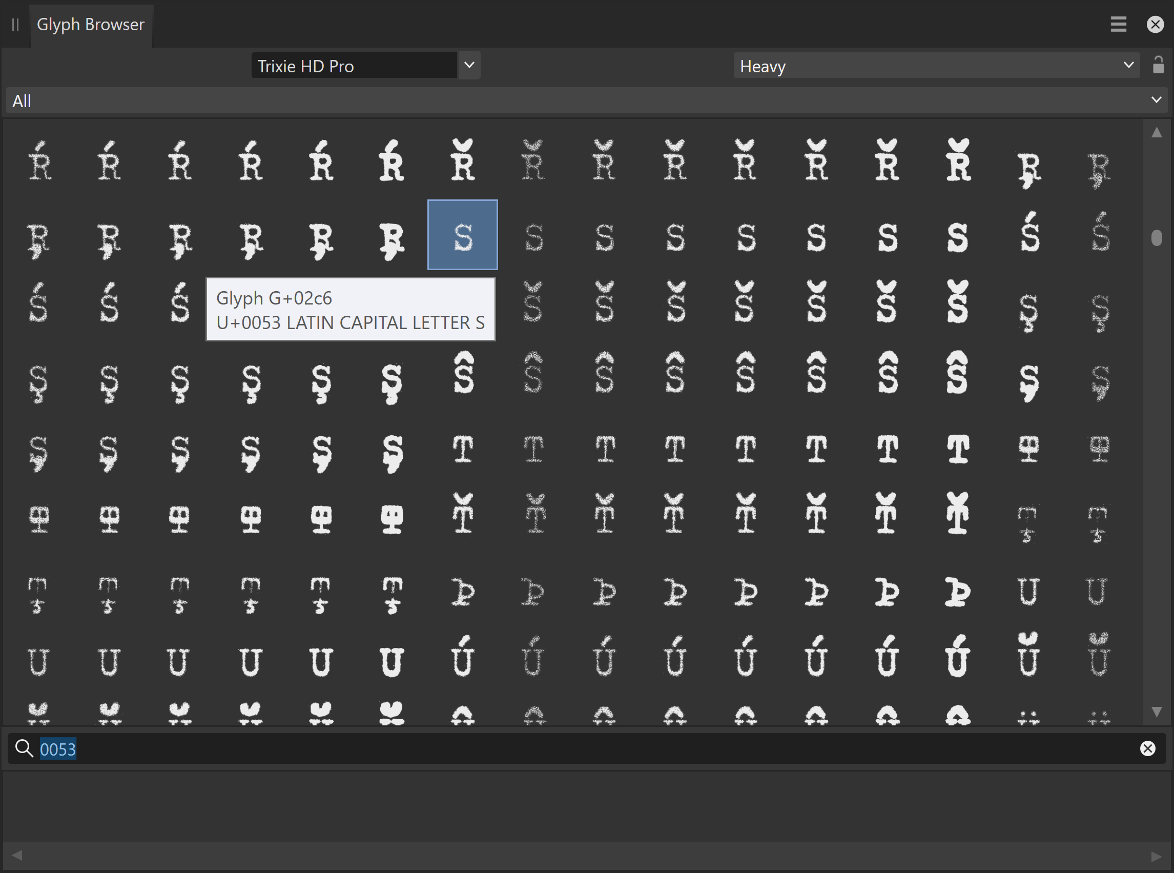
@duon Bad news - aalt is not going to show all the alternate glyphs. I took a closer look at the fonts today and many of the alternate glyphs are not available by using OpenType features, so they will not appear in the Typography Panel as alternates. Each character has seven alternates - and those alternates are controlled by the OpenType Contextual Alternates (calt) feature. The calt feature is On by default so the pseudo-random alternates appear automatically. But, the seven alternates do not all appear in other OpenType features. Thus they will not appear in Alternates or other features in the Typography Panel. So the bad news is they will only appear in the Glyph Browser. Luckily the alternates follow directly after the character in the glyph order. For example "A" is followed by the seven alternate A glyphs. Type the Unicode code point in the Search box. For "S" type "0053" and it will take you to the S plus the seven S alternates. Hopefully Affinity will add your requested feature (it has been mentioned before). Note: Are you seeing any of the Stylistic Sets or other OpenType features in the Typography Panel? I can see all the OpenType features and test them in font editors, and my fonts work fine in LibreOffice, but the features do not appear correctly in APub. (I was testing with Trixie HD Pro Heavy, and Trixie HD OT Heavy) UPDATE: Trixie HD Pro Heavy font works fine in QuarkXPress 2024 also. So my guess at this point is APub does not support the look-up types used (like the problems with FF Chartwell). Have to keep investigating... Or it just chokes on the large number of look-ups and classes. Dunno. Whatever... it appears the problem is APub not the font.
-
If the font has the OpenType feature Access All Alternates (aalt), the selected glyph will be shown as selected in the list in the Typography Panel. Most newer fonts have aalt included now. It could also be highlighted in another OpenType feature list. Depends on how you selected them. In InDesign (and probably IL) when you highlight a character and a small box appears with all the alternate characters - that is accessing all the alternates. Adopey does this whether the font includes aalt or not. aalt just gathers-up all the look-ups from the other OpenType features. So which Trixie font are you using? Is that FF Trixie? FF Trixie does have aalt. Note: Character Viewer (Mac) and Character Map (Windows) only show characters (with a Unicode code point) not all the alternate glyphs (which typically have no code points; sometimes they may be up in the PUA).
-
Everything after the last / is not needed. That is their own internal reference tracking and is not needed to get to that page. PDF readers typically have a feature to automatically convert text which looks like a link to an actual link. Most likely your reader is doing this wrong and breaking the link. Check the reader's settings to turn this feature Off.