

CalebK
-
Posts
23 -
Joined
-
Last visited
Posts posted by CalebK
-
-
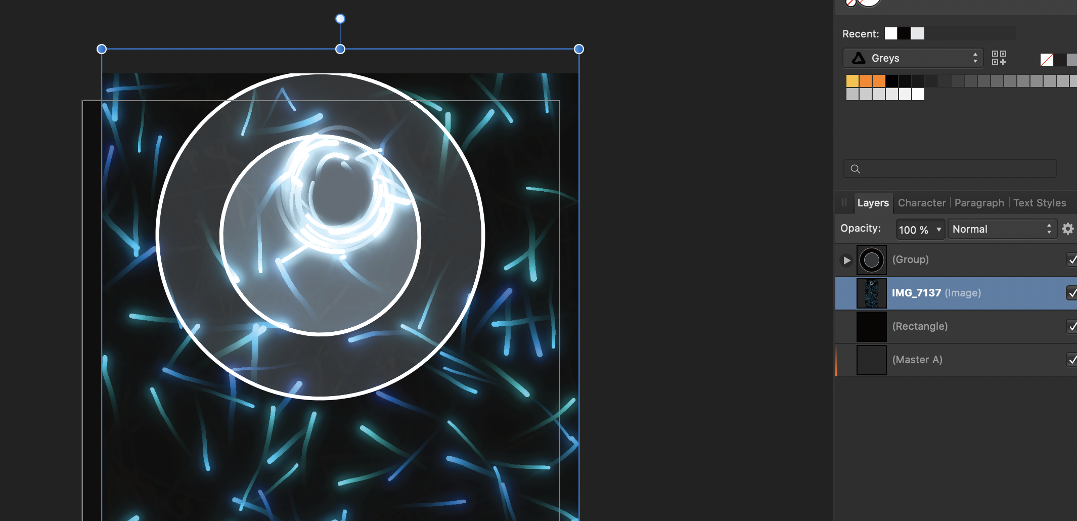
Ok so maybe I am doing this wrong but I made a design inside of publisher mostly using the designer persona. It is two circles with black fill and white outline. The goal is just two white outlines (and yes I know I could use no fill that is what I am doing now given the bug).
Instead I get this (attached)
This is reproducible Publisher 1.7.3

-
Before I begin it is possible that this is a bug with Metal or MetalKit and not Affinity... However based on a few things my suspicion is that it is Affinity.
So here is what happened. I created an ellipse with a radial gradient to transparency. I rasterized it. And tried to export it. I added it to my assets in Xcode and oddly enough it failed to load.
Thinking that was odd I substituted in a picture I knew would load and it worked.....
So I determined I must be exporting it wrong.
I then open that png (that worked) in affinity resize the canvas and superimpose my transparent circle on it. I export it and put it in assets. It loads perfectly of course there is an unwanted background to this image.
I then hide the layer and re-export thinking this will work. It did not. Instead it still failed to load into my app.
Not even setting the layers opacity to 0% worked. The layer had to be at 1% opacity in order for the exported photo to work with my app.
To summarize:
For some reason I cant export a photo in a format that MetalKit will read and successfully load unless I add a layer that has a png that has an export that worked/loaded in at at least 1% opacity.
This is 100% reproducible for me.
Attached is a photo that would fail to load in Xcode and also a photo that did load in Xcode. I have also attached the affinity photo file that produces this un-importable image.
The gradient is white and thus appears like a blank image here.
And for those of you interested the image is loaded in through this code:
- (id<MTLTexture>) textureFor:(NSString*)name {MTKTextureLoader* textureLoader = [[MTKTextureLoader alloc] initWithDevice:device];NSDictionary *textureLoaderOptions =@{MTKTextureLoaderOptionTextureUsage : @(MTLTextureUsageShaderRead),MTKTextureLoaderOptionTextureStorageMode : @(MTLStorageModePrivate)};return [textureLoader newTextureWithName:namescaleFactor:1.0bundle:niloptions:textureLoaderOptionserror:nil];}I have also attached a zip file of an Xcode project (Version 11.3 (11C29)) ReproduceMetal.zip. If you build to your device it will crash with the image willFail which is currently loaded in.
-
Hello,
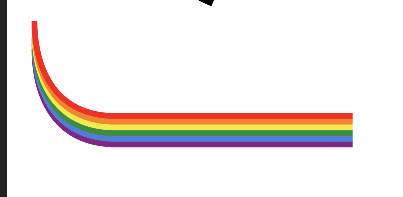
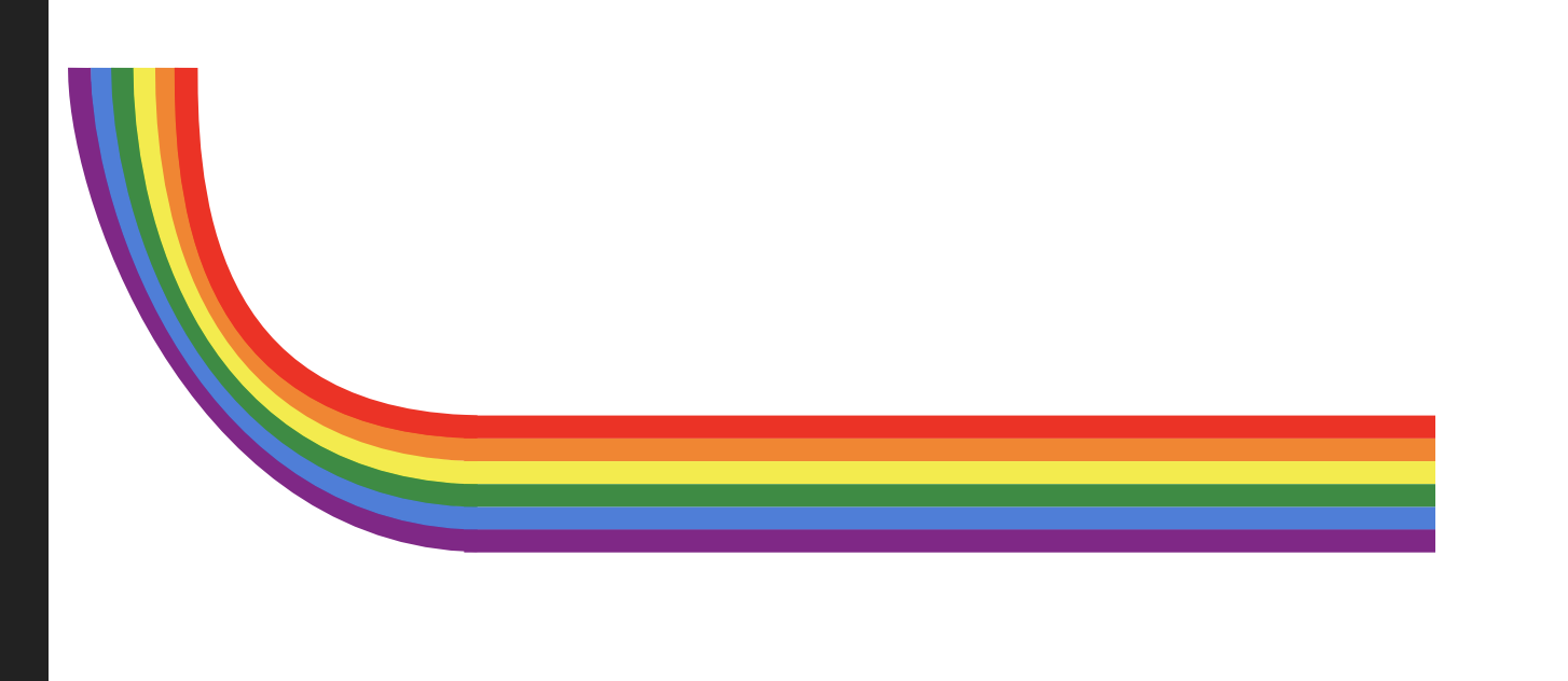
I am a student trying to make a logo for a LGBTQ+ club at my college campus. As such I am trying to make sure that rainbows are sprinkled tastefully everywhere in the design. Recently there have been some shapes I have been wanting to create but have been unable to due to lack of knowledge on how to make them.
Most of them end up being essentially rainbows but bent.
For example this shape
The black part I would love to be a continuation of the rainbow
I made a few stabs at it by adding curves
But as you can see you run into issues where they don't converge properly and each bit of the rainbow needs proper curvature.
And while I could potentially make this work I would love to be able to create more complex curves that are made with rainbow colors. How would you do this in Affinity Designer (or any other product)
-
-
I have this technique I like to employ where a string of text is completely written out using capital letters only the non-first letters are a smaller font. This gives the appearance of title style capitalization without using lower-case shapes.
It might not look great zoomed in but from a distance it looks brilliant especially when there are all caps acronyms like FPGA>
I would like to have this font style easily usable across fonts.
I am wondering how one might set this up as a character/paragraph style(s) in Affinity Designer. Currently I very manually have to apply a different style to the first letter vs the rest of the word.
-
I really appreciate the help here yall
I like the glyph solution but what about the following situation. I have 3 text frames. The aim is to have them overall be centered and equally spaced a part. Even though I can center to the spread as soon as I start messing with horizontal distribution their center will no longer be THE center. Is there a good workflow that does this differently but allows that?
-
Alright so I am trying to create my resume within Affinity Designer.
There are two operations I am trying to do in the header and they are prooving to be a lot more difficult then perhaps they could be. I am wondering if I am forgetting some feature/workflow that might make this easier. Could you please look at these videos of me working with the application and see if you can think of a way that these operations could be easier?
Situation 1: The goal is to be able to edit the font/content/character of this text and have it automatically center.
Situation 2: The goal is to have the two black dots centered in the screen and surrounding the email.
If you can think of any features/workflows etc that would make these goals easier to obtain please do let me know.
Thankyou
-
My swatch panel in Affinity Designer app is very empty and I would love to fill it with some nice palettes of pastels and flat design colors etc. However I am unable to find palettes anywhere that are compatible with Affinity Designer.
Does anyone know of any or have some to share? Is this even possible to do?


Export Bug: PNG does not load into iOS Xcode metalKit if a layer is not at at least 1% opacity.
in V1 Bugs found on macOS
Posted
Helps immensely thank you!