pummelfee
-
Posts
96 -
Joined
-
Last visited
Everything posted by pummelfee
-
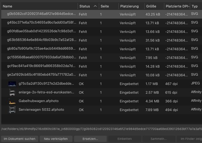
I have several Links in the PDF, but when i export it to PDF (yes, hyperlinks are turned on), the Links are completely messed up and confused. Its a big problem because everything is ready so far and i will miss the deadline if i can not fix it…
-
See, such massive bugs can destroy a job completely. Practically in my case i just had to make one simple change and promised the customer to deliver the PDF. But when i have to re-collect a bunch of lost ressources, i cant meet the deadline. Yes, all software has bugs. But what upsets me is the fact, that fixing of this critical bug seems to have no high priority at Serif. Serif should make all the existing fantastic features stable and reliable instead of adding new (buggy) features. Just my opinion. Thats the reason why i do not always use the latest OSsses. I wish Serif would pay more attention to the needs of professional service providers. Then it could become a real competitor to Adobe. And then I would also be prepared to pay a higher price if there was no subscription obligation.
-
To be honest, i do not trust in the progress of the Affinity Suite anymore, since there are still bugs in it from the first Version. If you do scroll longer and more often through the stock thumbnails, it crashes and it can be reproduced on Intel or M1. I think, Serif want to sell as many copies as possible in short time instead of having satisfied customers. At some point i have to decide to have a cheap software for the price of workarounds, lost files and frustration - or switch back to an old but reliable industry standard.
-
Thank you, then this is a bug to be fixed as i understand? I swear i did not delete any temporary directories over night or any time. 😉
-
Yesterday i made a layout, and today i should have get this to the print service. But now i can’t open what i saved. 🤯 The files are missing.... Its the same Computer (Mac), and i store my work files locally, not on a network or external drive. Is there a chance to find these files?

-
Das war’s!! Danke dir!!!
-
When i set a different paragraph style for a following paragraph, it does not work here. I think it should be work as following: Write something with a paragraph style named „Paragraph One“, then press return for a new paragraph and from then it should have the style „Paragraph Two“ that i defined as „next Style“ in the „Create Parapraph Style“ menu. But its not working - when i press return, the style does not change. What am i missing here? Thank you for any help!
-
Why does Publisher optimize the hyphenation only from top to bottom? And not backwards? To demonstrate, i made a little screencast. In the middle of the block there is an ugly gap. When i go a few lines upwards and insert a manual soft break between the two words „Freie” „Gesellschaften“ not only the hyphen goes away, but also the gap disappears. As i mentioned in a older thread, i remember InDesign to make this task much better long time ago. But maybe i did not set things up properly and did not find the right instructions yet. Any tipps are welcome! Bildschirmaufnahme 2023-06-10 um 15.15.43.mov
-
Hi!! Thank you very much. I thought because it was so long ago, it was fixed. So i will keep on looking forward… 🙂
-
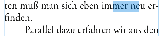
Its a bug since 2.0 and i am on the verge of despair … When i want to select Text with the texttool (pressing T on the keyboard), it often happens, that not the text is marked that i select. In the screenshot you see what happend, when i double click on the word „immer“ - Publisher selects something, but not the word i double clicked. This is definitely a bug since 2.0 - please help!!
-
So many helpful answers! Thank you so much! As i mentioned, i think its more my lack of skills that i do not have with affinity yet, but affinity itself. However, one thing that is new in V2 and that i can’t solve is: In justified Text, Publisher makes wrong line breaks with qotations: Example: „Aashjs shs jdhdjkshd. Adjhahj aj sdjasl askdja alsk daasj aklk. " The dot at the end of the sentence and the last quotation mark [.“] should not be devided (regardless what software it is and how stupid i am ;-).
-
When i compare my daily work in AP with InDesign now i must regret, that (at least i have the feeling) that justified body text looked better, somehow... Not only that the hyphenation is more often false then in the old days, but the whole look of a large justified text in 3 or 4 colums (on a A4 page) is often not much satisfying. So i spend much more time in manual adjustments, like setting one text-line a percent up or down and so on, stepping lines back and forth and do new manual hyphenations to make the whole page look good. Work steps, that i did not remember in that quantity. BUT please don’t get me wrong! I do not just complain about AP2 here, i think i actually complain more in my overall skills to handle the almost infinite settings that can be done. Anyone, a tipp for me where i can find good tutorials or maybe threads here (i did not found anything) about justified body text and typography of newspaper style body text in general? I am not searching for tutorials how to make crazy and stylish magazine headlines and fx and other eye candy. Just the „down to earth“ body text that was much easier in the Quark and InDesign days for me.
-
Danke für die Tipps!! / Thank you for your efforts!
-
AP2 Bug.afpub
-
When i try to select text, Publisher 2 drives me crazy because it does not follow the cursor. Just have a look at the screen recording that i made… buggy_selection_ap2.mov
-
Thank you very much, i think i got it 🙂
-
Hi! I have my problems with numbered lists in Affinity Publisher. I can define tabstops, but if the text is more then one line, the further lines should not be left aligned to the number, but aligned with the tabstop. If you have a look at the attached picture, you will see what i mean.... Thank you for any tipps 🙂
-
Thank you very much, dear Walt! I am not sure if i understand this correctly. With auto-correct i make a setup for all documents, right? But the replacement i meant is a typographic aspect for just one customer and not in general.
-
In a layout i need to have the „ and ” quotations displayed as » and « There is the Text Style Panel, but i can’t find any in-deep documentation. So my question is; is there a chance to make a setup for a textstyle that makes such replacements maybe with a text-style? I see there in this panel something like „typographic variants” but i can’t use it without a manual. Apropos replacements... it seems that it is impossible to make a search & replace just for a selected text frame. Publisher always searches the whole document.
-
Hi iconoclast, i work with mac mini m1, everything up-to-date.
-
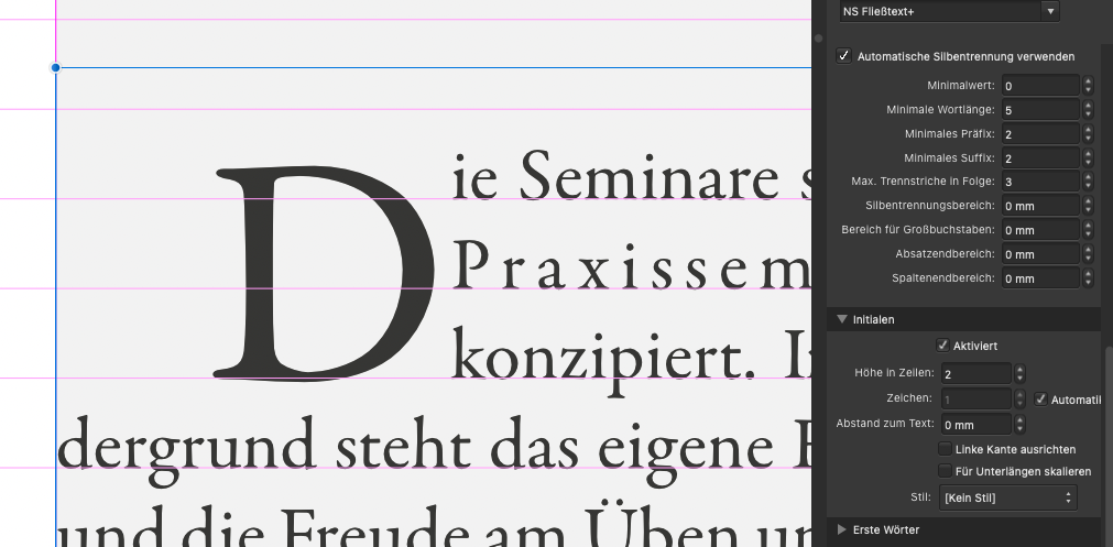
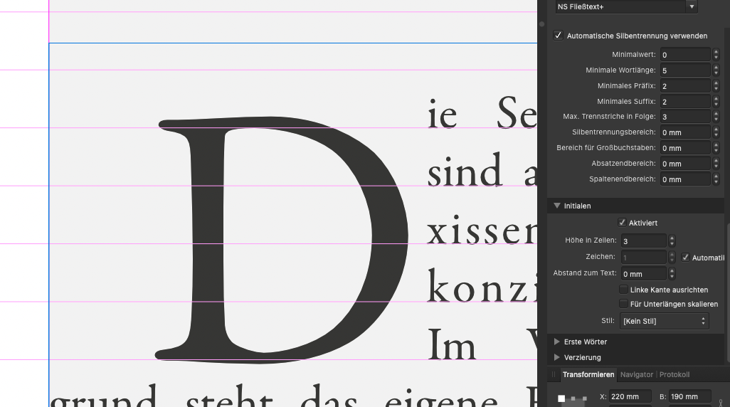
Publisher does not make the initials correctly. 2 lines are 3, 3 lines will be 5 lines high.... Cannot make initials 😞 Is this a bug? Appreciate any help!
-
Sometimes i cannot see the wood for the trees. thank you very much!!
-
When i have to see the baseline grid AND the guides, its nearly impossible to see what is what, when the guides are exactly on the lines of the baseline grid. I am aware that the color of the margins and the columns can be adjusted, but not the guides. This is a feature that i strongly miss or i just didn’t found out yet.
-
I still use an old release of FontExplorer Pro v6 on my M1 MacMini and it works so far. How do you manage your fonts? Would the included Fontbook app do the job also, if i do the Upgrade to macOS Monterey and FontExplorer quits...?? BTW, since i can think, i use Suitcase or Fontexplorer and never got in touch with the on-board utilities much. What do you use to manage your fonts on the latest macOS?
-
Yes, the PDF is okay and the network connection to the server is also stable.