Sharkey
-
Posts
353 -
Joined
-
Last visited
Everything posted by Sharkey
-
 Yup. That is what I did in the end. OK.
-
1-3 good, but nothing on 4. Which brush tool are you selecting?
-
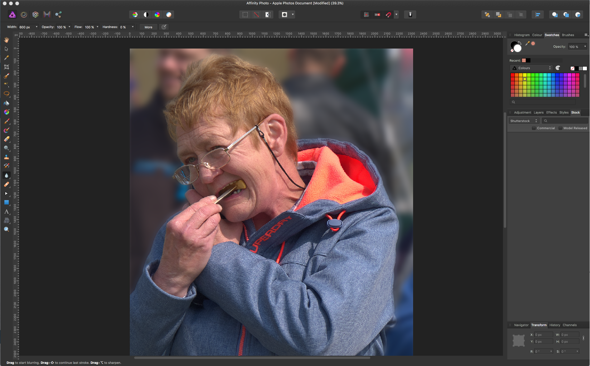
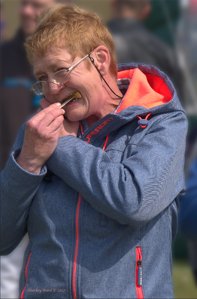
Thank you for that - I will use your suggestion in future. In this case I was looking to isolate the subject quite clearly from the back ground rather than affect some field depth. This was the outcome. I had chosen my widest aperture but the people in the background remained annoyingly clear. Without f1.8 telephoto (£) it is something I will need to do in the future quite often hence the need for a quick, simple method. Regards. Sharkey
-
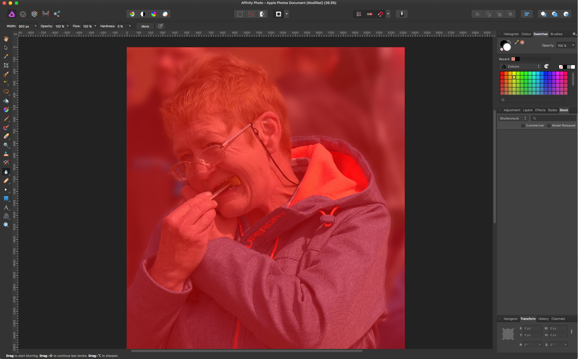
OK. But not can paint on red layer. Has no affect.
-
I've added Gauzian Blur to my selected background. I looks OK enough to use. At least the mans face is not recognisable.
-
All I want to do is blur the background!! How hard does it have to be!?
-
Just stupid! Me that is. How do I select a white brush?
-
Nope still don't get it!
-
Not to bother. Merge visible gives me a usable layer.
-
The instructional videos I try and use stat with one layer open market (pixel). My open layer after developing is marked Background (pixel) Why the difference and is that why I cannot get the 'quick mask' method to work? As usual a simple answer and if poss. instruction would be invaluable. Thank you Sharkey
-
Thank you. My other half has solved the problem. Just trust the camera and shoot RAW+jpg.. RAW for Affinity and high quality printing and high quality jags in Photo for web&publishing in General. Regards. Sharkey ps. it is interesting (to me anyway) that the camera can produce jogs in an instant and Photos can do it pretty quick too but other software design specifically to produce jags from RAW in bulk seem to take forever.
-
I guess no one knows!
-
From 'Edit with Affinity" Then Edit in Affinity Then? What next to get the edited photo back into Photos. I would like to end up with a jpeg and a tiff in the same place as the original or a new file within the original folder. Regards. Sharkey
-
Do I Need AD?
Sharkey replied to Sharkey's topic in Pre-V2 Archive of Affinity on Desktop Questions (macOS and Windows)
I get that. I am being asked to create a layers template for my own use with jpg examples for the customer to see and choose from. That is choose a template from a selection of jpgs. I will the insert their chosen image into their chosen template for them to approve the final result. That will be merged down to a high quality jpg and uploaded to via ftp to the site file reception area for the editor to put on line. Perhaps my question (as usual for me) was not precise enough. Regards. Sharkey -
Do I Need AD?
Sharkey replied to Sharkey's topic in Pre-V2 Archive of Affinity on Desktop Questions (macOS and Windows)
That was the kind of reply I feared most. Totally beyond me. I will therefor take your advice and just stick to what I know best. I will be providing the images as well as the templates and final product so keeping it all inside AP makes good sense. Thank you. Regards. Sharkey -
Simple question. I have been asked to come up with some posh advertising templates into which a clients image can be added, approved and published on line. Given the learning curve is already steep in AP (for me) would I be better off just using layers in AP or will AF give me some advantages I don't know yet. Getting it done is the priority. Thoughts please. Regards. Sharkey
-
Really pleased you pointed that out. It is not enough to feel decrepit and distinctly out of my depth (about 1") but you have topping out Sharky in LOTR :( Lucky my name is "Sharkey". Totally different! Regards. Sharkey
-
I am trying to make the 'G' more cartoonish by painting in an 'eye'. The white is supposed to be the start of that process followed by a brown and black circle with highlights. simple really :( I just cannot get my head around paint layers/pixel layers/adjustment layers. The whole damned thing is really teeing me off. Such a simple thing in my head and can I do it? No! Oops. In Serif language, got it a bit wrong there. Never mind Regards. Sharkey
-
The Cropping selection/choice has been and is from my perspective aligned with the ppi/dpi question the longest running of requested changes that appear on this and other forum posts. I have no axe to grind on either subject being sanguine about both, however, given that so many contributors both new and longterm bring them up so regularly (my impression), would it not be seen as a major positive response from Serif to just change them to a more universally recognised methodology? Terminology has always been the enemy of comprehension and usability in AP and I view this 'beta' as an opportunity for clarity and simplicity to come to the fore. Regards. Sharkey NB:- my opinions are just that.
-
Thank you. Must say that it is more by luck than judgement. Regards. Sharkey
-
I am very sorry but basically I recognise what you say but without the minor details I am stumped. "Group the Vectors"? The oval does not fit 'exact' and adjustment handles do not allow me to make it fit. Regards. Sharkey
-
This is my first adjustment of one of the letters. Next job is to paint on this 'G'? I want to select the inner area and fill with white then paint over the background and the letter. Oh boy do I not like struggling like this. Regards. Sharkey
-
OK. Found Convert Button. Getting there. Regards. Sharkey
-
How do I do that conversion? Tried to find 'convert to curves' without success (as usual). Regards. Sharkey
-
Right - I think? So the best starting point is? A transparent document and text (from font list ?). Go to Node tool and edit letter shapes. Add layers underneath. So far so good. Then another layer to paint on?? What am I going to export as to keep the image from pixelating? Jeeze; not at all sure I should have started this. Regards. Sharkey