Al Grasso
-
Posts
54 -
Joined
-
Last visited
Everything posted by Al Grasso
-
PDF Export not working
Al Grasso replied to Al Grasso's topic in [ARCHIVE] Publisher beta on macOS threads
I have reported the issue to the Affinity Team.Thanks again for helping to solve this issue. Your contribution and that of R C-R have been illuminating. The kind of knowledge answer I would give in my world of Physics. Well done to both of you. -
PDF Export not working
Al Grasso replied to Al Grasso's topic in [ARCHIVE] Publisher beta on macOS threads
Thanks for your input. I understand the issue better now. On the other hand, if such is the case, Apple ought not to make a public issue of discouraging the use of Adobe software as being a vehicle for introducing malware; remember this big issue a few years back? Obviously it stayed in my mind but I am willing to change it. I may even buy a full edition of Acrobat software but their commercial terms are unfavourable for private users who use the software irregularly. Anyway, the Reader is now my default preview app on my iMac. -
PDF Export not working
Al Grasso replied to Al Grasso's topic in [ARCHIVE] Publisher beta on macOS threads
Addendum for the Affinity Team: Previously I reported that I exported the pdf file using each of the pdf options available in turn, i.e. rasterise everything, rasterise unsupported and rasterise nothing. I opened each file in Adobe Acrobat Reader and each one is perfect. The only difference being that in the original file a couple of titles had been bevelled and in the rasterise nothing option they had been flattened but otherwise the export is perfect. -
PDF Export not working
Al Grasso replied to Al Grasso's topic in [ARCHIVE] Publisher beta on macOS threads
Wow, Eugene, I acted on your suggestion promptly. I had not Adobe Acrobat Reader installed so I downloaded it and after installing it the exported pdf file is perfect. There are no errors whatsoever. The file rendering is perfect. Since moving to the Mac platform I have always used the Mac Preview App and forgot about Adobe Acrobat Reader. So the problem is not with the beta version of Affinity Publisher but with the Preview App in Mac OSX. I will report it to Apple. Anyway, your intervention has resolved my problem and also provided a very useful input to the Affinity Team. I can't believe it. I never thought a Mac default App could be the cause. Anyway, thank you for your intervention. I would willingly buy you a few pints of Bathams beer, the best. I hope the Affinity Team will read this chat and focus on other issues rather than the one I raised on pdf export. -
PDF Export not working
Al Grasso replied to Al Grasso's topic in [ARCHIVE] Publisher beta on macOS threads
Update I tried exporting the same file in pdf by warying the rasterisation choices as 1) rasterise only unsupported properties, 2) rasterise every thing and 3) rasterise nothing. Results: 1- Rasterise every thing: Two pages of trifold leaflet are totally messed up and unreadable: Front page and back page of trifold leaflet. 2- Rasterise unsupported properties: Still bad but better than 1) 3- Rasterise nothing: Best conversion. Back page is clear and three thumbnails photos rendered like old negative cells film. The same file exported as .psd or .png converts perfectly well. Both were viewed on Mac OSX Preview and they show beautifully clear. -
PDF Export not working
Al Grasso replied to Al Grasso's topic in [ARCHIVE] Publisher beta on macOS threads
Yes, Unfortunately I only have this one project created in aPublisher. -
PDF Export not working
Al Grasso replied to Al Grasso's topic in [ARCHIVE] Publisher beta on macOS threads
I cannot share the file publicly. What does PM stand for? Private Mail? The file size in Publisher is about 30 MB. I thought file sizes greater than 10 MB could not be sent via email. Please advice. Thanks. Incidentally I created the same file using another program called Publisher Plus and the file exported fine in pdf format. This implies that the file contents should not be the cause. -
I am working on a leaflet to be sent to the printer but upon exporting at either 300 dpi or 400dpi it fails to export properly and the outcome is messy: images are not rendered and text are misplaced or duplicated. Yet when I selected the file from Finder, the preview appears fine. By the way, in the previous beta release I tried exporting the file and it exported, from memory, fine. However, I was expecting the file size to be around 80 Mbytes as that was approximately the size of the exported pdf file with the previous beta. Now, with this current beta the file has shrunk to 29.95 MB in 400 dpi and 28.85 in 300 dpi. I tried exporting the same file in png format and it exported fine in good quality. File size 31 MB. I also exported in Psd format and the export seems successful. Two pages of an A4 trifold leaflet resulted in two files of 70 MB each and both files appear of good quality.
-
I had the attached screenshot slider wondering on my desktop after closing AP. The only way to get rid of it was to turn the iMac off and reboot. It appeared several times and each time I could not get rid of it. Also, when importing a photo into a photo frame the editing bar function seems incomplete. The slider works but the other two options did not seem to work for me. More importantly, if I had to edit a photo this editor bar did not appear. Neither could I find a way of removing the photo and replacing it with another one. Removing photo meant also removing the photo frame and had to restart from the beginning again. A desirable feature would be to keep selected fonts at the top of the list rather than having to scroll alphabetically down the list. I am using three font types and scrolling through the list is not productive. This also applies to Photo and Designer but it may be more important for APublisher as fonts are used more often. Regards AL Grasso

-
That is a very good tip. I will optimise a couple of custom settings that suits my needs. Thank you.
-
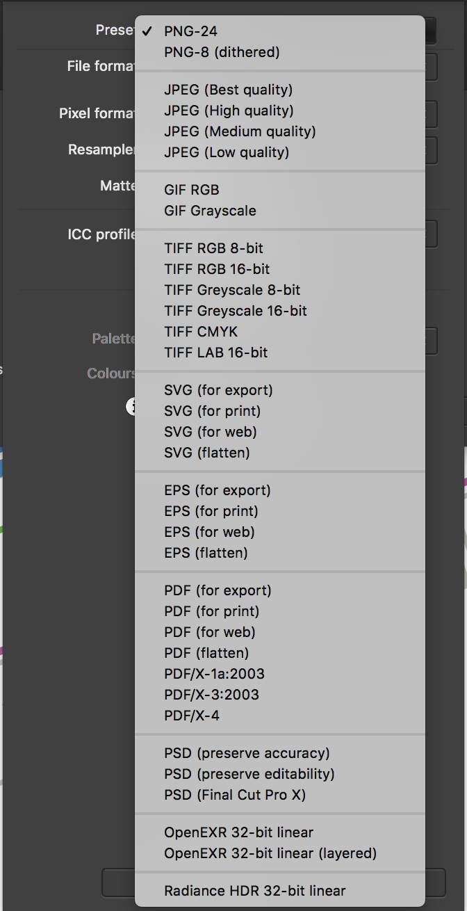
In reply to Walt.Farrell- I think I am beginning to understand how the png export presets in AD are structured. They have been confusing for me as it implies that there are only those two options available for exporting a png format file. ThePNG-8 and PNG-24. The key point is that one has to click on the MORE button and then select/choose the rasterised resolution required in the exported file. I guess the Affinity Team imagine that all users are professional illustrators and are familiar with these details. I am not a professional illustrator and I find that more optimised presets for non-specialists would be better for me; as they used to be in DrawPlus. I almost wish I had made that map in Autocad rather than Affinity Designer! Thanks for your further inputs. In reply to Owenr- I am perfectly aware that exporting to a png format I am rasterising the vector entities in the original file to a format chosen by the default presets made available in png export "persona", using your jargon. I think the point is that I was used to DrawPlus which was able to export in 32bit and got a crisp image in png format and transparent, whereas now, if I have understood correctly, in AD I have to set it myself from the MORE dialog box. Fine, I try to work with it but I do not like it. I much prefer to have the same approach as your software had in DrawPlus. At least users like myself can get results intuitively and quickly. Regarding the term I used in my reply "resampling" I accept the point that being the original file a vector quantity made up of n-vector entities, every time I make an export the file is being sampled rather than resampled from vector to raster pixel. I actually implied this function but I accept that sampling rather than resampling is the correct word to use. One of the problem I find is that Serif's business format since moving to the Affinity new software is that the old reference manual that was available with DrawPLus, PagePlus, PhotoPlus, etc. have been effectively discontinued. The built-in help file is rather fastidious to search through and often does not provide the information required if one is looking for detailed explanation of how the, for example, export png function works. I assumed there were only the two presets mentioned earlier whereas now I understand there is a plethora of other choices to make by clicking the MORE button. Of course the fact that PNG-8 or PNG-24 do not refer to what they imply does not help. Thanks for your patience and inputs.
-
I followed your advice by resampling at 2416 px. The resulting png file is good. Issue closed. I hope Serif will improve the export dialog png options in future so as to make it more straightforward to resample at the relevant optimal pixels. They ought to have 24, 32, 48, 68 and Custom. Thank you for your contribution and advice.
-
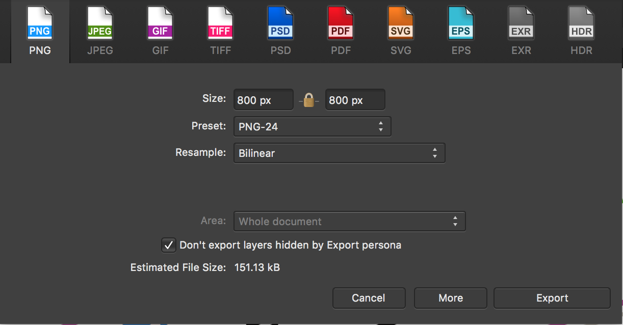
I think we need to focus on the original issue that I raised, viz. the export function in AD does not provide a good enough quality of the document designed in the workspace. In this specific example I had an 800x800 pixel document in transparent mode. The image on the document was nice and crisp and basically faultless. Upon exporting it using the default options in png available in AD, and choosing 24-bit and bilinear, the resultant png file was awful in terms of resolution. I could not use it to embed in a leaflet for final printing. I tried the other options available instead of the bilinear, but they all gave similar results to the bilinear mode. These are the facts and this is the key issue. I contend that AD as it stands is not fit for use if the png export algorithm cannot be made richer in options, hence my quotation that the old DrawPlus allowed bit depth choice up to 64 bit. Other export option in AD are fine except that I would need to revisit the Jpg export as that also did not provide me with a good enough resolution of the same document at 800x800px; but I admit that I could be wrong here as I only tried the jpg conversion once at 95% compression and the result was not good. As a way of finding a solution I just took a screenshot using the facility available in Mac OSX of the drawing displayed by AD on my iMac5k. The result was a clean and crisp png file that I could use it for printing purposes. It left me quite disappointed that I could not achieve the same result using the export function in AD when selecting png, because the option available are either 8 or 24 bits and none others. Regarding the experiment of exporting in eps format from AD: I only did this to enable me to export the document file from AD to Graphics so that I could use Graphics to convert the file, subsequently, to png because the png export function in Graphics allows me to chose the bit depth. Yes, I chose 144 pixels and I know this will result in a larger document size but the point is this choice is not available in AD that is bound to either 8 or 24. I could have chosen even 300 or 400 (but did not try) pxs but at 144 I had a crisp png conversion suitable for inserting into a brochure for printing. Now the fact that I may have upscaled the conversion is largely irrelevant because the result cannot be better than the original. The same argument is valid if one up converts an mp3 file encoded at 48kbps to 192kbps. The second file will not generate the high frequency notes because they were not in the 48kbps file. The quality will be the same but the resultant file will be much larger. I was left frustrated and disappointed that I could not achieve this result simply by using the AD png export function. There rests my case. I do not think it to be unreasonable to expect AD to be better in this png export function. I really have no more to add and would welcome a closure on this matter. Your inputs are much appreciated but please understand my point: if, on the other hand, there are settings in AD that I have not discovered and that enable me to export a good quality png file from the drawing designed in AD then I am more than willing to understand how I can go about amending the settings and proceed to export a fit for use png document.
-
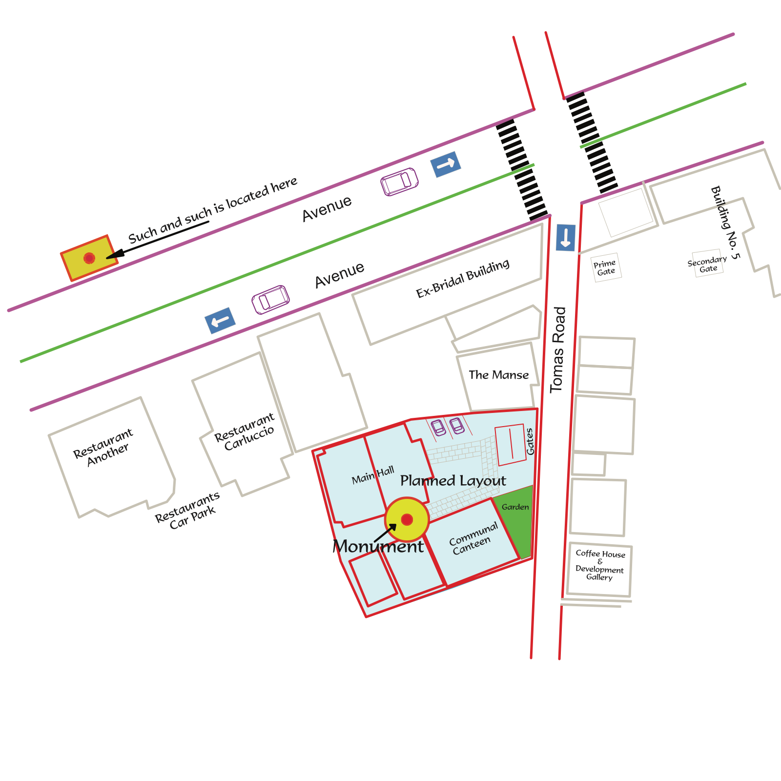
Wow, I did not intend to cause so much work and frustration to all concerned. I yielded to your request and changed the name in the file to enable me to upload it. I attach three files. 1- Map for test.png is exported from AD using the standard default PNG-24 bilinear. 2- Map for test.eps is exported from AD using Raster DPI 300px Postscript 3, again an almost default export except for the choice of DPI which was selected by me at 300 DPI. 3- Map for test exported from Graphics.png was generated after importing the eps file (2) into Graphics and then re-exporting the same file into png format at DPI 144. Results: Export 2 is poor. In analogue terms the high frequencies have been cut off and whereas the original file in AD is beautifully crisp ( I use an iMac 5K retina) the resulting png file is far inferior. Export 3, compared to 2 is far superior in high resolution, which translated into the frequency domain means the high frequency loss effect is negligible. Incidentally, taking a screen shot from the document area in AD results in a Mac png file that is far superior to the equivalent export in png from AD (i.e. 2). See Screenshot1.png. Finally, to prove that the eps file imported into Graphics was of high quality I took another screenshot on my iMac and I attach it as Screenshot 2.png. I hope now you have enough information to help you understand that my original comment was rather justified. Please ensure you view the attached files in Retina display, at least 4K, else the comparison will not be effective. I look forward to your comments. Map for Test.eps
-
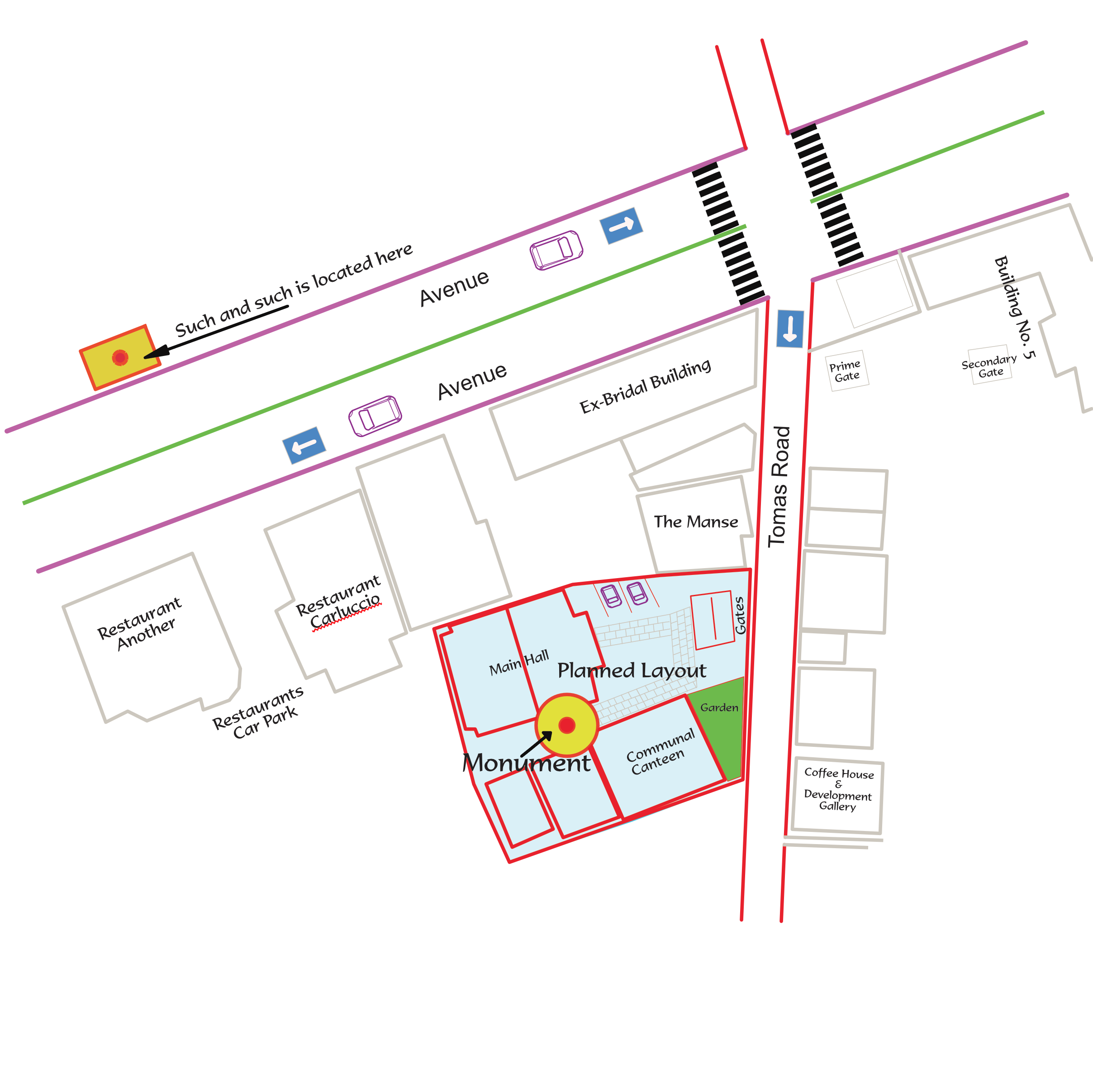
I do not agree that my post was generic or poor in details. I gave a comparison that the vector diagram exported to pdf resulted in a file of 600 KB. This is a relatively large file for a pdf containing 95% of vector entities. The png export at 24 bit, the default depth, resulted in a file of just 50 KB. This is far too low and my expectation was that it should have been more in the 200 KB range. Indeed when I exported the same vector diagram in eps and then open this eps file in Pixelmator and re-exported in png the quality of the resultant new png export was significantly better than the AD export and the file size was around 160 KB. As to the ADVANCE button I could not find one, see screenshot attachment 1. I did see a button with the inscription MORE (screenshot2) and that provided different options for export depth or compression but in png format the choice was still limited to 8 and 24. The same depth I referred to before; and I had used 24 bit previously when the resulting file was 50 KB as mentioned previously. I could not post the original vector diagram as it is confidential for now. Instead I provided the resulting byte size of the exported file as I thought those in the know would understand the implication of exporting a file that in pdf is 600 KB and in png is barely 50 kB. In ay event to get a quality png export I had to resort to using a lower grade program than AD. I never experienced this problem with DrawPlus before. Hence, I was quire surprised. I am still having to export vector files from AD in eps and then convert then to png using another program. The screenshot below shows a file size of 151 KB but the file I opened for this message is a different one from the one I refer to in this message.
-
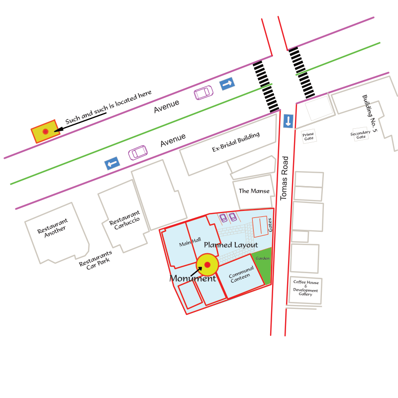
I exported a vector drawing in AD for Mac in png format and the resultant resolution was very poor. I also tried in jpg mode and it was equally poor. Exported as a pdf the file resolution was good. The resultant file was around 600KB whereas the png file was around 50KB. I then looked into DrawPlus and noticed that the export functions available in that program were far superior to the current AD. The png format could be exported in 1-4-8-24-32-48-68-CMYH and MONO bit depths. Why is it so poor and useless in AD for Mac?
-
What you say is correct. However, it seems that even Microsoft has implemented it in the mutually exclusive format. At least that is how it works in Word for Mac 2011 and Publisher (for Windows) 2010 & 2013 versions. I suggest you try it out. I am preparing a font set with the key OT GSUB tables so that you can test them out. I know your programs can display up to SS20 but only 6 are shown because I only created 6 SS tables. The point is that the MS App solution is very practical as it displays the first six, in line with my table, and then displays the lower 14 as the default glyph. As it stands these features in MS Word or Publisher are working correctly and are also user friendly. Yours look the best and the most complete but requires more work to be done to make them practical and useful. Bear also in mind that when the OT feature specifications were written there were hardly any applications that could use them or even compile the GSUB or GPOS tables for font creation. Then Microsoft released Microsoft Volt to generate OT features. In short, the provisions in the specifications have to be referenced to what they have implemented in their own Apps. For example, my investigations into SS and Salt show that they both do the same thing except that in SS the table is arranged as a column vector arrangement of glyphs whereas in the Salt table the arrangement seems to follow an X-Y matrix. I have tried different permutations in Publisher, as it provides both SS and Salt tables, and I can achieve the exact same functional result. In the end I will decide to use the SS option as that is available in Word for Mac, whereas Stylistic Alternates is only available in Publisher for Windows. I was attracted to the Affinity series because it seemed that your set of OT features was more advanced. As it stands I cannot use it whereas I can use Word for Mac and Publisher is a very user friendly way, which is the way these advanced typography features will have to work for ordinary users. I have even arrived at the conclusions that for the Western European languages all you need is a Salt table, ligatures, old style and proportional numbers and kerning. The rest is of doubtful use. Please bear in mind that I am aware that the best and most complete OT features are to be found in the Adobe Apps and Quark Express App, but I have not had experience with them hence it could be that my judgement is not totally correct as it is based on the MS Apps I quoted above and how they have implemented their typography features in those two Apps. Apple also does not do a good job in implementing OT features in Pages hence there is a real shortage of good Apps for testing OT features during font development. You will be releasing Affinity Publisher later on hence I recommend that you review these OT features in time for that release.
-
I am afraid I need to report that the Stylistic Sets are not working correctly. As they are now they are not mutually exclusive. I loaded a font with six tables of stylistic sets and although I can choose each set individually when pressing the corresponding radio button, one is inclined to tick the other radio buttons, for the reasons I mentioned in an earlier post, and the result is somewhat chaotic. Please look at MS Word for Mac 2011 to see the correct implementation of this feature. They need to be mutually exclusive and be able to provide either single letter substitution or whole paragraph style substitution. See the attached files. Please amend these features at your earliest convenience. The panel in Word can be scrolled up to SS20.
-
Let me clarify how this feature works currently in the Affinity Series and how it should work. If the font chosen is type OT and suitable tables are present in the font set for stylistic alternates then Affinity works by selecting one particular letter that the user wants to change, by highlighting it, and then, by pressing the Stylistic Alternates button, that letter is replaced with one only other letter. This, however, is not how this feature should work. The proper function is that ticking the SA button it should open up a dialog box and provide a list of the alternate letters that are available for that particular selected letter. I just retried it with my font, which contains six different styles of the capital letter L, to mention just one. Clicking the Stylistic Button, after selecting the letter L in the text I am writing, I get a substitution of the first letter L I coded in my table, the other 5 are ignored and I am given no choice to sequence through the whole set. This is not how this feature should work. Upon ticking the SA button for the letter L, as I the user feel like I want a different style, on the basis of "when I want and where I want" Affinity should open up a dialog showing the six, to stay with the example quoted earlier, variations of the letter L. Then I choose one of those six. Regarding the Stylistic Sets, they work fine. My only criticism is that, again, ticking, say SS1, should open up a window that shows me what style set is coded in SS1, etc. You do this correctly in DrawPlus for Windows where you show both the row SSx and, at the same time, display what kind of style is embedded in that choice of SSx. That is all. Otherwise I agree that your OT feature Palette is one of the best I have seen so far. Making these two corrections would not require a long development time. As it stands, though, the OT feature palette is not very useable hence I have to test either in Word for Mac which has a good set of Typography features, bar the salt table and Swash table, or if I want to test these two tables I have to go to Publisher for Windows. I got excited with Affinity Designer and Photo because of the OT palette. Finally, I thought, I can test all the features with one program! And that is why I am urging you to hurry up and make these changes! I agree with your clarification: "These attributes are applied on a per-character basis, the same as font and pointsize, not per-object or per-layer." Obviously if you select, SS1, by ticking it, before you start writing text, then that selected SS1 style will be applied as the default style until SS1 is unticked and then the default style of that OT character set, becomes active, again. This will be relevant for Publisher more than for Designer and Photo.
-
Unfortunately with the current offering in the Affinity series you are not able to do just that. Illustrator can do that and much more because it was designed properly and is the reference App that all others try to emulate. The only program that can do that for you now is Publisher 2010 or 2013. But with a program change the Affinity series could do the same. But I fear that this issue is not regarded as a high priority feature. Indeed, I am becoming critical of Serif's offering in this series. Also, I have learnt that the Apple Store is primarily a source of inferior software. It sounds good but it leaves you disappointed and out of pocket! Sorry guys at Serif but I think this is largely true.
-
Double click on the zoom tool = 100% option
Al Grasso replied to Shmoo's topic in Older Feedback & Suggestion Posts
Affinity Designer: Zoom tool I am surprised to find how primitive your zoom feature has been implemented. I can't help being sarcastic with the following comment: just make it the same as in Drawplus 5, not the 8 even, just the 5 as that was far more advanced and practical that what you provided in Affinity Designer. It is just ridiculous gentlemen to sell an App with such basic tools. -
I cannot find the pencil tool at all. Any idea where it is hidden? I looked at the Customise Tools but could not find it there either.
-
It seems to me that you do not have a full understanding yet of the many OT features, which is not surprising as there are so many of them. Stylistics Sets can be from 1 to 20. How you display them is a decision you make when you develop your App. In this case you have chosen to lists the heading and allow the user to know what is in each set. A daunting task for any user and makes the feature very unattractive. Using toggle switches to enable/disable the feature is poor design. I am not aware of "sa01", "sa02" etc as you quoted. I think you might be a bit confused by the many variations of tables available. So far as I know there is only one GSUB table for Stylistic Alternates and you can choose to make it for single substitutions or multiple substitutions.This table is known as "salt" and there is only 1. I admit I have not tried to see what happens if I duplicate with another salt 2, salt 3, etc. But, thinking about it, there is no need to duplicate this table as you can list on the same table n-substitutions for each letter or number or punctuation you may want to create alternates for. So one table is enough. What you are implementing in your Stylistic Alternate toggle switch, is the single substitution which is useless. The only way you can make this salt feature useful is to do it the way I am recommending which is the way those typo geniuses of Microsoft has implemented it. Your solution is amateurish not professional. So please change it. Look at Publisher 2010 or 2013. The same comment applies to Affinity Photo, same function and same limitations. I have just tested it a few minutes ago. The change is quite simple to make. I also advise you to change the options in stylistic sets else users will not find it useful at all. You need to provide a dialog box which shows the corresponding style in the stylistic sets. Imagine you are using the feature and want to choose 1 of the 20 styles embedded in the font. Look at Word for Mac 2011 and see how they implemented the Stylistic Sets 1 to 20 properly and professionally.
-
I don't think that it is much different from the stylistic sets 1 to 20. The GSUB table is much the same. What you need to do is to have the toggle button on the Typography Palette to open up a dialogue box which lists the glyphs defined in the SA table. The stylistic sets do the same, I am wondering now if they do the same in Affinity Designer. In Word for Mac 2011 when you toggle the SS button a dialog box open up showing all the available stylistic sets defined in that font. So for the Stylistics Alternates you have to do the same thing but refer to a different look up table to bring out the glyphs defined in that specific SA table.
-
The font I use is designed by myself and has many Open Type features.The stylistics alternates defined in my font work in Publisher both 2010 and 2013 releases.Both version contain the Stylistic Alternates feature. Regarding the test program: I am using Affinity Designer, which I bought mainly for the attractive OT feature palette but I was surprised to see that the SA did not work. I cannot provide my font because it is a big font set but if you need one I can quickly make one up for you with a SA GSUB table so that you can test the stylistics alternates. The stylistics sets, ligatures and other features seem to work. I can't remember though if the swash features were working. Let me know.