nmatsuo
-
Posts
11 -
Joined
-
Last visited
Everything posted by nmatsuo
-
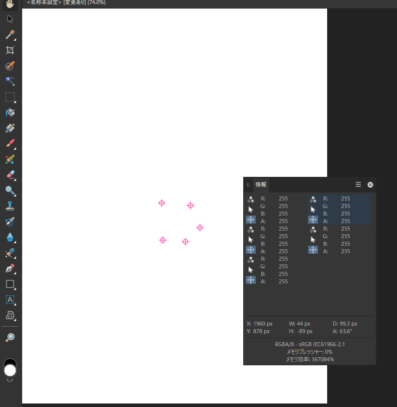
While color correcting using the info panel in Affinity photo, I always set up 3 point samplers at a time. They are placed on the colors that correspond to black, white and gray on the image. Although Affinity Photo allows multiple points to be placed at will, it's so hard to find the differences among each ones on the info panel. I think it would be much easier if each sampling position were just marked with a sequential number such as 1234. Please consider.

-
On creating my photobook in Publisher, frequently I wanted to change the frame size while maintaining the white space between each photo. However it seems we have no choice but to make full use of alignment panel and snap features in Publisher. On the other hand, Adobe InDesign has a solution for this case, called GAP tool. Tried it immediately and was amazed at how easy it was to resize, and I can't give it up now. There should be the ability to resize based on the blank space, not the object. I hope you will consider😋 FYI:https://books.google.co.jp/books?id=u0oZBwAAQBAJ&pg=PT49&lpg=PT49&dq="gap+tool"+indesign&source=bl&ots=_li1ZN1Gj7&sig=ACfU3U01v1AdyEAdmOpwE1HCjdYyYm_I8A&hl=ja&sa=X&ved=2ahUKEwjZhpT0jIqCAxXciFYBHd2bAzA4RhDoAXoECAUQAw#v=onepage&q="gap tool" indesign&f=false
-
Sorry, I didn't realise this was an archived thread and commented. I've made new submission as follows.
-
Accidentally replied to the archived post, so posting this again as a new topic. Affinity still lacks original suggestions from nine2020 and I completely agree. Especially Composite Font is essential. Actually in non-English texts, it is common to change the font to match the text character. For example, Japanese text have to use Japanese font, however it's not good for alphabet text or numeric one. We'd like to use Helvetica, Frutiger and other famous roman fonts instead. Of course, this can be accomplished by handle each one with application's UI, but this is a tremendous task with a large amount of text in Publisher. The true power of Composite Fonts is also realized when combined with the Reduce Font characters. By using the Composite font, we can save a tremendous amount of memory for our fonts for languages with very large alphabets, such as Asian languages. The following entries are easy to understand. https://www.w3.org/TR/jlreq/#mixed_text_composition_in_horizontal_writing_mode https://www.globalizationpartners.com/2016/03/09/illustrator-working-with-composite-font-for-japanese/ Text font is responsible for 70% of the importance in design. Please consider.
-
Affinity still lacks original suggestions from nine2020 and I completely agree. Especially Composite Font is essential. Actually in non-English texts, it is common to change the font to match the text character. For example, Japanese text have to use Japanese font, however it's not good for alphabet text or numeric one. We'd like to use Helvetica, Frutiger and other famous roman fonts instead. Of course, this can be accomplished by handle each one with application's UI, but this is a tremendous task with a large amount of text in Publisher. The true power of Composite Fonts is also realized when combined with the Reduce Font characters. By using the Composite font, we can save a tremendous amount of memory for our fonts for languages with very large alphabets, such as Asian languages. The following entries are easy to understand. https://www.w3.org/TR/jlreq/#mixed_text_composition_in_horizontal_writing_mode https://www.globalizationpartners.com/2016/03/09/illustrator-working-with-composite-font-for-japanese/ Text font is responsible for 70% of the importance in design. Please consider.
-
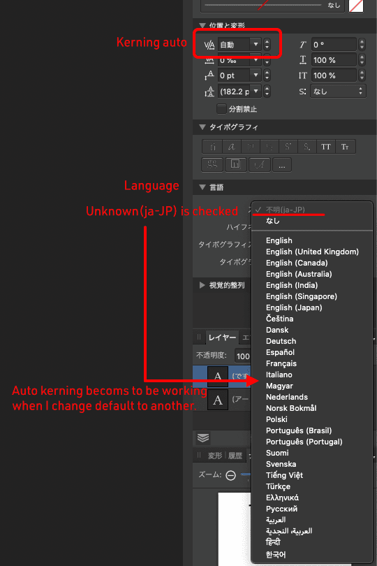
Thank you, Walt. I'm Japanese and I'm always using Japanese text in Designer. I had been wondering why Japanese text does not have the differences when the value of kerning setting is set to "auto" or "0". Since it works with Publisher, I assumed I must have to switch Publisher when I use the kerning text in Designer. Thus I was misunderstanding Designer does not have auto kerning option for text. I'm aware auto kerning for alphanumerical text is working in Designer and "Unknown" is selected at Language property for some reason. On changing this to another language, for example "English (Japan)", auto kerning for Japanese text becomes to be working as I expect. if I were using a non-Japanese version, I might not aware this issue. I hope this issue would be fixed in next release.
-
I love Affinity products but there are still insufficient points. Please forgive me for appealing the missing features I really want. State Previously known as frames, states are used for animation purposes. They are also used for defining behaviors in cases of symbol buttons like Up, Down, Over (changing the visual style of buttons on click, release, and hover with the mouse). Common examples of symbol with states are buttons, checkboxes, and animated toggle buttons. These symbols need to change when users interact with them by tapping or hovering over them. Currently Adobe XD has this feature recently. I believe "State" must be essential for creating our design mock-up soon. Auto kerning option for text Kerning involves adjusting our typography to look right rather than creating mathematically equal spacing. Though we can set them one by one manually, it's difficult to do with a large amount of text. On the other hand, I can see this feature is only available in Publisher. This must be also essential in Designer. Thanks and regards, Naoki Matsuo
-
Japanese Vertical Text
nmatsuo replied to Pedro Dias's topic in Feedback for Affinity Publisher V1 on Desktop
Agree, but it looks rather difficult to implement this feature. Recently, iWorks and CSS in browsers are supporting vertical-text as follows. https://tympanus.net/codrops/css_reference/text-orientation/ https://support.apple.com/en-us/HT209535 There are some amateur programers in Japan who try to do into their own application. Their answer to the question in the community forum might help for implementing vertical-text into Affinity products. Please review these threads. https://teratail.com/questions/40691 https://teratail.com/questions/8881 Additionally, MS has provided code sample for managing vertical-text. It would be helpful. https://docs.microsoft.com/en-us/windows/desktop/directwrite/vertical-text Anyway, it's too hard if programer does not know CKJ text itself at all. -
Thanks, R C-R. I can make sence what is occuring on my canvas. Oh, I see..... :o Thank you!
-
Dear team, Though I had been using Fireworks for 15 years, I've just decided to switch to AD. I love it so much and I'm very looking forward to symbol and previewing for export image. Please keep on. BTW, I'm aware unknown purple outline appears around a first letter when I type the text on the canvas. Is this a known behavior? If it were to be a bug, I'll log it to Bug form. Thanks,