kanihoncho
-
Posts
154 -
Joined
-
Last visited
Everything posted by kanihoncho
-
The crop tool grid appears and disappears and there are no handles. I also get weird shapes that appear and disappear. It also seems to turn into a rotate tool . . . .
-
Is this on any to-do-lists? These really are a must have!
-
Affinity Presenter
kanihoncho replied to wishimac's topic in Feedback for the V1 Affinity Suite of Products
Just take Designer and add what Keynote can do and call it Affinity Presenter! It would be GREAT to not have to relearn how to design projects based on the lack of what an app can do. Of course, I don't have any clue what's required in order to make this possible . . . I want to learn Keynote. I have tried it a bit and it sucks but I can tell it's better than powerpoint. -
Adopting MS Word type practices is bad. It is a letter writing program not a professional page layout program although they try to make it one. If Serif would just automatically set type when created according to traditional type software practices this discussion would be moot. That means when you select a 12pt type size it is automatically created at 12 on 14 or 12 on 15. Whether Serif uses 14 or 15 pt leading is immaterial. By default it is "set solid", equivalent to using no leading at all in metal typesetting, that is the leading is automatically set to the type size (12/12, 15/15, etc). This crowds lines and makes it difficult to read while still in the design phase (not production) I come from a typesetting background and would prefer that the leading override be replaced with leading. When I start documents I do not preset all my styles. I work in the document for a bit to find the natural rhythm and hierarchy. Only then do I create my styles from the text I have already set in order to complete the document faster. InDesign can create the styles from highlighting the text to define the style. It takes the current settings of the text to create the style. I do not have to recreate the style from scratch by entering numbers in the paragraph panel.
-
I am a designer that has grown up with Pagemaker, Quark, and InDesign. All of these apps had type size and leading next to each other. I've always wondered why the leading in your apps were always set solid by default (12pt type on 12pt leading, 13pt type on 13pt leading, etc.) Most true design applications create text with two or three point leading automatically (12 on 15 for example). I recently discovered that this leading setting is an override feature and that to have a default leading one must preset all the headings and body text using the paragraph feature. You have adapted many functions that operate like MS Word. This is not a good thing as MS Word is a typing program that pretends to be a page layout program. I do a lot of different magazine and catalogs and until I get into working solidly into the project I am constantly changing headers based on experiencing the project. As I develop hierarchy via spacing and text size I reach a point where I will create my presets for each to rapidly create the project. Is there anyway to restore ta REAL leading function to replace the leading override in the character studio window?
-
But they cannot be locked in those new positions can they? They are subject to being moved by accident I would guess . . .
-
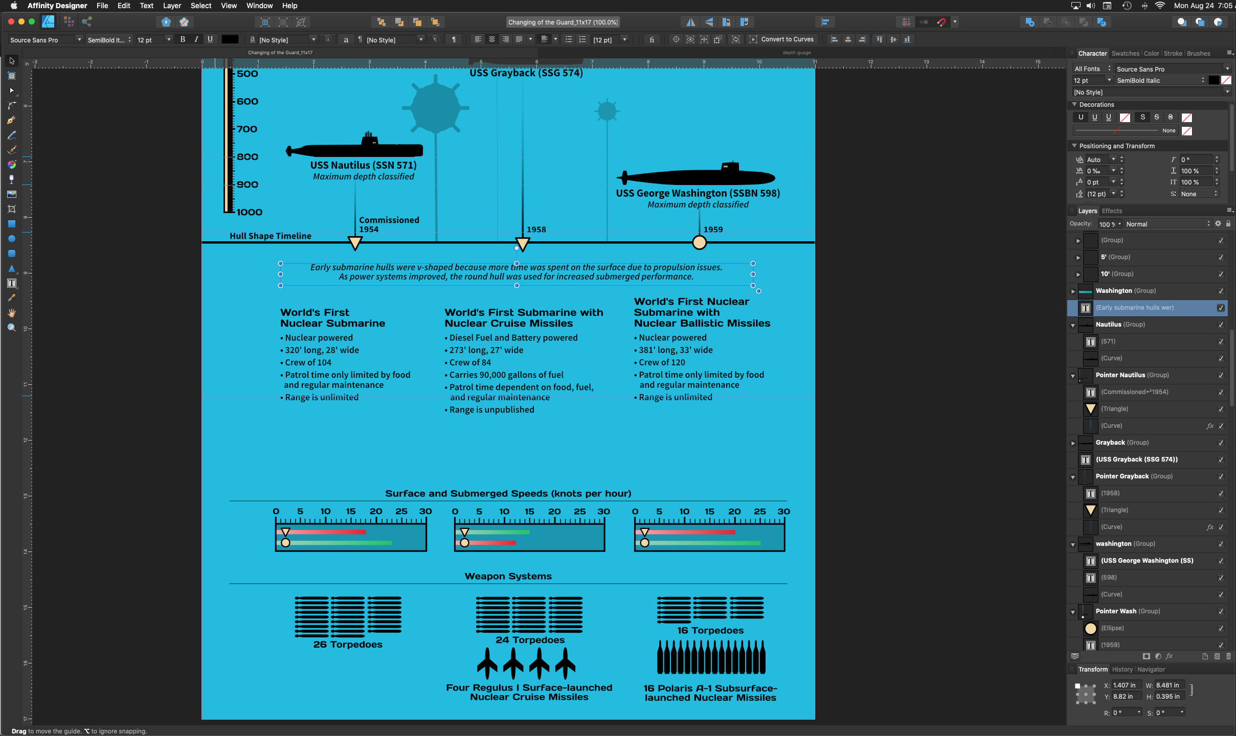
I am right handed and have a 21 inch screen and I have to reach all the way across to the left side of the screen when I need to select tools. Is there anyway to move the Tools Bar so that it locks to the right side of the art board? Like the mock GUI pictured . . . thanks

-
DOH!
-
Looks like an example of where the software and OS use the same key combo for different purposes . . .
-
I don't have recording software. The actions above explain exactly what happens. Below: In the top photo I selected text. I then held the option key (option D on Mac selection objects that are not sequential) to select text in another layer. This example end up being different because of two text objects. The screen is all white when two shapes are selected.
-
Update: it happens when I try to use the option key to try and select two layers only (on Mac) in two different groups (one in each) . . .
-
I switched back to the move tool and clicked on the paste board and everything came back . . . go figure . . .
-
I hit a key or two by accident and suddenly all my artwork is invisible. They are still in the Layers list. CMD-Z doesn't undo what I did . . . Any remedy? Help, online & forum search reveal nothing . . . . TIA
-
If the spellchecker doesn't tell you "there are no misspelled words" or "done", what's the point? If every new user of this function is going to post here with this issue, it sure is a lot of wasted effort . . . just a rhetorical statement . . .
-
English, every thing else there is set to auto . . .
-
None of the buttons do anything. I don't know if I had any misspelled words. You would think that if Publisher didn't find any misspelled words it would notify me like InDesign does . . .
-
The spell checker for a text body does not work at all. I select the text then top menu > text > spelling > spelling options. I then get the pop up window that does nothing at all.
-
When I use the crop tool in photo 1.8.4, and only cropping one side, it adds the amount I am cropping to the opposite side. I have done this repeatedly on separate files. I have even rasterized and trimmed the photo and it still happens. I am on macOS Catalina 10.15.5.
-
Publisher is my least favorite app of the three. I'm most likely going back to InDesign . . .
-
there is no tab ruler to show where tabs are located in AD and you have to enter numbers manually to set tabs. In AP there is a tab ruler where you can select the tab in the ruler and move it around and the text moves with the tab. Very intuitive for visually spacing text tabs rather than entering regular spacing increments. Every time you mess with tabs in AD the text jumps around and you can't create any accurate spacing . . .
-
The tab feature in designer is pretty useless. Before I spend time doing this with a complicated tab setup, can I import tabbed text boxes from publisher into designer without tabs getting screwed up?. TIA
-
then why does every other text-based program automatically have a default leading? Why does publisher automatically set solid all fonts? I have to manually go in every time to set the leading every time I add a new font . . . this should be an automatic setting like every other program. if you don't like the automatic setting THEN you can go in and alter manually or create a style. I don't feel that I should have to create styles every time I open a document, especially on new projects. I fool around with styles manually and then create a style sheet AFTER the project is finished so that other designers know what's going on.
-
Indesign does nothing with text until you establish a style. I've gone into styles and they seem very similar to the way word is setup. I think that spacing before and after paragraphs already built in is an MS Word feature. Another issue with Adobe is that the same function has to be achieved different ways in two programs. Tabs in Designer are pretty much useless when creating graphs and charts. Why can't they bring the tab function from Publisher into Designer so we don't have to learn another way to do the same? I have been using these programs a lot lately and I'm starting to not like them. I have a lot of little features that just suddenly refuse to work until I restart the programs. Perhaps I should start maintaining a list . . . these are never repeatable and happen sporadically. Another issue is leading is frequently the same size as the chosen font. 12 pt type should be 12/14 or 12/15 by default. Same for all other font sizes; the type size + 3 points is standard leading for most programs. These apps are not growing up fast enough. I realize they are only $50 but I would pay more for all the exciting initial debut features these apps have and the adoption of the myriad of recommendations people have made. Sorry about the rant but these apps are starting to disappoint me the more I use them. And I don't really want to go back to Adobe
-
I am a Quark and InDesign user and I think basing your text manipulation on MS Word is a HUUUUGE mistake. It's extremely unprofessional. I'm don't think I'm going to continue with publisher. Photo and Designer are great apps but I think this one is a complete failure . . . sorry. I'm going to purchase another computer so I can continue to use InDesign from CS6 . . .