kanihoncho
-
Posts
171 -
Joined
-
Last visited
Everything posted by kanihoncho
-
Just bought a new M4 Mac Mini (512 storage, 24 GB RAM) ; can I install and run the suite on a fast external SDD? Thanks
-
Boundary sizes of vector objects
kanihoncho replied to kanihoncho's topic in Desktop Questions (macOS and Windows)
Boundary . . . yes. the bounding box that defines the vector object. I just saw that when I copy and paste the vector, the bounding box is just the minimal area taken up by the vector object itself. When I place the vector, it includes the area defined by the page size . . . I will have to look into artboards in Designer as I don't know if they are the same thing as used in Illustrator. I've never used slices but aren't they used to cut up images for interactive web use (like GUIs and links assigned to the slices)? Will look into your recommendations this weekend . . . -
I remember a long time ago when working with Illustrator the page size would define the boundaries of the vector object. If you created a vector as 3"x3" on a 8.5x11 page, the boundary for that object would be the 8.5x11 page. When you have created multiple, separate small vectors (for the purpose of a vector library) and placed them in one document, selecting the vectors became difficult because of the large overlap of the boundaries. At the time I would reduce the page size to fit the vector rather than enlarging the vector to fit the page. So I see that illustrator, I have been using it again at work after 5 years, allows you to switch to an artboard where you can change the page size similar to cropping an image. This reduced the boundary size at the same time. Very quick and a nice improvement . . . So I have been creating separate vectors in designer and have once again run into boundary problems when combining them in a new designer document. I'm assuming I am going to have to compromise by enlarging the original vectors and reducing the page size to minimize the boundary to the vector object itself. I have found that I can export as an .svg file and can define and export the vector object as "selection only" which will minimize the boundary size. Has anyone worked this way that might have a better solution? TIA . . .
-
A couple of questions about this image. Logo on sack made in Designer exported as png. Sack is a photo. Both combined in Photo. 1. Drop shadow - do I need to cut up the image so I just get a shadow near the base? I don't like the shadow on the front, top, and vertical right hand side (back). It's not a very realistic shadow . . . it's pushed a bit to highlight the problem areas. 2. Distorting the logo on the bag (I used perspective). I also used displacement with a live filter but not getting much visually. I would like to bend just the bottom text so that it conforms more to the flat face of the lower bag. I suppose I would have to create it as a separate element and then distort it . . . Thanks

-
I never knew these "industry standards" for type until talking with you folks. . . I just thought that's how it was. I'm just an end user! I thank you both for your insights
-
The computer eliminated 99% of typographic knowledge. Just about the only place you will find real "working" typographers (not type design but layout) are in publishing houses and ad agencies. One should not have to increase the leading of text every time it is imported in order to read the text or get a sense of what you're dealing with. Set solid is unacceptable. I think Quark and InDesign are more professional than Publisher. They are easier to use because they are more intuitive. Publisher has a lot of positives but it has just as many negatives. It is my least favorite in the Affinity suite.
-
BAHAHAHAHAHAHAHAHAHAHAHAHA!
-
Great answer for explaining the "supply side". Thanks. All the font metrics-talk aside, we still need to have a unified type size/leading interface. We shouldn't have to go to two different windows to adjust each of these settings. I adjust both at the same time. Both entries should have a size drop down or a +/- device to adjust them. Beyond the basic type sizes (which currently exist), I shouldn't have to make manual numerical entries to increase/decrease size unless I want to enter a specific number, especially for the leading.
-
My default leading is ALWAYS the same as the type size I choose. Like I implied above 12/12, 24/24, 125/125 and so on . . .
-
I don't have that and it's still not next to the type size
-
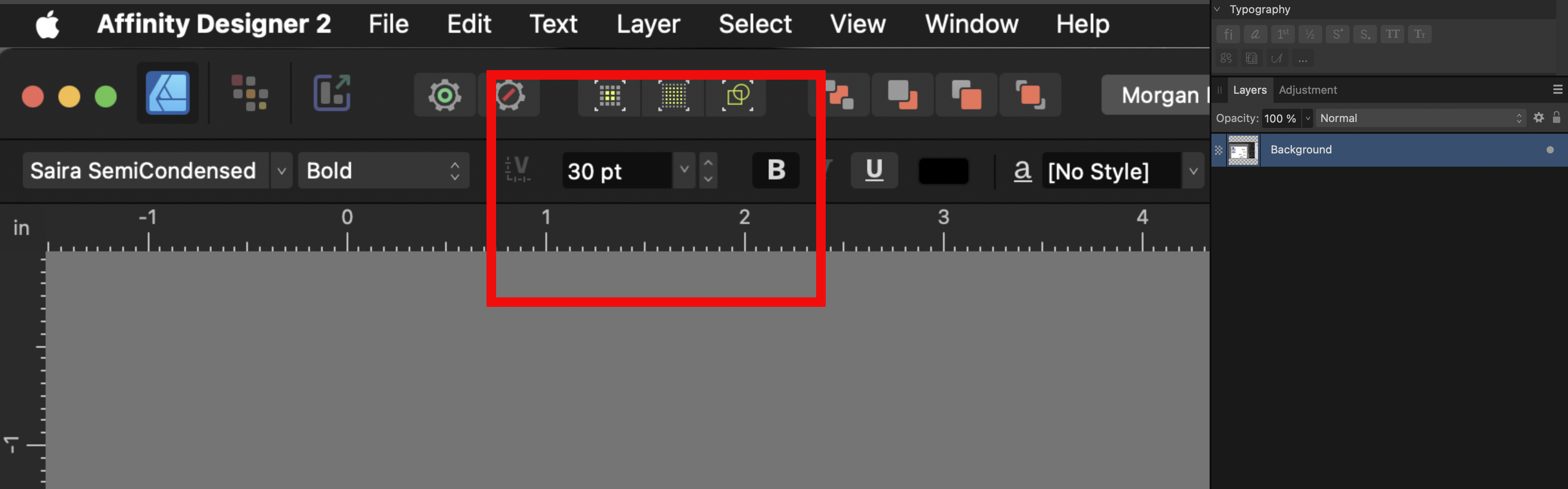
1. The interface for type control still needs improvement. Why is there not a leading drop down setting next to the font size in the top menu bar? Why do I have to go to the Character window on the opposite side of the default screen to change leading? 2. And we STILL have a default leading that is equal to the type size (ex: 12 point type on 12 pt leading) NO OTHER PROFESSIONAL PROGRAM DOES THIS! Most other programs have a default leading that is two or three points MORE than the chosen type size. (ex: 12 point type on 14 or 15 point leading . . . 12/15 . . . 24/27 . . . 125/128 and so on. Type that is 12/12 is known as being SET SOLID and is only used in metal type on special occasions . . . it is NOT used by default. 3. The problem here is that Serif assumes that everyone defines all the type styles at the beginning of a project. Being old school, this is not the case for me. Every writer has a natural rhythm and sentence structure unique to themselves. Very similar to patterns of speech. I was trained to organically develop column widths and sentence breaks to accommodate these patterns for improved visual appearance on the page and for readability. I let the words and the font of choice determine what the type styles will be. I work many pages to develop the rhythm of the document to see what works best THEN I create type styles!
-
I was hoping to get some info on physical setups but I went with the basic M4 Mac mini with 24GB ram and 512 GB storage. I bought an OWC Express 1M2 external drive and paired it with a 4 TB WD Black SN850X NVMe Internal Gaming SSD. I'm going to try and save the majority of files to the external and see how working with them off that drive works. I'll get back with speed results in a couple of weeks . ..
-
I am considering the M4 Mac mini and am curious about performance with the Affinity Suite with the base model of 16GB ram and 256 or 512 GB of storage. I'm willing to go with more of each if needed, so reports of upgrades are welcome also. I use Designer the most . . . Thanks in advance . . .
-
I'm curious as to whether the AS upgrade is coming soon or not . . .
-
Font size by one step above 16
kanihoncho replied to Iztok's topic in Feedback for the Affinity V2 Suite of Products
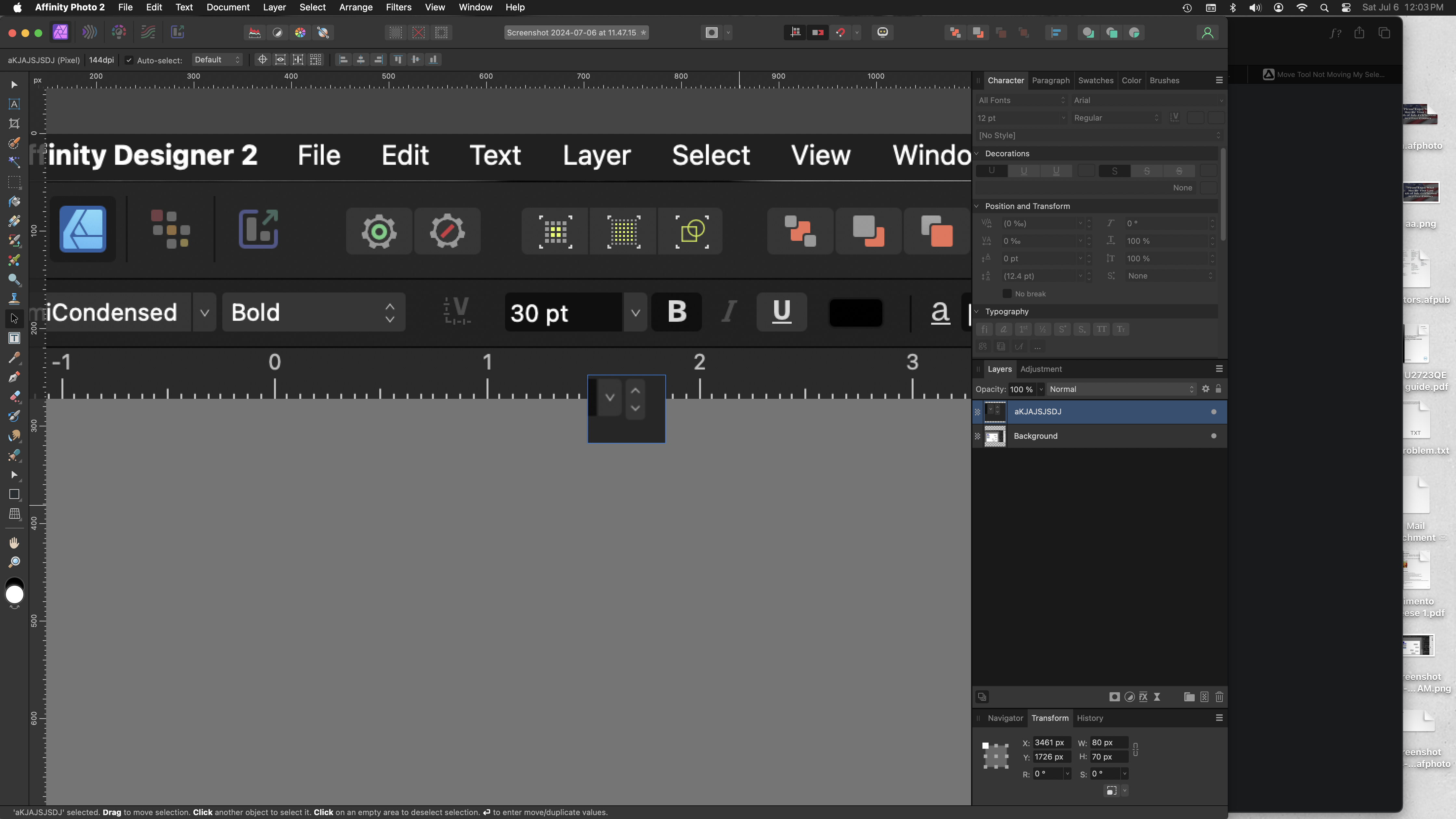
I would like to see the font menu in all the apps the behave like this. Have the drop down for preset font sizes and the up and down arrows next to it for one point increments . . . I just dummied this up . . .
-
Photo 2.5.3, move tool not working
kanihoncho replied to kanihoncho's topic in Desktop Questions (macOS and Windows)
In the lower menu bar there were three or four square outlines. I just selected the one on the left and now it works. The one selected was the second from the left. I tried to find a way to bring whatever those squares were back but was unable to do so . . . I just now saw that those squares are modes when the Flood Select Tool (W) is chosen . . . go figure -
Updated to Photo 2.5.3. I copied and pasted part of the background image into a new, unlocked layer. I can select the layer and the object but I cannot move it. I restarted Photo and my iMac and it still doesn't work . . . what's going on?
-
Hi gang, just purchased a Huion Kamvas Pro 16. While testing brushes in mirror mode I can see that I cannot scroll brushes on the pen display. I have to return to the main display M1 iMac to scroll and select a new brush and then return to the pen display to continue working . . .
-
Hi all, I'm looking at the following and I'm moving up from a tablet (which I hated) . . . Artist Pro 16TP (4k) and Artist 24 Pro (2.5k) Q1 - I would appreciate any feedback on use with Affinity Suite products, especially on the Mac as I have a M1 24" iMac . . . I am a print designer and not an illustrator. I do mostly vector work and strive to roughen up lines and do not plan on reproducing any physical, real-world brush techniques at this time. I've attached a few examples of work (for t-shirts) that I need to learn how to change the perfect quality of vectors. I have purchased some brush sets for Designer. In essence I'm a rookie at making vector art look more realistic . . .
-
I have a function question about pixel persona in Designer. When switching to the pixel persona are the changes that are made non-destructive? Does Designer split the saved portions of work in the designer and pixel personas? I'm of the mind that I should create in Designer and then filter/brush in Photo in order to keep the vector work preserved. Sorry for the stupidity. If there is a link that will save somebody warped fingers, please let me know . . .
-
Is it possible to switch keyboard commands for text only? I have a feeling the answer is no . . . Is it possible to take Command +V for "Paste" and assign it to "Paste without Format" and vice-versa? Or is this a general action that applies to everything rather than being contextual? To me it is a more useable than the existing setup . . .
-
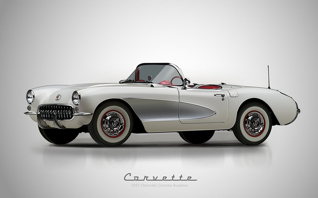
As a graphic designer I have never tried detailed illustrations. I'm more of a text/photo/artwork assembler, working daily in print, that creates simple things when I can. I have attached a couple of images of styles I am interested in learning. The yellow car style seems pretty straight forward. The corvette style seems extremely intimidating . . . Can anyone recommend a good book or website as to how these are created. There are some time-rushed movies on YouTube with no explanation. Some artists seems to create filled objects and build layer upon layer. I saw another artist that creates their line work and use a layer mask to color it in. I'm curious as to why he does it that way. Any links or recommendation would be highly appreciated . . .
-
THAT WAS EASY! MANY THANKS! Results below . . .
-
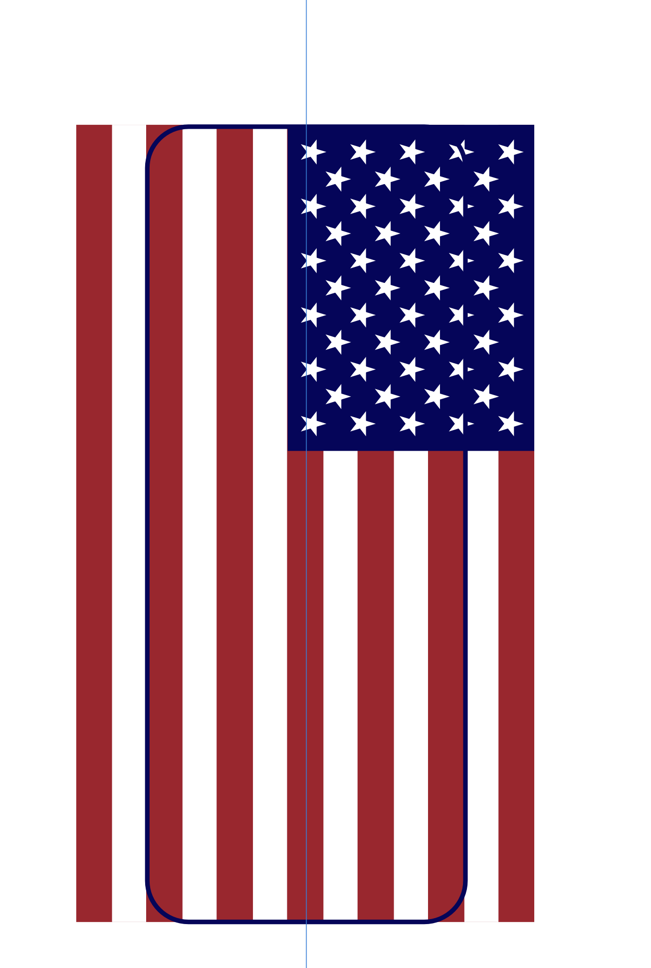
I'm making a casket icon and I don't really don't know how to approach this unless I use the coffin outline repeatedly to remove every individual stripe, field, and star. Is there a way to unite all the elements of the flag so that I can use the subtract tool to remove all the excess at once? . . . TIA. I have attached the file as well. iconCasketFlag.afdesign
-
Affinity Designer 2, todays latest version
kanihoncho replied to kanihoncho's topic in Desktop Questions (macOS and Windows)
I somehow was able to do this correctly once but was unable to recreate it. I went to transparent pngs . . Thanks for trying.