derekpadula
-
Posts
7 -
Joined
-
Last visited
-
Footnotes support in IDML import
derekpadula replied to Pedrober's topic in Feedback for the Affinity V2 Suite of Products
Agreed. I was disappointed by today's 2.4 release notes, as I don't have an interest in any of those features or enhancements, and will likely never use them. But when reading each update, I saw a lot of people who are glad those updates are coming. It'll probably be another two to three months until the 2.5 beta is announced and we'll see if they provide the features we're looking for here. -
Footnotes support in IDML import
derekpadula replied to Pedrober's topic in Feedback for the Affinity V2 Suite of Products
I feel the same disappointment. I hoped that they would add this feature in the 2.3 update, so I would then buy it during the Cyber Monday sale in November. But this is missing, as is epub export, which are the two features I need in order to abandon InDesign. Now it's a question of whether I should buy software that I can't use, in the hope that I'll be able to use it some day? It'd be nice if they would at least say they're working on it, so I could have more faith in my potential purchase. On the bright side, they announced that their future updates will arrive sooner than before, at every 4 to 6 weeks. So, we'll see. -
 derekpadula reacted to a post in a topic:
Footnotes support in IDML import
derekpadula reacted to a post in a topic:
Footnotes support in IDML import
-
derekpadula reacted to a post in a topic:
Global Layers (in Publisher)
-
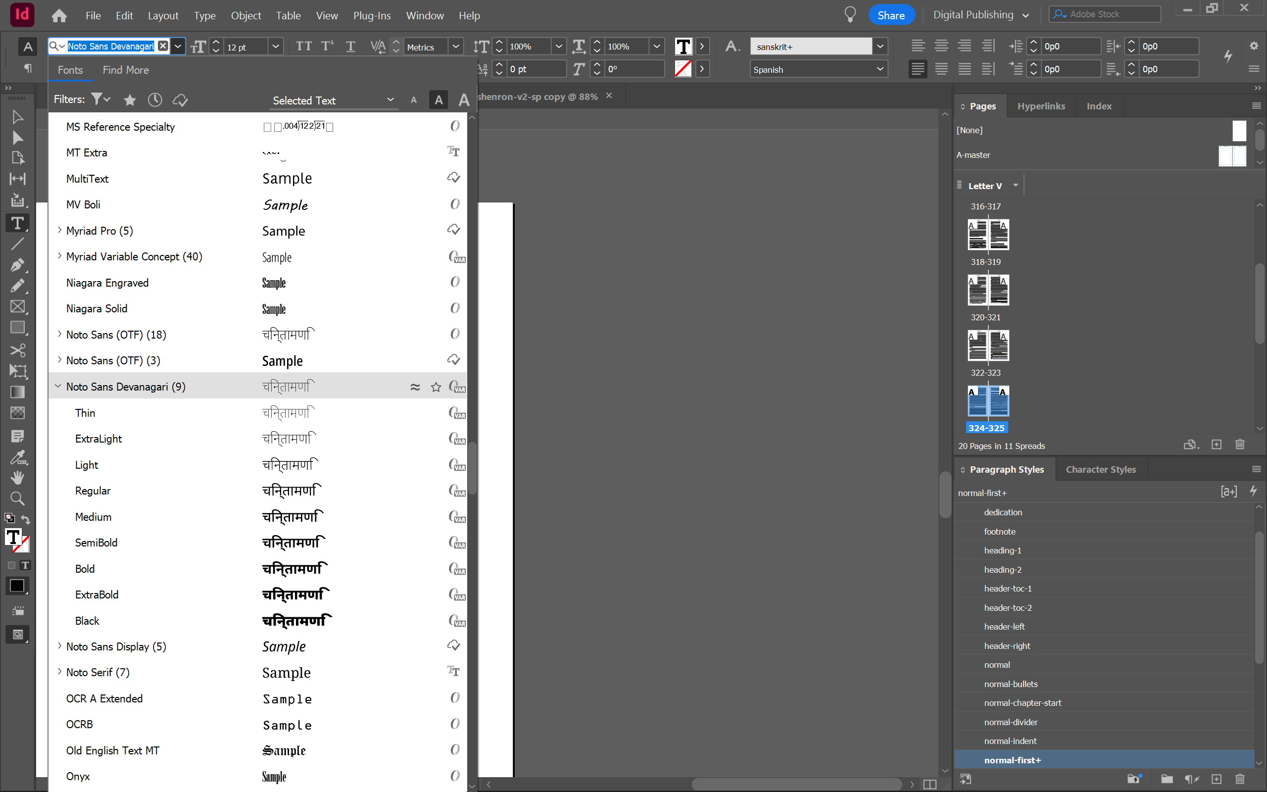
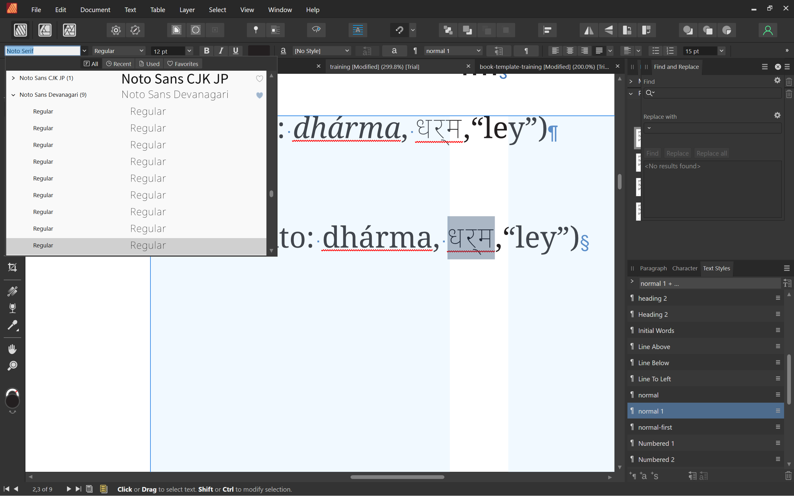
I believe this is incorrect, as I have the 9 static versions of the font installed (see this screenshot). Devanagari is offered as a variable font, but I installed 9 of the possible 36 static versions. The font can be downloaded from Google here, and it comes with both varieties: https://fonts.google.com/noto/specimen/Noto+Sans+Devanagari Perhaps your team can experiment with the two and see what's going on. In any case, if variable fonts are not supported, then why does it export properly at the Regular weight? Maybe a short-term fix would be that if Publisher detects a variable font, to render it in the app as Regular, just as it does when exporting. Thank you.

-
Footnotes support in IDML import
derekpadula replied to Pedrober's topic in Feedback for the Affinity V2 Suite of Products
Footnote importing is not arriving in the 2.2 version either. I hope they are working on it for future versions in 2. I installed the trial version of Publisher two days ago after having font problems in InDesign. I had heard good things and was excited to try it and potentially buy it. I then followed the Affinity Publisher Essentials video course on LinkedIn Learning and was impressed by how Publisher 2.1 handled certain things compared to InDesign. I thought, 'Of course! Affinity got it right!' But then I tried importing my IDML file and none of the footnotes were included. This was a shock. I'm a non-fiction author with hundreds of InDesign files that are filled with thousands of footnotes. Prior to this, I was mentally prepared to export each IDML file and switch over to Publisher, but now there's no way I'm adding those footnotes back in by hand. Same for index entries. I also tried adjusting font styles, and each time I did so, the program froze for 10 to 30 seconds. That's even with having a brand-new gaming laptop with an RTX 4070, a Ryzen 9 CPU, and 64 GB of ram. Turns out that this is a bug reported on this forum in at least 2018, and is still an issue, despite supposed fixes. Some users say it's due to different versions of the .net framework. Maybe in my case it's because I have video games installed via Steam that install different .net versions as a matter of course for being able to run the games? I tried a suggested workaround, but to no avail. In any case, it's frustrating and put a blemish on my experience. It raised concerns about the current and future quality of the app. The second deal-breaker was no epub export. This is a must-have feature for an indie publisher. Flowable text 3.0 epubs would be fine for now. Fixed are far less important. Publisher does so many things right, but as it stands, I won't be buying Publisher until they announce that they are adding better import features and an epub export feature. -
Thank you! To Komatös, I agree that a shade of grey by itself would not be helpful for two otherwise identical icons, and that's why I recommended different icons for each status report. That way, you have increased accessibility and usability for all users. Everyone could see if it's pass or fail at a glance, whether you're visually impaired or not. It's the same logic for why an 'X' mark and a 'check mark' for fail and pass are better than a 'red check mark' and 'green check mark.' Different icons express more meaning and are easier to understand. So, to clarify, I would like different icons for Preflight Status that are also available in mono.
-
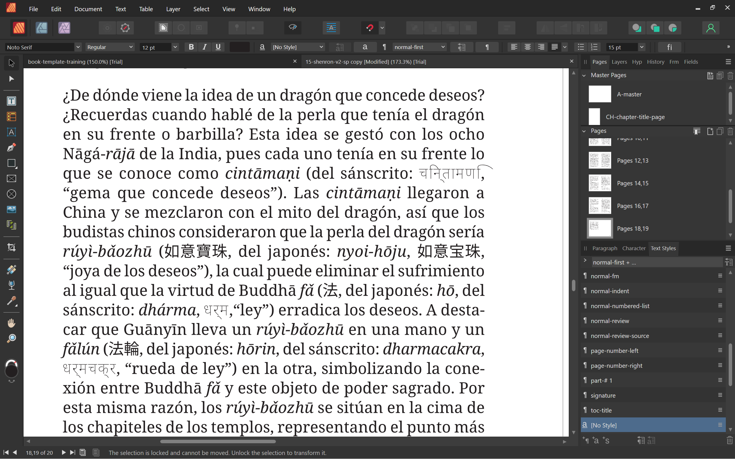
Text written in a Sanskrit font appears with a thin body weight instead of a regular weight. It exports at the proper weight in a PDF, but it looks wrong in the program itself. I have a body text that uses Roman letters, Japanese, Chinese, and Sanskrit in the same paragraph. I use the Noto Sans and Serif font families, including Noto Sans CJK JP, and Noto Sans Devanagari (as there is no Serif versions of these foreign language fonts). In the font selection field, all of the 9 style options for Devanagari are listed as "regular," even though they appear as light. This is not a problem in InDesign, where all 9 display properly, from Thin, to Regular, to Black. This is not an issue in InDesign or Word. I tried importing the text via IDML and via Word. In both cases, Publisher displays the Sanskrit text as a lighter version of its regular self. It then exports it as a regular weight. This difference in weight throws off the readability in Publisher, and may also effect the distribution of characters and line width.
-
The icons in Affinity Publisher can appear in color or mono (greyscale), but when you choose Mono in the Settings > User Interface > Mono, the icons for Baseline Grid, Account, Preflight Status, and the application's Publisher icon remain in color. The preflight icons remain in green and red to indicate a pass or fail status, but color-blind people might not be able to see the differences between the green and red. So for increased accessibility and overall usability, please consider different icons for each status report instead of a color shift. For example, the same icon with a diagonal line through it for the fail. The Affinity Publisher icon at the top left is also in color. Could you please turn this icon to mono? You already have the mono version right beneath it. The only colors I want to see are in the layout I'm designing. I find the color icons distracting, so I was pleased to see an option to switch to mono icons in the Settings. Thank you.