Amy Choue
-
Posts
86 -
Joined
-
Last visited
Everything posted by Amy Choue
-
In my case, I found the Epub export option at Reedsy easy to use and great overall, especially compared to the Word to epub conversion that's in place at Amazon KDP. I was so hoping for Affinity to introduce reflowable epub export, but Reedsy's epub export settled the matter for me for now.
-
I manually went to the Chapter headings to see whether any of them has to do with the missing font. And I realized that, Chapter headings were originally "Chapter I, II, III, etc." as that panel above shows them, but then I had changed them to "I, II, III, etc." I remember I tried a number of different fonts for the initial "Chapter I, II, III, etc.," and the missing font must have been one of them. After I changed them to "I, II, III..." though, I updated them all under one font (as the way it is done). So it seems Publisher somehow shows the past usage of fonts (which now are not used) in its preflight warnings. It would be great to know for certain though. I would appreciate any comments.
-
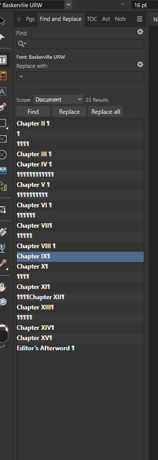
May I ask one last question? This below is what I got after clicking "Find." and none of these, when clicked, takes me to its occurrence in the text. And it shows something (Editor's Afterword) that has been deleted. Can it be that Publisher shows the usage of fonts, even when they were replaced by other fonts?

-
I think I'm beginning to understand how this is done. Thank you so much again!
-
Oh maybe is this the right place, below?
-
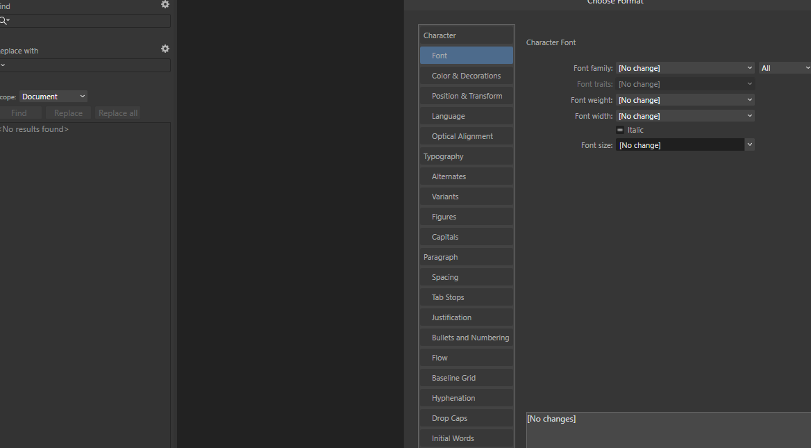
Thanks! I didn't know there was "Find and Replace" in Publisher. But am I at the right place? I clicked the Cog icon and opened a dialogue, but don't seem to see Font here.
-
Many thanks for the comments! May I ask what Cog menu is? I cannot seem to find it anywhere.
-
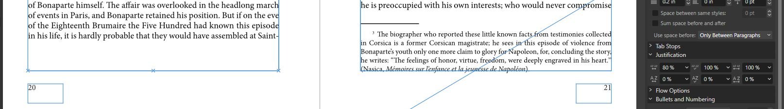
I had subscribed to Indesign, to have access to Adobe fonts, and quit it recently. Today I needed to make a correction in a publisher file before exporting it to PDF, and the "Preflight Warnings" is saying that there is a missing font and it needs to be fixed. It shows that the missing font is BaskervilleURW-Reg. What do I need to do to fix it? When I click on "fix" on the right side of "Missing font," a dialogue box opens (Font Manager), and it seems I can choose a font to replace the missing font there. Do I simply choose a font there and click on "Close"? Does this take care of the missing font error? What happens if I do not take of "missing font" and export it to PDF? I just did this and am going through the PDF to see whethere there are any texts that have been damaged/mangled, that do not appear normal. But of course this can't be trusted as a way to look for errors. It seems I didn't use that "BaskervilleURW-Reg" font anywhere in the file. If it was used, it has to be in the Headings, and none was in that font. Are there ways to go to the places in the file where "missing font" was used?
-
I noticed that when I export to PDF, the cover I created slightly changes in color. For the cover, I used fill color of pale blue and added some white and blue with paint brush. After exported, the PDF shows some reddish smudge, looking sort of like water stain. The smudge shows before the export as well, but only very vaguely (I noticed this after I exported it). But in the PDF export, it's quite noticeable. I redid the cover, using only fill color and recolor adjustment layer, and could get rid of that smudge. But I am wondering, if this sort of change in color is something to be expected, what are the ways to deal with it? Will I need to learn not to use paintbrush if the end result is to be exported to PDF? Or it doesn't have to do with paintbrush and actually is about something else? It seems there must be something important that people starting to do any kind of graphic design need to be aware of. Any comments or pointers will be deeply appreciated.
-
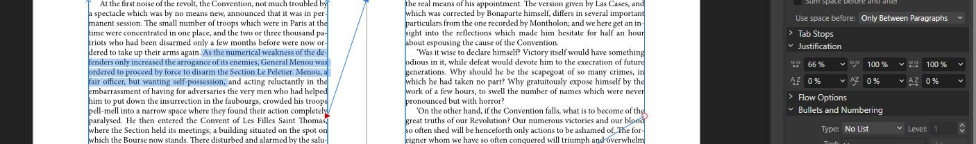
It seems Minimum Word Spacing works like charm. I'll just have to get used to this. (Why do I remember doing this differently. I am so sure of this. This is so strange). When I first discovered by chance that I can manually change the word spacing, I remembered all those odd passages I've read where the spaces between words were sometimes too narrow, sometimes too wide; somebody was trying to resolve the issues I was trying to resolve. Since the tutorials I studied did not cover much about how to import a large amount of text from Word, and somewhat more advanced skills related to format books, I am still doing this in a haphazard way. So, many thanks for the comments and help! What will the beginnerd do without the Forum.
-
It seems I'll have to uninstall Publisher and then reinstall it, among its previous versions. I'll try this and report back if anything worthwhile happens. (Edit). Before uninstalling, I tried to do the extremes with the slide bar to see what happens, and could move and split the footnote. This is really odd, I could do this same thing with so much more ease (and fun) before updates.
-
Yes, I am absolutely sure of this. I remember enjoying this greatly, so much so that I did it with manuscripts that need not be formatted. It was a great pleasure to see page numbers changing, after paragraph shortening, and becoming fewer in the end. Oh, I now remember, I even have PDFs, one with no or little word spacing, and another with much tweaking with word spacing. I'll have to look over them and try think this through.
-
I am having trouble with using word spacing in Publisher. I did not have the same trouble in the previous version, which I last used sometime around mid October. Can we go back to the previous version? I've searched "deactivate updates" and "uninstall updates" and couldn't get results. Those words sound negative but please do not take them that way. I remember instructors in tutorials mentioning users who use versions without updates and now am thinking maybe some users choose to stay at a particular version in the past for a reason. Anyhow please let me know if there are ways to go back to a previous version. This will be an immense help to me. Thanks. (I am on Windows 10).
-
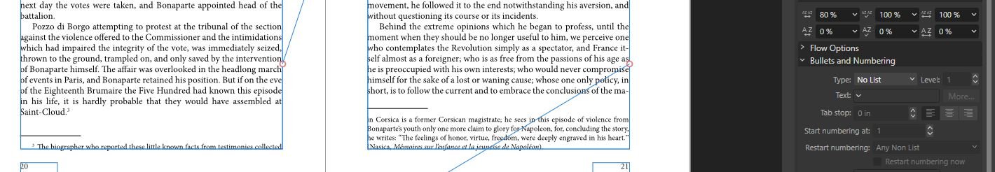
This is odd. In my Publisher, I always enable "split notes," which works fine when the notes are quite long, but doesn't work when the notes are somewhat long (between 4-7 lines long). I could fix this by narrowing the word spacing of the paragraphs that precede the paragraph with the note. I quite enjoyed doing this. This wasn't covered in any tutorial I studied; I came upon it by chance and thought "aha, this is the way orphans and widows and gaps from footnotes are dealt with!" Maybe, I wonder, if it's possible to somehow uninstall updates, the problem will not be a problem.
-
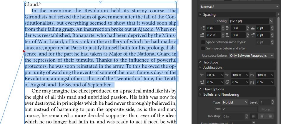
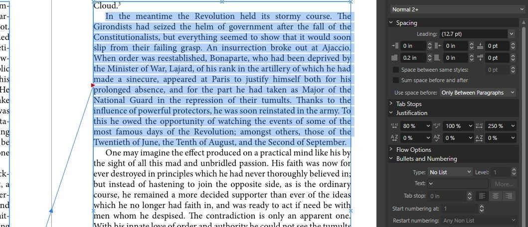
Many thanks for the comment. It was a great relief to hear that nothing has changed. But it seems so different from how I did this before. With a paragraph like the one below, I could compress the paragraph so that it becomes a line (or two lines even) shorter. If it seemed the compression was too severe, then I could undo that by increasing the word spacing by clicking. Now word spacing can be changed by using the slider, but there cannot be significant increase or decrease. Is this true? If this is true, then the issues from orphans and widows, and the blank spaces due to footnote placing, will be much harder to resolve. Or is this not the case? How can we reduce the blank space that footnotes create?
-
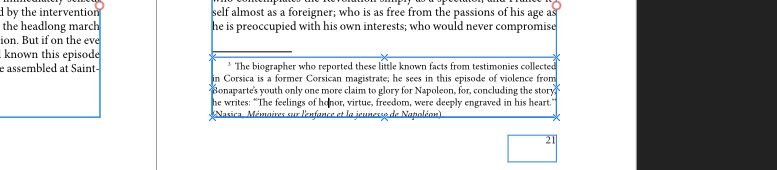
I just realized that word spacing the way I did before was also very useful in moving the footnotes around. Publisher seems to prefer not to split footnotes and tend to send footnotes of some length to a new page. So, there was often a blank space left, like the one below. I could compress paragraphs with word spacing and resolve this issue as well. Please let me know what I can do to adjust word spacing! I'm having these problems and do not know what I can do.
-
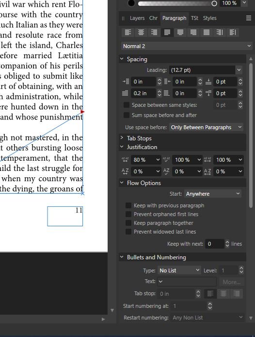
(I am on Windows). The last time I used Publisher was before the latest update. I remember using word spacing menu under "Justification" of the Paragraph panel by clicking on arrow (it must have been arrow, I guess) beside dialogue box. This worked really well for dealing with orphans and widows. It was almost fun to manipulate paragraphs with this. Has it been changed? I opened Publisher today, and I cannot do as I did the last time. There are dialogue boxes for word spacing under Justification, but clicking does not work. And I put in number by typing, and this does not seem to work either. How do we adjust word spacing with the latest Publisher?
-
I came upon this while searching for ways to create epub, and when Affinity Publisher will have epub export. I have used MS word for this, which seems to work fine with text-heavy books and if the book is released only at KDP. But even with an extremely limited experience in all tech-related things, I seem to see coarseness and waywardness in epubs based on Word. When will Affinity have epub reflowable option? What great news the release of that would be to those waiting for it, who search for it to find out the state of things as regards to it. Please release it in the near future!
-
Can you tell me some of the other methods? I looked up how to use image layer and it seems somewhat over my head at this stage. Maybe a "blend mode" can be useful? Some sort of combining a simple color layer with a pattern (in pale gray color?) layer? I'll go explore any suggestions or pointers.
-
I am trying to create a book cover (for a multi-volume book on Napoleon) and now it seems I'm near the end. The final version will be something close to the one I am attaching here. I may become able to create something better in the future but for now this will have to do. Creating this, I did not know about removing the border lines of PNG image and completely forgot about using rectangle tool with fill color for the background. So I added one pixel layer upon another, manually painting the color in, removing border lines and such with inpainting brush. And if I change just a bit on any of the adjustment layers, the many corrections I made show up and the whole thing goes awry. They can be hidden from view for good, by arranging the sequence of layers (I've learned about this from tutorials), but I couldn't do it correctly. So the background pale blue in the blue cover is something I happened to have. I used a lot of blue and white with large paint brush. Much of the painting was over the traces from previous layers. All the adjustments in the adjustment layers are set just so that corrections do not show. I tried to recycle this blue background, by turning it into JPEG and applying HSL adjustment. I could have some results. But I am wondering, what are the ways to recycle a background in cases like this? In the green version I attach below, the PNG file is without border lines (so no inpainting corrections), and I used a rectangle tool with green fill color and paint brush in white color. Can this green background be recycled in any colors I want? If I want to have a background in 4-5 different colors with the same pattern (same haphazard pattern), what would the workflow be like? Any suggestions or pointers will be deeply appreciated.
-
I would like to thank you again. I didn't know about Gradient Map (the courses I took do not cover it) and this seemed like something very difficult for me to do. Then today I got definitely closer to what I want. This is something quite unexpected! I couldn't have done this without you telling me about Gradient Map! Many thanks again!
-
I looked for it hard and found it under "Edit." Edit -> Settings -> Assistant. Many thanks!
-
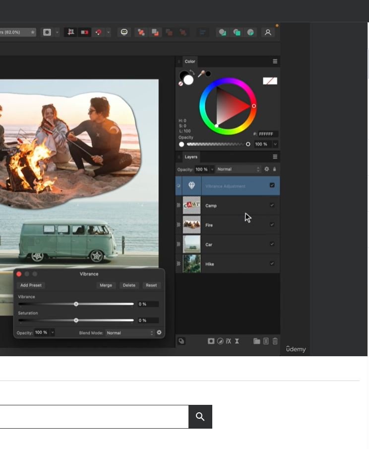
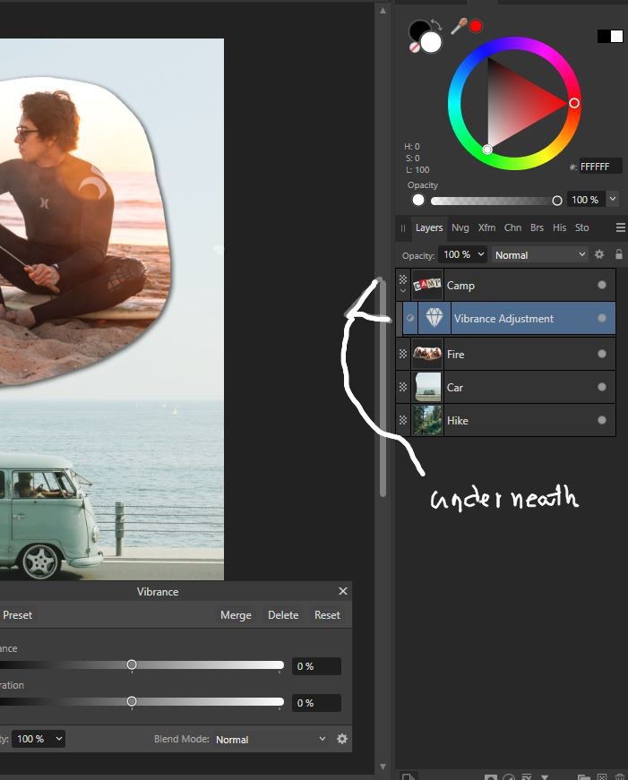
In the course created by Affinity Revolution (they have a Q&A, where answers could be expected in earlier days, but not any more; instructor herself says that help could be sought at Affinity Forum; so please pardon me for asking questions that arose from watching their courses), an applied layer is always placed above the chosen layer. So in one exercise, the top layer ("Camp") is selected and a Vibrance adjustment layer is applied, which is placed above the chosen layer. On my screen, it is always placed underneath the chosen layer (the one marked "underneath" in white handwriting is my screen). This difference had caused many difficulties in understanding layers the first time I tried to learn Photo. This time around, I began doing what the instructor does by first placing the applied layer above the chosen layer myself. Then things are getting increasingly complicated, and now it seems I'll have to figure out how I can fix this so that I can follow the instructor without messing with the placement of an applied layer on my part. Is this something that can be changed at the layer panel? I clicked that hamburger menu at the layer panel and went over the choices there, but there does not seem to be a setting related to the placement of layers.
-
Going beyond the beginner level is so difficult to some beginners because they create many obstacles on their own. I've experienced this so often, repeatedly. This is a great relief! Thanks again!
-
Oh the context tool bar was the one on the top of the screen! And it was fixed! The term "context tool bar," even after months of practicing Photo, still is something mysterious to me. Anyhow many thanks! Now I can practice again!


.jpg.9643e897ceb1e4d48153c0899bbb6d42.jpg)